


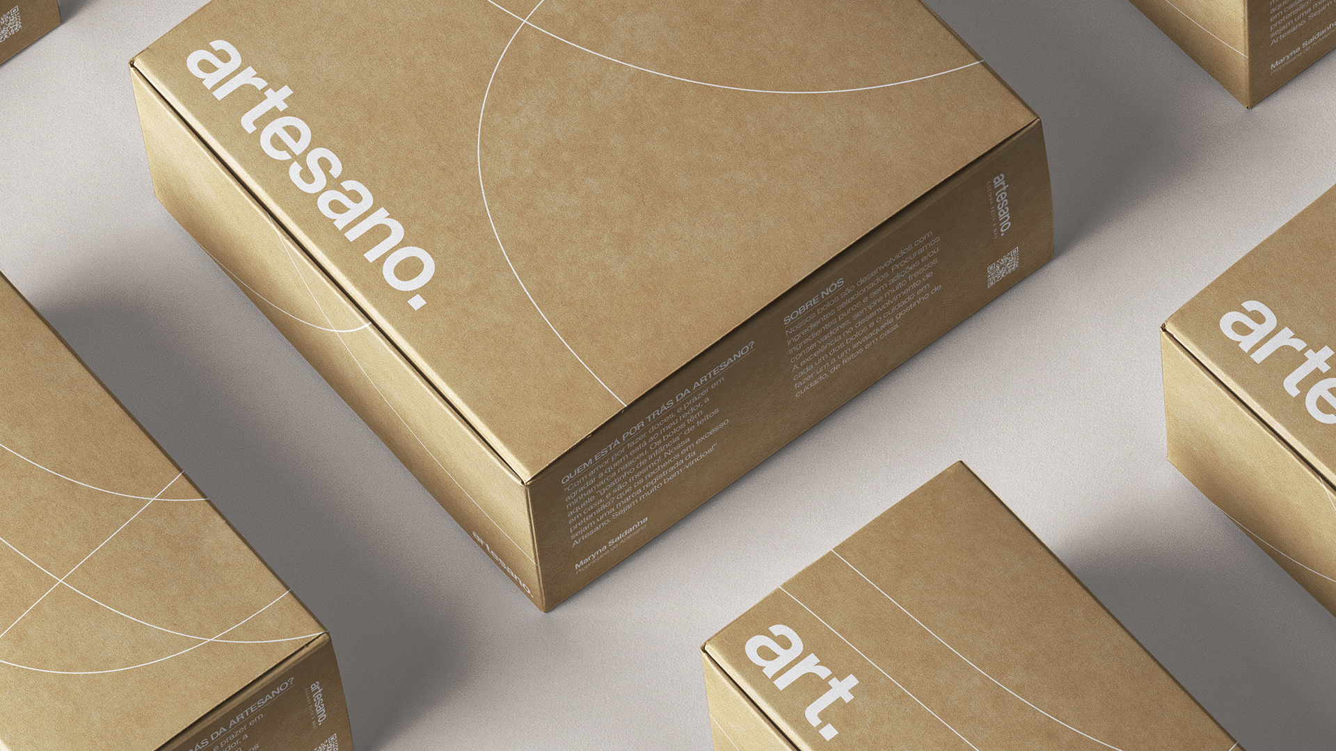
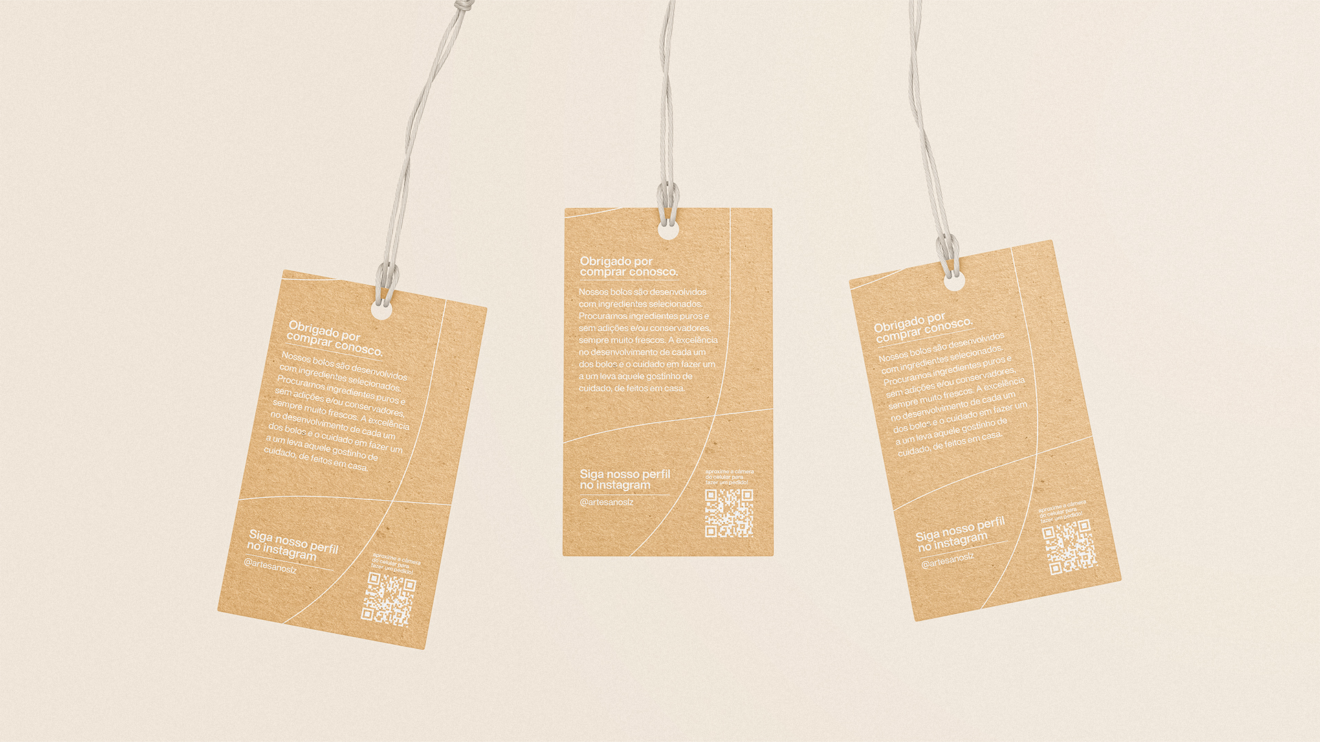
“Our cakes are prepared with selected ingredients. We look for pure ingredients without additions and/or conservatives, always very fresh. The excellence in the development of each cake and the care in making it one by one leads to that little taste of care, of home made”.
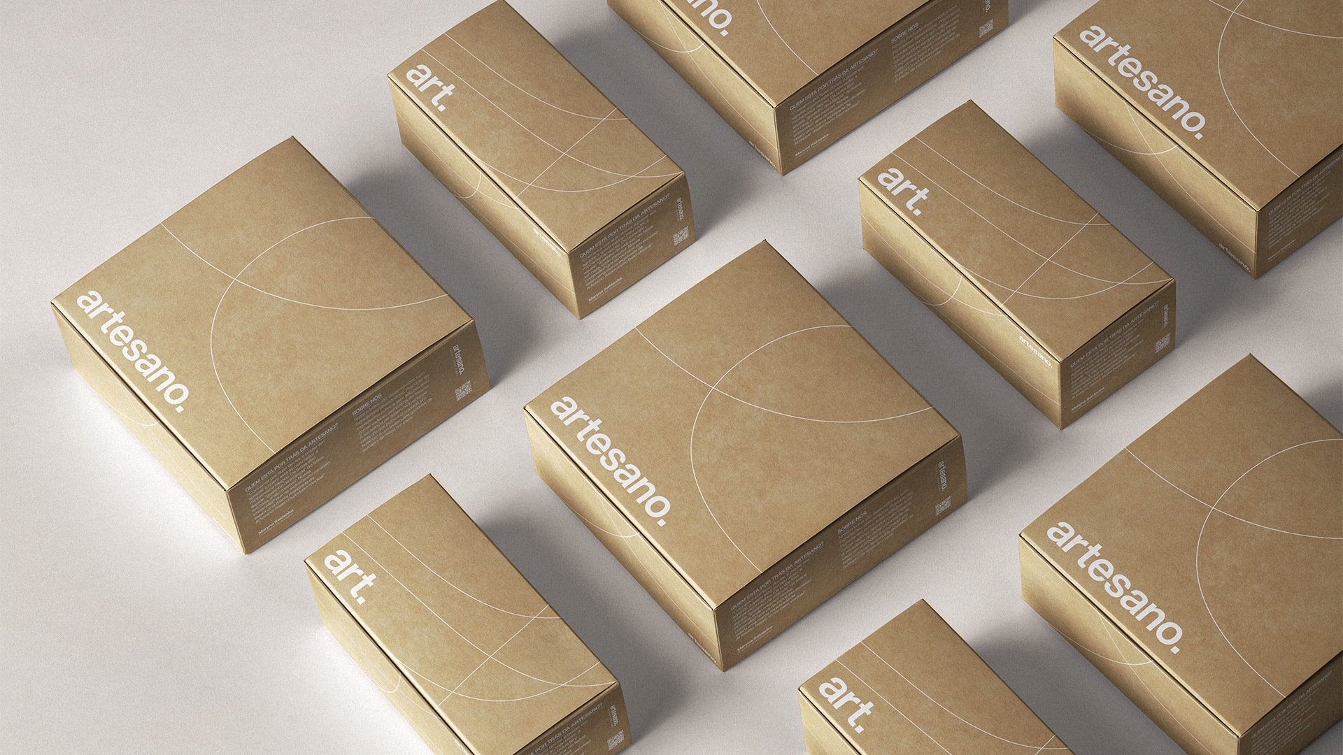
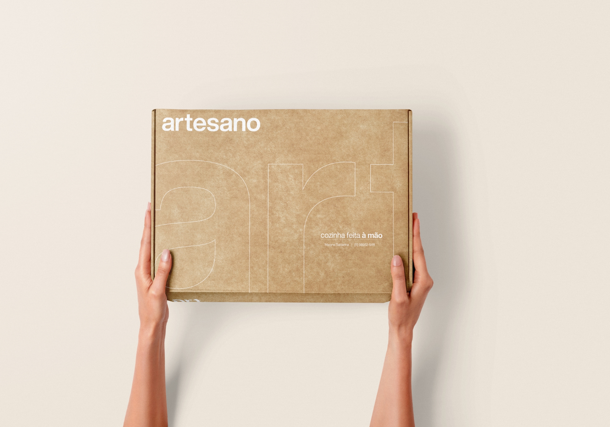
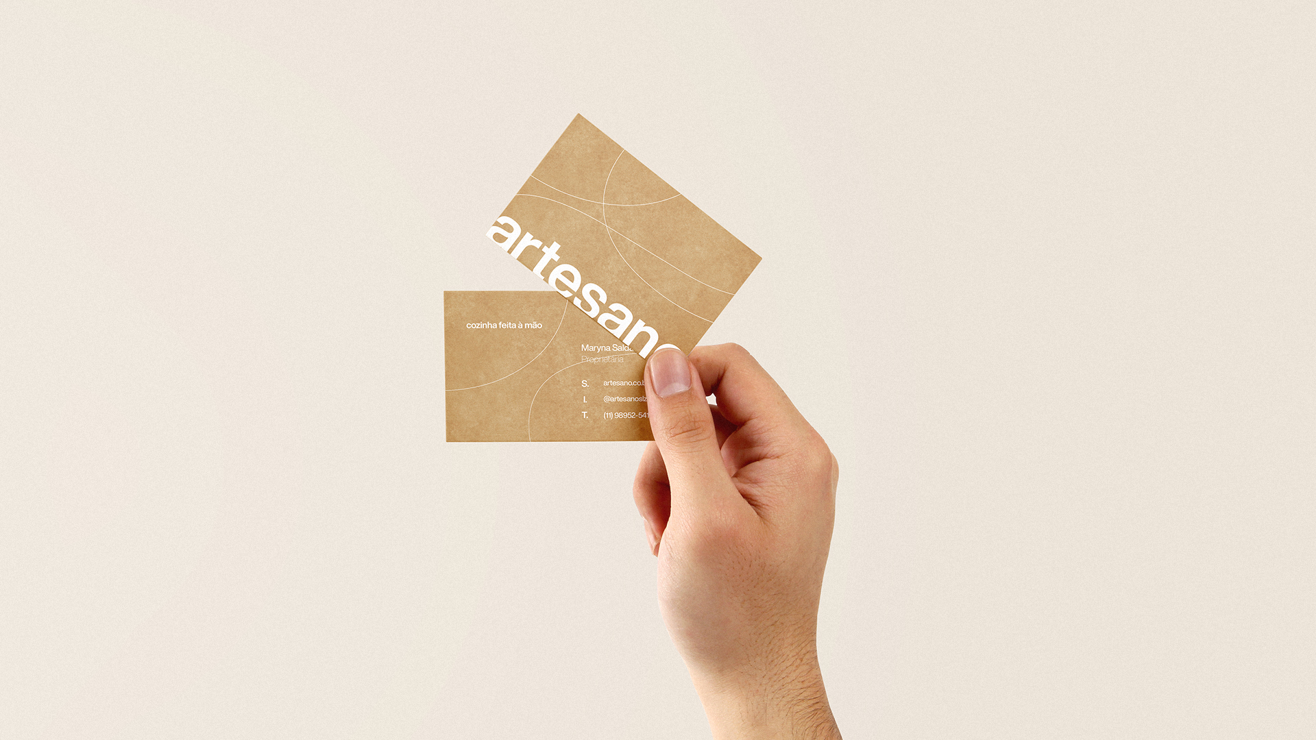
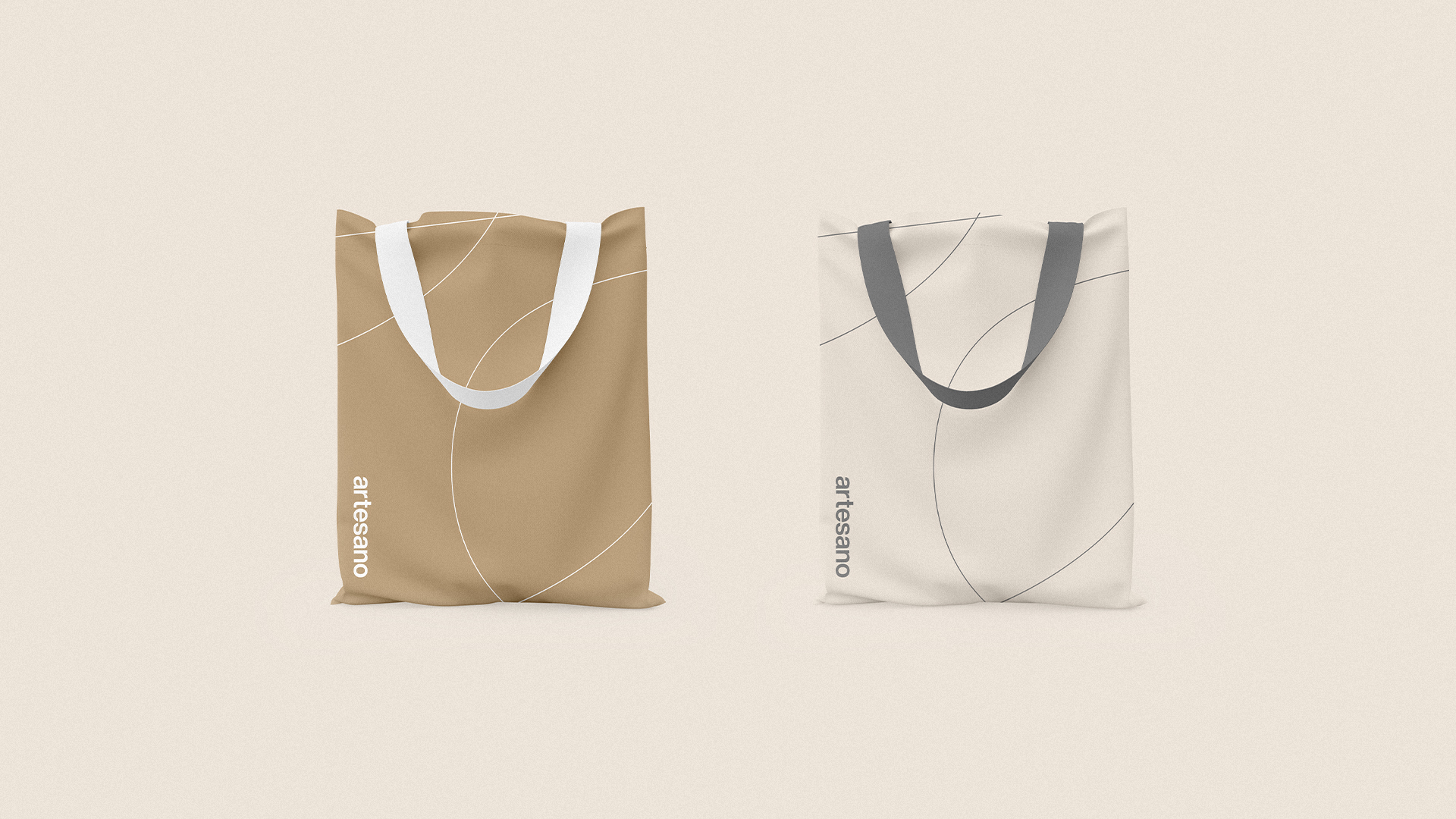
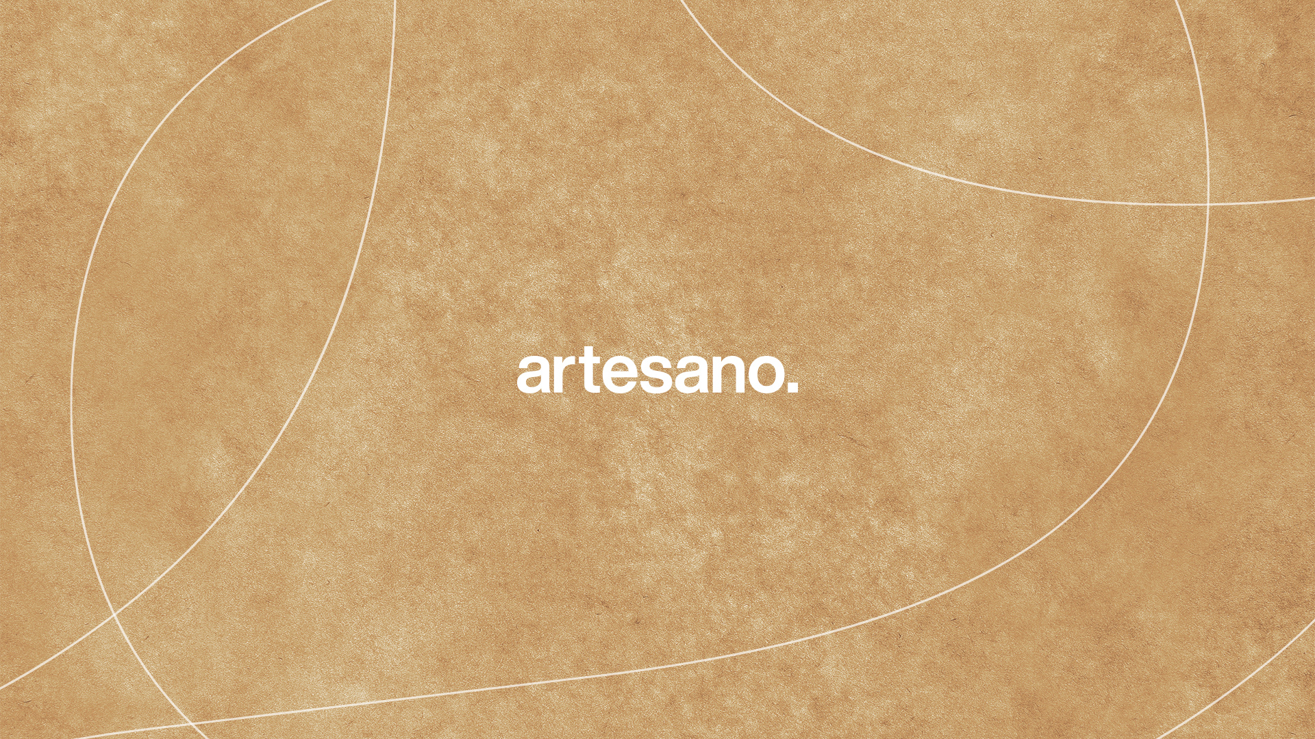
Bringing a modern and sober tone of voice to the brand, “artesano” was written with small caps. The end point completes the signature, and can be used in both its full and reduced version, “art.
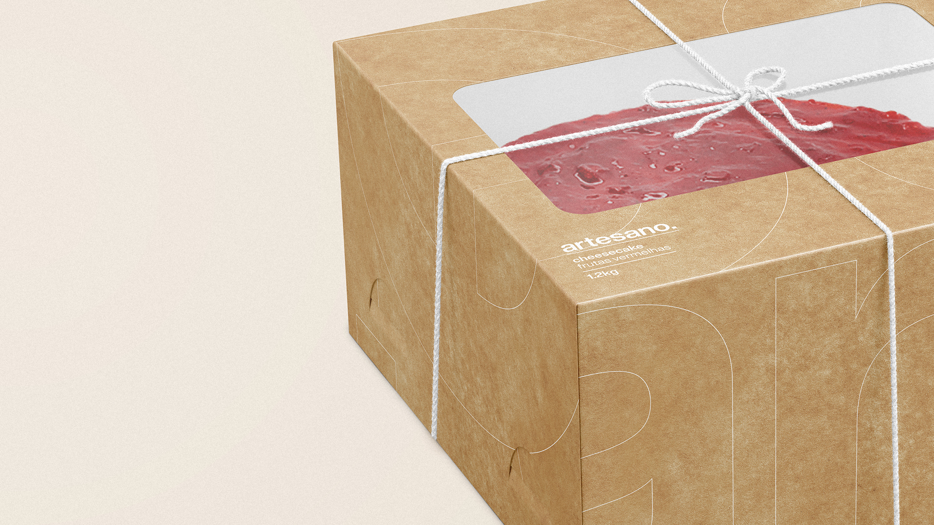
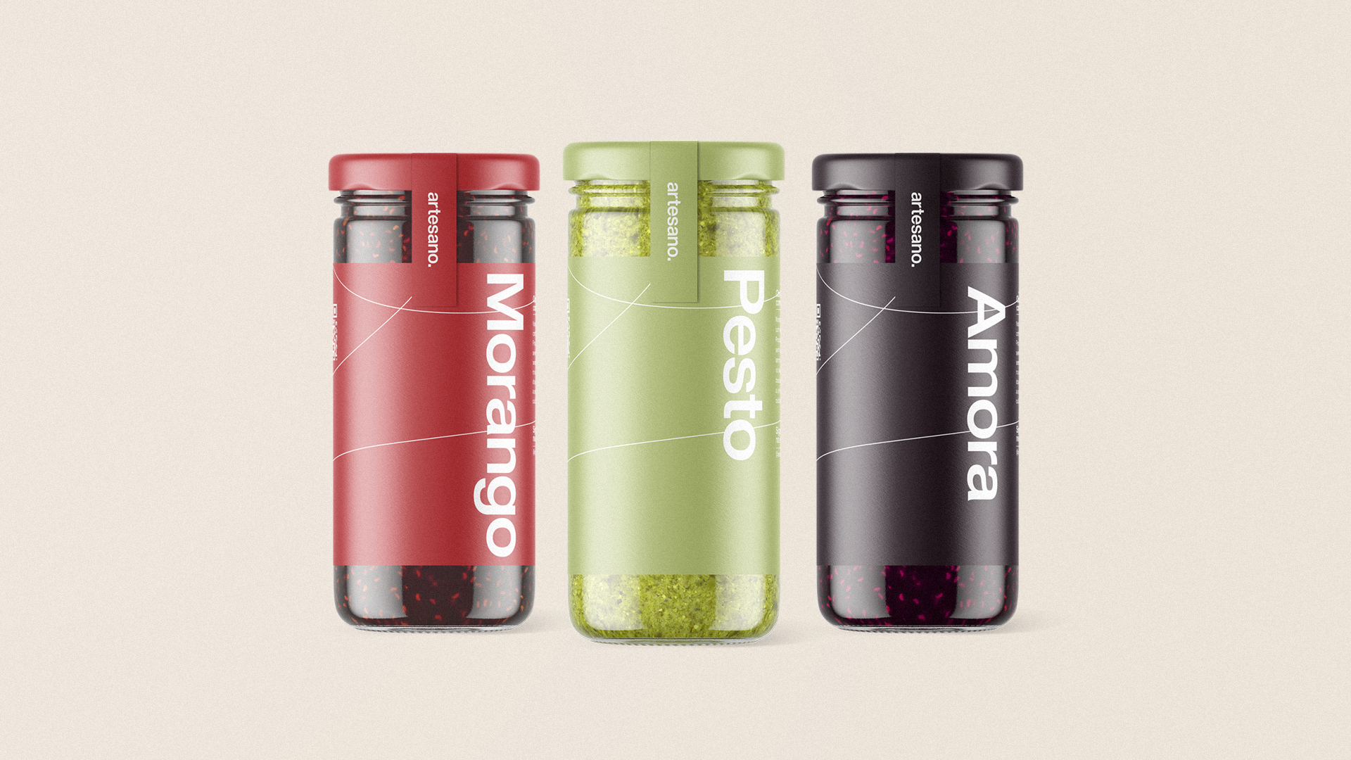
The color palette is composed of neutral and contrasting colors. Kraft paper is a very important part of the brand, since it will be present in virtually all packaging. Therefore, it also works as a colour.
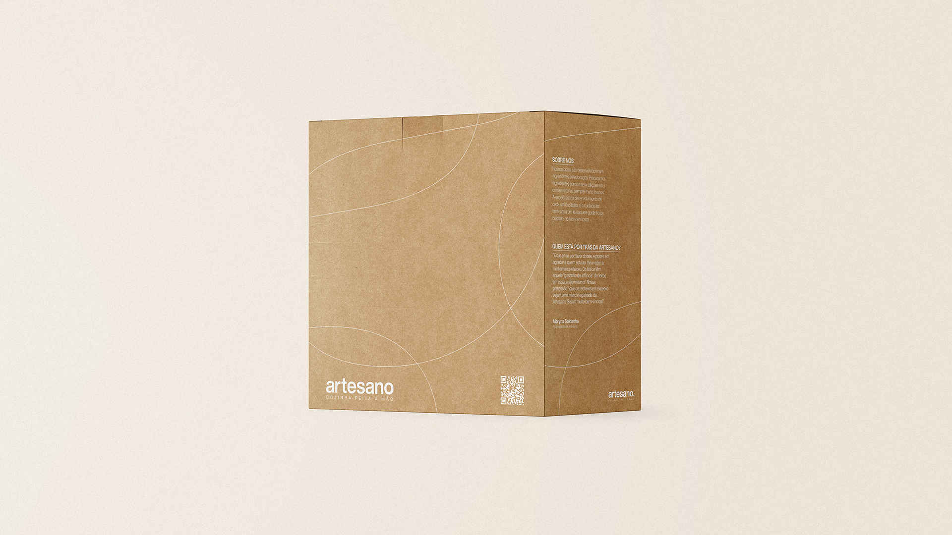
“With love for making desserts, and pleasure in pleasing those around me, my brand was born. The cakes have that “childhood taste” of home made, and they really are! Our pretension? That the excess fillings are a trademark of Artesano. You are very welcome!”
CREDIT
- Agency/Creative: Miguel Vaz
- Article Title: Artesano Rebrand and Packaging Design Designed by Miguel Vaz
- Organisation/Entity: Freelance, Published Commercial Design
- Project Type: Identity
- Agency/Creative Country: Brazil
- Market Region: South America
- Project Deliverables: Brand Creation, Brand Identity, Brand Strategy, Identity System, Rebranding, Tone of Voice
- Industry: Food/Beverage
- Keywords: cake, packaging, logo


