


Maricae Legazpi – Laya Branding and Packaging
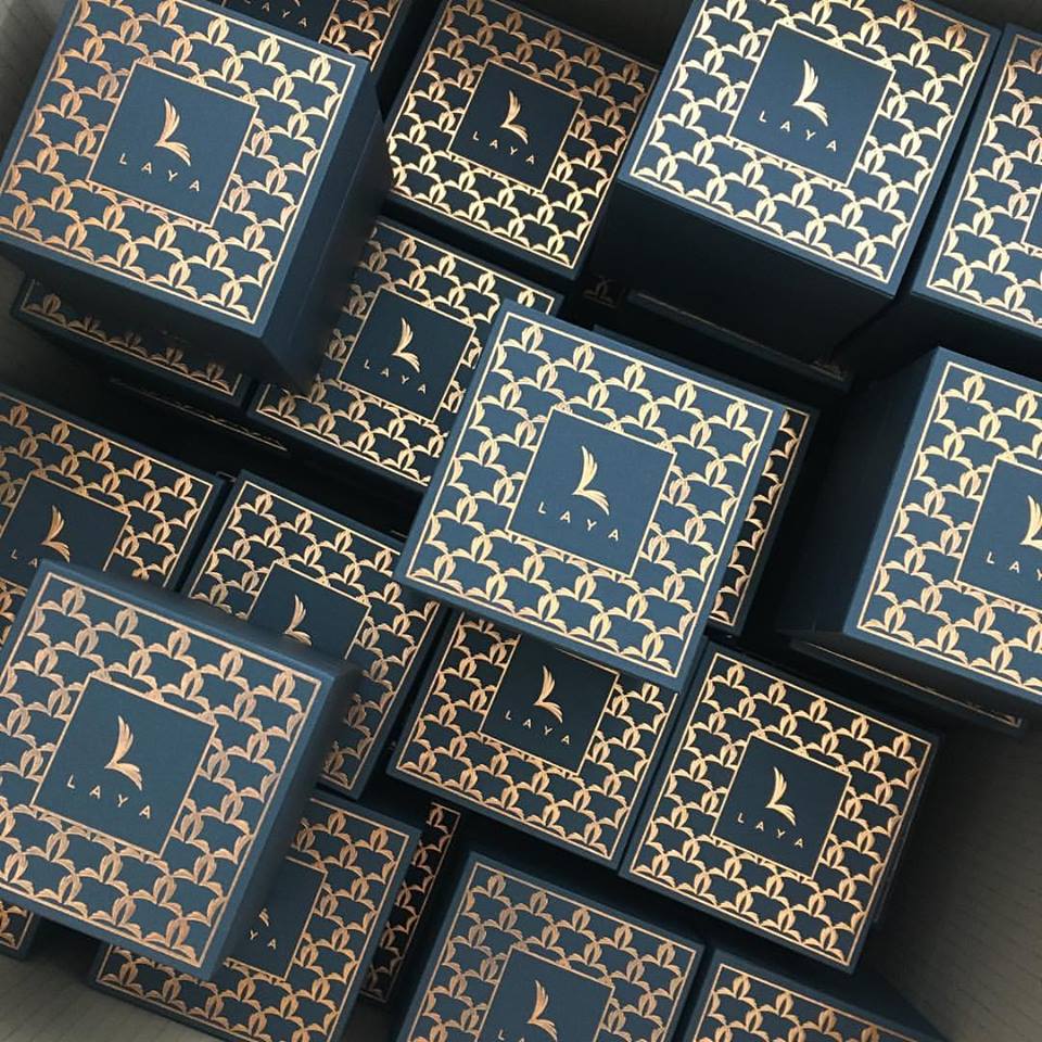
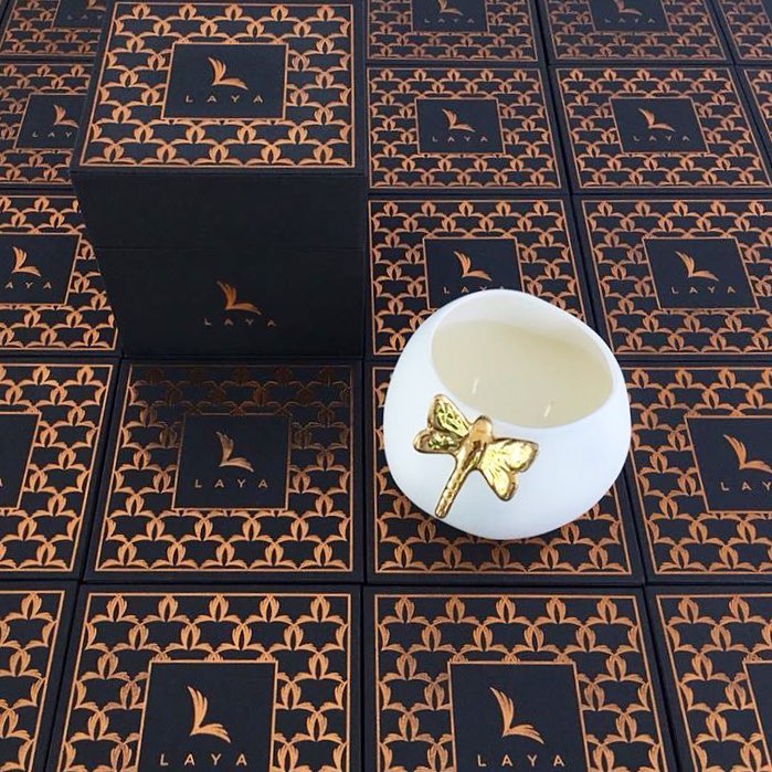
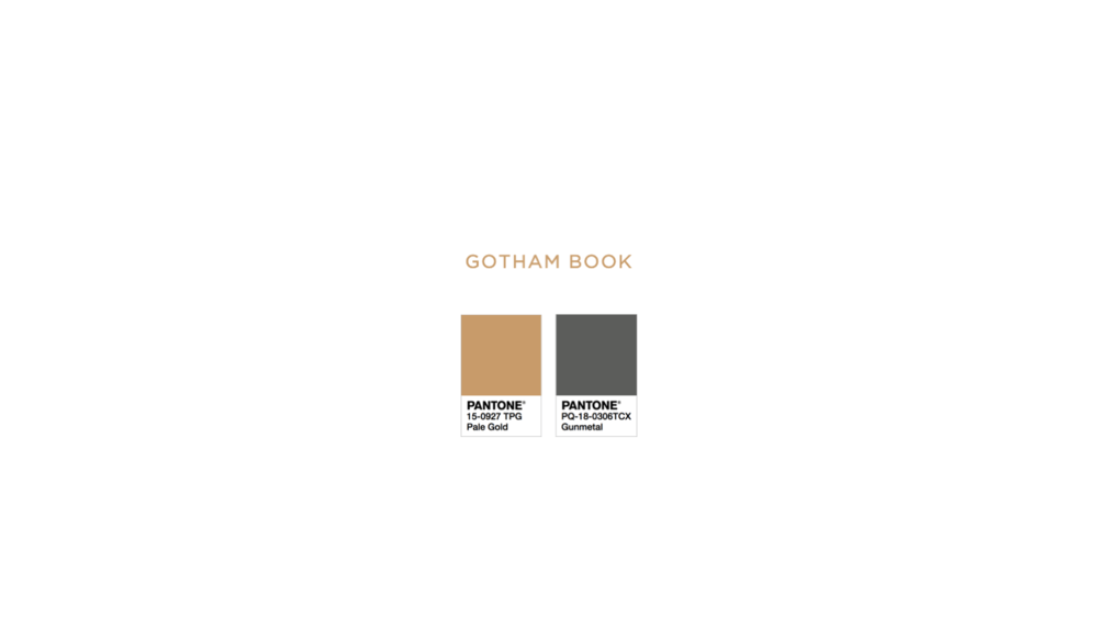
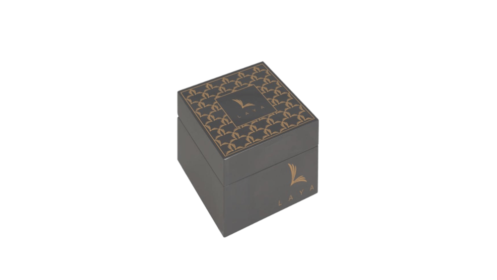
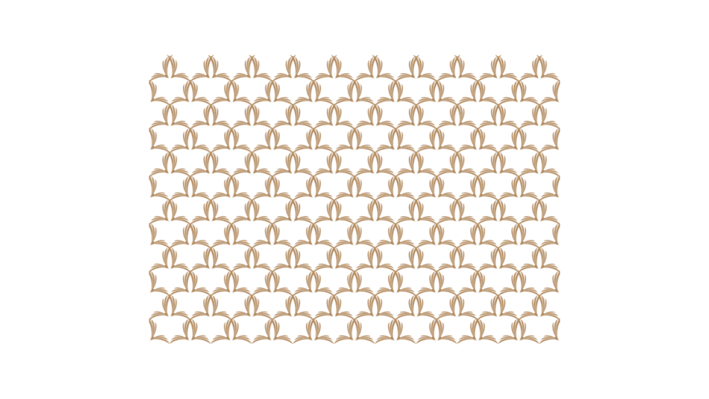
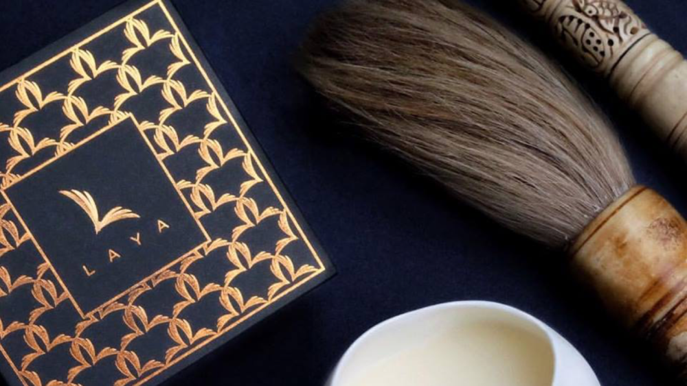
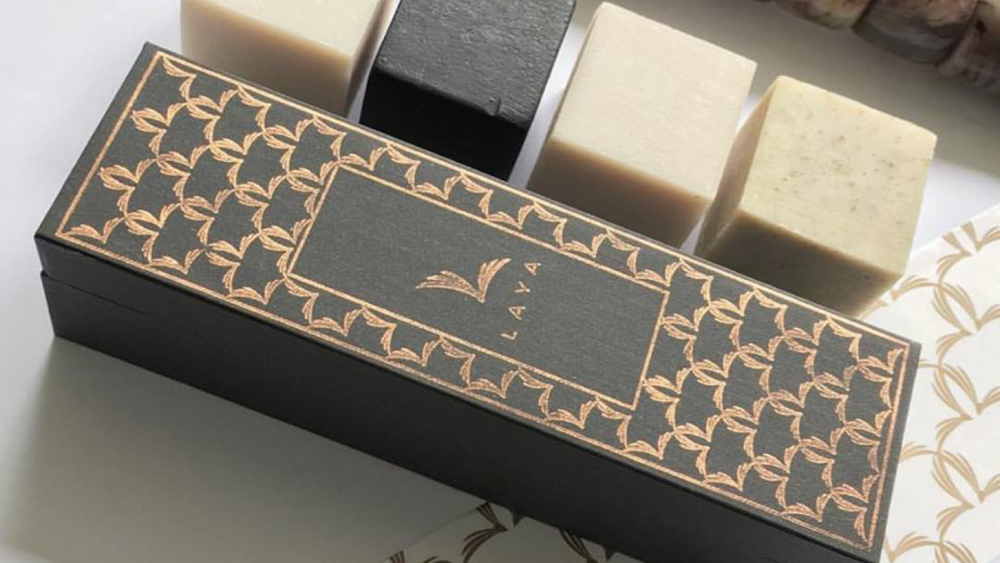
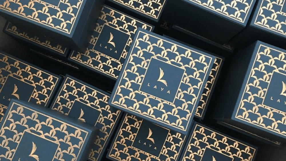
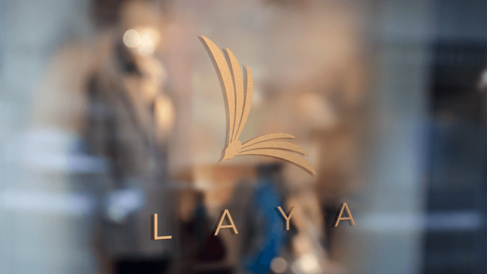
“Laya client wanted branding to be androgynous and almost masculine and packaging specific for handmade soaps and candles, look and feel was to be vintage classic. The result is a minimalist logo of a flying bird formed in a capital L, as the word “laya” means freedom in Filipino, a classic color way of dark grey and copper, and the packaging pattern is inspired by 1920s art deco.”
CREDIT
- Agency/Creative: Maricae Legazpi
- Article Title: Art Deco Inspired Identity and Packaging Design for Filipino Health and Well-Being Brand
- Organisation/Entity: Agency Commercial / Published
- Project Type: Packaging
- Agency/Creative Country: Philippines
- Market Region: Asia
- Format: Box
- Substrate: Pulp Board, Pulp Carton, Pulp Paper
FEEDBACK
Relevance: Solution/idea in relation to brand, product or service
Implementation: Attention, detailing and finishing of final solution
Presentation: Text, visualisation and quality of the presentation


