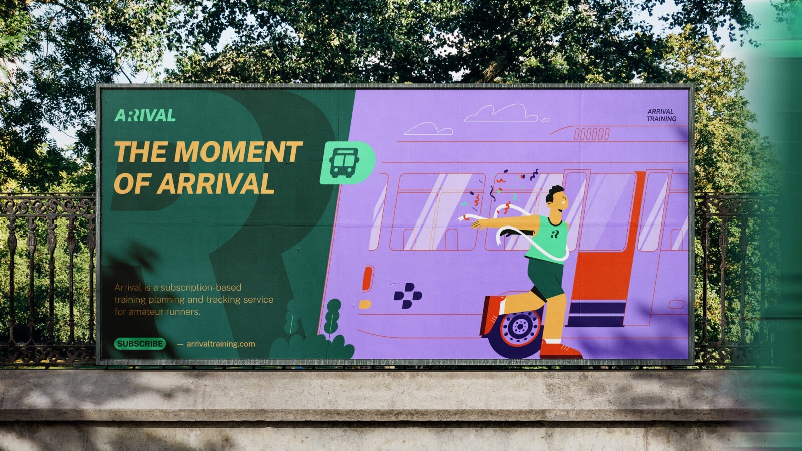
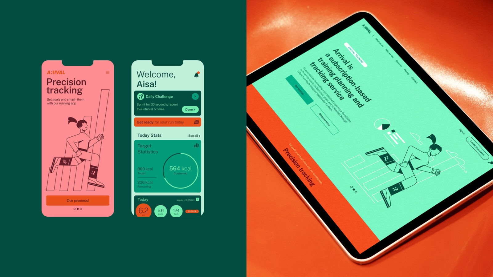
Arrival is an innovative online platform that provides a comprehensive training planner and progress-tracking service specifically designed for amateur runners. The primary goal of Arrival is to create a personalized experience by offering customized workout plans tailored to each user’s unique athletic background, specific goals, and personal motivations. At the heart of Arrival’s mission is a dedication to a scientifically grounded approach, promoting both modern training methods and ongoing educational opportunities for athletes. This emphasis on education and scientific rigor supports the creation of strong, personalized coach-athlete relationships, fostering a supportive environment where each runner can feel motivated and engaged.
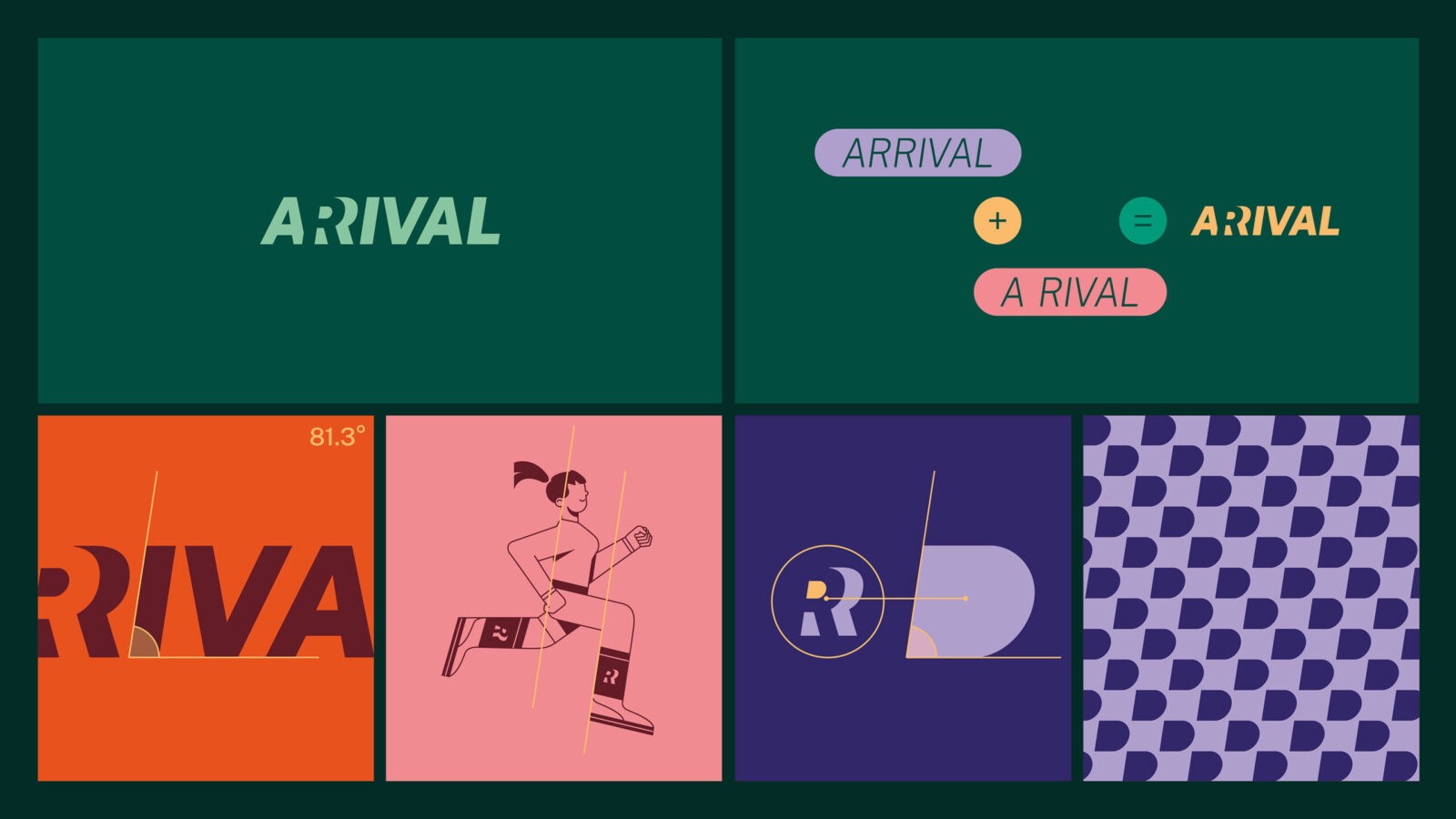
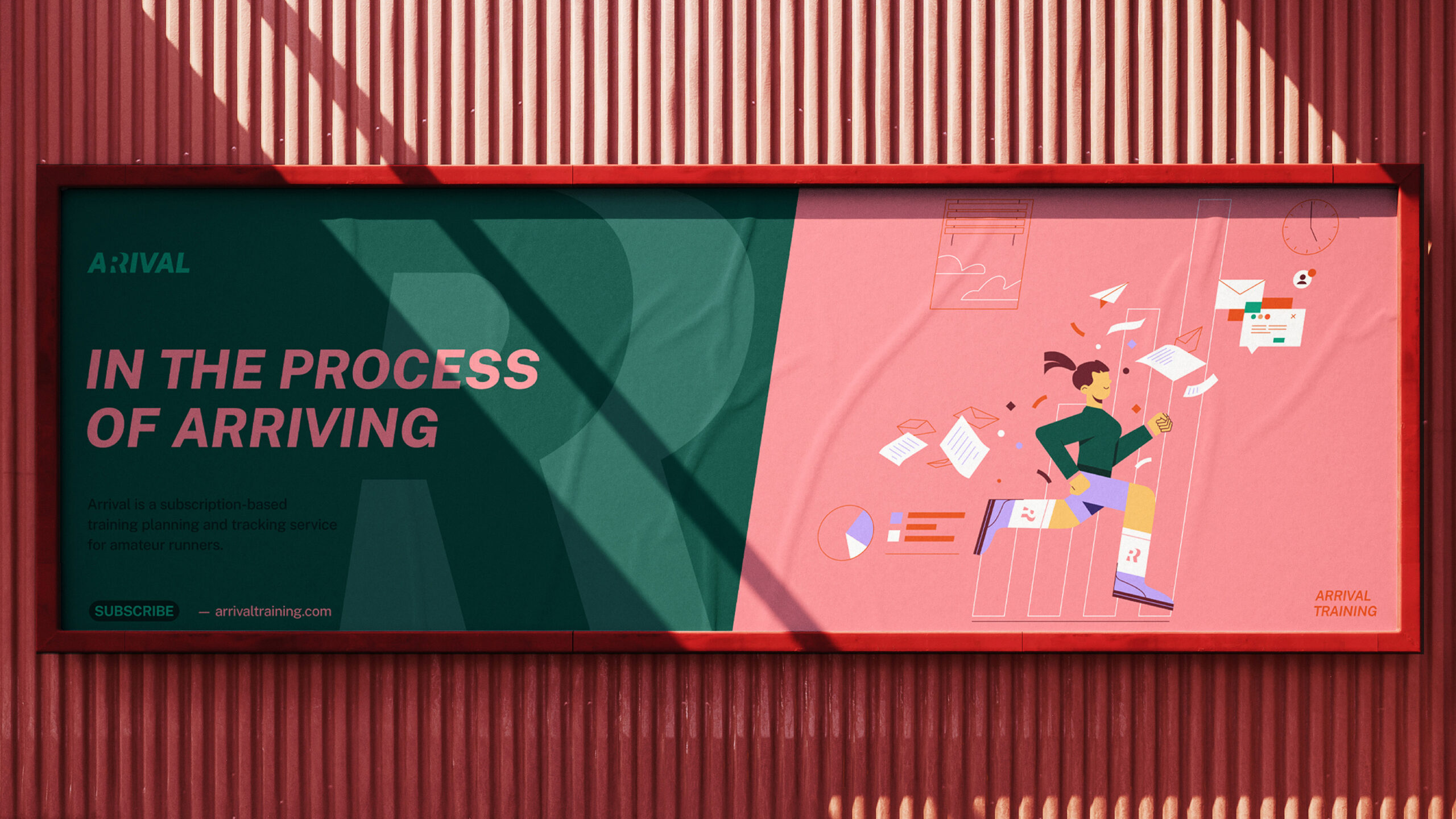
The logotype of Arrival is crafted to convey a dual meaning, cleverly hinting at the wordplay within “Arrival” and “A Rival.” This is achieved through a visually engaging positive-negative design trick incorporated in the “R” letter. For those new to running, the word “Arrival” signals a positive and welcoming invitation to start their fitness journey. Simultaneously, the hidden presence of “Rival” symbolizes the inner drive and competitive spirit that Arrival encourages, emphasizing the value of healthy competition and self-improvement.
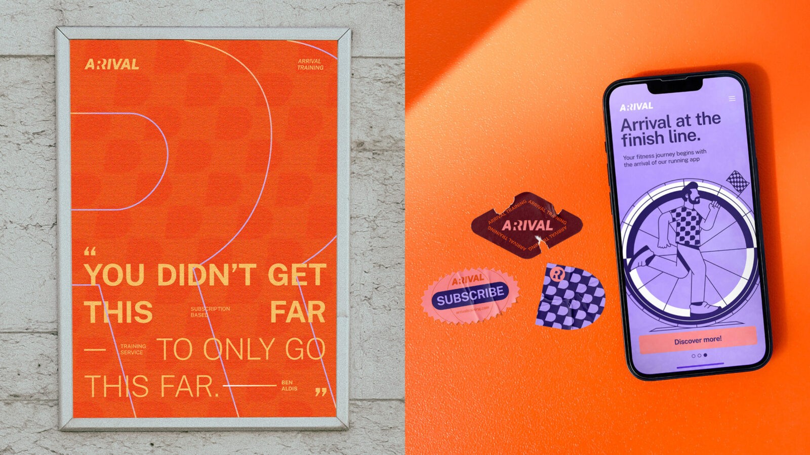
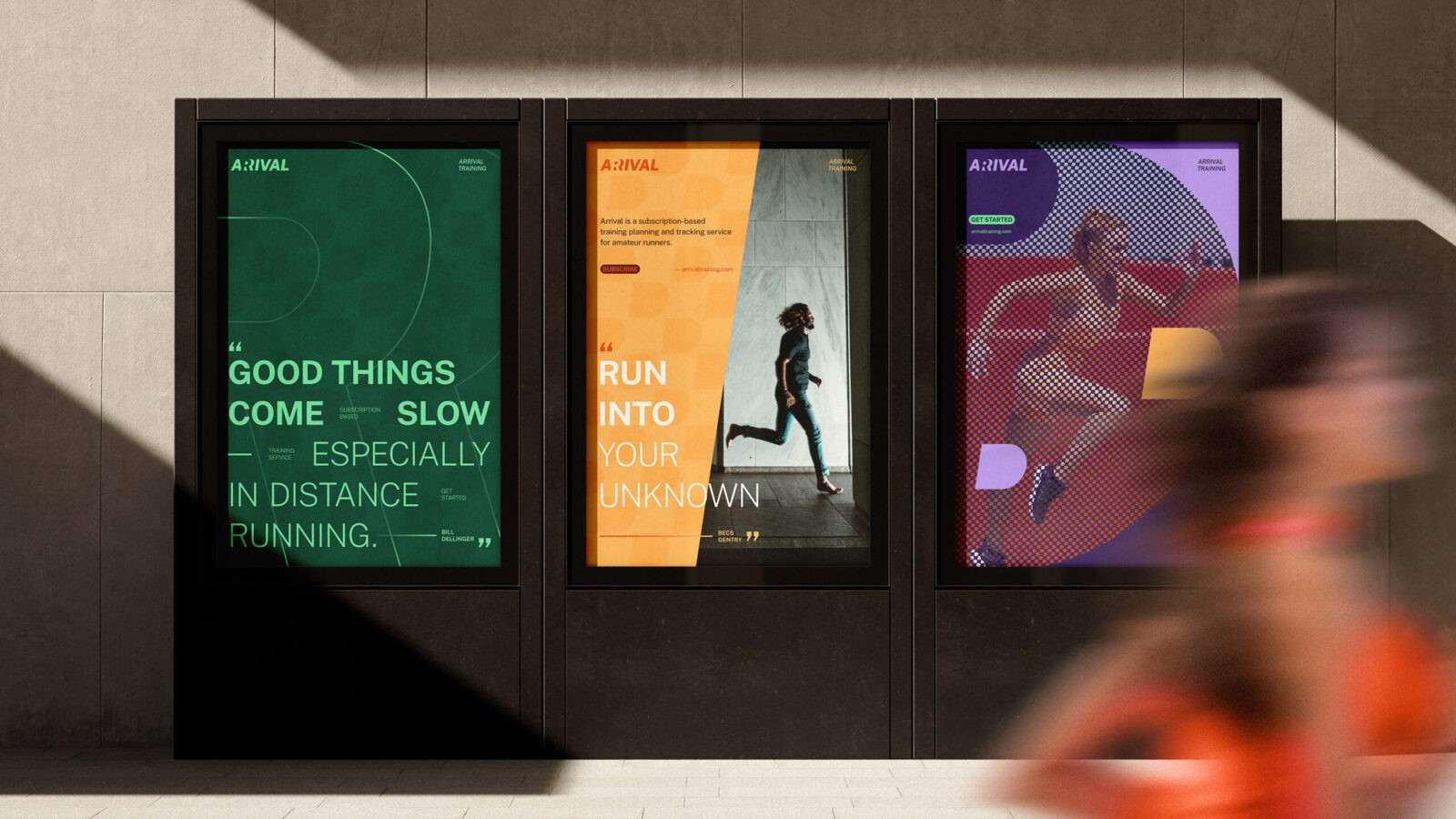
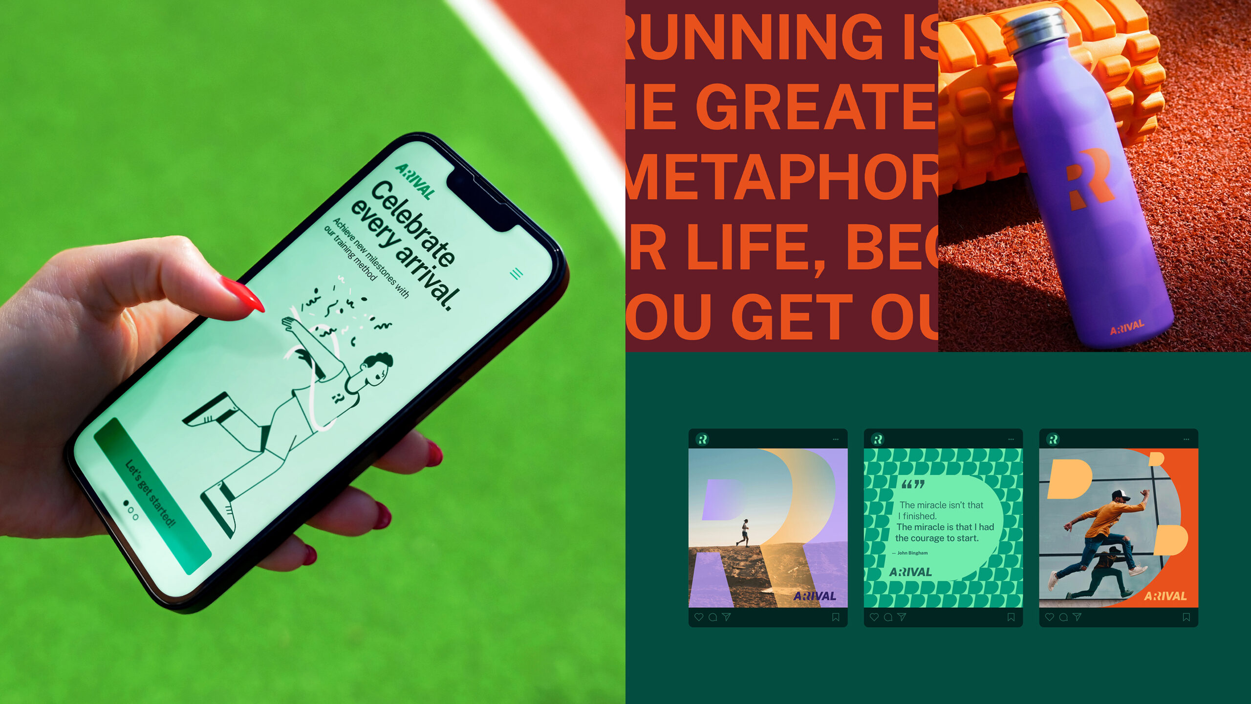
The design of the logotype features a distinctive slanted typography that adds a sense of dynamism and movement, visually resonating with the brand’s active spirit. This unique angled design permeates Arrival’s entire visual identity, inspiring not only the structure of the logotype itself but also influencing the style of the illustrations, icon structures, and overall layout. Customized icons were created to represent specific features within the service and visually reinforce key messages in a way that is both accessible and engaging.
An abstract design pattern, derived from the “R” character, frequently appears on various surfaces, subtly referencing the checkered flag that marks the finish line of a race. This visual element serves as a unifying graphic motif, ensuring that the brand maintains a cohesive appearance across different platforms. At the same time, it gives Arrival a distinctive visual language that is authentic to its brand values. Through these design choices, the communication style of Arrival feels fresh, modern, and playfully engaging, aligning well with its mission to support and inspire amateur runners on their athletic journey.


CREDIT
- Agency/Creative: Botond Vörös
- Article Title: Arrival’s Dynamic Branding: Botond Vörös Blends Fitness and Friendly Competition for Runners
- Organisation/Entity: Creative
- Project Status: Published
- Agency/Creative Country: Hungary
- Agency/Creative City: Budapest
- Market Region: Hungary
- Industry: Health Care
- Keywords: WBDS Creative Design Awards 2024/25
- Keywords: WBDS Creative Design Awards 2024/25
-
Credits:
Art Director / Graphic Designer: Botond Vörös


