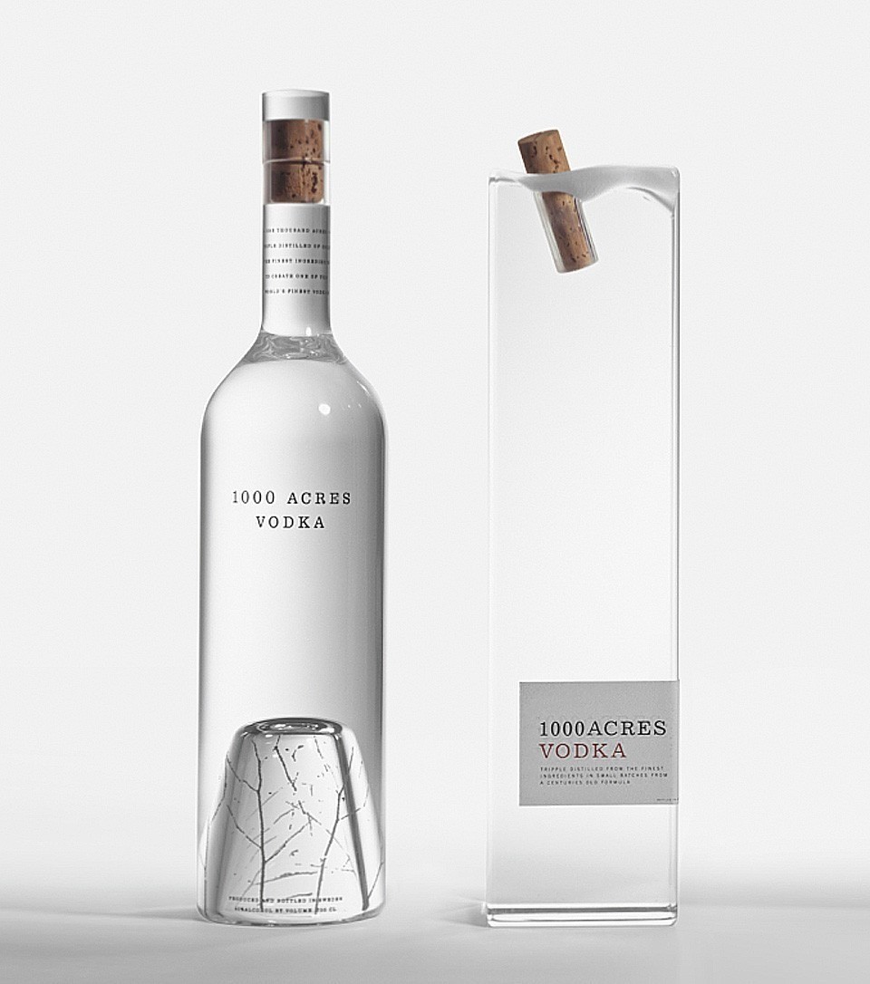
Where structure takes a leading role and the label is secondary. Sometimes the old ones are the best. Designed by the The Arnell Group in early 2009 – its Vodka of course but its more than that its purely breathtaking. The cork that looks like cork frozen in water and the birch tree twigs found at the bottom of the glass just captures the origins of where vodka comes from. Amazing work! 1000 Acres Vodka proves that investment in bottle design will always be king.
CREDIT
- Agency/Creative: The Arnell Group, New York
- Article Title: Arnell Group – 1000 Acres Vodka
- Project Type: Packaging
- Substrate: Plastic, Pulp Paper, Wood
FEEDBACK
Relevance: Solution/idea in relation to brand, product or service
Implementation: Attention, detailing and finishing of final solution
Presentation: Text, visualisation and quality of the presentation


