


Bicu is a Mexican electronics brand focused on young generations, who are looking for high-quality and accessible products, but without leaving aside the design, versatility and comfort that current life offers us.
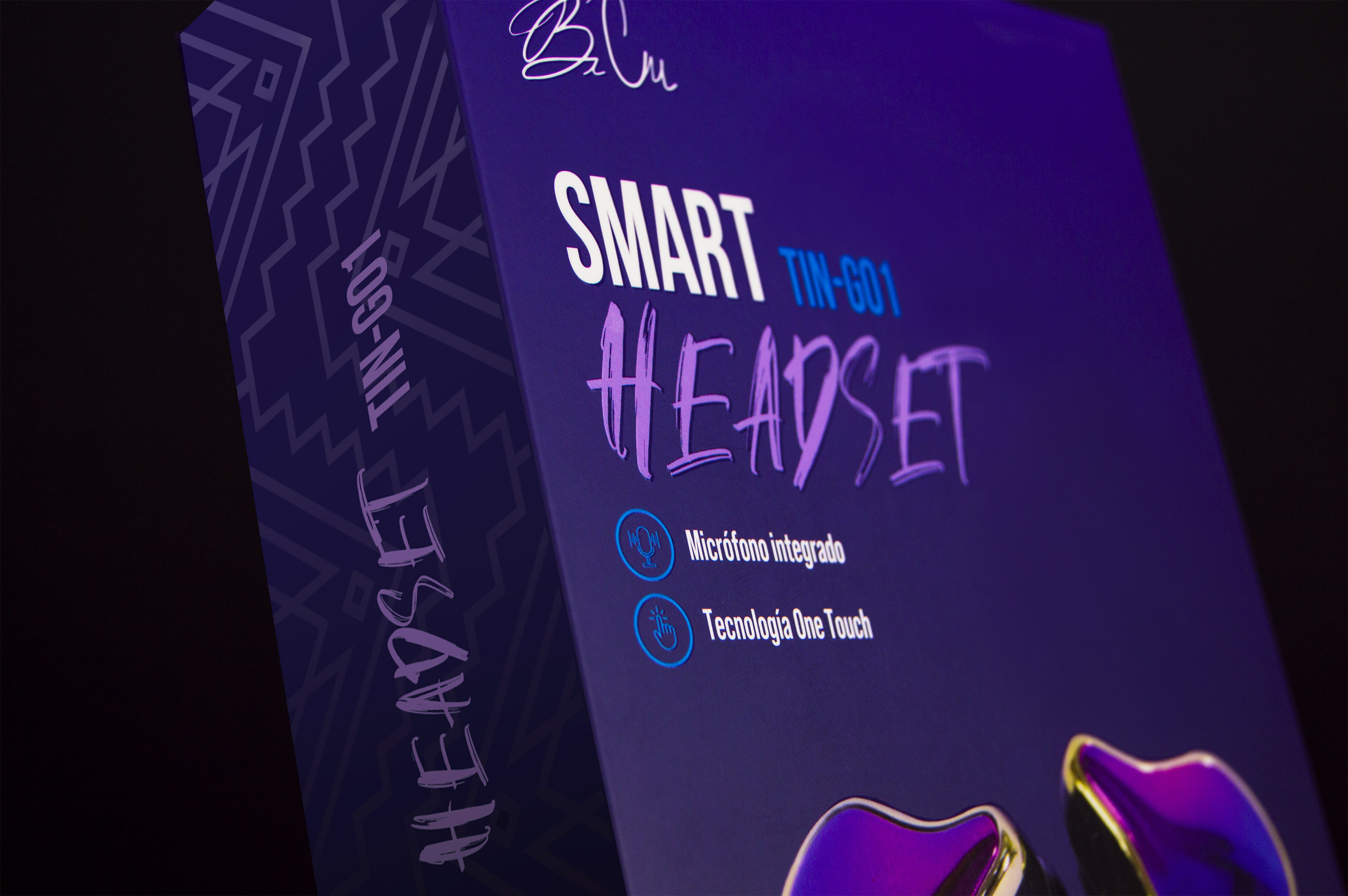
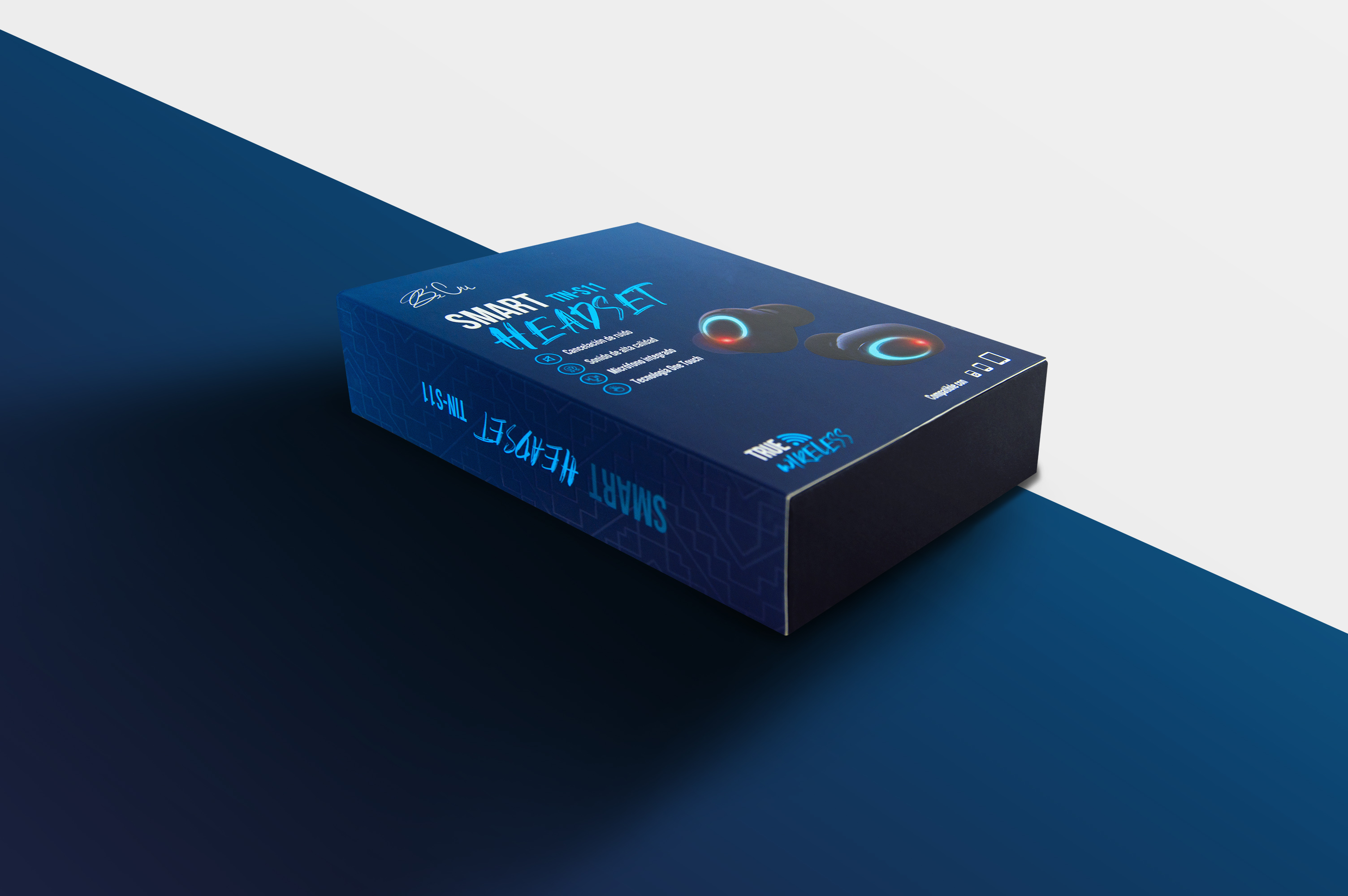
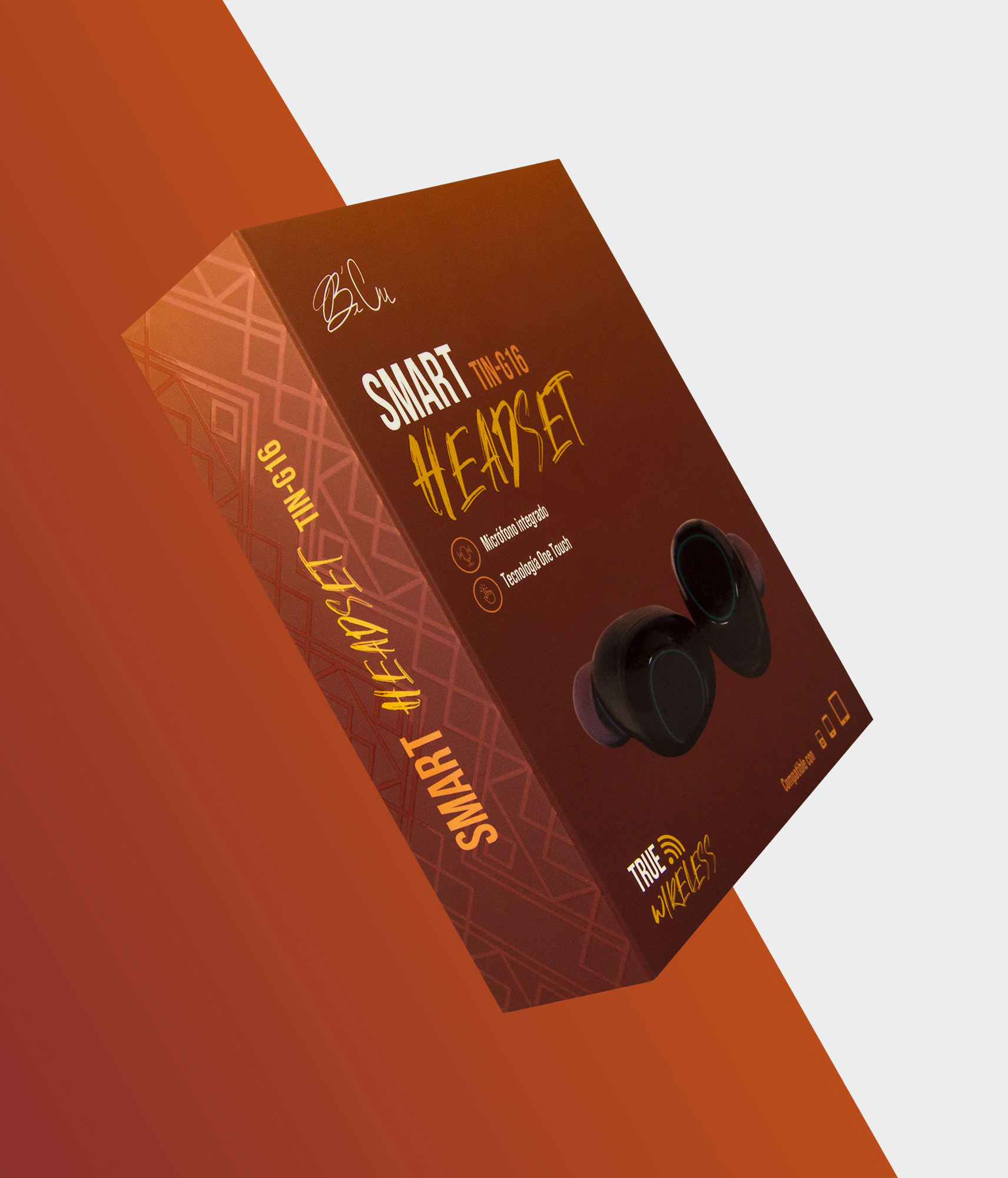
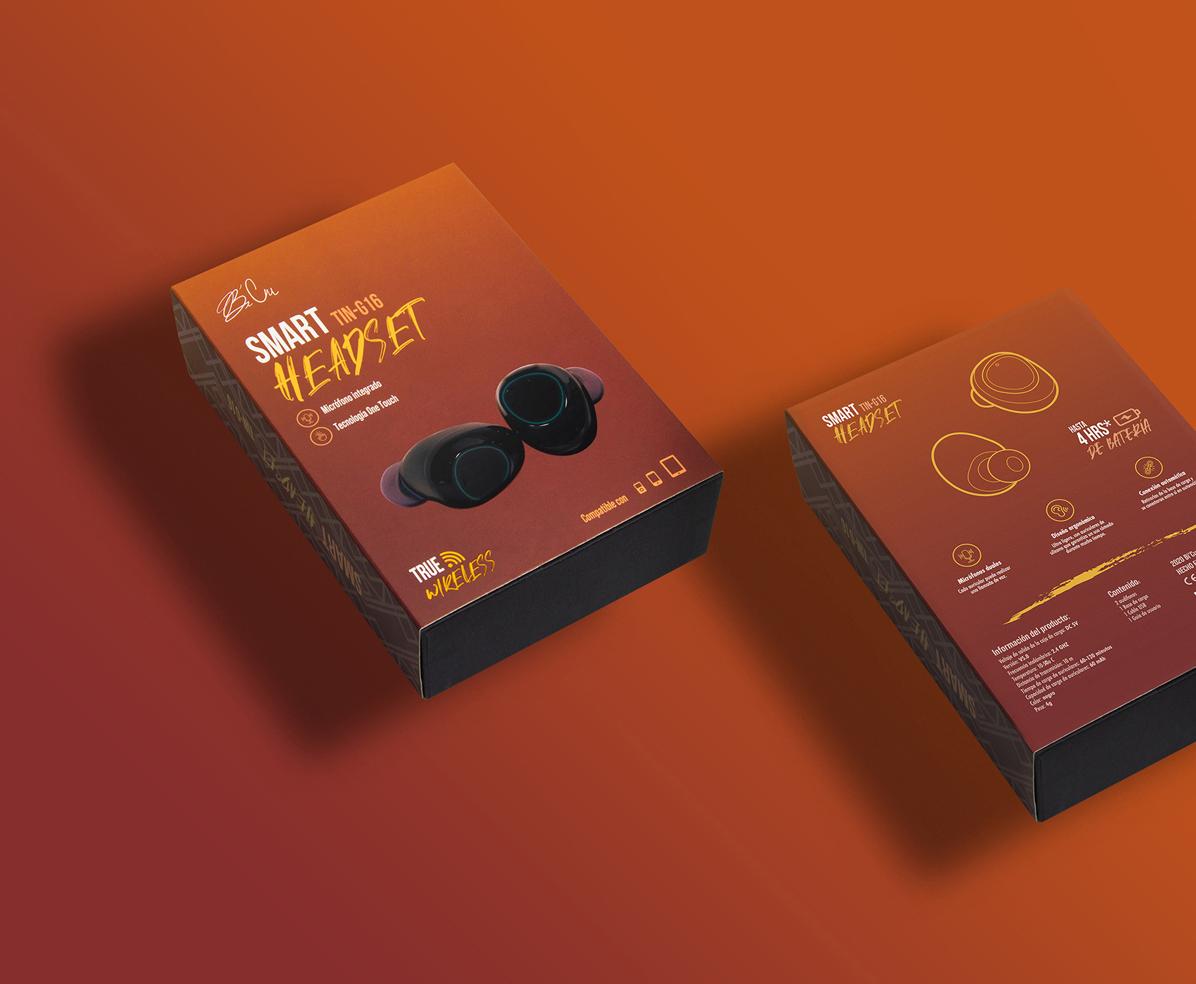
The brand’s launch products are a collection of four in-ear headphones, with different benefits, styles and features, but part of the same values of technology and innovation that the brand offers. For these launch products, a graphic line was sought that would help shape the beginning of a robust visual identity, which could be followed by the following products to launch, but showing the differences and qualities of each of these hearing aids.
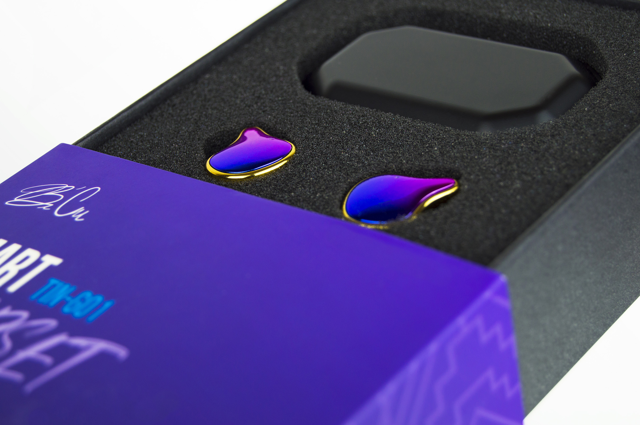
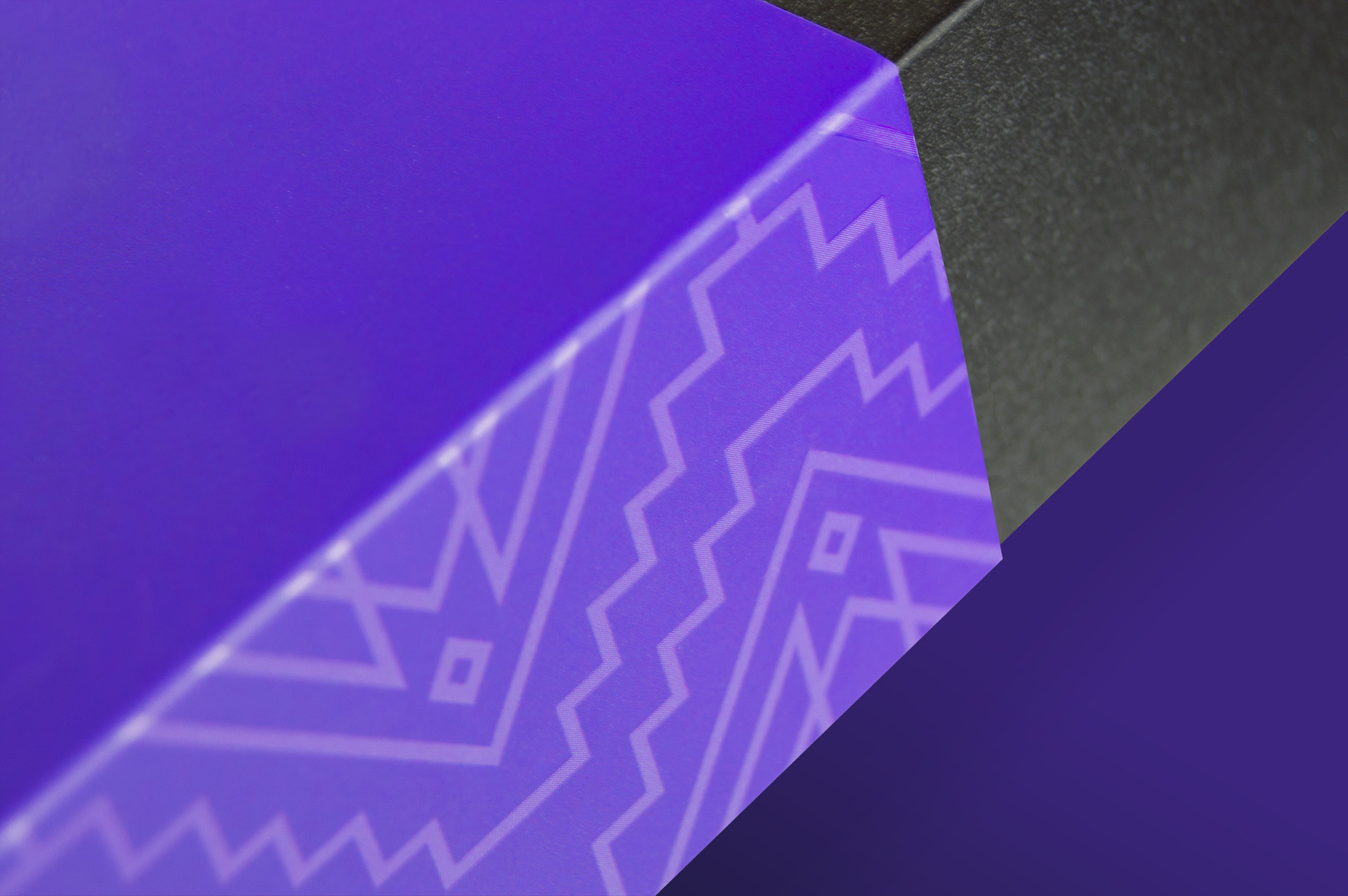
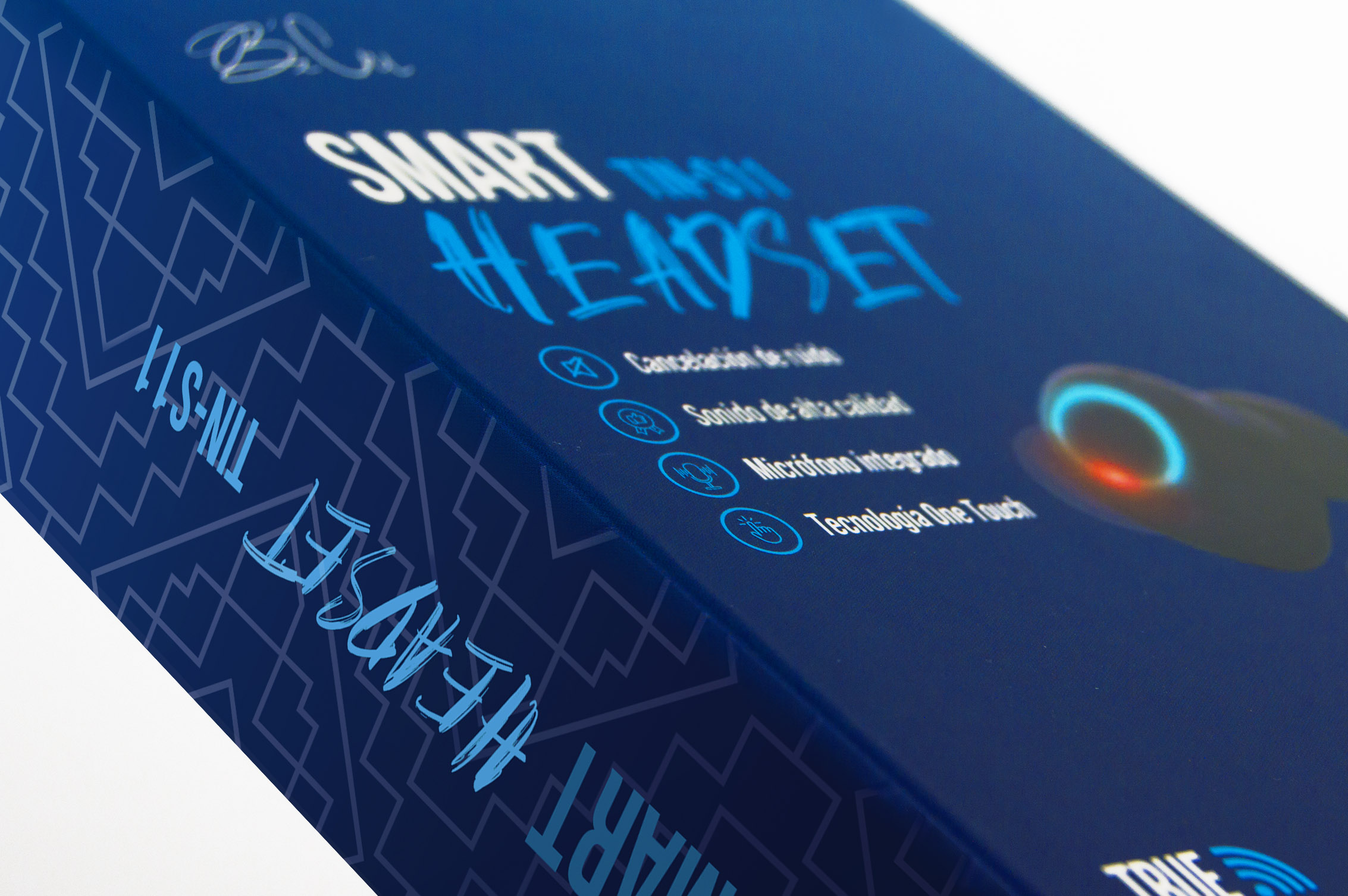
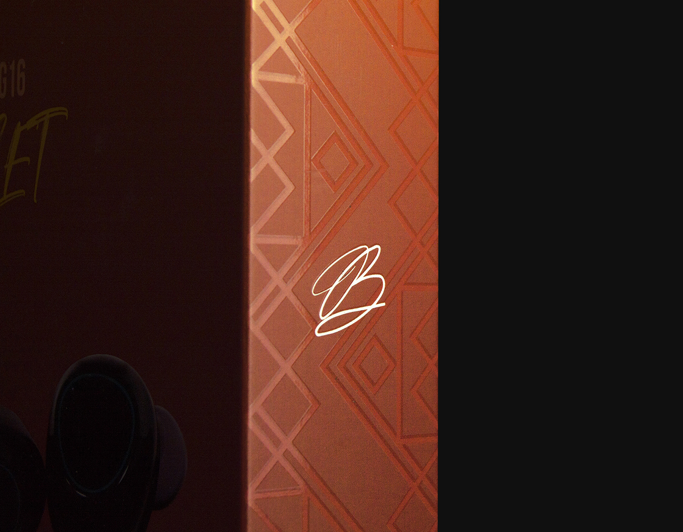
The challenge: When designing the visual identity of Bicu’s packaging, our objective was to generate a visual fusion between a technological aesthetic and the abstraction of Mexican graphics, such as fretwork. The challenge was to make this fusion between two initially different styles, but when they are combined, they can generate new styles and a different identity from other products in the same category. We chose three colors to differentiate each model, and we incorporate lateral patterns inspired by pre-Hispanic fretwork and textures, brought to a contemporary visual language and technological aesthetic.
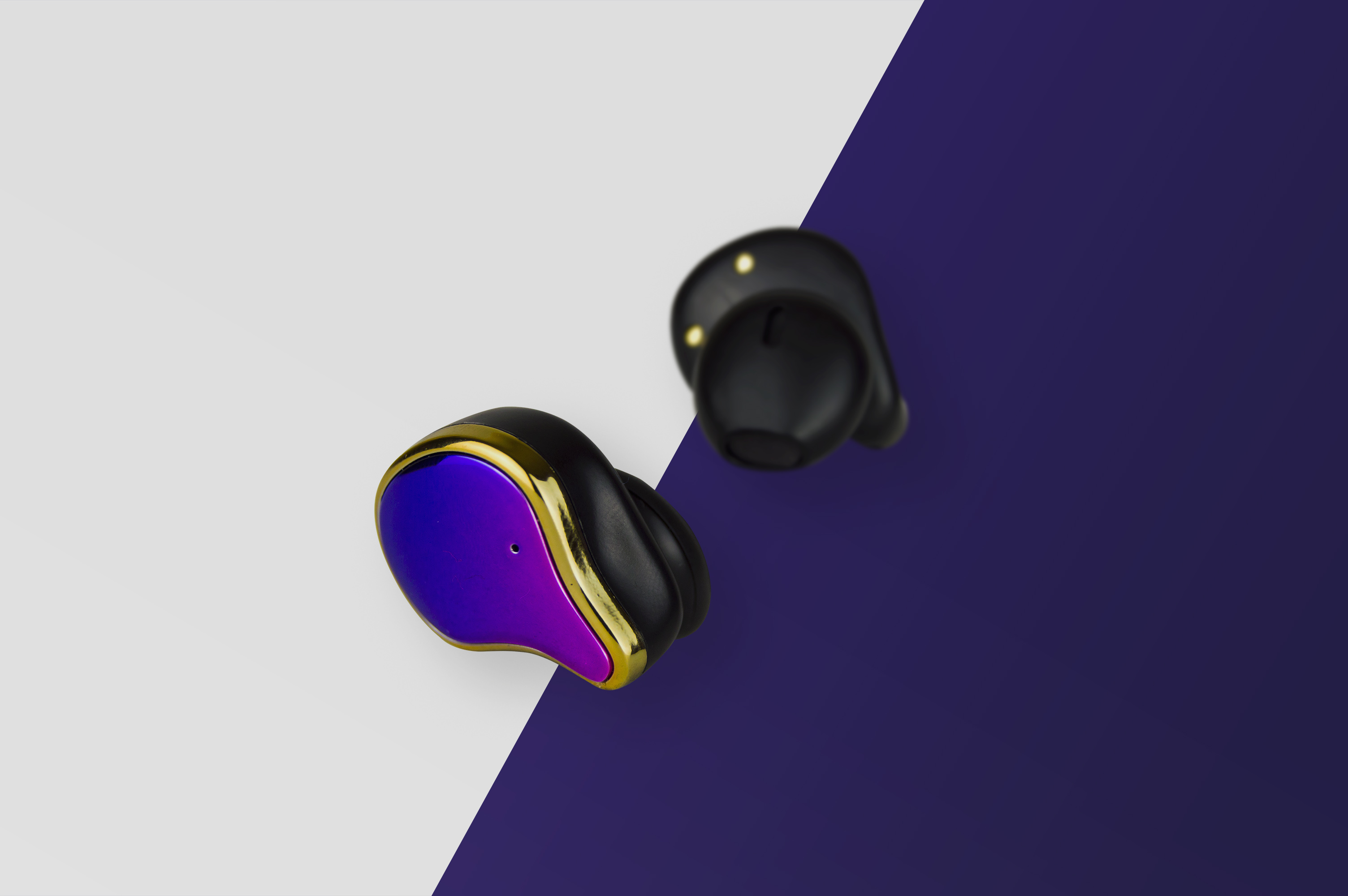
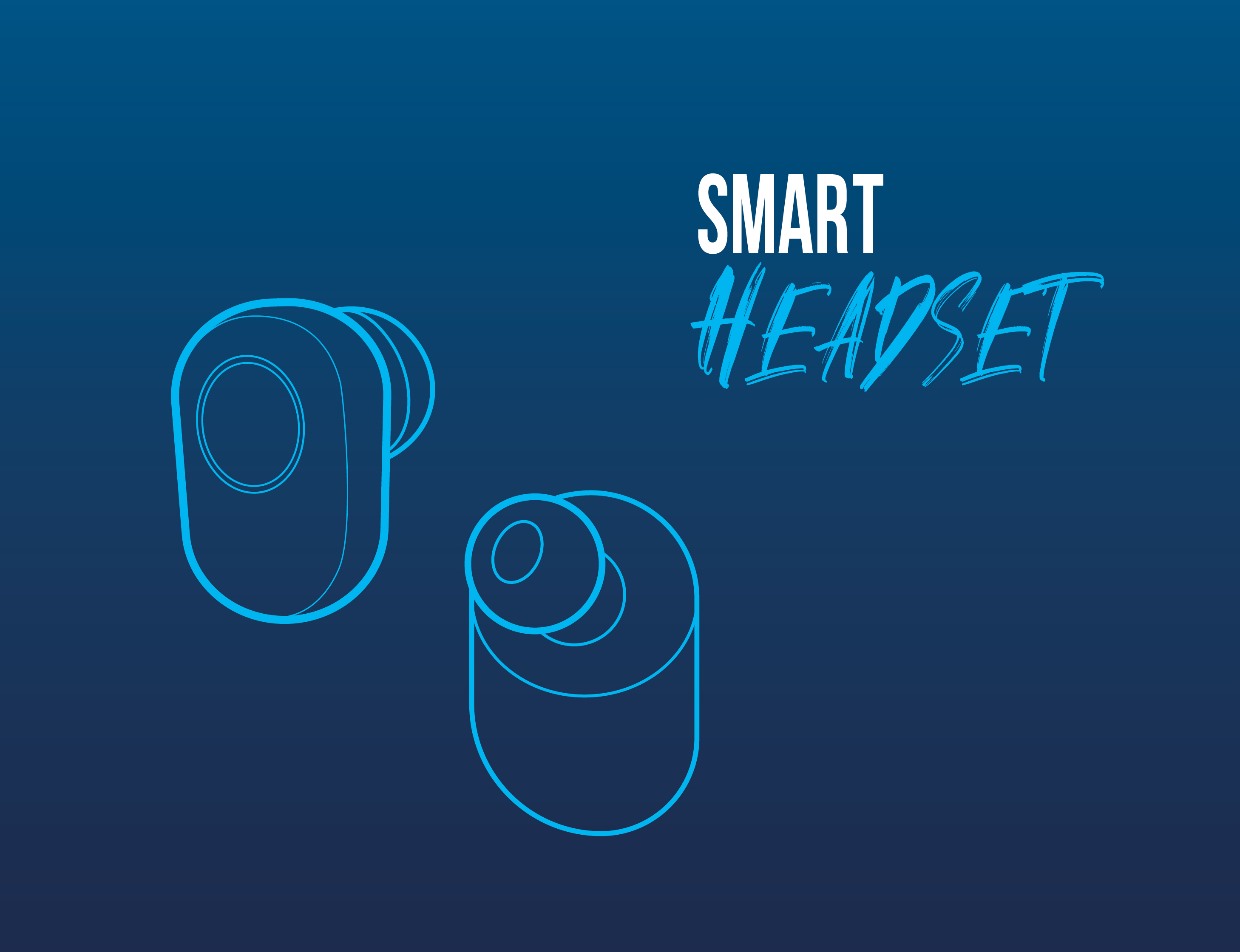
The four headphones models have four different unique identities, but they are homogenized with a universal aesthetic that generates the similarities in this family of products. The iconography, fonts, finishes and product photography harmonize in such a way that an integral identity is generated, which can be replicated in the product lines subsequently launched.
These four initial products represent for Bicu the first signal to the market about the quality of its products at an initial and decisive moment to set a standard for what can be expected from the brand. The result of the design opened the doors of major stores and quickly position itself as a trusted brand. “People trust a product with packaging that looks quality a lot more. For many, that can make the difference between buying it or not. ”
CREDIT
- Agency/Creative: Armatoste
- Article Title: Armatoste Creates Bicu Headphones Packaging Design
- Organisation/Entity: Agency, Published Commercial Design
- Project Type: Packaging
- Agency/Creative Country: Mexico
- Market Region: North America
- Project Deliverables: Brand Architecture, Brand Strategy, Brand World, Packaging Design
- Format: Box
- Substrate: Pulp Paper


