


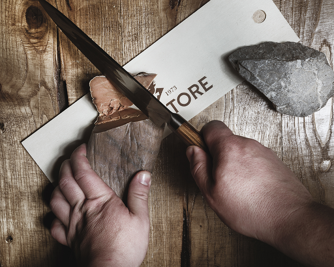
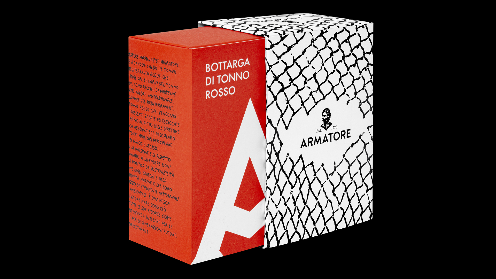
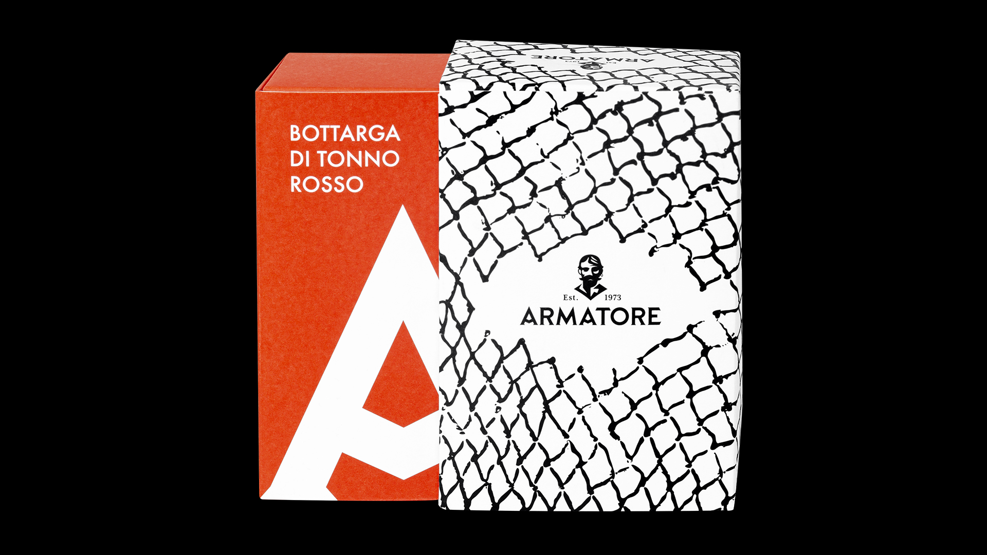
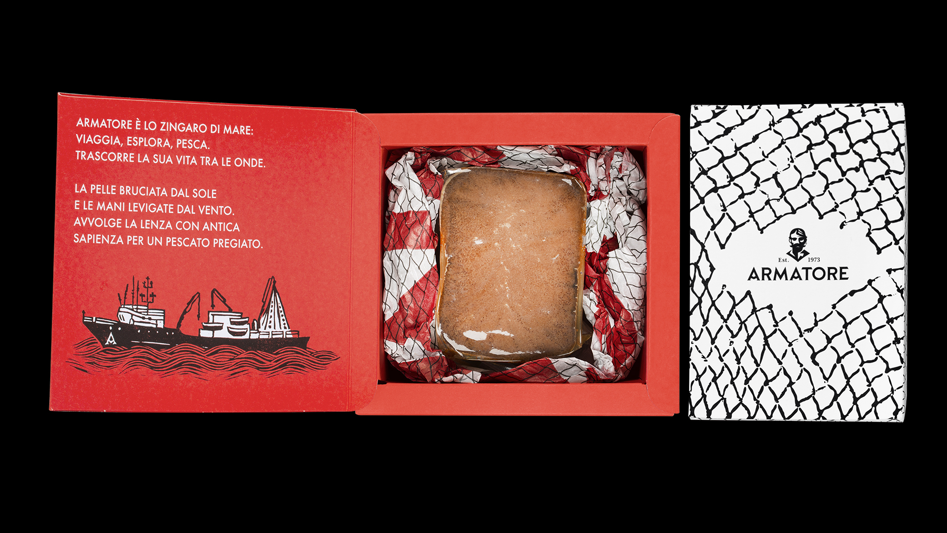
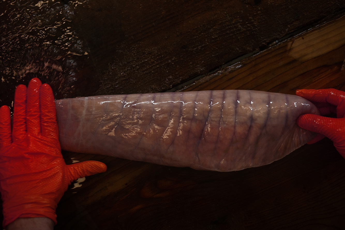
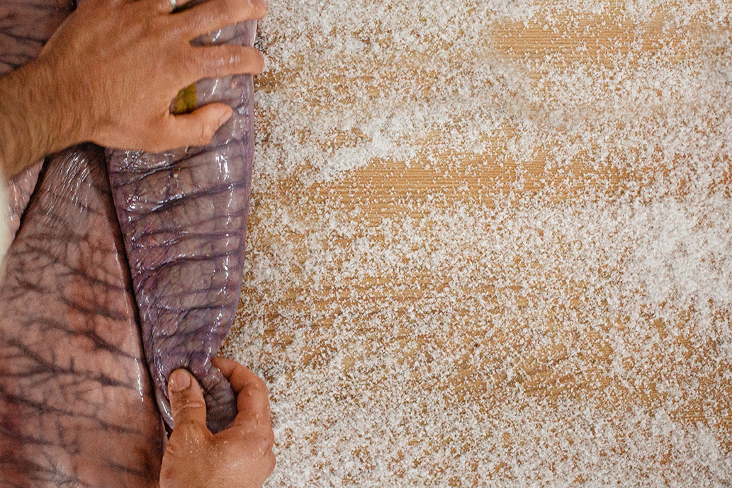
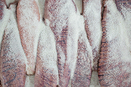
For the Bluefin Tuna Roe, we realised a packaging inspired by the matchboxes, imagining it as a drawer of memories when the matchsticks finish. The general finishing is spartan, rough, and the paper is soft because we wanted it to be ruined by the touch, to evoke the the wearing power of the sea salt and the craftsmanship of the product.
CREDIT
- Agency/Creative: Lettera7
- Article Title: Armatore Bluefin Tuna Roe Packaging Design by Lettera7
- Organisation/Entity: Agency, Published Commercial Design
- Project Type: Packaging
- Agency/Creative Country: Italy
- Market Region: Europe
- Project Deliverables: Branding, Graphic Design, Illustration, Packaging Design, Product Naming, Research, Retail Brand Design, Tone of Voice
- Format: Box
- Substrate: Pulp Carton, Pulp Paper
FEEDBACK
Relevance: Solution/idea in relation to brand, product or service
Implementation: Attention, detailing and finishing of final solution
Presentation: Text, visualisation and quality of the presentation


