


Requirement
The objective of this project was to design a visually unified yet clearly differentiated can series for a special edition drink inspired by ARM Squid Game, a rapidly growing Armenian reality show that has gained massive public attention and cultural relevance in a very short time. The project already possessed a strong and recognizable visual identity rooted in symbolism, tension, and competition, which needed to be carefully translated into a commercial product format.
The main challenge was to adapt the intense and highly symbolic visual language of the show into a shelf-ready beverage design that would work not only as a reference to the original project, but also as a standalone consumer product. The cans had to immediately communicate their connection to the ARM Squid Game universe while remaining readable, attractive, and competitive within a crowded retail environment.
Another key requirement was achieving clear flavor differentiation without breaking the overall system. Each flavor needed its own visual personality and instant recognizability, yet all cans had to feel like part of one coherent collectible series. Cultural relevance, strong shelf impact, and brand clarity were essential, as the target audience was already familiar with the project and expected a design that matched its intensity and boldness.
Solution
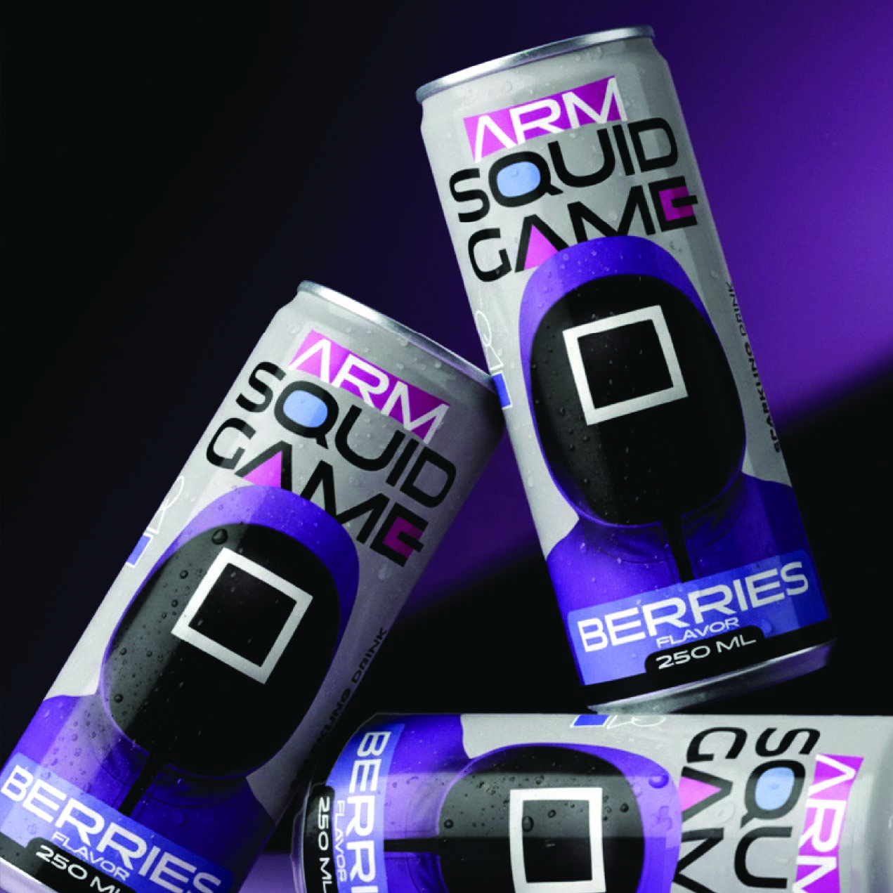
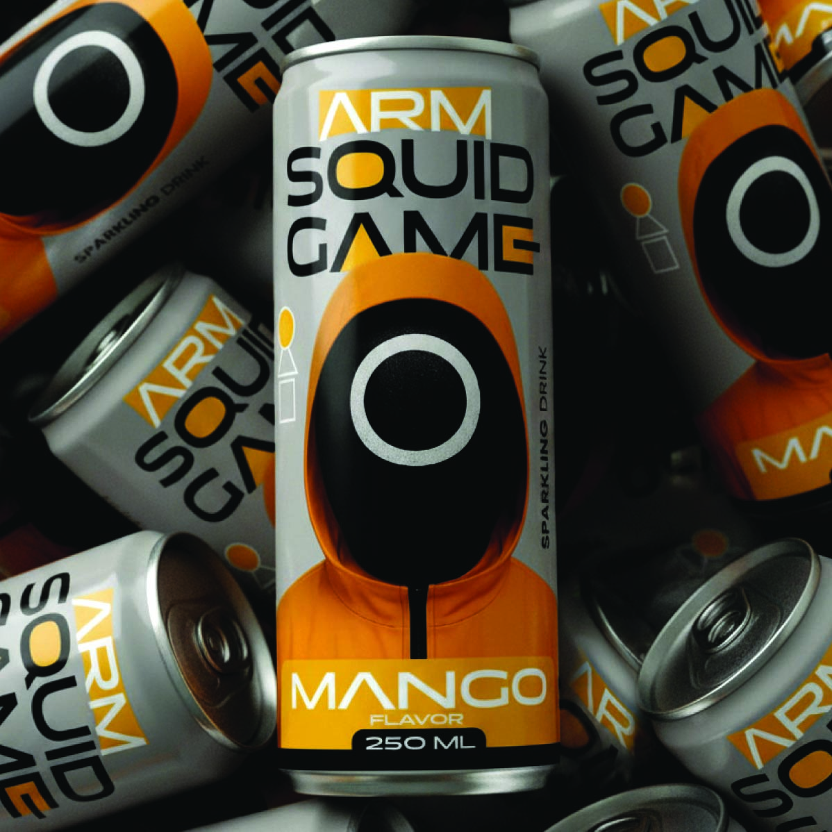
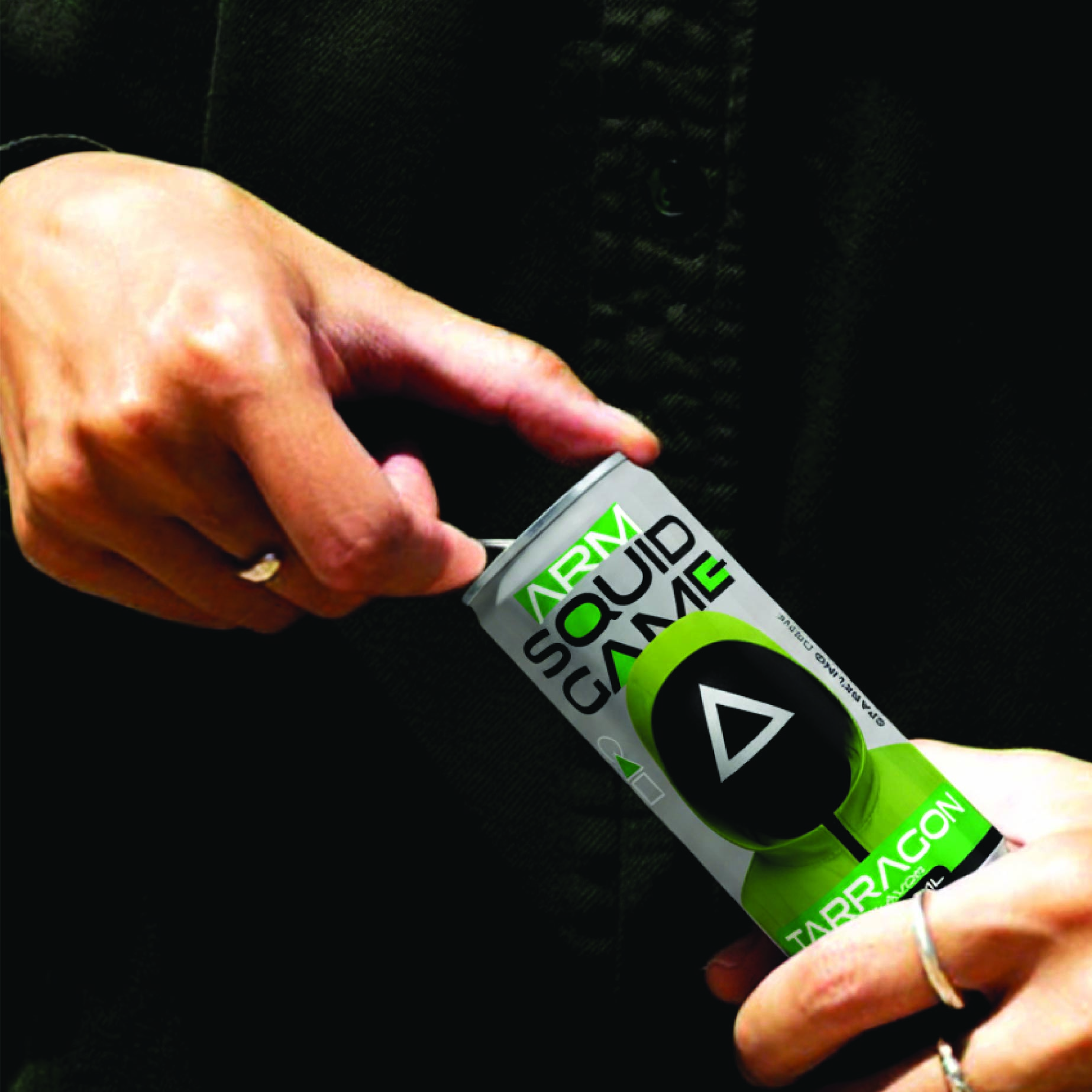
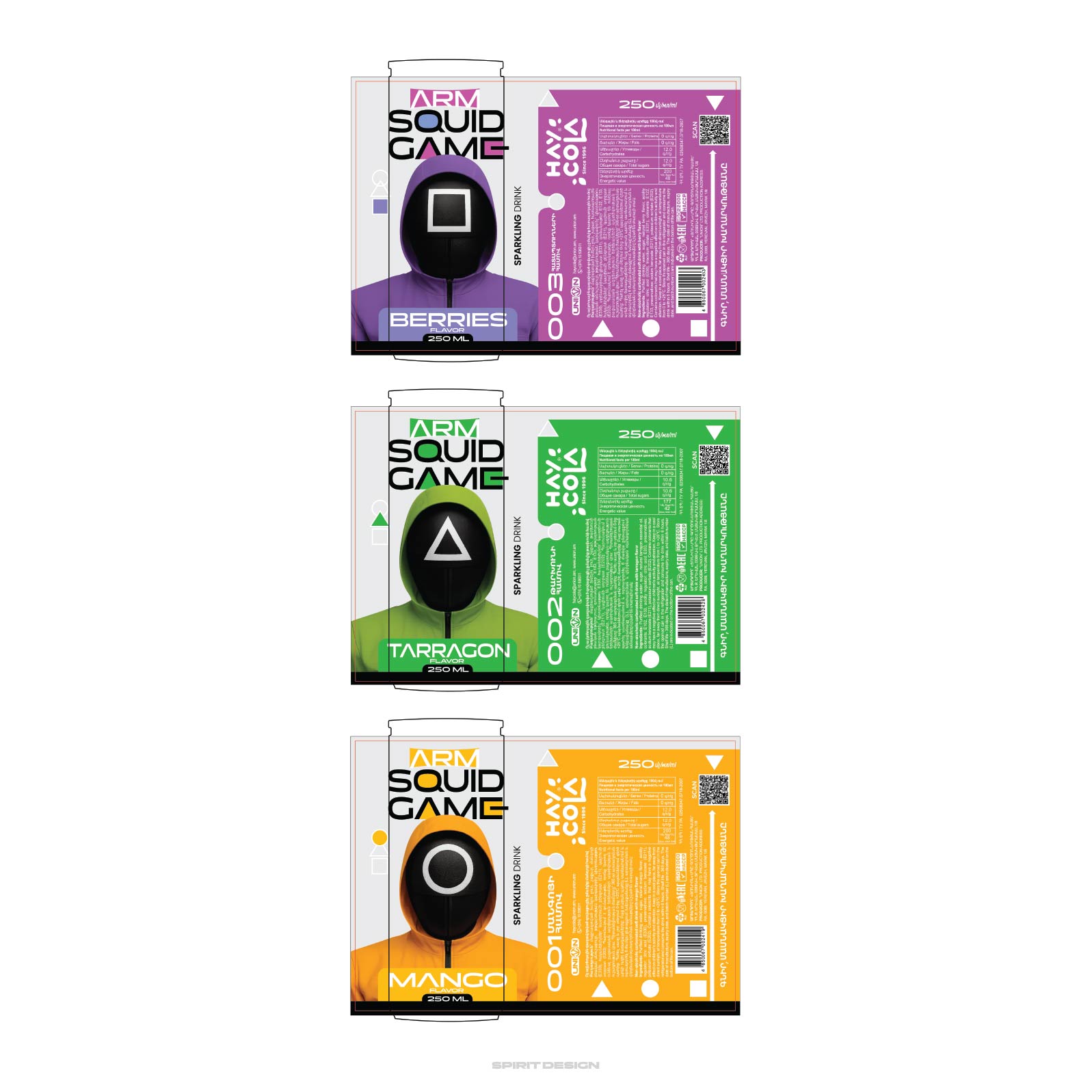
To address these challenges, I developed a minimal yet high-impact visual system based on the most iconic elements of the ARM Squid Game universe. The geometric role symbols Circle, Triangle, and Square — were reinterpreted and elevated into core branding elements, transforming them from narrative symbols into powerful visual anchors for the product line.
Each can was assigned a distinct color identity corresponding to its flavor, allowing for immediate differentiation while preserving visual harmony across the series. The color choices were carefully balanced to ensure strong contrast, high shelf visibility, and digital adaptability for online promotion and social media use.
Consistency was maintained through a unified typographic system, grid structure, and composition logic applied across all variants. This ensured that despite the different colors and flavor cues, the cans functioned as a single, cohesive collection. The minimal design approach amplified the impact of the symbols, making the products feel bold, modern, and collectible rather than overdesigned.
The final result is a striking trio of cans that successfully bridges entertainment culture and product branding. The design directly connects to the ARM Squid Game universe while enhancing the drink’s presence on retail shelves and digital platforms. It positions the product not just as a beverage, but as a visual extension of a popular cultural phenomenon, increasing memorability, engagement, and brand value.
CREDIT
- Agency/Creative: Alex Simonyan
- Article Title: ARM Squid Game: Limited Edition Sparkling Drinks by Alex Simonyan
- Organisation/Entity: Freelance
- Project Type: Packaging
- Project Status: Published
- Agency/Creative Country: Armenia
- Agency/Creative City: Alex Simonyan
- Market Region: Asia
- Project Deliverables: Packaging Design
- Format: Can
- Industry: Manufacturing
- Keywords: ARM Squid Game
-
Credits:
Graphic Designer: Alex Simonyan


