


Arithmetic was approached by a local Dog Bakery to update their pet treat packaging. We were tasked with the challenge to rename, reposition and overhaul the design aesthetic of a collection of dog cookies that could simultaneously straddle both the “gift” the “grocery” market categories.Designed by Arithmetic Creative
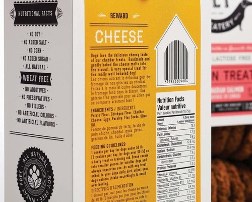
Our first step was to provide research and a strategy approach by refining the product offering to highlight healthy nutritional choices. Specifically to create a completely gluten free line, and offer dairy free and vegan options for dogs with sensitivities.
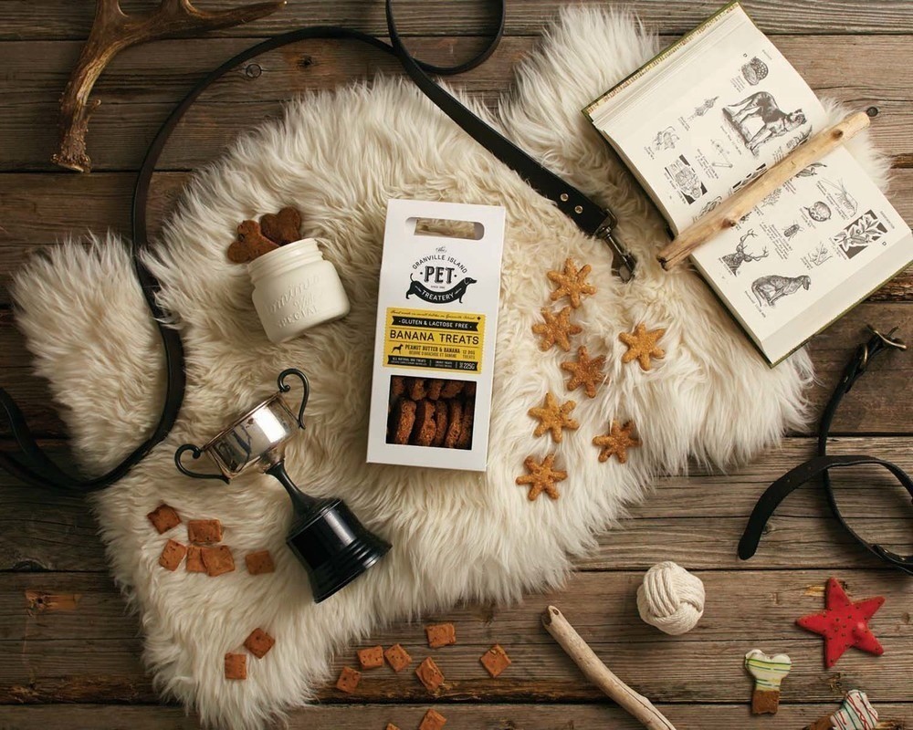
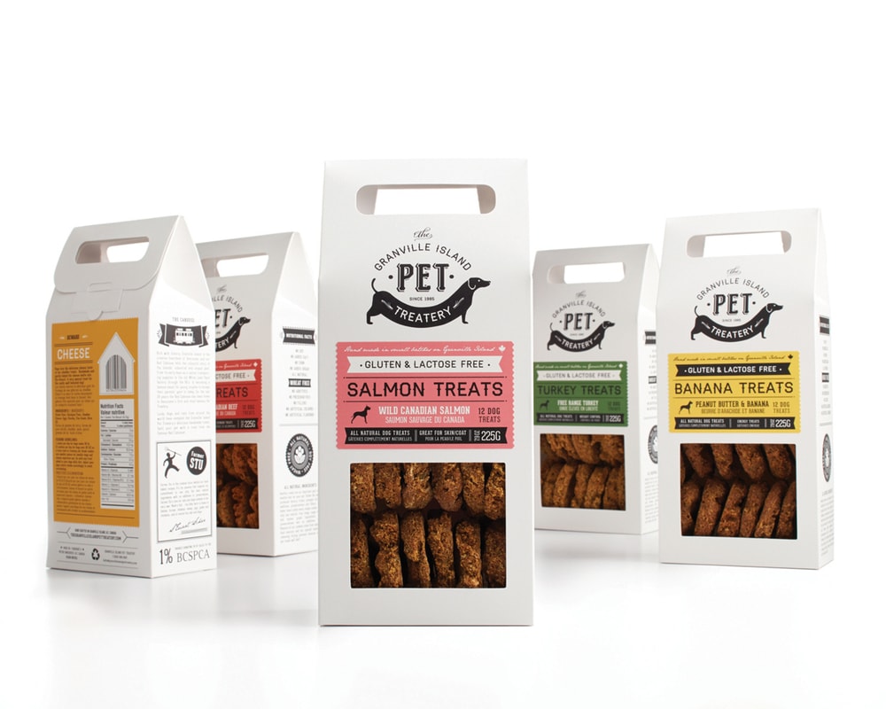
With the gifting market in mind we designed a cardboard package that would allow the consumer to feel like they could give a gift from their travels to their pet, or friends with pets as a hostess gift. Integrating a handle and creating a bakery like carton was the perfect solution to convey the feeling of home baked and gift all in one. A window showcases the handmade and healthy quality of the cookies while a black and white printed carton portrays the vintage history of the brand and it’s Granville Island Heritage (the 2nd most visited place in Canada) and allows for a system of interchangeable, brightly coloured labels for each product. This packaging design is unique in that it breaks conventional models in Pet shops, allowing it to stand out and clearly communicate a healthy, natural and fun option.
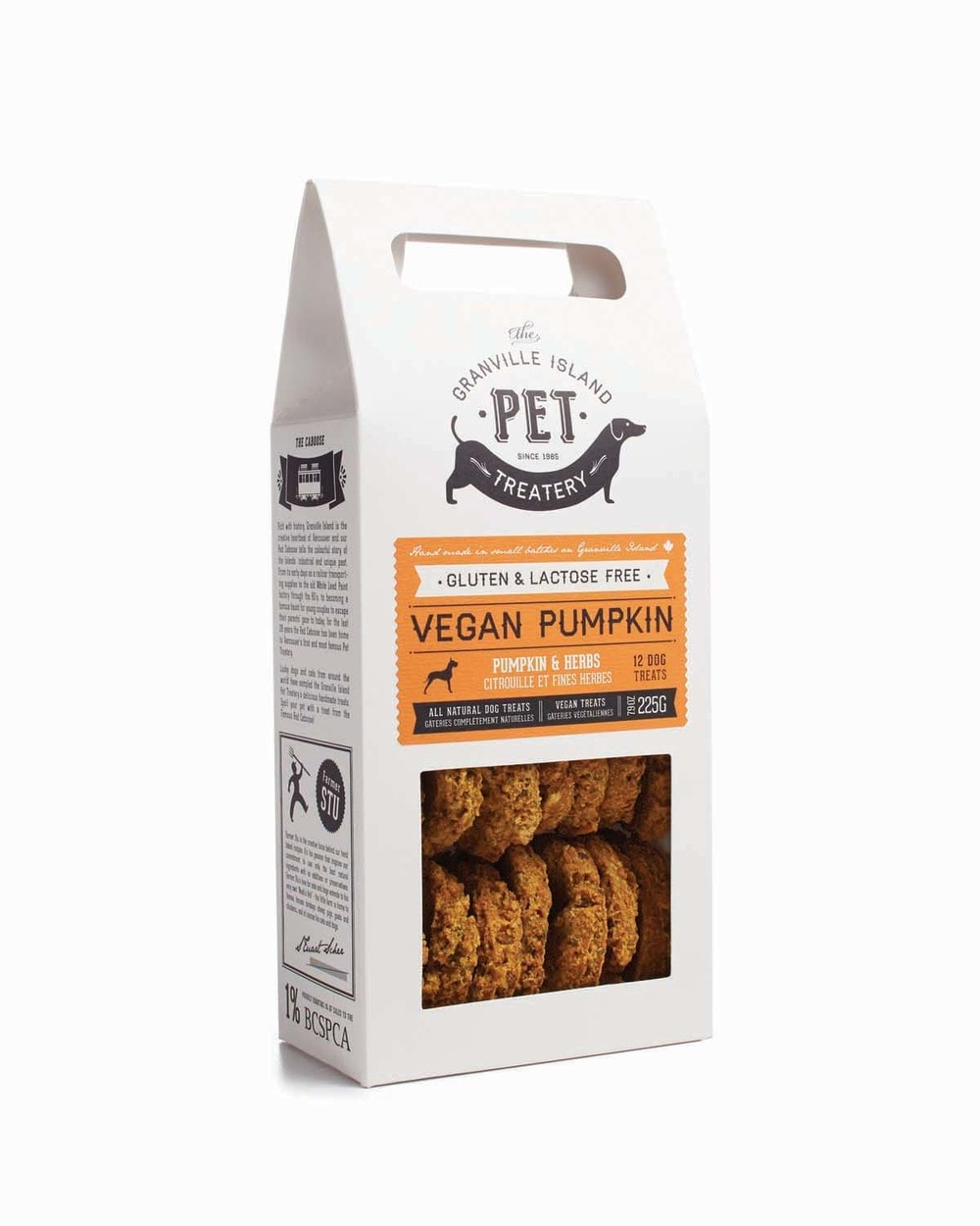
A large majority of products in the pet category scream with bright colors and an abusive approach to typography. The combination of the two created the perfect opportunity for us to use a simple, understated palette for the box design and use a strong palette of single placement colours to indicate flavour. With type calling reference to a nostalgic time of when the pet bakery first came to be.
Uncoated, textured paper stocks were chosen to emphasis the beautiful imperfections in the handmade quality of the cookies. The light weight material means that shipping via the company’s website is low in cost, allowing them to reach a wide spread of customers.
Inducing some wit, the logo features a humourous rendering of a weiner dog (Dachshund), inspired by the owners own pet.

The end result is a new approach to souvenir purchasing while not compromising the ability to sell in pet and grocery channels. It’s a fun gift giving experience for dog lovers that care about the health and happiness of their furry ones.Introduction to Contributor:arithmetic is a creative strategy and design company located in beautiful Vancouver, Canada. We’re known for our novel, meaningful ideas that build smart and cool brands – rich with cultural experiences. Ideas that help your customers live a cultured life.
Our ideas create tangible and attractive brand experiences that will connect you and your customers through compelling experiences that reinforce the values of your brand and deliver an experience that transforms a passive, observing consumer into and active participant.
Our sensitivity to trend shifts in fashion, retail, cultural values, colour, interior home style and consumer behavior makes us expert in fusing cross culture style and identifying when key culture shifts are applicable to your market so you can be a style leader in your industry.
CREDIT
- Agency/Creative: Arithmetic Creative
- Article Title: Arithmetic – Pet Treatery
- Project Type: Packaging


