


Arithmetic of Magnitsky is the first Russian textbook on arithmetic, which turned 320 years old in 2023.
An exhibition was dedicated to this event and an identity was developed. The essence of the exhibition is to show the connection and continuity of two times: now and 320 years ago.
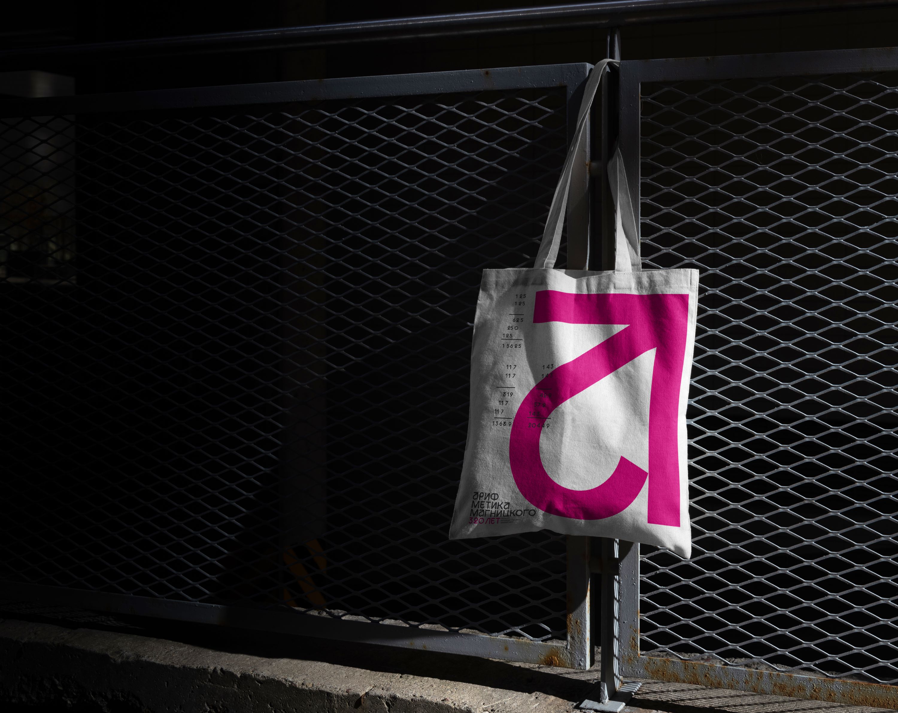
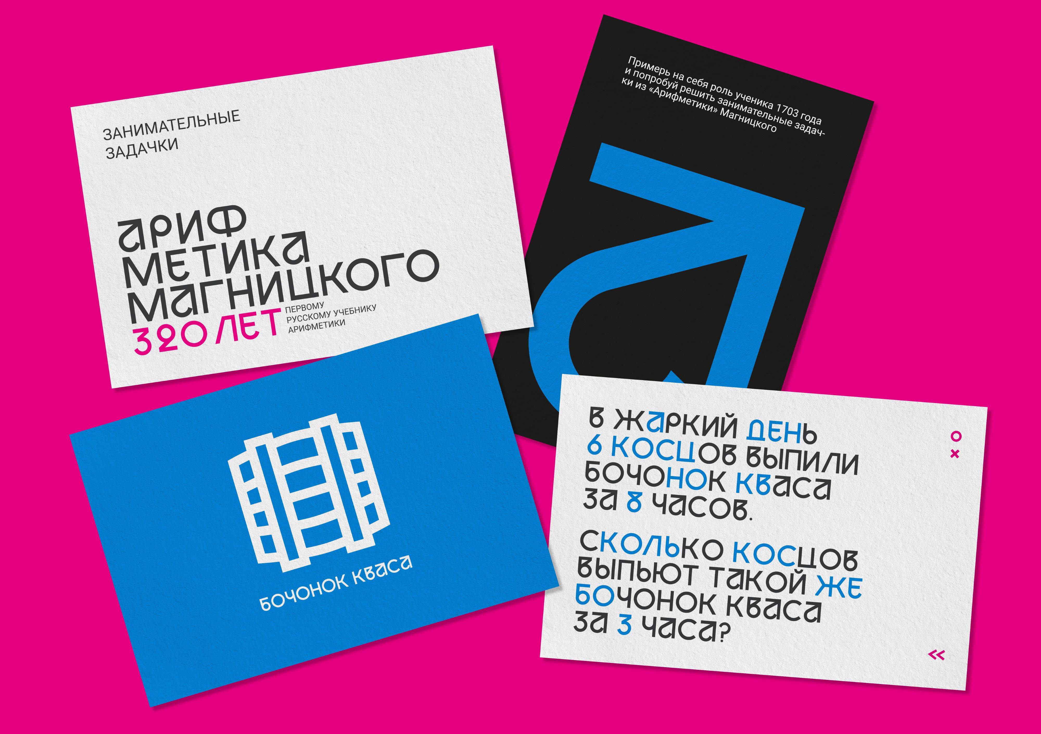
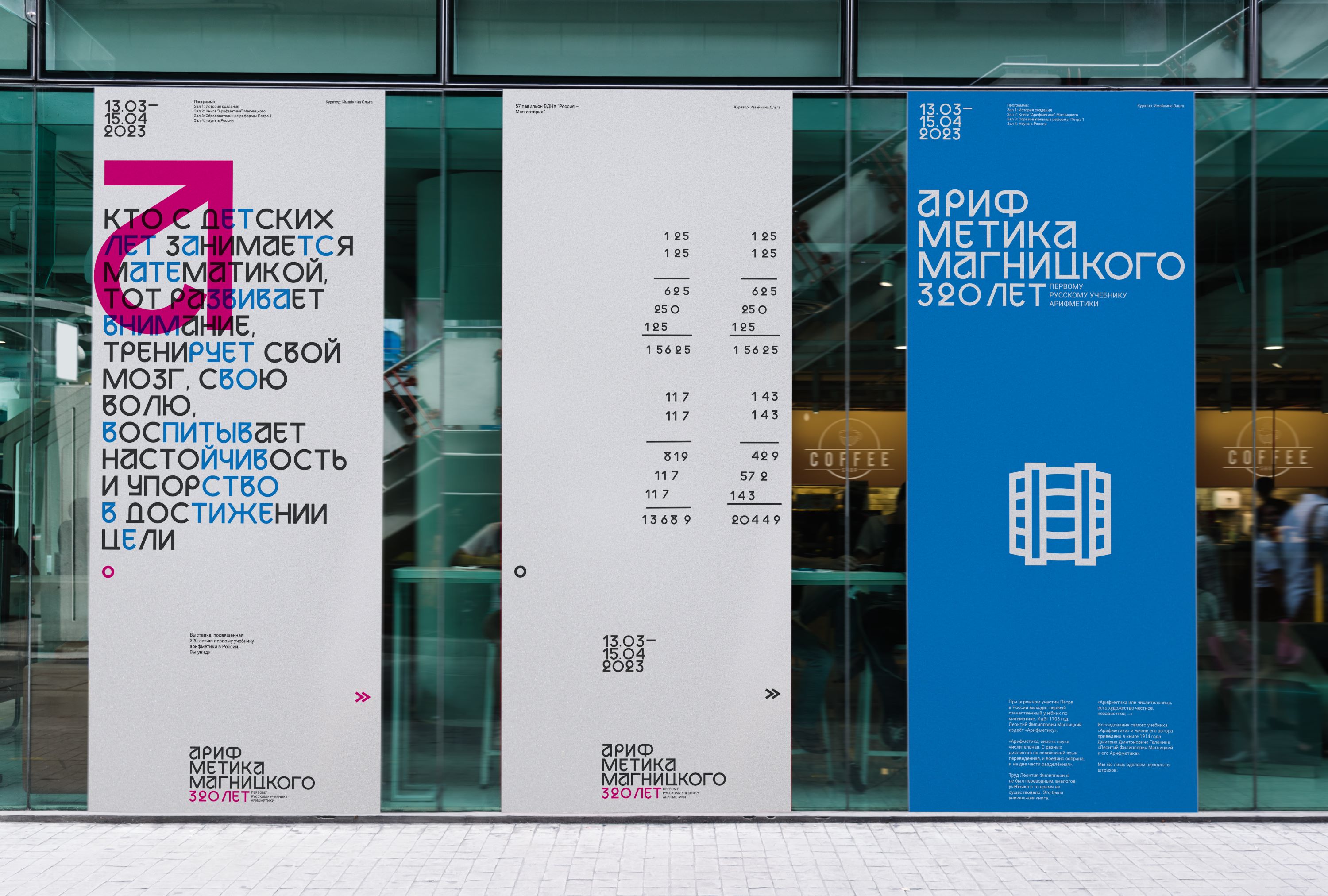
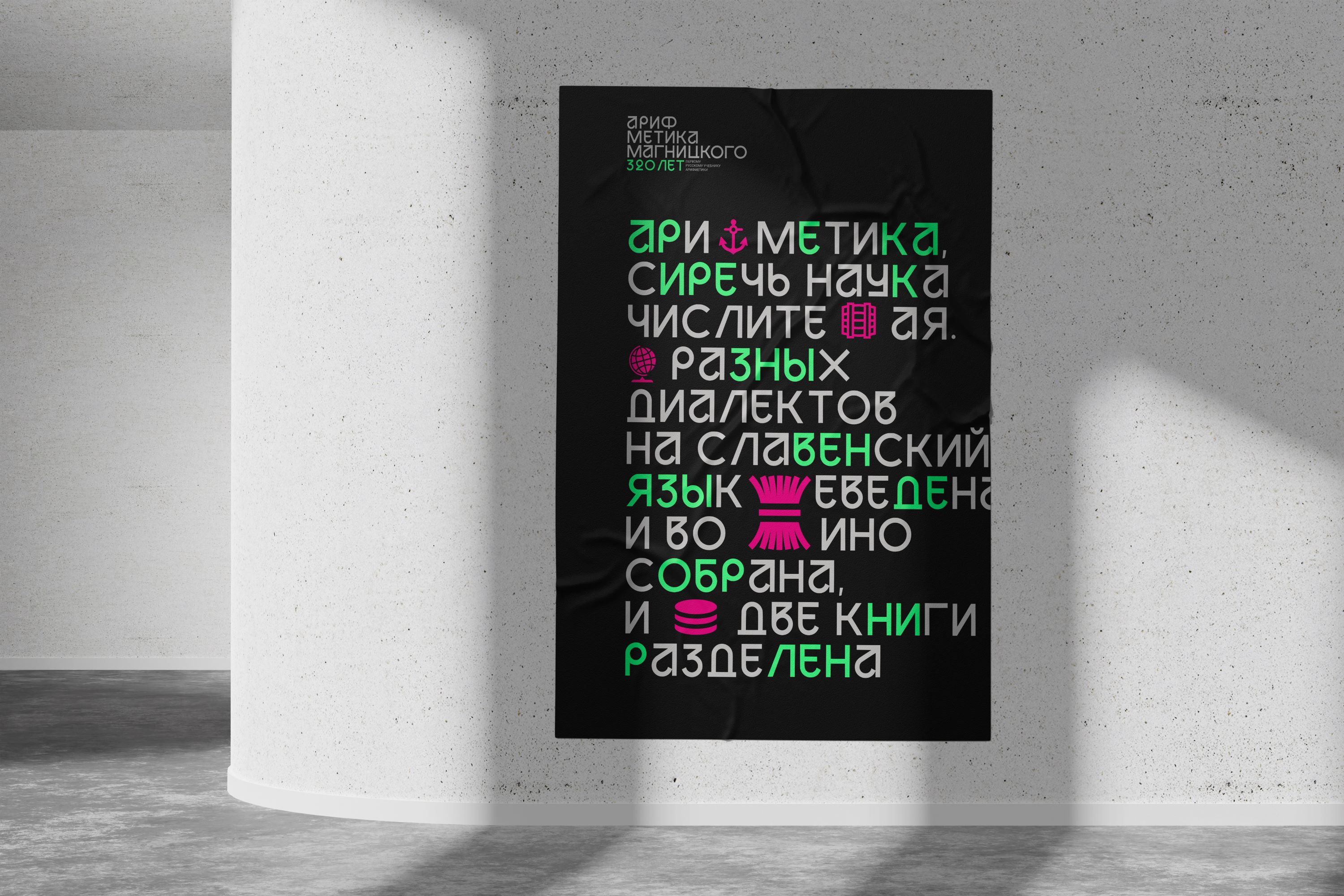
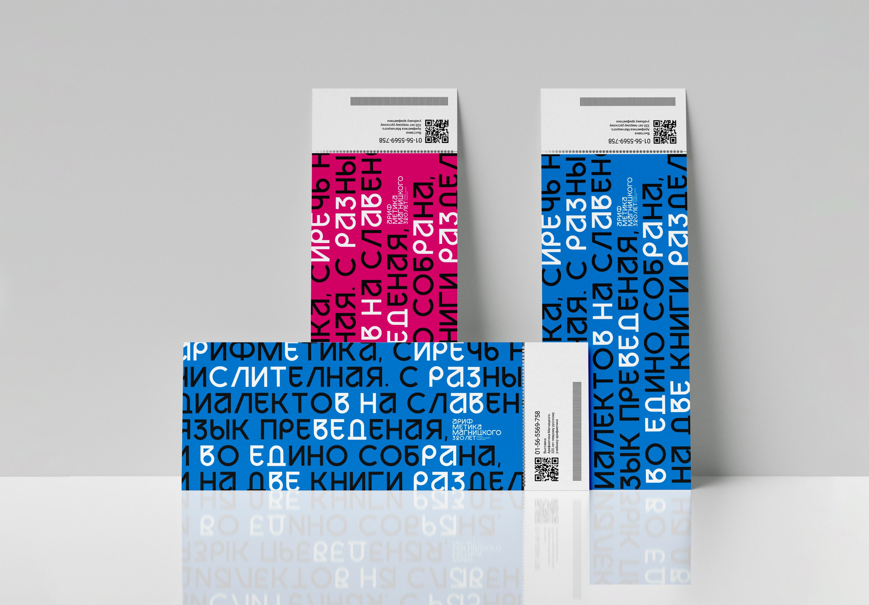
Typeface: The identity is based on the Aksioma typeface, created specifically for this project. The main shaping letter A consists of inverted numbers 1 and 2, as the exhibition is dedicated to mathematics and science in general. The rest of the signs are built from geometric shapes. Due to the unusual shape of the letters A, B, V and E (in Russian transcription), a feeling of the era of 1703 is created, while the font remains modern. The font is the main element of the whole style, it is used to type the main text, and also the text logo is assembled
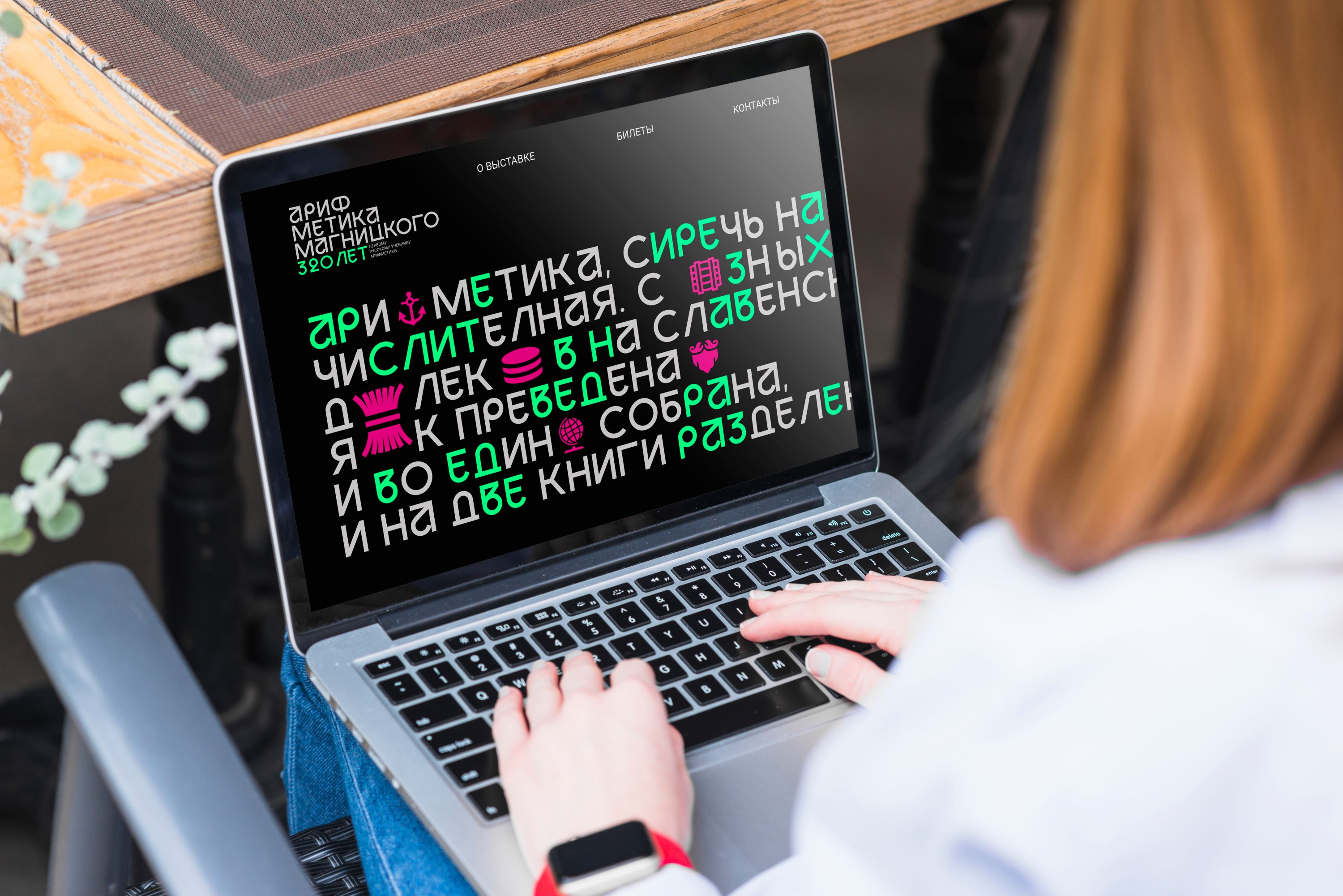
Graphic: In order to tell about Magnitsky’s book and the era in which it was written, graphics were added in the form of icons associated with tasks from the textbook. In addition to icons, solutions to multiplication examples act as graphics.
Colours: The main coloor is blue. It gives severity and seriousness to the event, but added accent pink for balance. In some places, inverse colors appear: black, light green. They symbolize the fact that thanks to mathematics, including, we now have our modern tech world.
Flexible identity: As I said above, the identity is built on the font, but icons are also embedded in it, which overlap part of the text. By this we show the relationship between the two times. The changing color in the words also symbolizes the interweaving of two eras.


CREDIT
- Agency/Creative: Chugaeva Olya
- Article Title: Arithmetic of Magnitsky: Exhibition Identity
- Organisation/Entity: Student
- Project Type: Identity
- Project Status: Published
- Agency/Creative Country: Russia
- Agency/Creative City: Moscow
- Market Region: Europe
- Project Deliverables: 2D Design
- Industry: Education
- Keywords: identity, custom font, typography
-
Credits:
Tutor: Pavel Borisovsky


