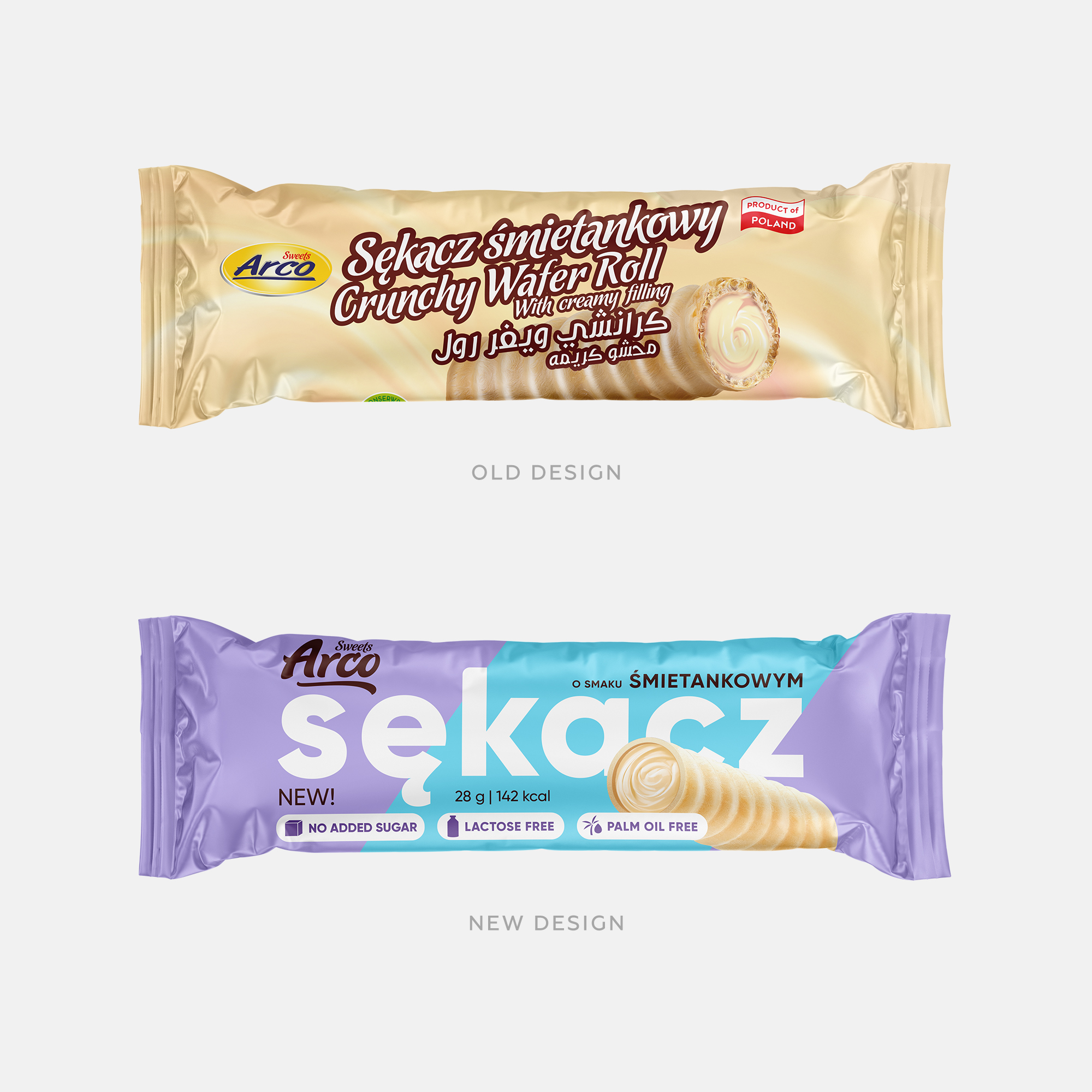
Task: to develop packaging design for reimagined natural products from Arco Sweets. Arco Sweets decided to rethink some popular products and make them more natural: without palm oil, without sugar, without lactose and gluten. The company also develops product lines and offers consumers new tastes: bars with cannabis seeds and flavors of chocolate and chili.
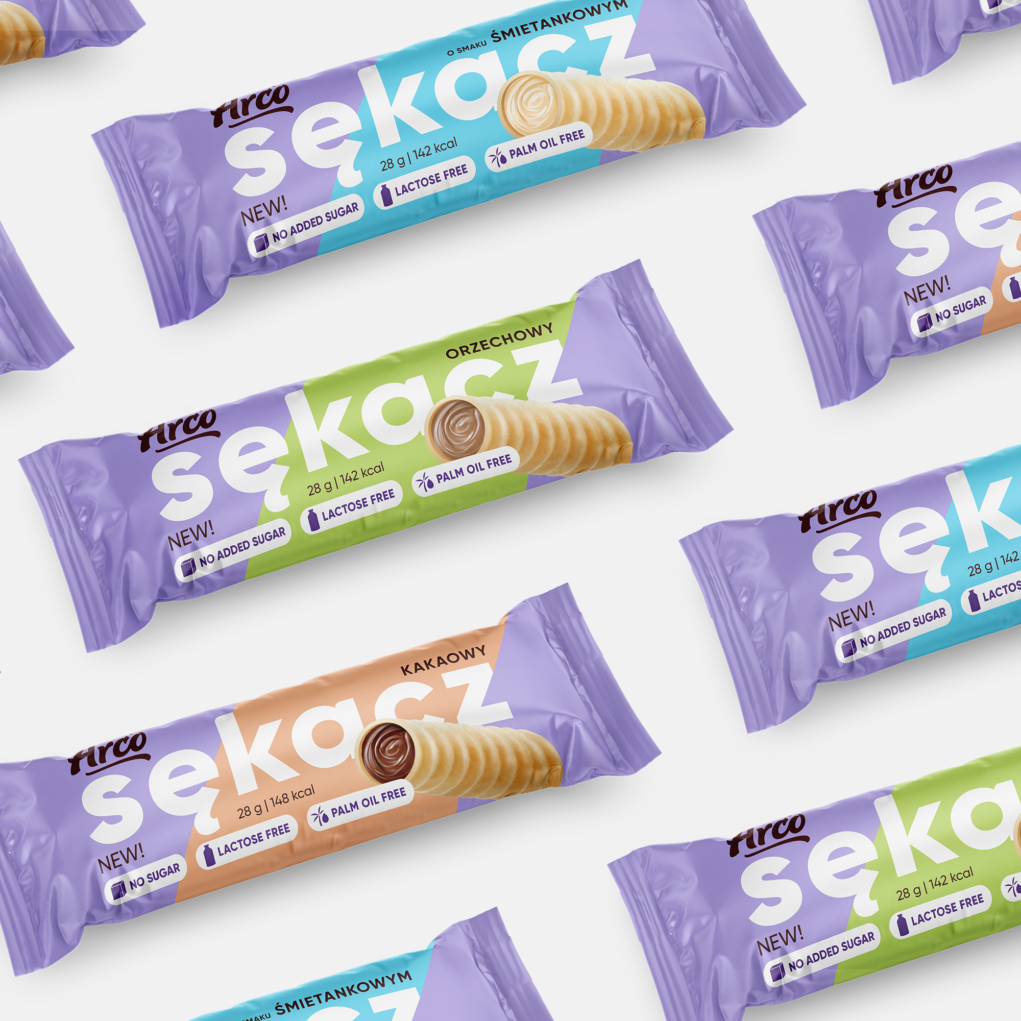
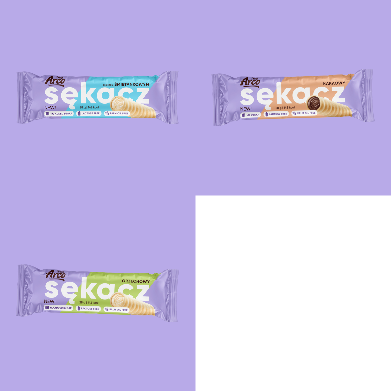
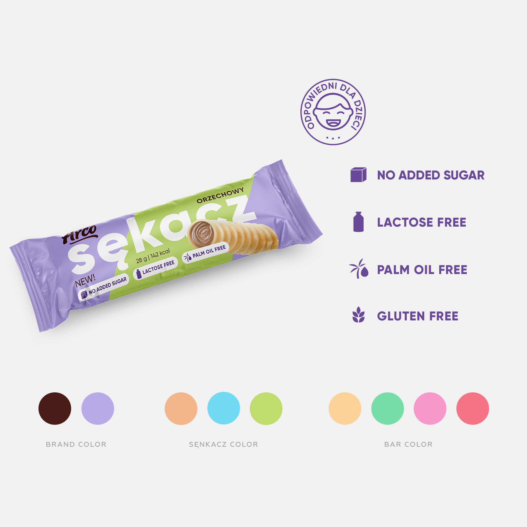
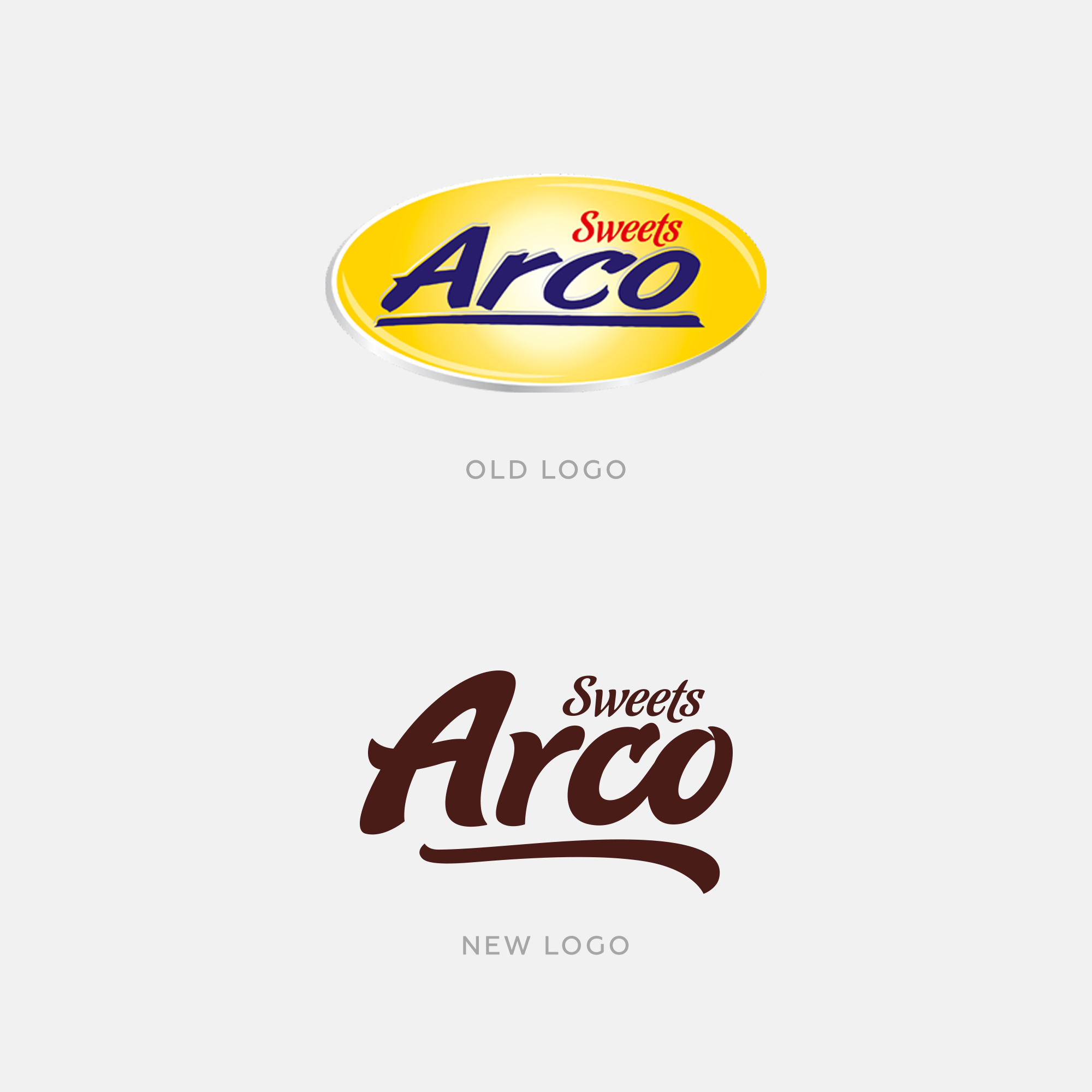
Solution: PG team updated the brand logo, now it’s more modern, friendly and tasty. Natural lavender and chocolate colors reflect our open-mindness to new products and emphasize the transition to more natural compounds. At the same time, the product should look attractive and bright enough so that the consumer does not give preference to a competitor with the usual ingredients. Each SKU is differentiated by a color plate and a juicy image, which recalls that sweets remain delicious, even with the right composition.
The new packaging design not only to differ the brand on the shelf, but also broadcasts the main values of the brand: preserving the taste with the usefulness of the ingredients, openness to change, caring for its consumers, even the smallest.

CREDIT
- Agency/Creative: PG Brand Reforming
- Article Title: Arco Sweets Brand Sekacz New Packaging Redesign
- Organisation/Entity: Agency, Published Commercial Design
- Project Type: Packaging
- Agency/Creative Country: Poland
- Market Region: Europe
- Project Deliverables: Brand Redesign, Brand Rejuvenation, Brand World, Branding, Graphic Design, Packaging Design
- Format: Flow-Pack
- Substrate: Plastic


