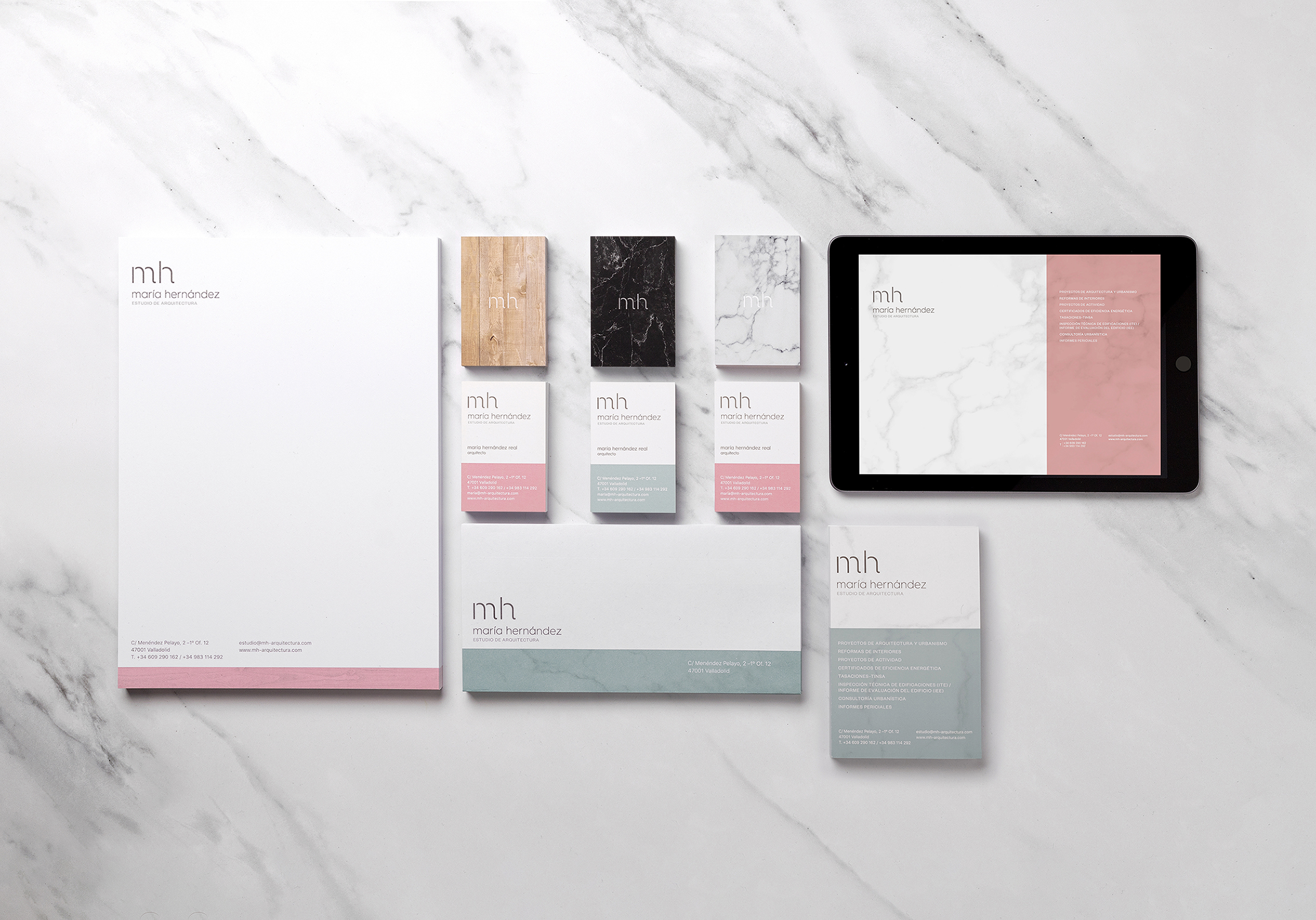
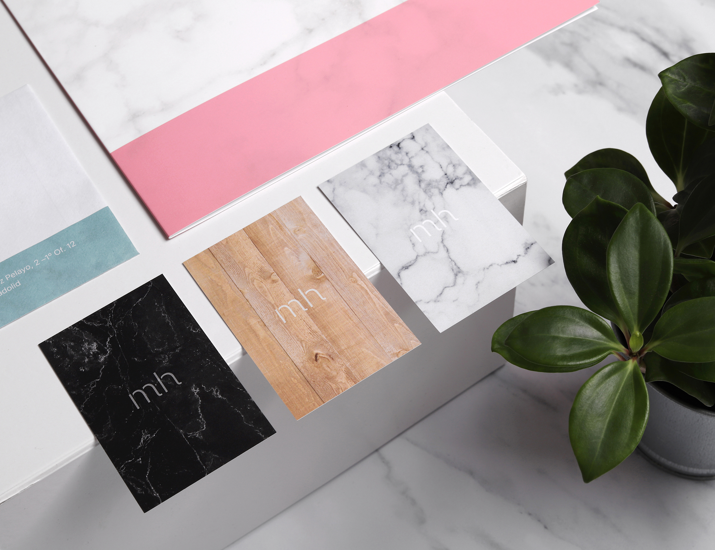
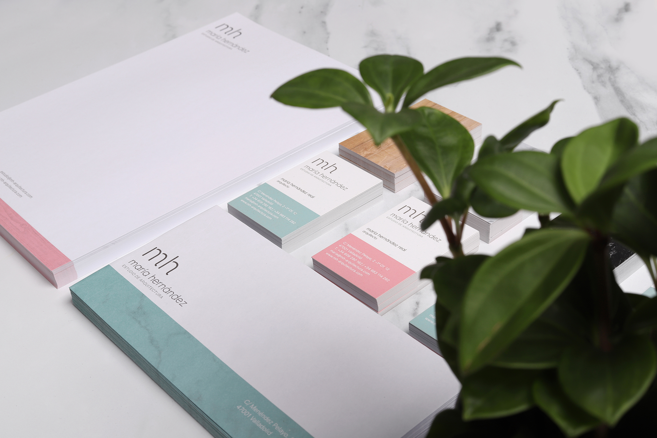
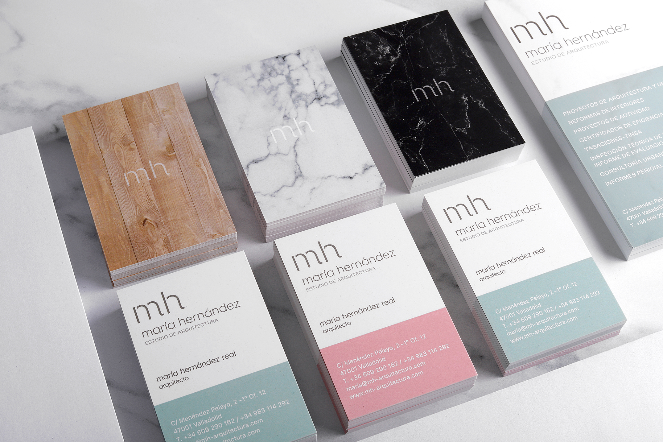
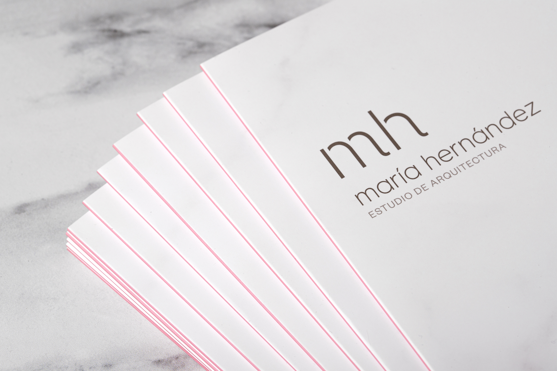
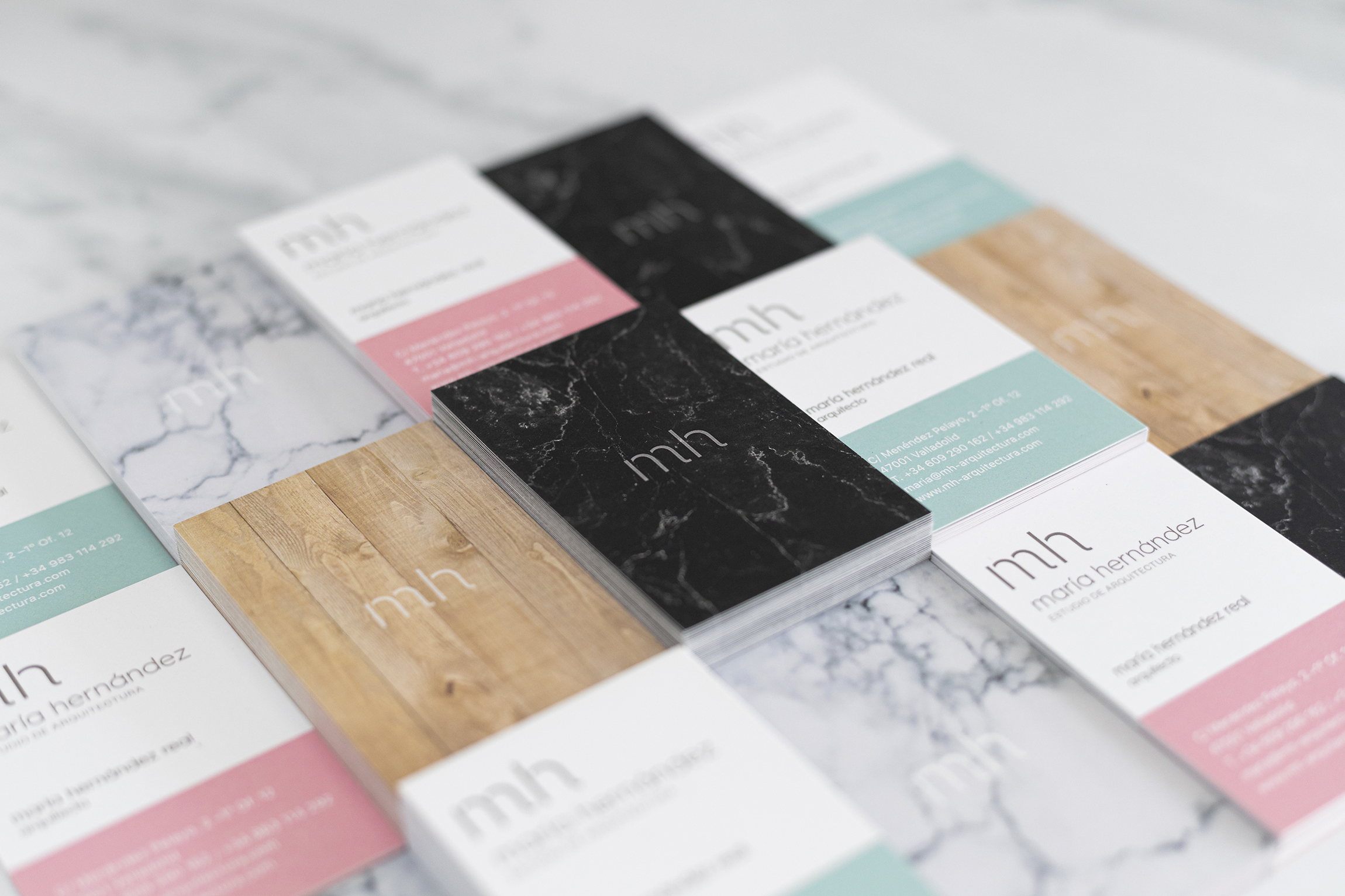
A few months ago, María Hernández contacted us to design a new visual identity for their architecture studio. We developed all the stationery and applications taking as a reference photographs of the textures and colors of some of the materials which are used in their daily projects: marble, concrete, wood… Also, we designed a constructed symbol “mh”, in order to endow the identity of a sign easily identifiable. All the photographs are also taken at our studio
CREDIT
- Agency/Creative: Miguel Diez. Estudio de diseño
- Article Title: Architecture Studio Visual Identity by Miguel Diez Estudio de Diseño
- Organisation/Entity: Agency, Published Commercial Design
- Project Type: Identity
- Agency/Creative Country: Spain
- Market Region: Europe
- Project Deliverables: Brand Identity, Brand World, Branding, Photography, Research
- Industry: Construction
- Keywords: Architecture, Brand design, Visual identity, Logotype, Branding, Architecture design
FEEDBACK
Relevance: Solution/idea in relation to brand, product or service
Implementation: Attention, detailing and finishing of final solution
Presentation: Text, visualisation and quality of the presentation


