


Since 2001, AFBC has created programs and funded initiatives to connect BC Communities with all things design. The foundation was formed by a group of BC architects who saw the need to better educate the general public on architecture and design, and to support the design community through the provision of grants, scholastic awards and events.
Our goal is to make architecture and design accessible to all stakeholders by promoting awareness through a variety of programs and annual events.
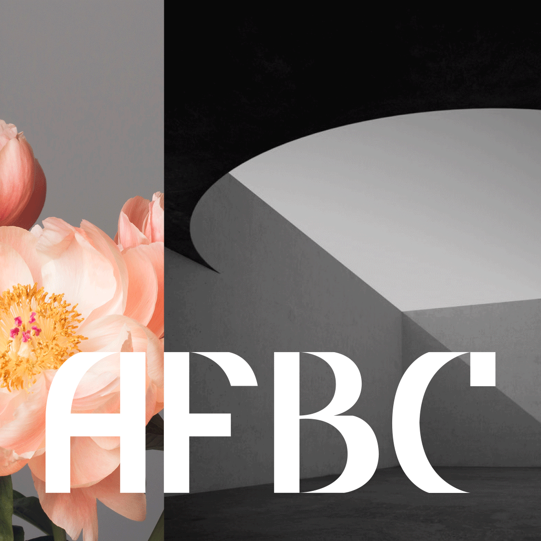
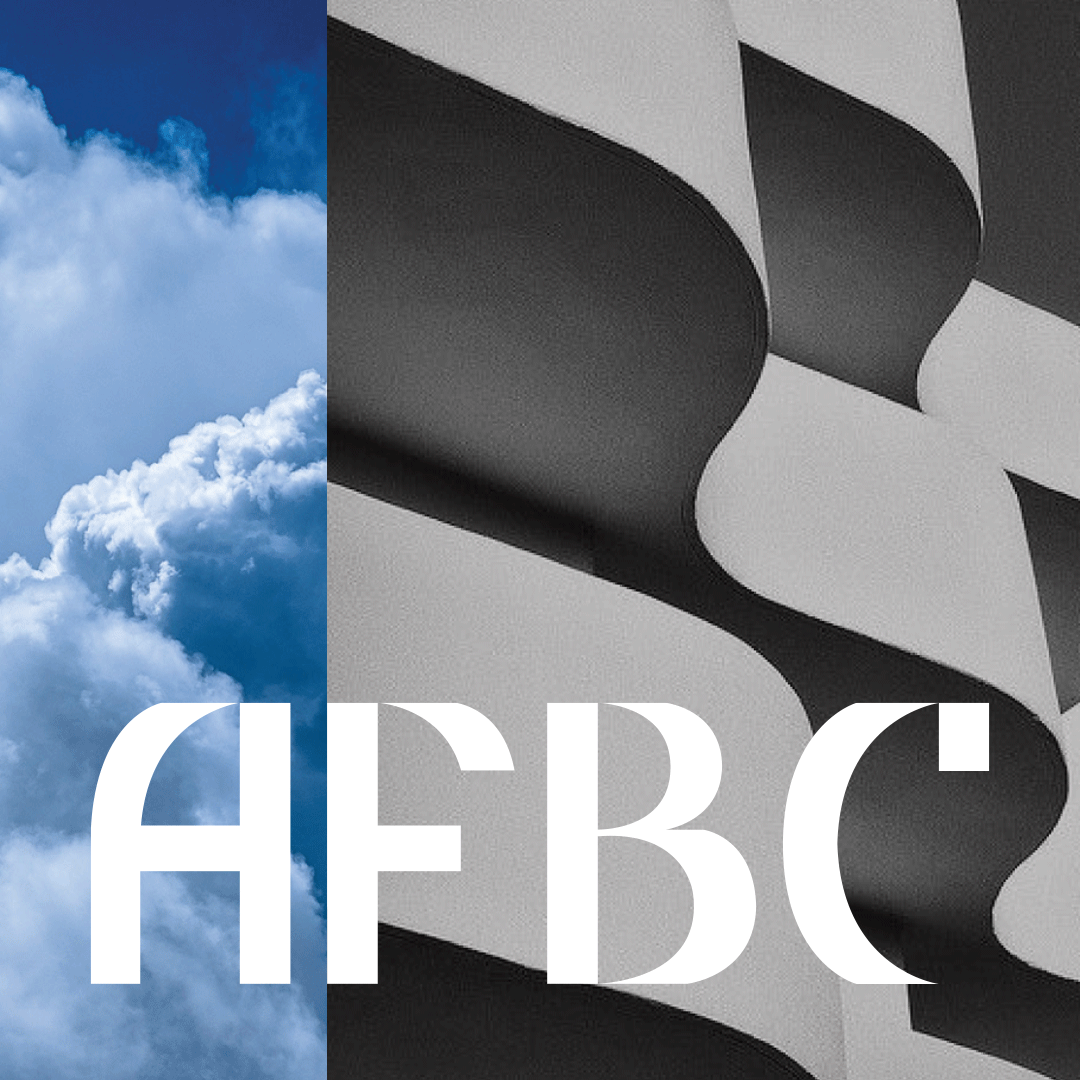
Architecture is one of the few disciplines that truly combines the rigour of art with science. How can these two seemingly separate practices be married into a single thought that immediately conveys the fluidity of the design practice and the engineering precision that goes into each and every project (and into the profession as a whole). This tension between art and science/engineering is the driving force of this brand identity and is used as the lens through which all visual decisions are made in order to create a striking and comprehensive system.
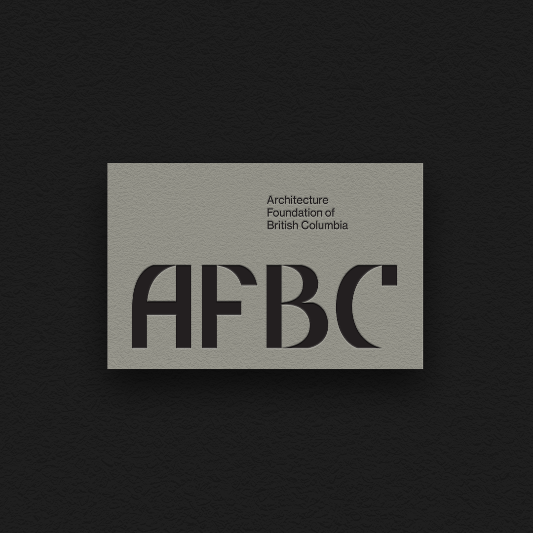
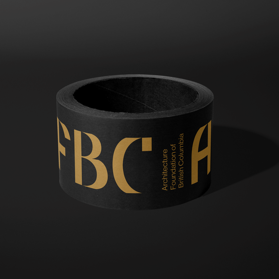
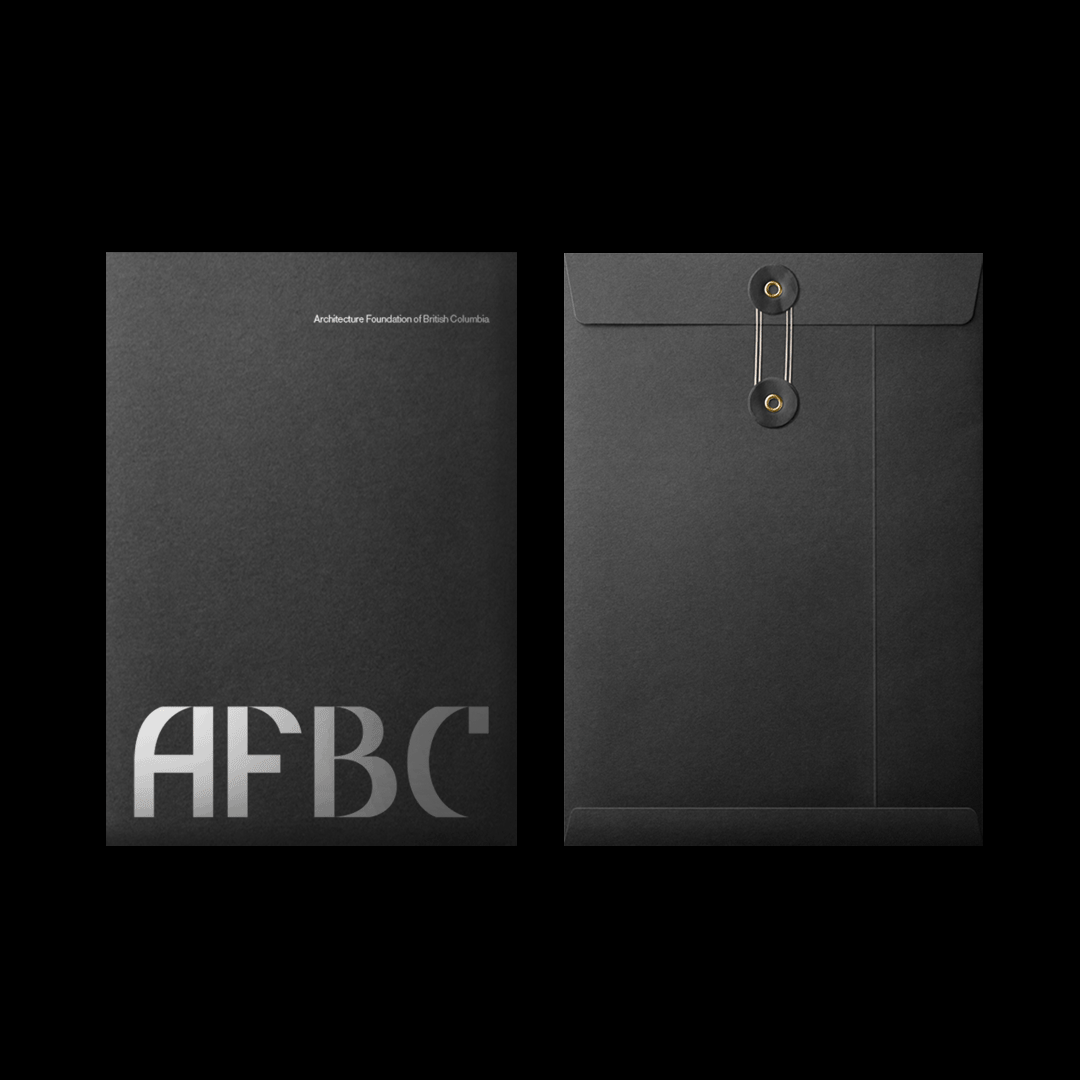
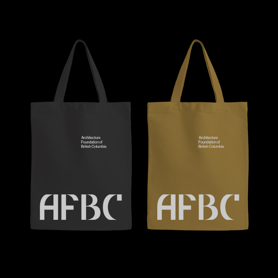
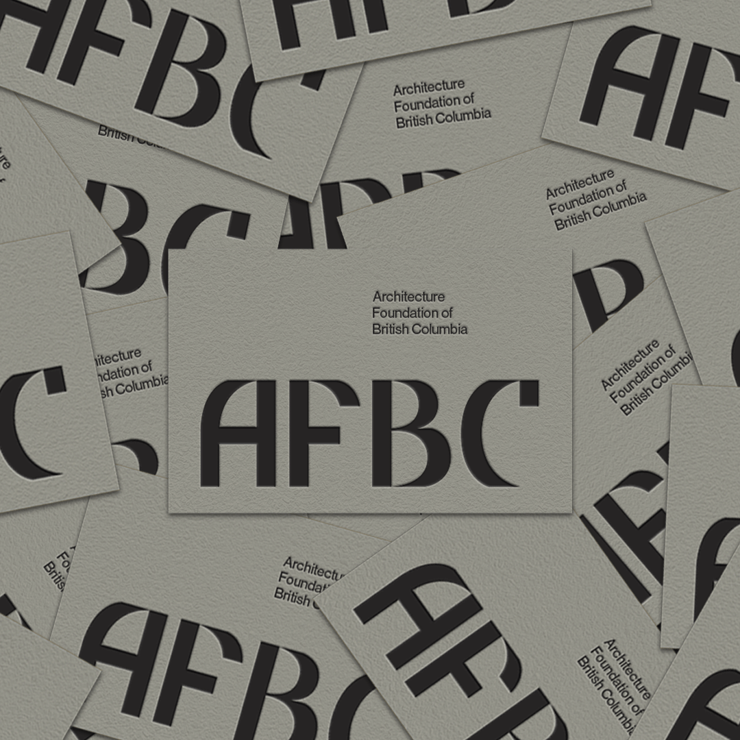
This idea of art and science inspired the construction of the mark itself. Using pairings of linear blocks along with curvilinear forms on each letter of AFBC we created a custom wordmark that conveyed the underlying strategic direction of the brand.
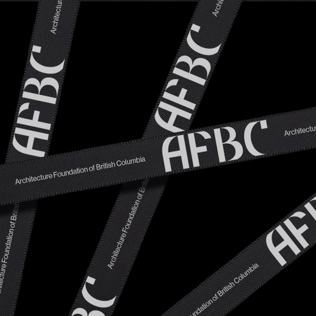
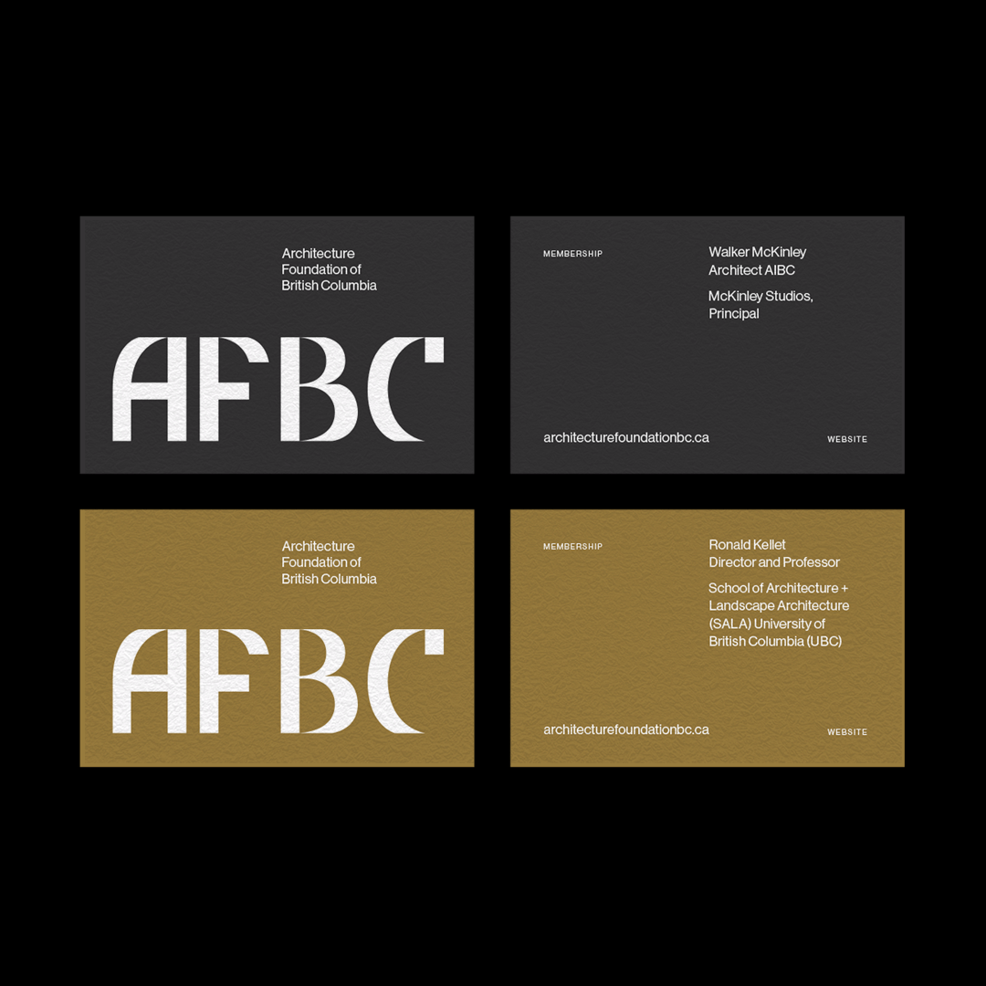
The notion of art and science was further explored in the colour palette. Black is paired with white. Concrete (grey) is paired with metallic (gold). This simple, paired down palette feels sophisticated which feels appropriate for a foundation advocating for the province’s incredible architecture force.
The image system was similarly inspired by the driving concept of art and science. Black and white photography of architecture was paired with full-colour inspiration photography to create an arresting juxtaposition of the two very different visual directions.
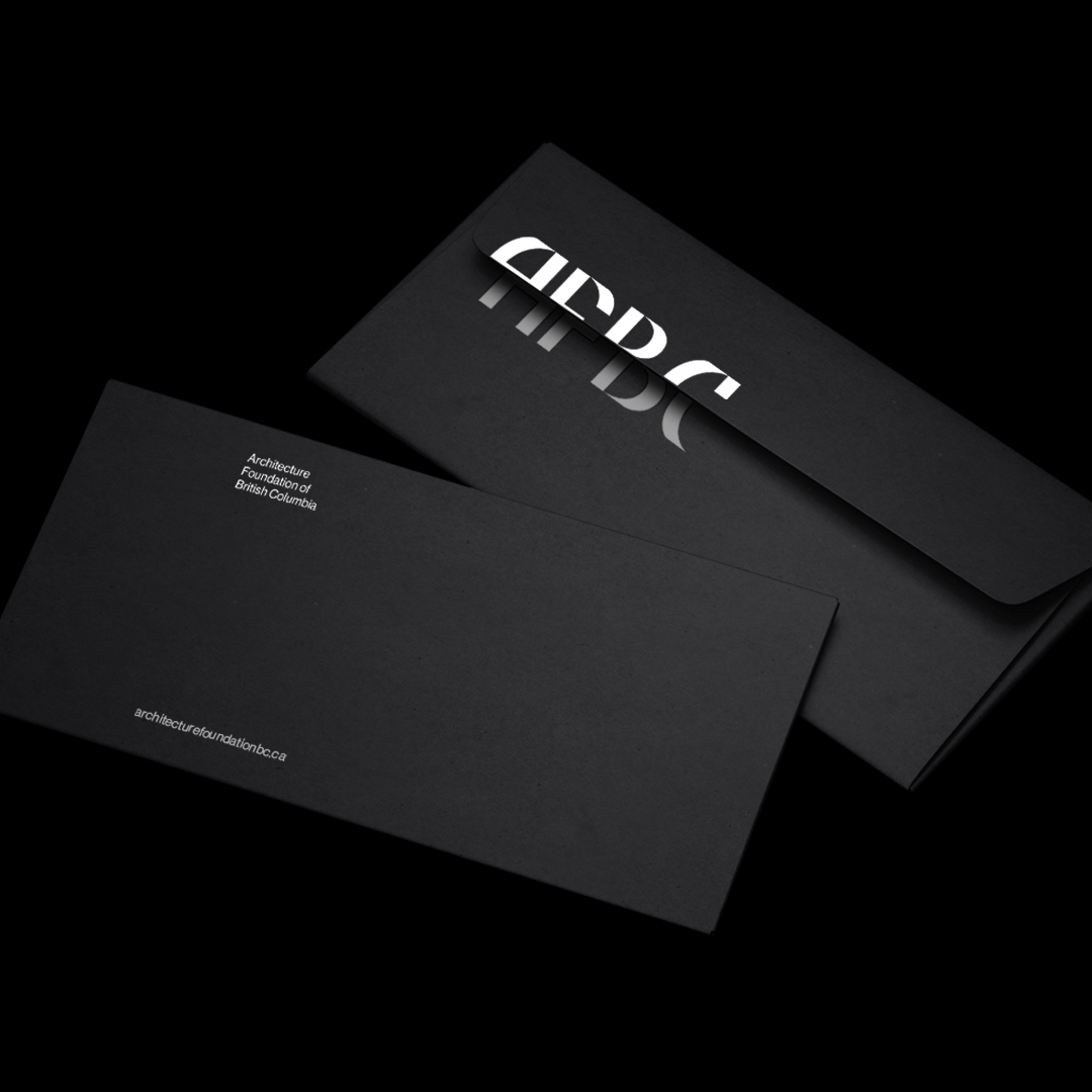
The logo itself was always (or at least wherever possible) positioned at the bottom of each application. This takes its inspiration from the word “Foundation” and, as such, acts as a foundation or base for each of the brand’s applications.
CREDIT
- Agency/Creative: Awake Studio, Matter Studio
- Article Title: Architecture Foundation of British Columbia Brand Updating for Better Audience Connection
- Organisation/Entity: Agency, Published Commercial Design
- Project Status: Published
- Agency/Creative Country: Canada
- Market Region: North America
- Project Deliverables: Brand Creation, Brand Digital Design, Brand Guidelines, Brand Identity, Brand Redesign, Brand Rejuvenation, Brand Strategy, Branding, Identity System, Rebranding, Tone of Voice
- Industry: Construction
- Keywords: Branding, architecture, typography, palette, brand identity, visual identity, British Columbia, photography


