Arcadia Science is a research and development company leveraging the biology of non-traditional organisms such as ticks, poisonous frogs, and algae. Their mission is to push the boundaries of open science and innovate at every step in the research, development, and commercialization process.
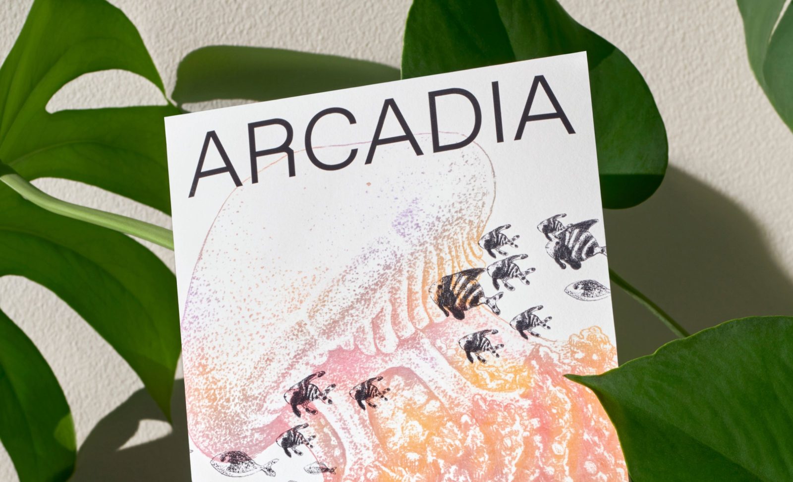
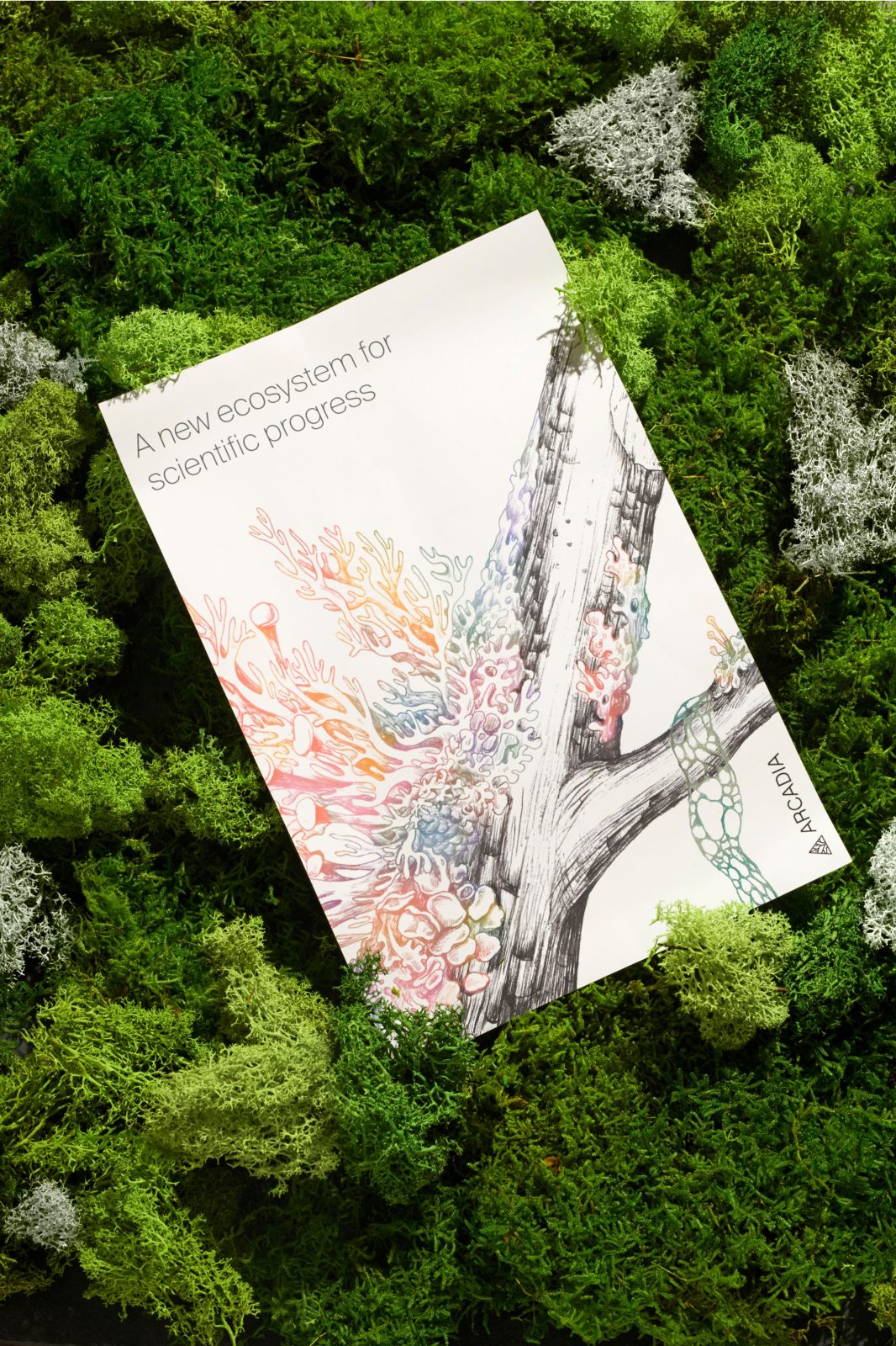
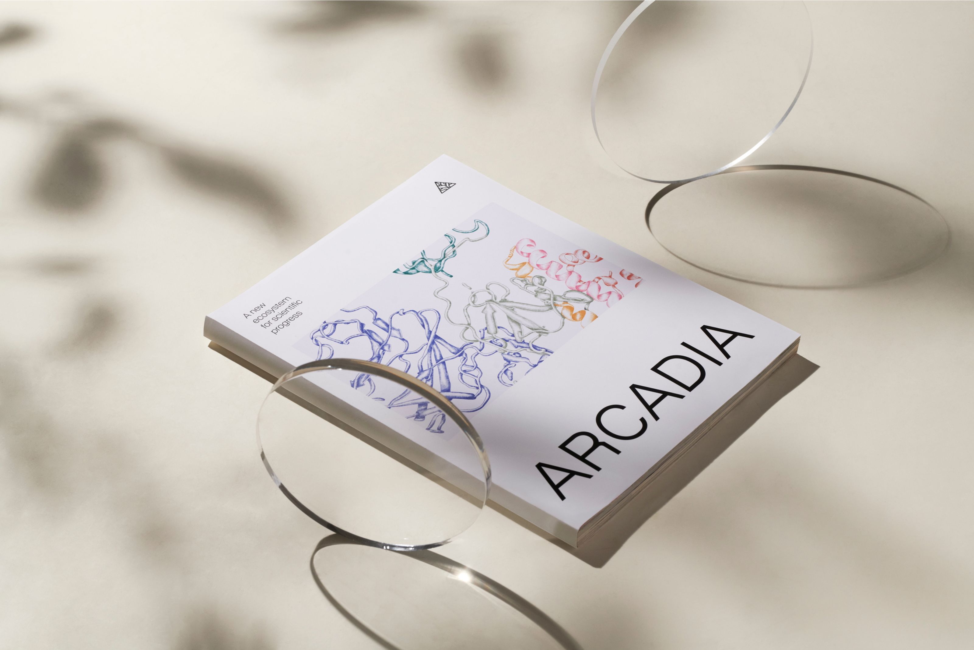
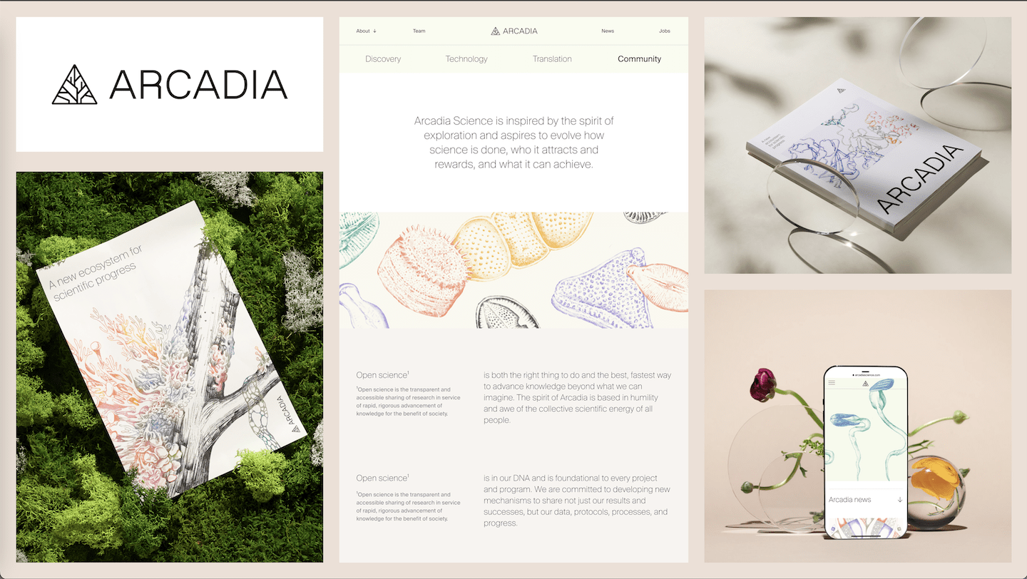
Our new identity grounds their experimental vision through complementary neutral and vibrant color palettes, sketchbook-inspired layouts, clear typography, and a mix of highly technical and abstract illustrations.
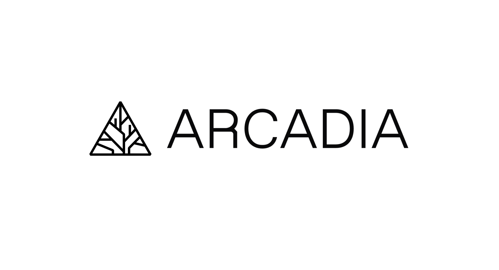
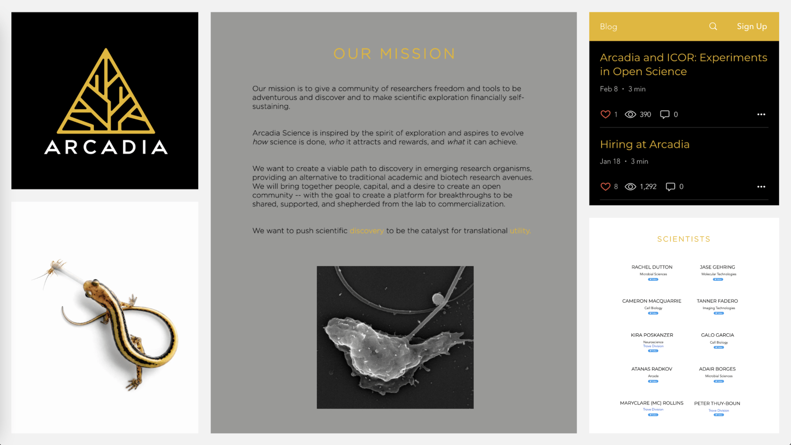
The Arcadia Science logo mark is an artful depiction of the tree of life. It represents their mission to serve as an ecosystem for scientific progress. The client asked us to retain their existing logo; however, we made a couple adjustments to improve legibility when reduced for smaller applications like mobile. Our simplified version uses slightly increased line weights for a clearer and faster read. For the same reason, we made the corners and bevels consistent. Lastly, we selected a new typeface, Favorit Light, to establish a strong visual relationship between the mark and wordmark.
We employed two complementary color palettes in the color system. The brand palette uses pastels and neutrals to ground the system; color blocking was implemented across the website for the same purpose. The illustration palette is made up of bright colorful hues to draw in added attention. Together these palettes support each other, delivering an overall effect that is both natural and vibrant.
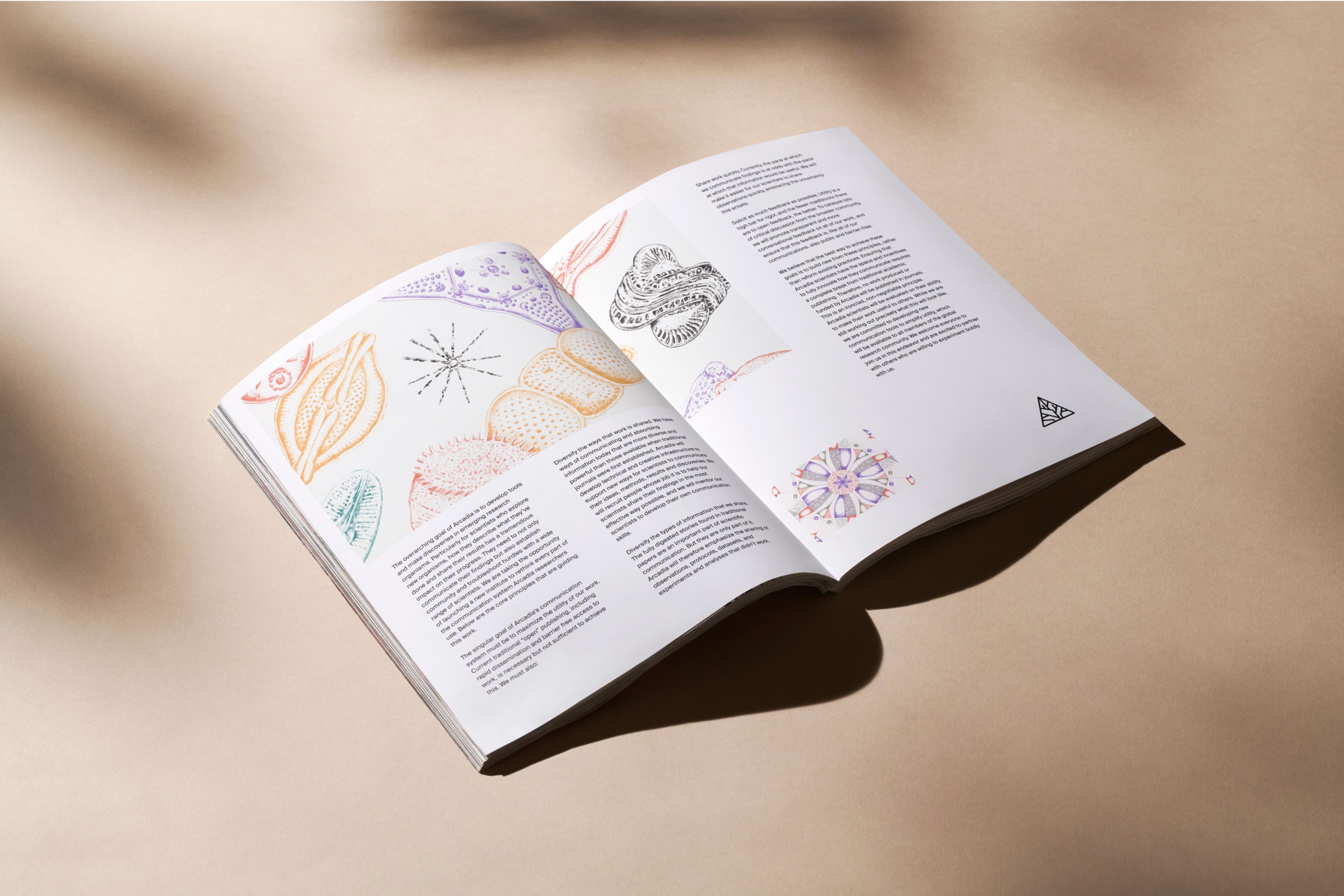
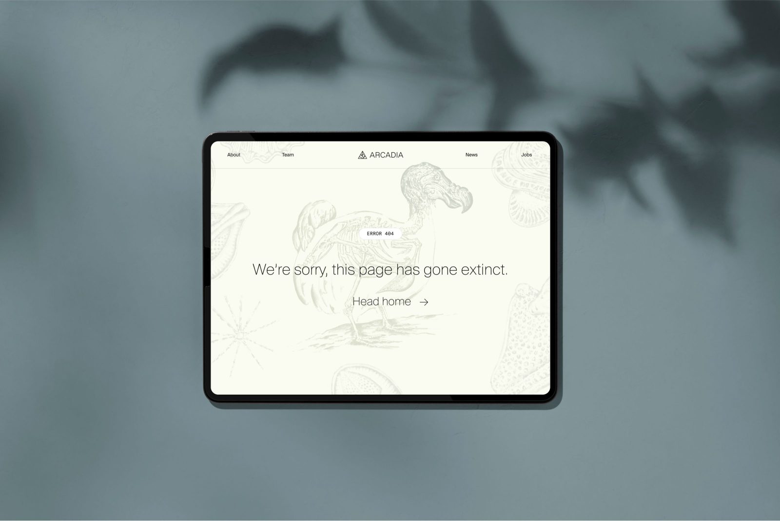
The website layout was inspired by the look and flow of observational sketchbooks, wherein sketches are horizontally paired with full-bleed illustrations, and large organized type. Ample use of white space and color blocks give the layout a free flowing rhythm allowing balance to elegantly coexist with asymmetry. The About pages are modularized for simplicity in the build while at the same time giving each section an individual feel.
The Suisse family of type was chosen for its look of authority and immediate credibility, important qualities for a new company like Arcadia Science. Specifically, we used Suisse International, rooted in the Swiss Style, a movement that espoused the objective presentation of information, a core value in scientific research. We incorporated Suisse Works for its elegant serif with balanced proportions. Its substantial x-height feels friendly and easy to read. Finally, Suisse Int’l Mono was chosen for use in labeling and other supporting roles.
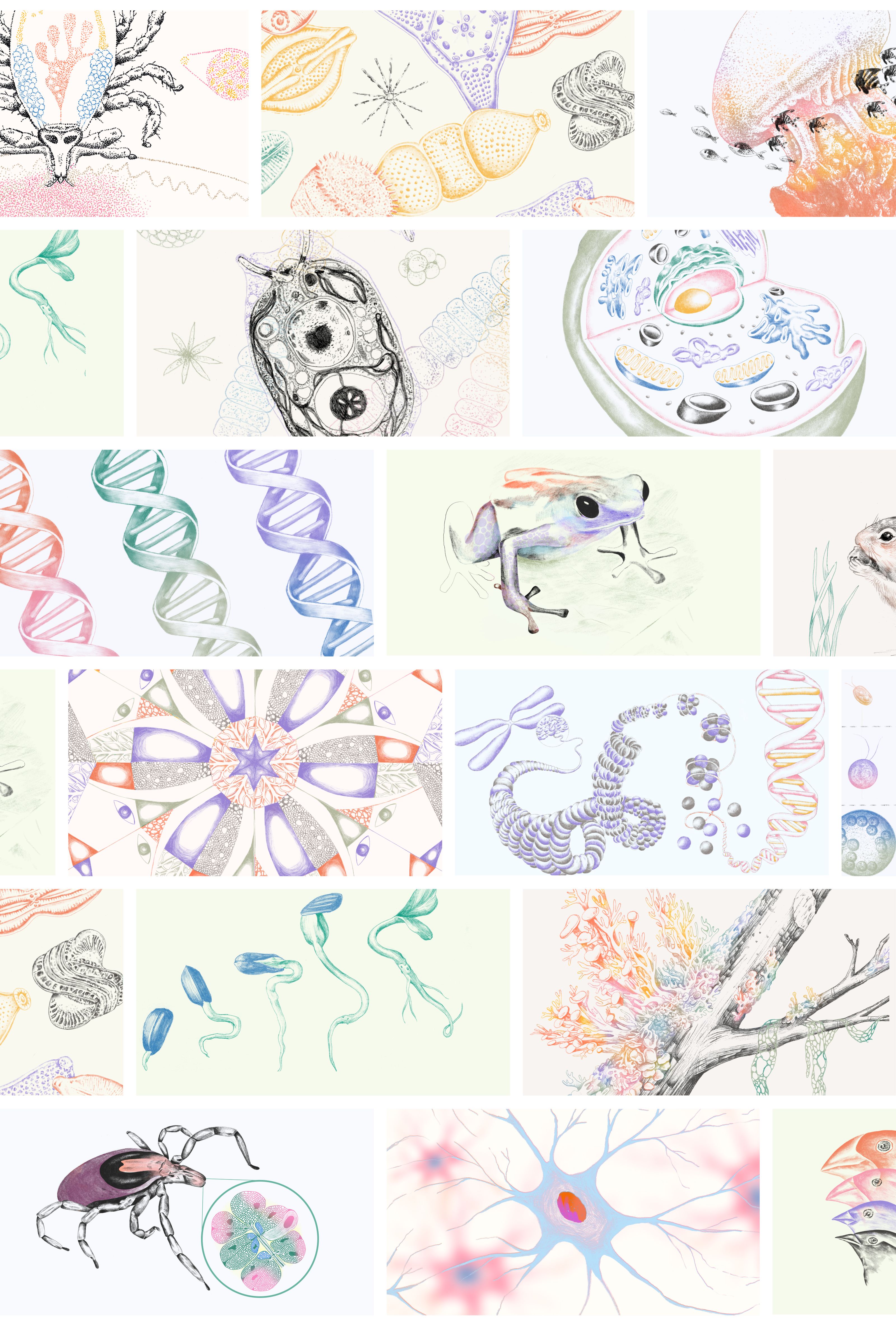
A variety of illustration styles are used across the design system, though all are inspired by the look and feel of the observational sketchbook. They range from highly technical drawings found in scientific textbooks to looser, more abstract approaches. Each is united through the use of a shared color palette. Bright shades with a mix of neutrals, pastels and neons breathe life into every illustration.
CREDIT
- Agency/Creative: Play Studio
- Article Title: Arcadia Science Brand Redesign by Play Studio
- Organisation/Entity: Agency
- Project Type: Identity
- Project Status: Published
- Agency/Creative Country: United States of America
- Agency/Creative City: San Francisco
- Industry: Education
- Keywords: WBDS Agency Design Awards 2022/23
-
Credits:
Executive Creative Director: Casey Martin
Design Director: Kyle Beck
Sr. Designer / Illustrator: Ellis Latham-Brown
Sr. Designer / Illustrator: Kelly Scheurich
Sr. Designer: Simon Blanckensee
Sr. Designer: Rosie Manning
Sr. Designer / Illustrator: Alexia Webber
Designer: Claire Whitman
Designer: Dylan Wells
Designer: Alli Berk
Photographer: Mari J


