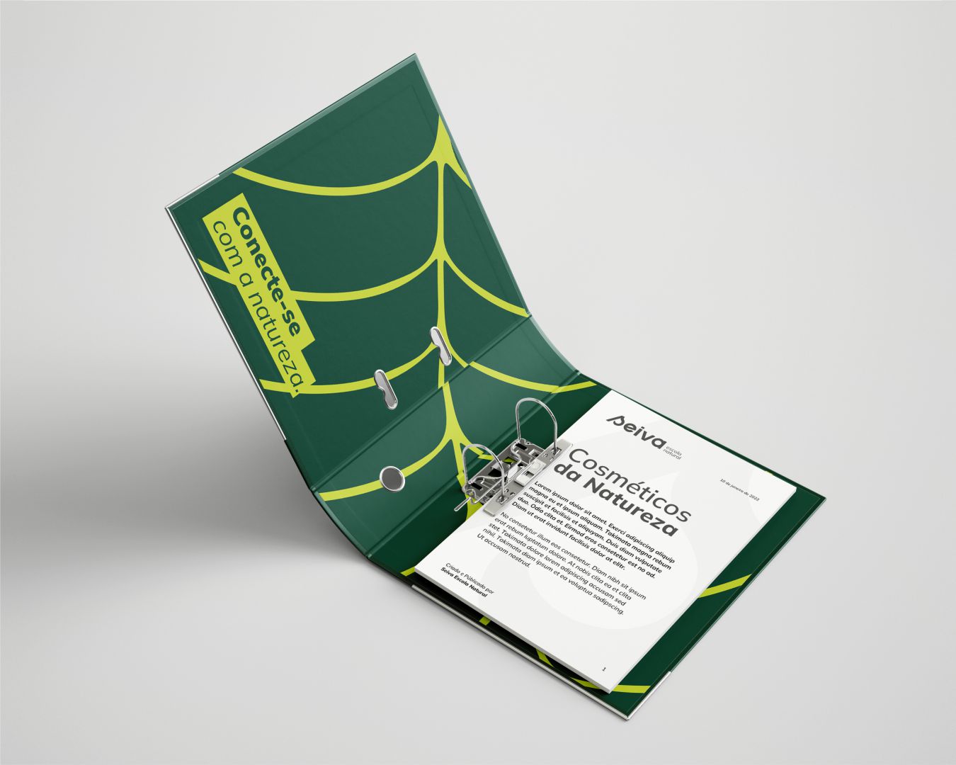
Seiva is a digital school focused on knowledge for a more natural life and more connected with our humanity. Seiva (sap in Portuguese) of plants is responsible for delivering all the nutrients they need, both raw matter and the material already enriched post photosynthesis.
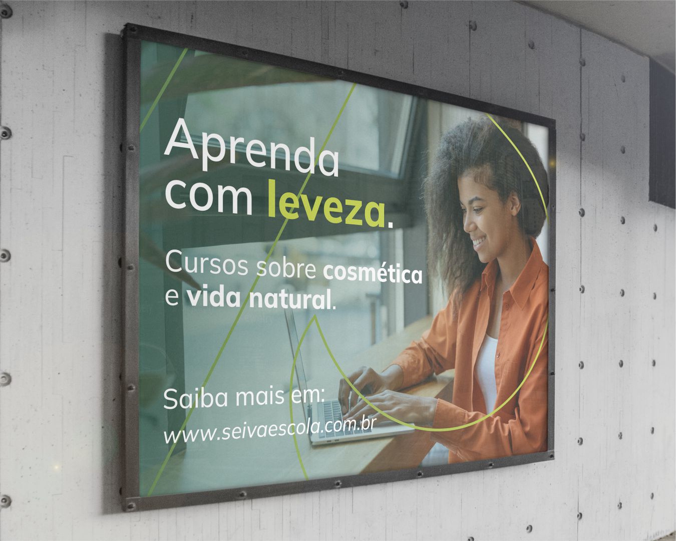
Education is a fundamental part of our lives and just like sap, it can be enriched when it circulates freely. Talking to the owners of the brand, it became clear the need for the brand to be born modern, bringing a differentiated and impactful look, inspiring customers to have a simpler life and connected with nature, promoting autonomy about the use of certain cosmetic products.
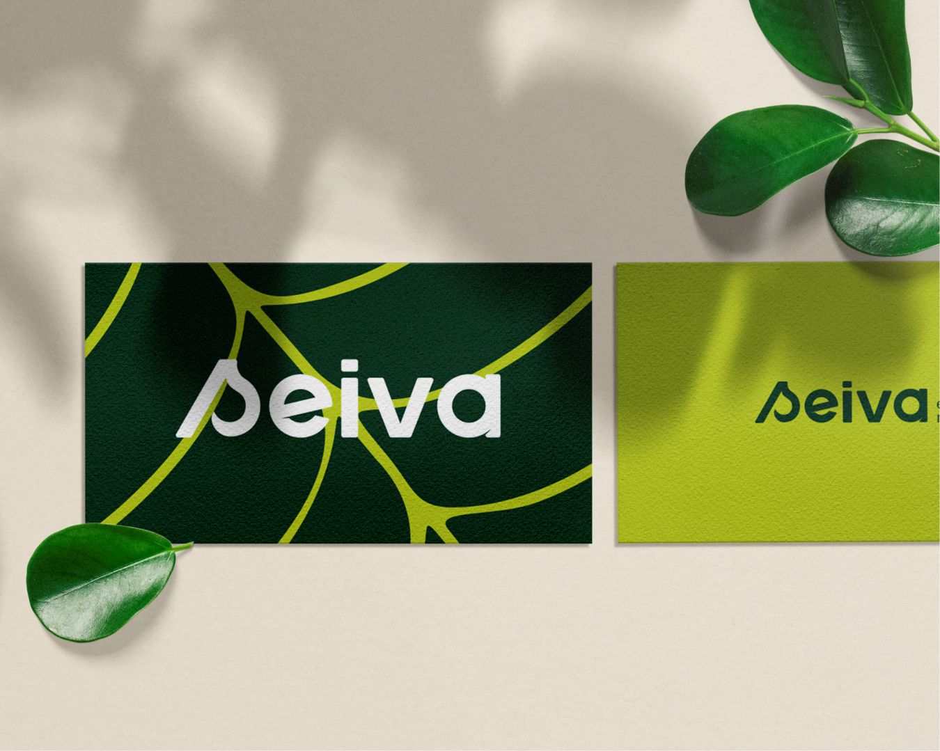
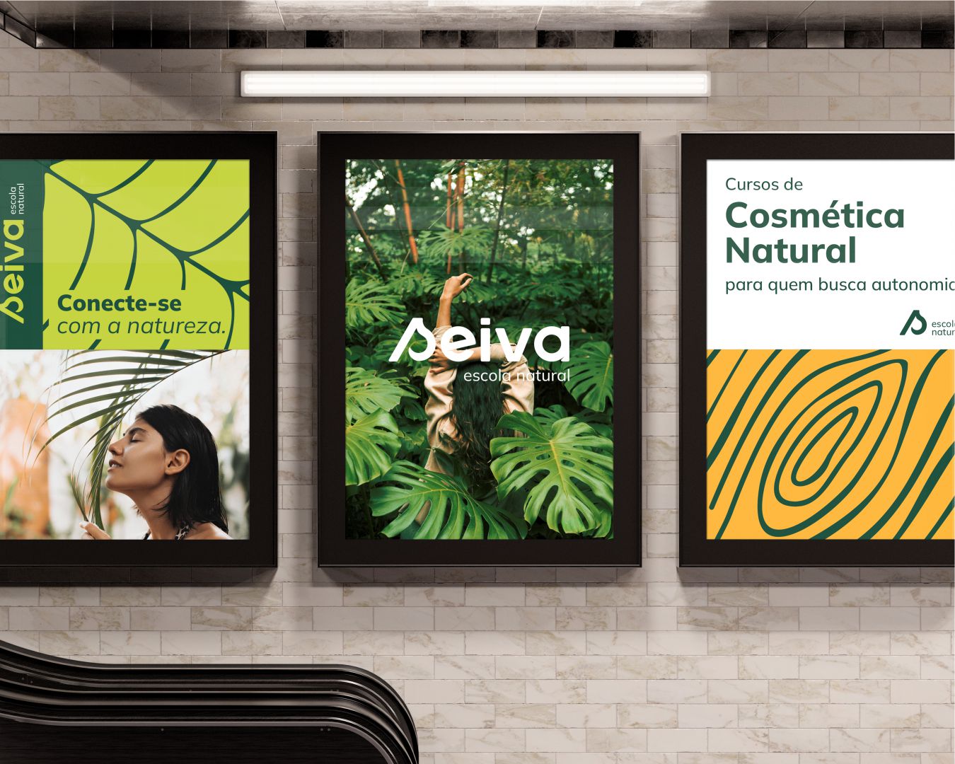
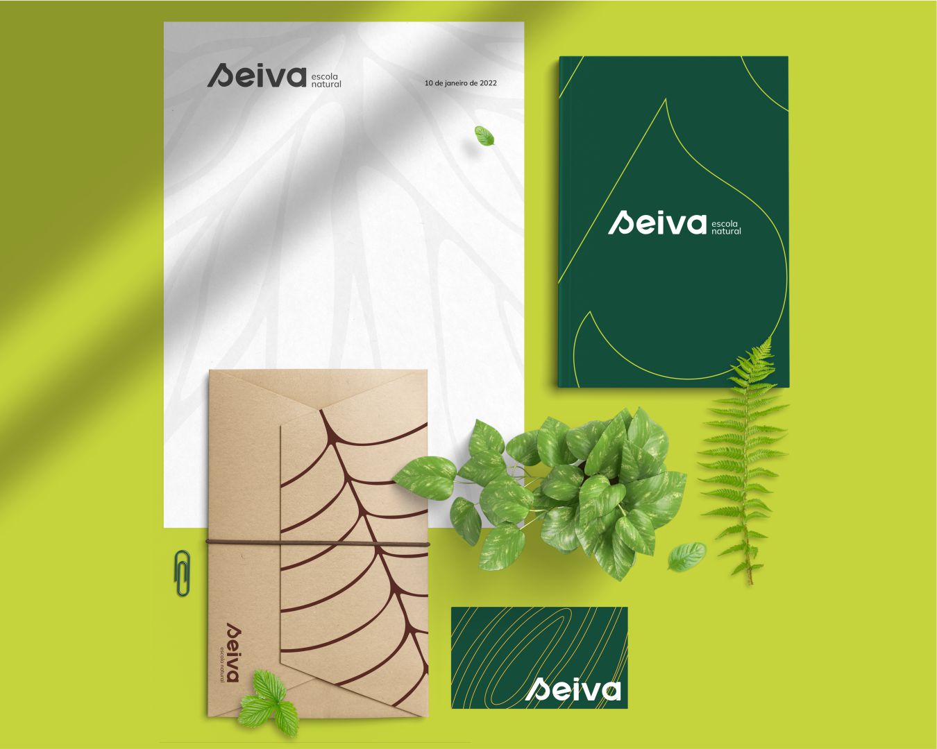
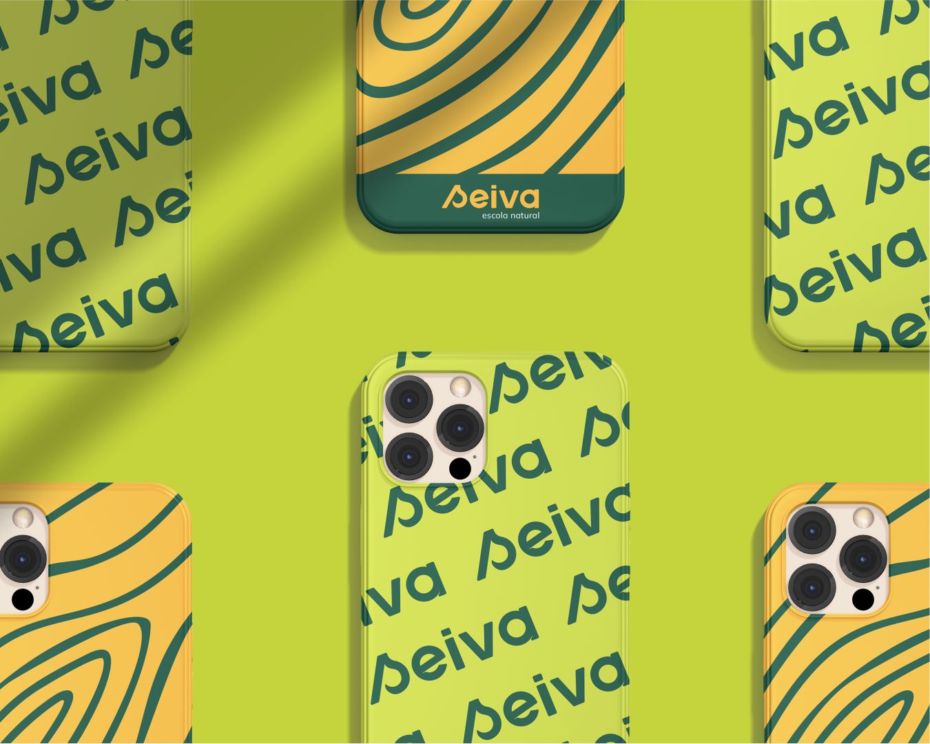
The colour palette was chosen in order to combine the personal characteristics of the brand with a good application on its points of contact with the public. The result were colours of nature in modern tones, aligned with the purpose of the brand and enabling versatility in future applications.
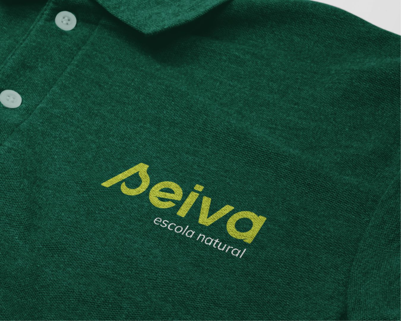
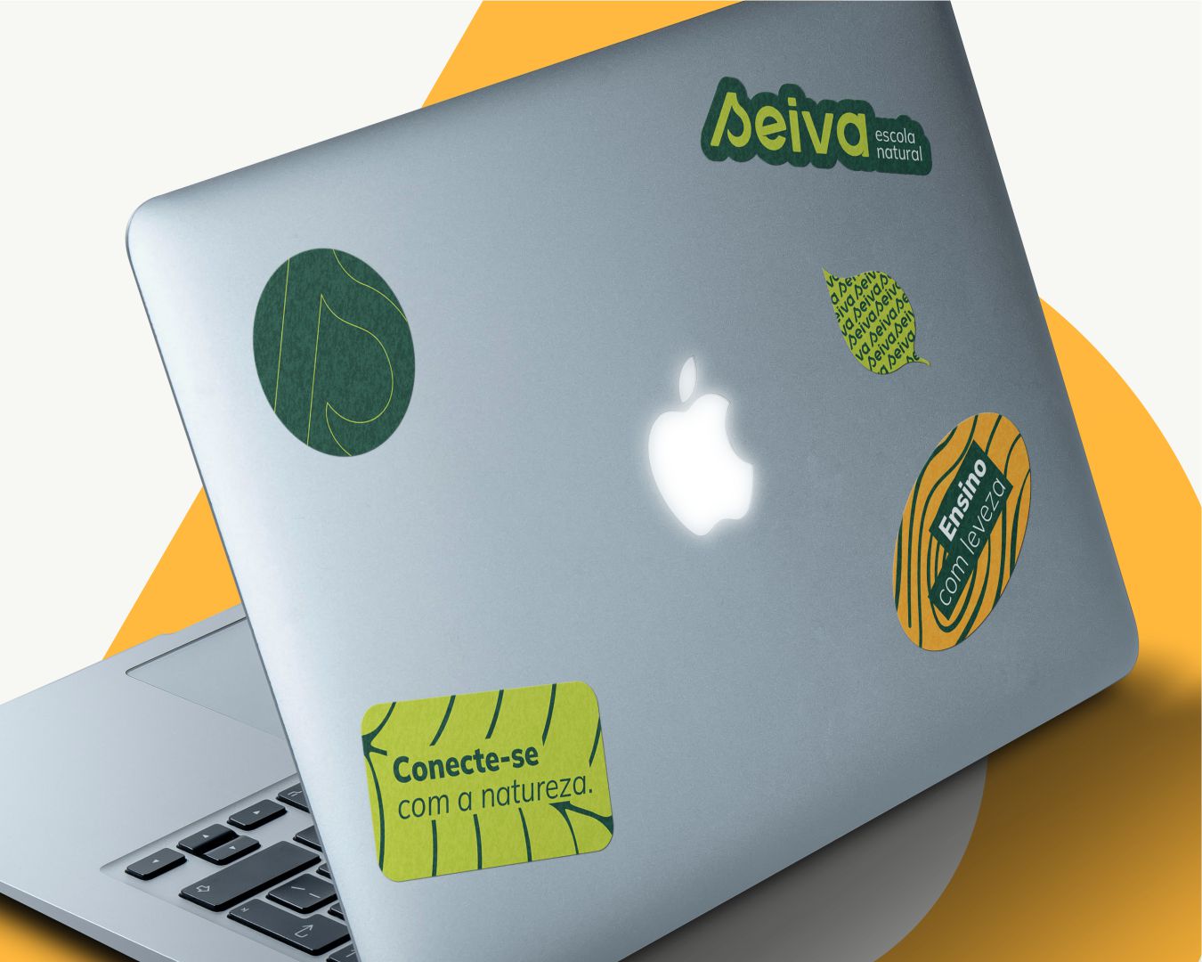
The logo was constructed from basic shapes and the result was a sans serif typography, with rounded corners, which conveys a friendly and modern feeling. In the negative space of the letter “s”, the concept of a leaf was applied, a subtle touch, but that adds personality to the brand.
Contrasting with the regular shapes of the logo and inspired by the parts of a plant, the graphics were developed using free lines and organic design. Those graphics were inspired by the lines of a leaf, roots, and tree rings, parts of the plant where the sap passes through carrying all the organic materials it needs.
CREDIT
- Agency/Creative: Aratu Design
- Article Title: Aratu Design Creates Seiva Natural School Brand Identity
- Organisation/Entity: Freelance
- Project Type: Identity
- Project Status: Published
- Agency/Creative Country: Brazil
- Agency/Creative City: Aracaju
- Market Region: South America
- Project Deliverables: Brand Identity
- Industry: Education
- Keywords: nature, school
-
Credits:
Designer: Arthur Sena


