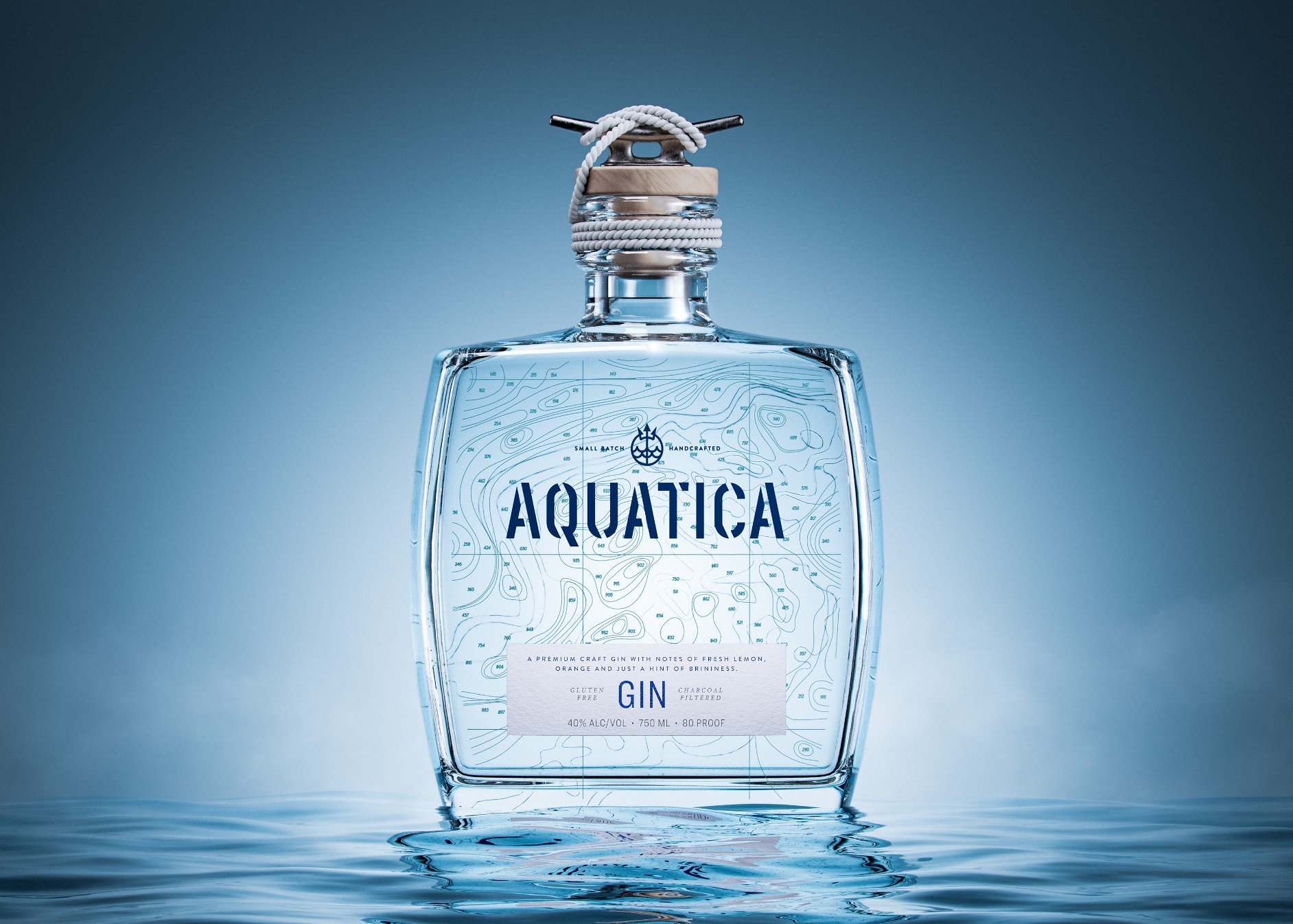
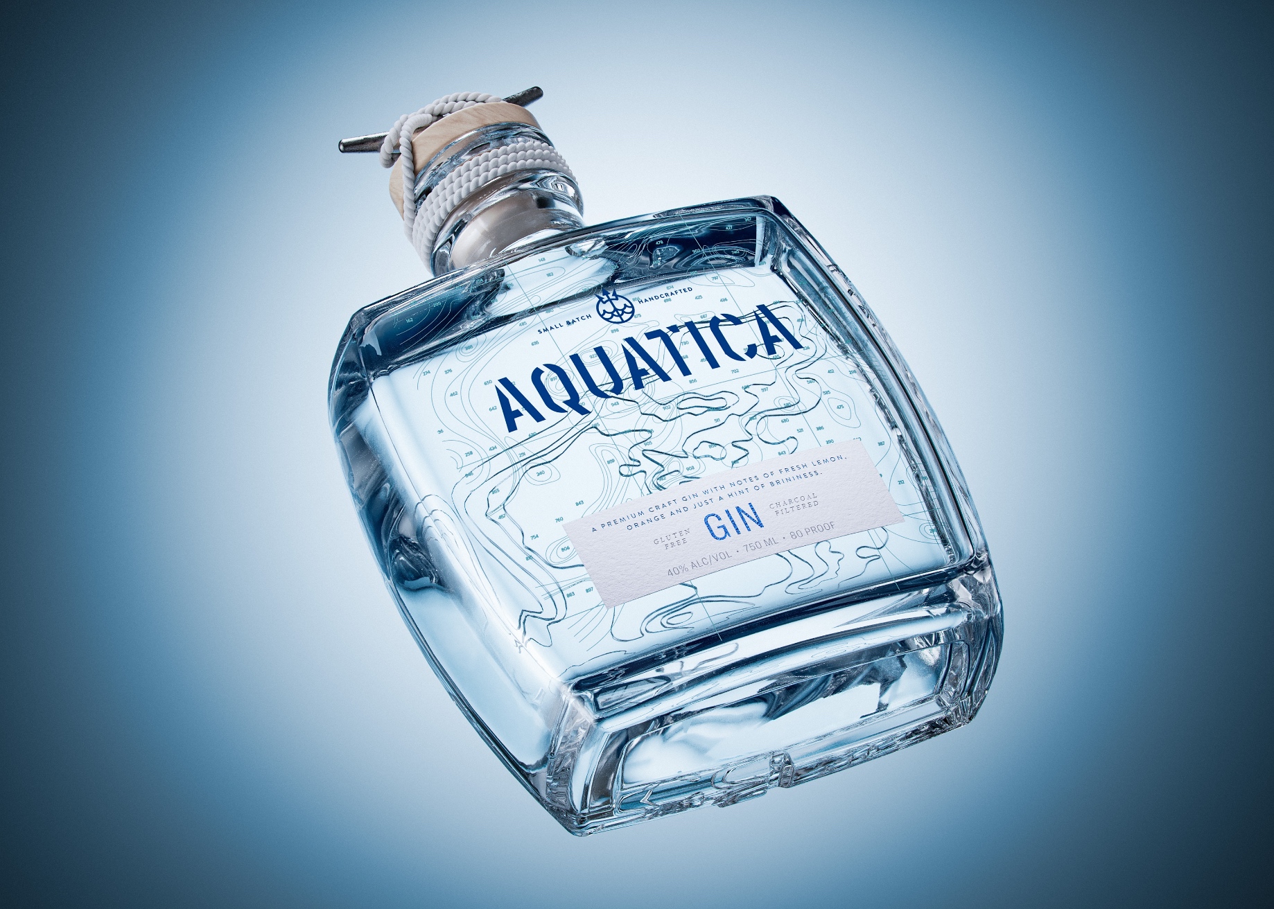
Aquatica Distilling came to CF Napa Brand Design to develop the name, packaging, logo, and custom bottle for their premium craft American Gin inspired by California and the Pacific Ocean’s influence on the Golden State’s agriculture. Distilled and bottled in Northern California, the premium craft gin had notes of fresh lemon, orange, and just a touch of brininess. CF Napa Brand Design developed the name “Aquatica” to connote water, evoking the awe-inspiring magic of the Pacific Ocean.
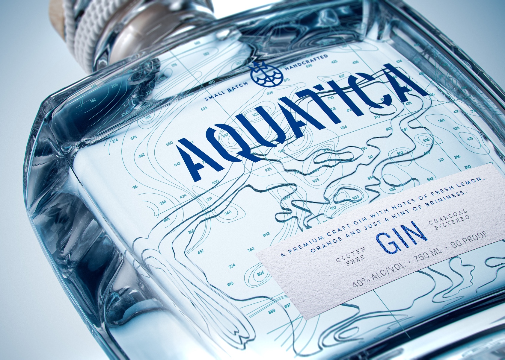
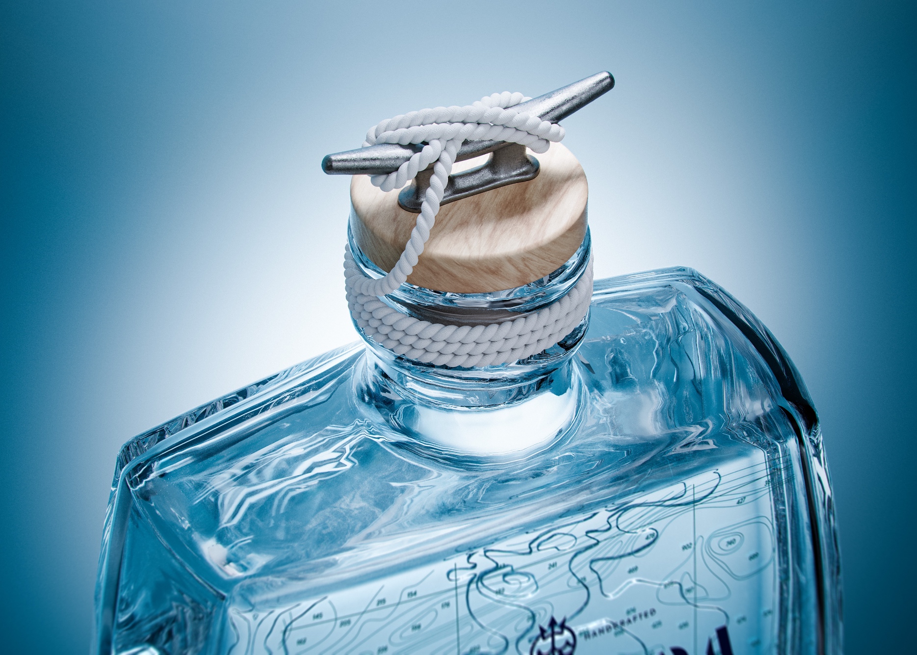
For the custom glass bottle, CF Napa Brand Design created a square-shaped bottle that was unique in the gin category, which traditionally displays round or cylindrical shapes. The glass was given a distinctive light aqua-blue hue to further support the Aquatica name and brand story. The back of the bespoke bottle was embellished with a custom deboss of California Pacific Coast ocean floor topography. When the topographic map was viewed through the front of the bottle, the refraction of light through the layers of glass gave additional depth to the multi-level deboss. The custom closure was a replica of a boat tie-off, complete with knotted rope. The nautical, ocean-inspired theme of the packaging was accentuated by the wordmark, the icon, and the linear topographic map lines.
The CF Napa Brand Design team began the design process with pencil-on-paper sketches, referring to Pacific Ocean topographic maps and maritime imagery for inspiration. The design was then brought from paper to the computer to create final artwork and production-ready files. The CF Napa design team worked hand-in-hand with paper and foil manufacturers to select the optimum materials to express the Aquatica design, and then with label printers and bottle manufacturers to make the design come to life. The design made its worldwide debut at the LUXE PACK Monaco show, the premier trade show for creative packaging.


CREDIT
- Agency/Creative: CF Napa Brand Design
- Article Title: Aquatica Gin Packaging Design
- Organisation/Entity: Agency
- Project Type: Packaging
- Project Status: Published
- Agency/Creative Country: United States
- Agency/Creative City: Napa, California
- Market Region: North America
- Project Deliverables: Packaging Design
- Format: Bottle
- Industry: Food/Beverage
- Keywords: WBDS Agency Design Awards 2023/24
- Keywords: Packaging Design, Product Creation
-
Credits:
Design Agency: CF Napa Brand Design
Client: Aquatica Distilling


