


Savanna Rums have been given a full brand positioning and visual revamping by drinks design specialist Appartement 103 to provide the brand with a contemporary yet classic look and feel, enhancing the beauty of La Réunion Island.
Anxious to perpetuate the story of its origins and its passion to create exceptional rums for more than 150 years, the Savanna distillery takes its inspiration from the wildness and magic of La Réunion Island. Faithful to the island’s motto, “Florebo Quocumque Ferar”, “I will flower wherever I am worn”, Savanna promotes the aromatic expression of its extensive range of rums while respecting the manufacturing know-how from the 18th century to the present day.
However, La Reunion Island is not always spontaneously identified as a source of premium rum origin, and Savanna has been suffering from this misconception. We spotted an opportunity to elevate the brand’s perception and challenge Savanna to free itself from the island clichés and negative perceptions, giving the Reunion’s rums its seal of nobility and, thus, demonstrate that rare rums of exceptional quality exist there.
We created a new brand platform and story from a deep analysis of the brand, its values, communication activation, current graphic assets, and positioning against its competitive environment. Because Savanna offers a different perspective on its terroir and its island, the tasting experience is different: the rums get their uniqueness from what the island has of more rare, exceptional and wild. Guided by its quest for quality and passion, the entire Savanna’s team has free rein to its creative breath, with the production of rare rums that thus reveal the grandiose, unexpected and untamed spirit of the island.
The graphic direction premiumise and iconises the brand, staging it locally and internationally, attracting a broader drinking audience.
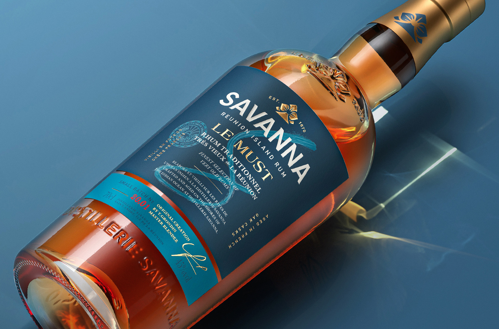
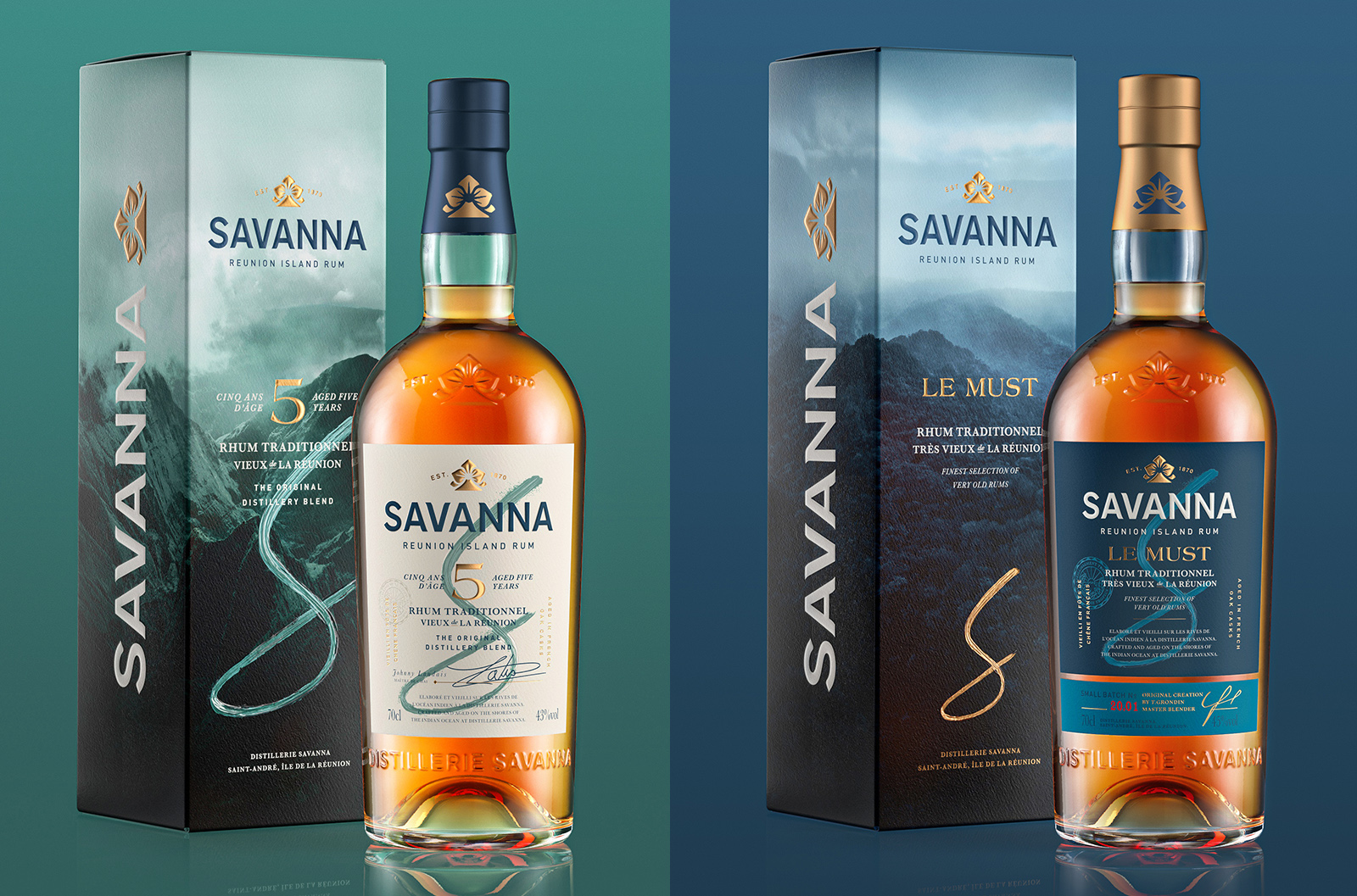
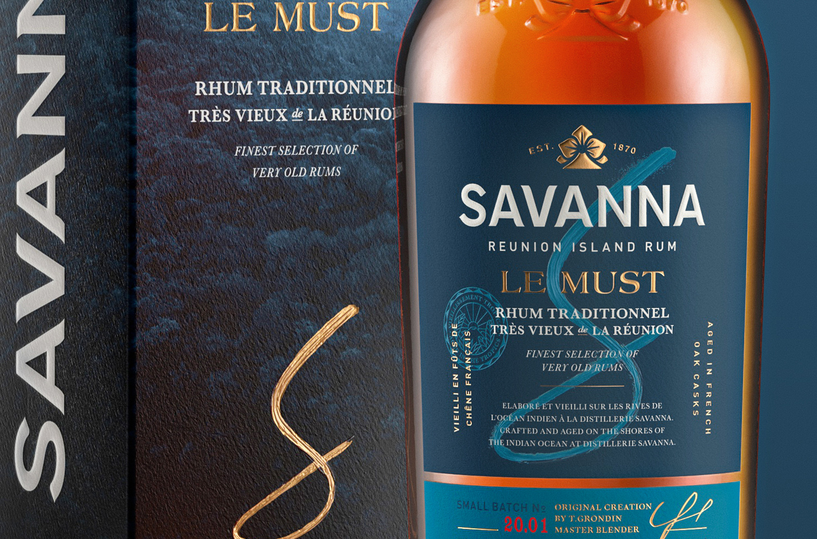
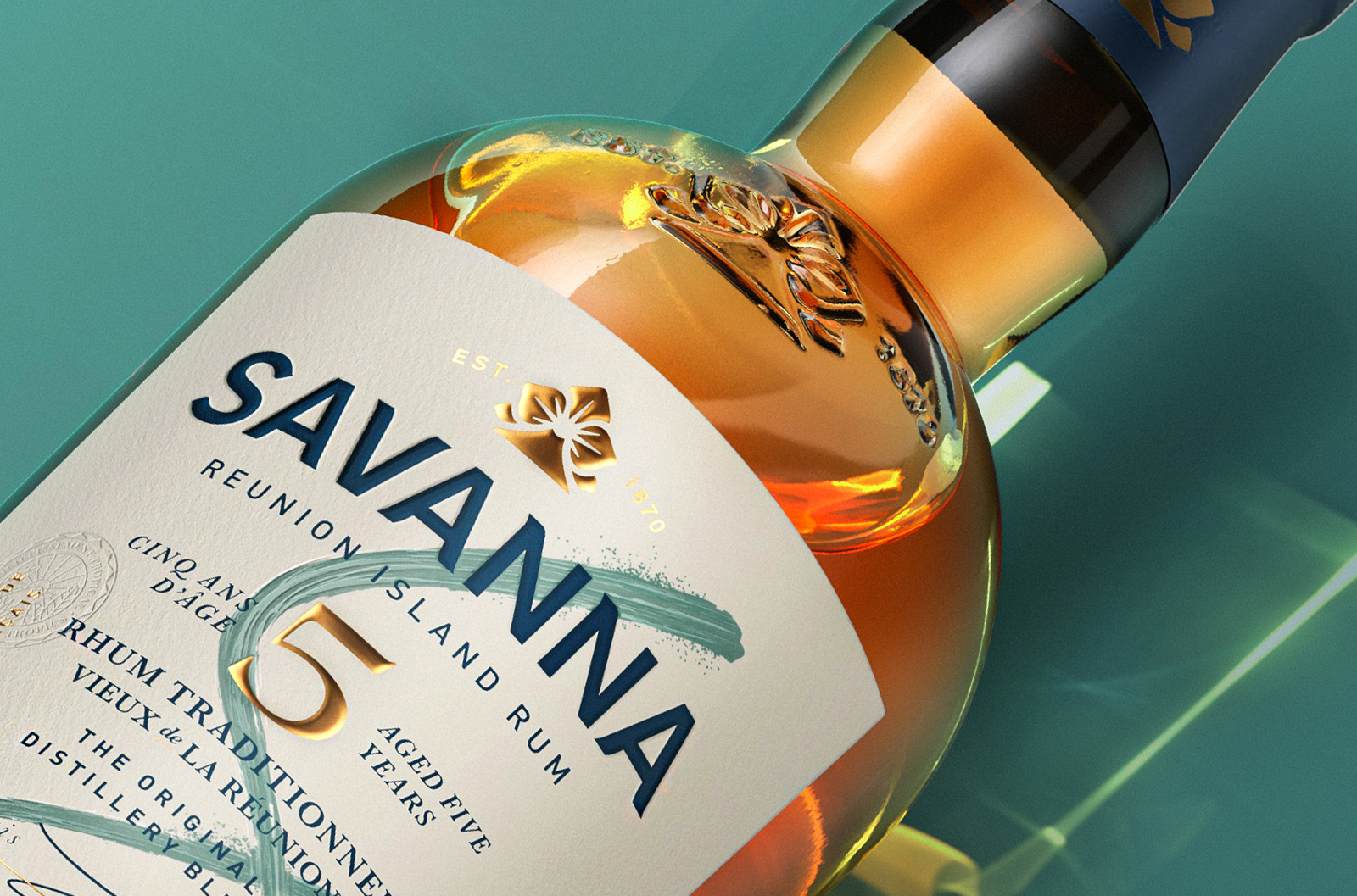
The historical brand icon of the Fleur de Lys has been revamped into an inspiring symbol composed of the iconic orchid flower and the Piton de la Fournaise, one of the world most active volcanoes. For boldness, the Savanna wordmark was redrawn. A new brushed S symbol, carefully printed and multileveled embossed, appears on the front label, injecting craftsmanship and a touch of creativity into the presentation. Carefully selected, each SKU boasts natural colour tones: blue symbolising the shores of the Indian ocean for the Le Must variant and green conveying the wild forest for the 5 YO. Pushing the consumer immersion further, tone on tone photography has been placed on the outer carton.
The distillery invested in premium materials, papers, and printing finishing for enhanced desirability, which was carefully followed. Every detail was studied more deeply to convey elegance and tactility, from the brand icon gold foil to multilevel embossing and debossed elements.
Le Must and Le 5YO are the emblems of the know-how of the Savanna Distillery and the start of our work.
The full brand portfolio, composed of the “Bartender range” and a rare casks range, will be released in the near future and will strengthen the global image of Savanna.
“Carrying out such a project for Savanna was a real challenge in many ways. Thanks to Appartement 103 team’s great expertise, humility, patience, creativity and strong commitment. This first collaboration was a real pleasure and a great success! We are looking forward to the next challenge! “ Samuel Pitarch – Commercial & Marketing Director – Réunionnaise du Rhum
CREDIT
- Agency/Creative: Appartement 103
- Article Title: Appartement 103 Redesigns Savanna Rums
- Organisation/Entity: Agency
- Project Type: Packaging
- Project Status: Published
- Agency/Creative Country: France
- Agency/Creative City: Paris
- Market Region: Global
- Project Deliverables: Brand Design, Packaging Design
- Format: Bottle
- Substrate: Glass
- Industry: Food/Beverage
- Keywords: Rum, Reunion Island, Packaging Design


