


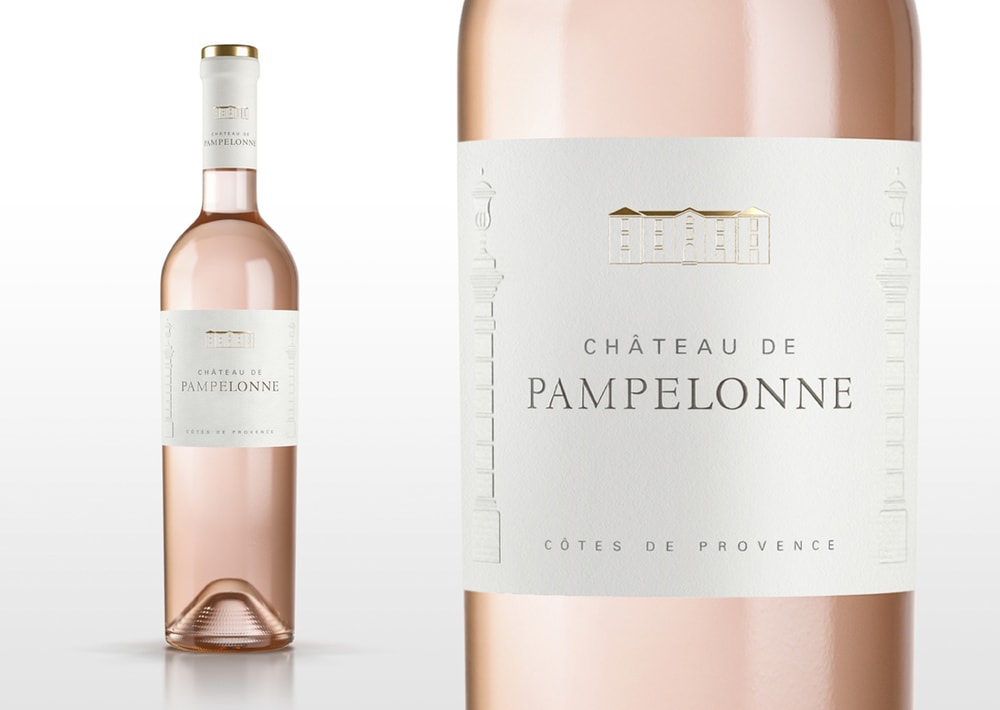
“Château de Pampelonne is one of the leading Rose brands from Provence, established 200 years ago and sold across all five continents. The branding and packaging design specialists Appartement 103 were commissioned to rejuvenate this historic icon without losing its international appeal and global recognition.
“Understanding and respecting the key visual elements of the brand identity was a crucial part of this project. The final chosen design kept the original overall label structure, where every single detail has been carefully reworked and modernised” – says Julien Zylbermann, Appartement 103’s Creative Director”
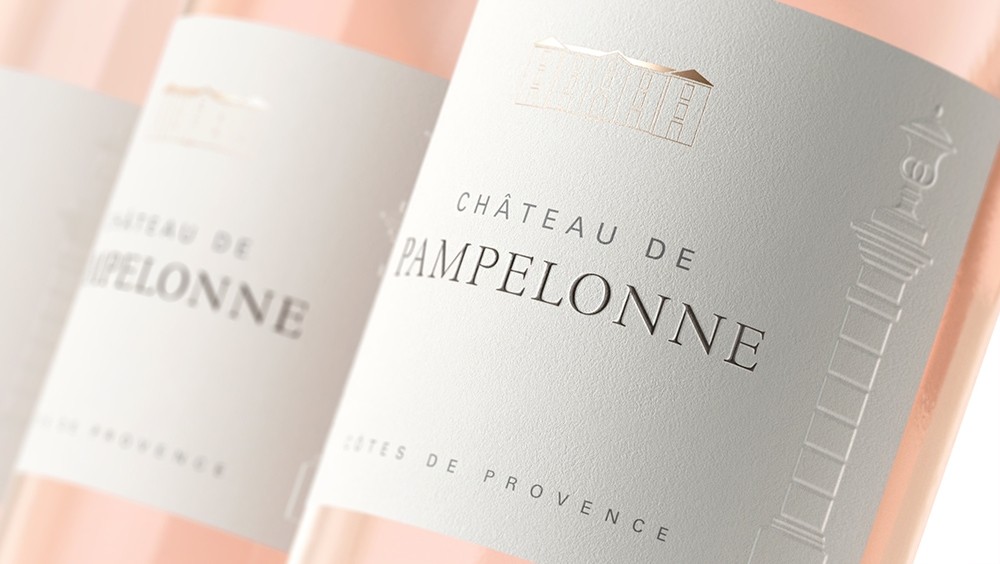
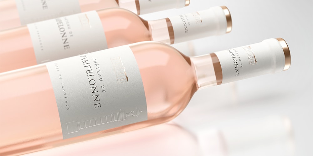
“The redrawn castle is now accentuated in a subtle copper hot foil printing. The logo typography has been cleaned up, boosting more visibility and elegance. The iconic embossed towers, part of the brand’s DNA, have been redesigned with more detailing to create an elegant presentation while increasing the tactile experience. Even the cotton-like paper has been carefully selected in order to enhance the premium feeling of the presentation as a whole.Overall, the new Château de Pampelonne presentation is a clean uplift of the brand that keeps its identity intact, while ensuring the brand’s evolution through time.”
CREDIT
- Article Title: Appartement 103 – Château de Pampelonne
- Project Type: Packaging


