Agencja Kreatywna Creative Flow – API.PL Brand Identity
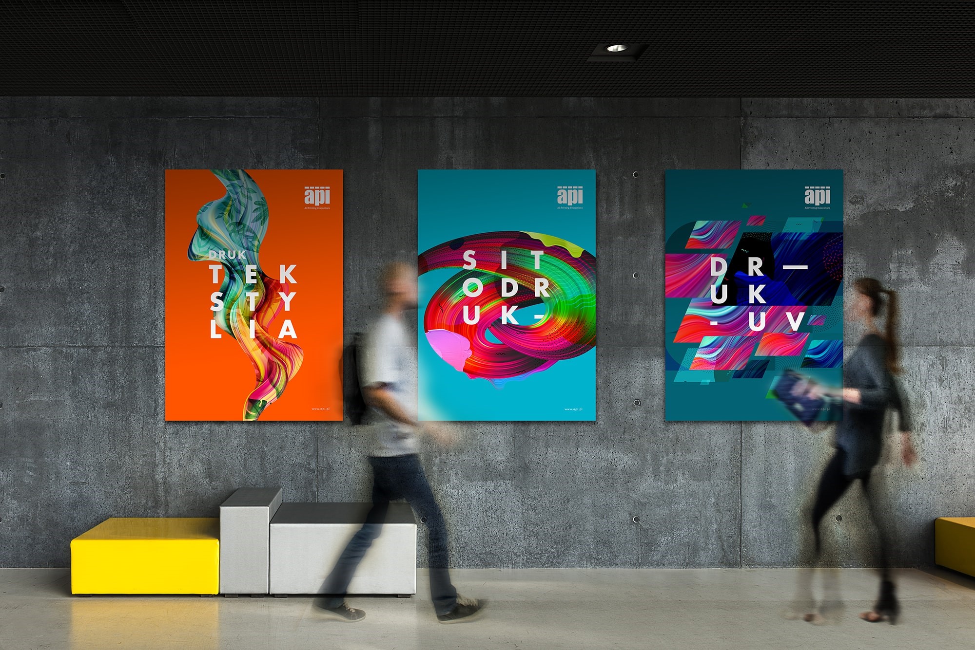
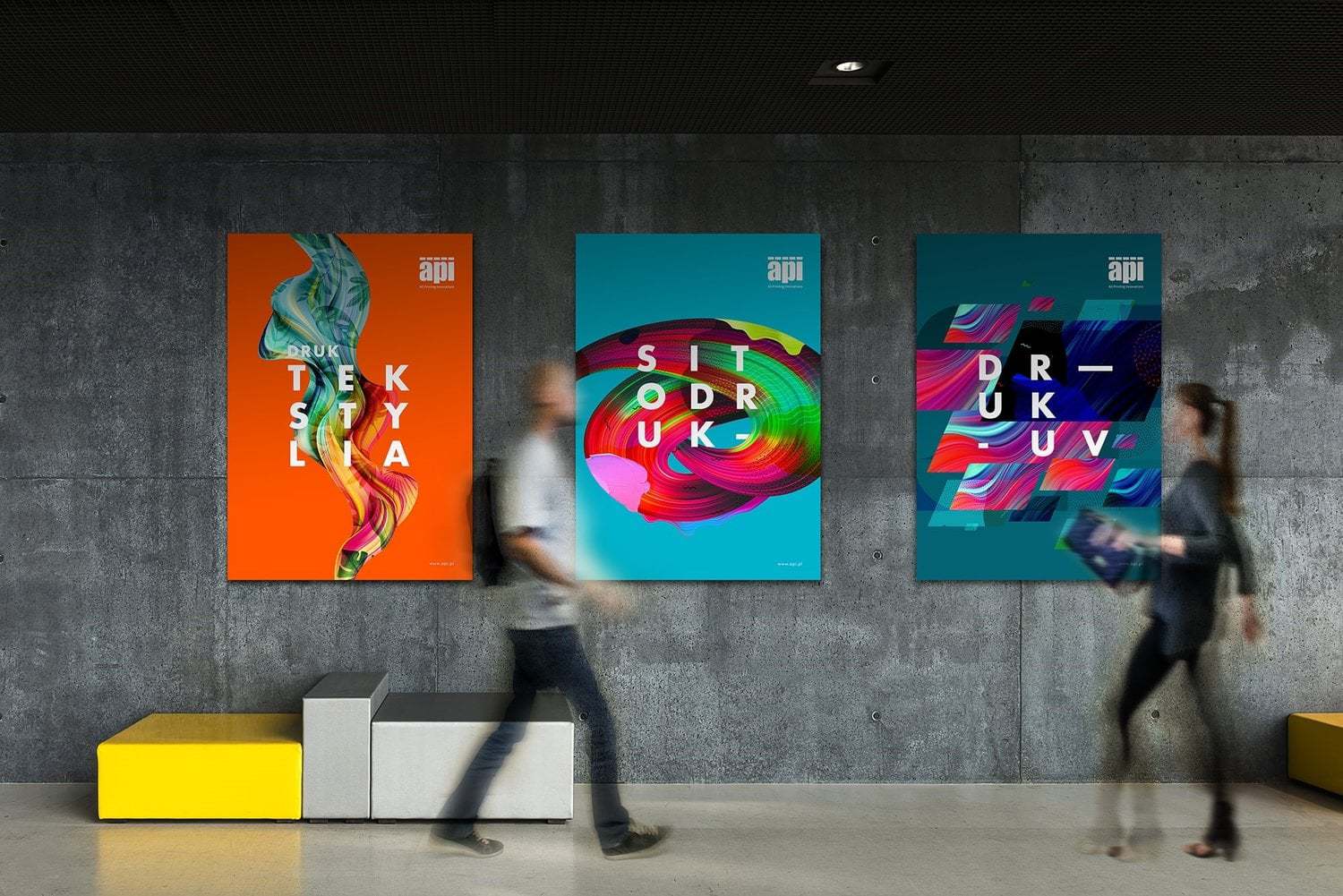
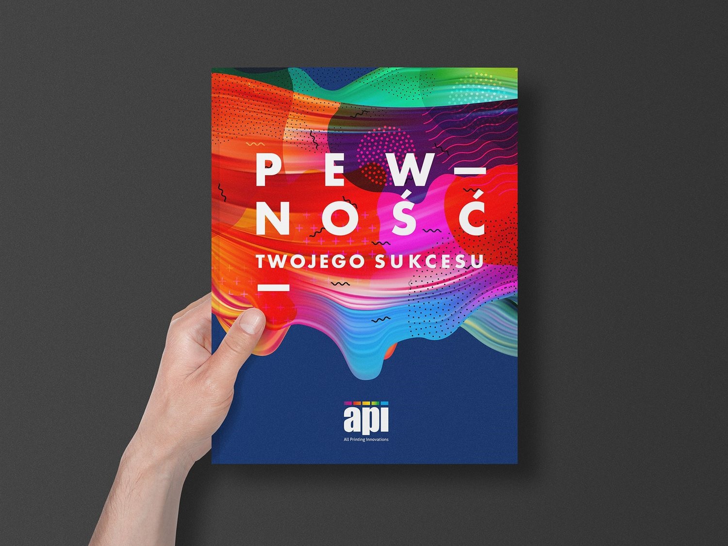
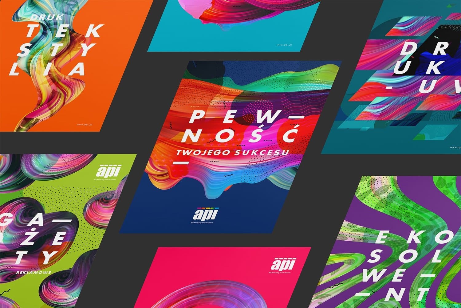
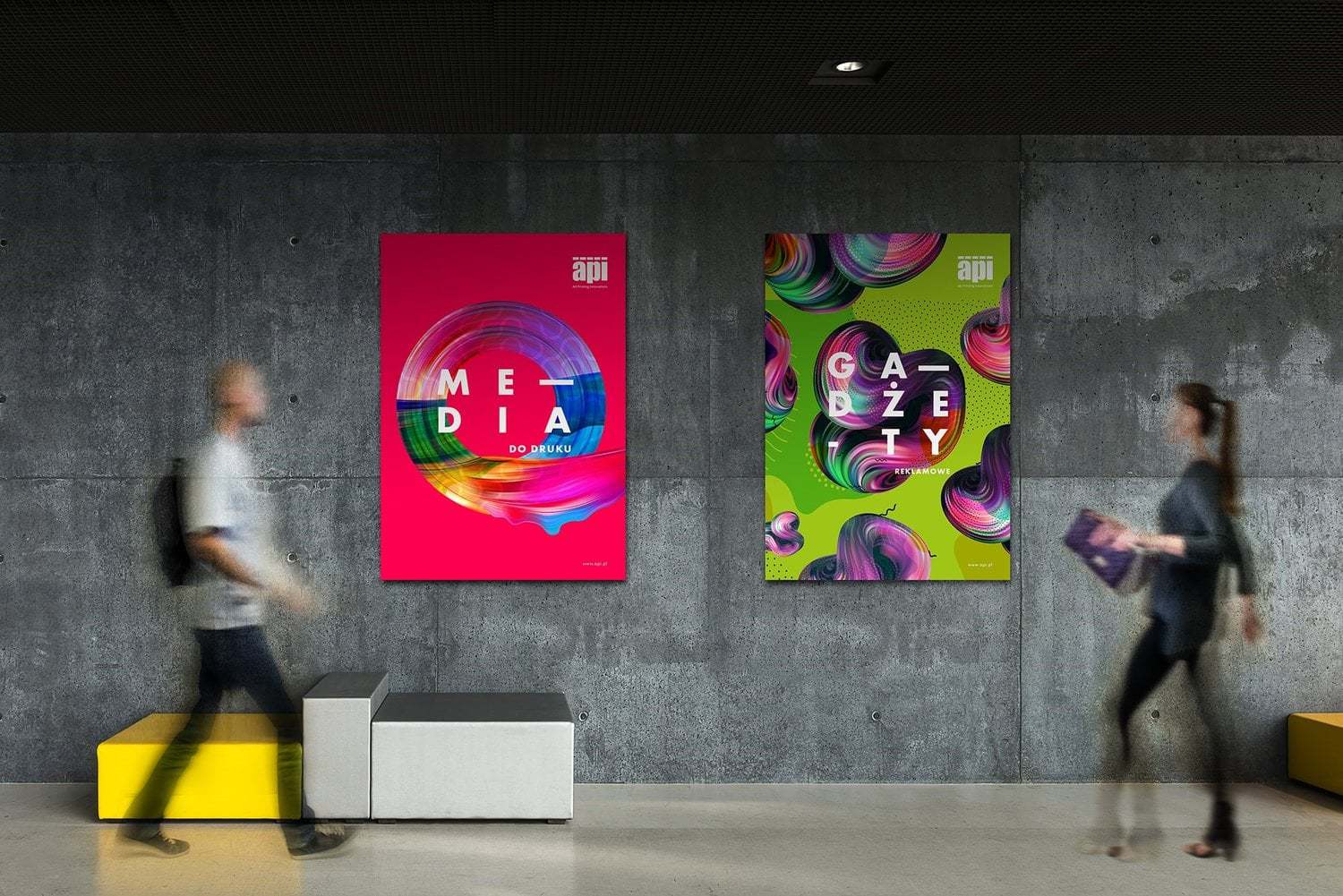
Stand out or die. We took there words to ourselves designing new brand identity for API.PL. In our heads also kept hearing: consistency. Adapting the key visual we managed to harmonize the materials and at the same time they all have their own identity and still they are surprising.In our project every field of API.PL’s expertise has gained its own shape by the specific choice of colors and forms. In obvious way they all refer to what the brand does on the market. Where there is print – there is also colorful ink spilling all over. Strong colors, clear and bold contrast, non-obvious combinations. However, everything remains pure and in order. Because API.PL wants to convince us, that with their solutions and professional advice you have „The Certainty of Your Success”.Minimalistic typography closed in a rectangular form with specific breaking of the words corresponds with effusion of colors and convinces us about innovation and brand’s professionalism
CREDIT
- Agency/Creative: Agencja Kreatywna Creative Flow
- Article Title: API.PL Brand Identity
- Organisation/Entity: Agency, Published Commercial Design
- Project Type: Packaging
- Agency/Creative Country: Poland
- Market Region: Europe
- Industry: Technology


