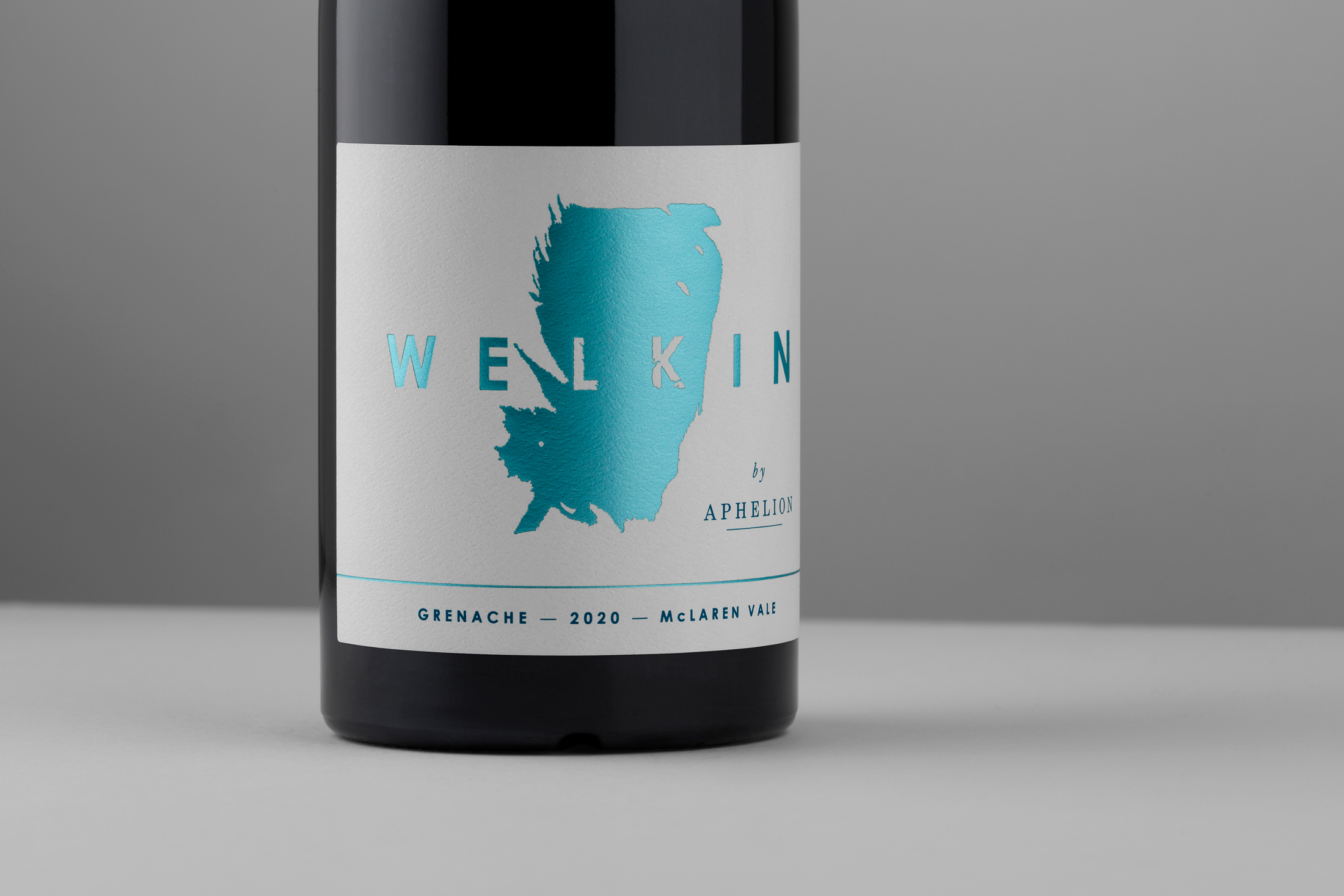
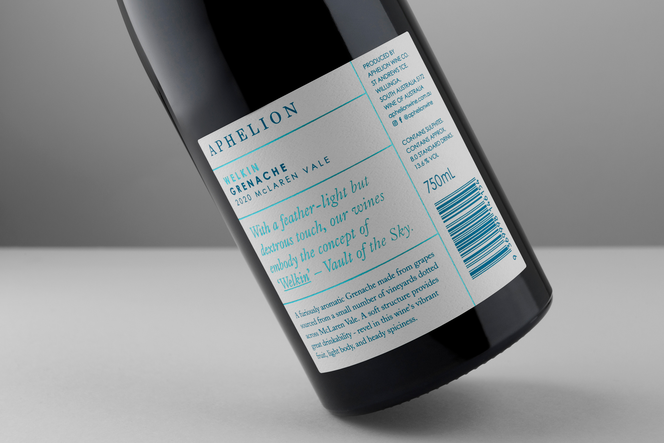
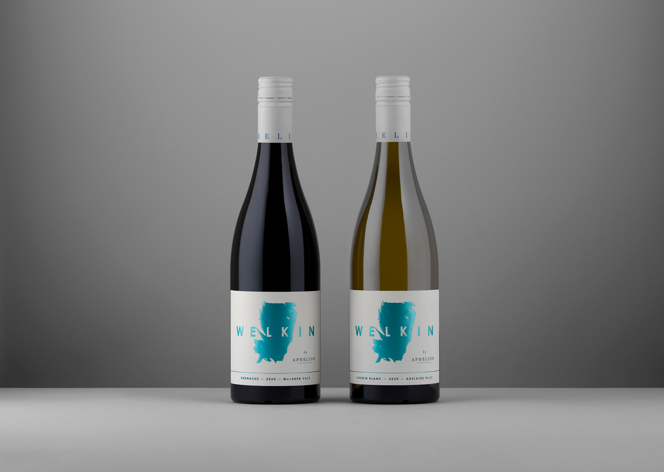
A new entry level offering in the Aphelion Wine Co folio; ‘Welkin’ is less of a nod, and more of a playful wink to the almost ethereal spirit that travels through Rob Mack’s wines.
Meaning ‘Vault of the Sky’, Welkin is a range of light, vibrant wines that have enjoyed a deft touch in the winery. The labels convey that mystique through a clean execution of Aphelion’s feather logo-mark and cool blues, synonymous with the brand.


CREDIT
- Agency/Creative: David Byerlee Design
- Article Title: Aphelion Wine ‘Welkin Series’ Designed by David Byerlee Design
- Organisation/Entity: Agency, Published Commercial Design
- Project Type: Packaging
- Agency/Creative Country: Australia
- Market Region: Multiple Regions
- Project Deliverables: Brand Architecture, Brand Refinement, Graphic Design, Packaging Design, Product Architecture, Retail Brand Design, Tone of Voice
- Format: Bottle
- Substrate: Pulp Paper
FEEDBACK
Relevance: Solution/idea in relation to brand, product or service
Implementation: Attention, detailing and finishing of final solution
Presentation: Text, visualisation and quality of the presentation


