Overview
So what is on the other side of the door?
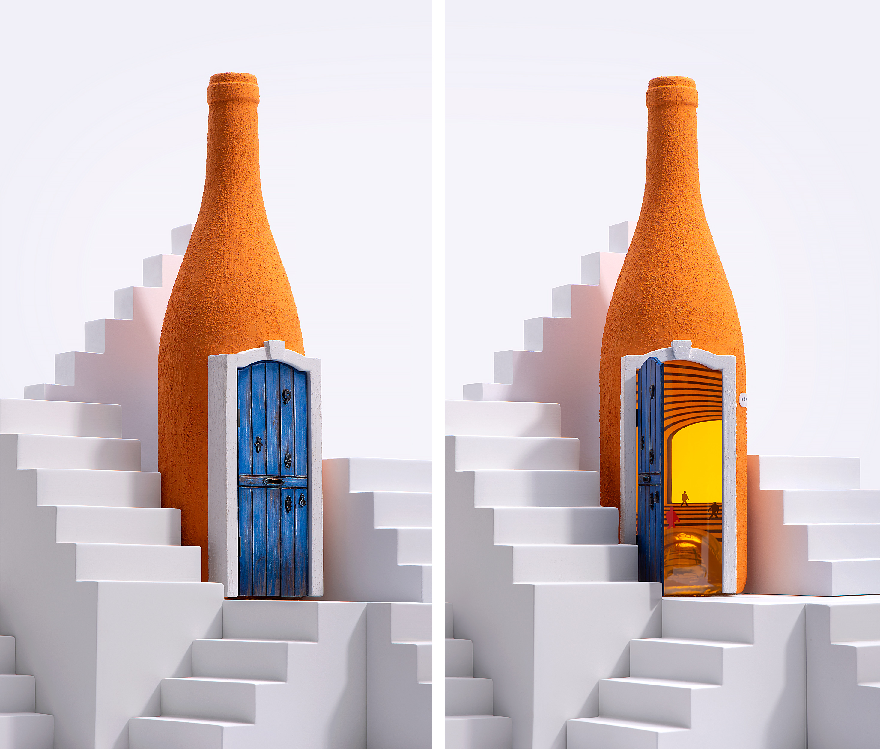
This question has always taunted people. Closed doors attract the curious mind with their mystical beckoning, all the possibilities, all imaginations are hidden behind them – luring you to turn the handle.
The unknown rises various fantasies in imagination that dissipate as soon as the doors are opened
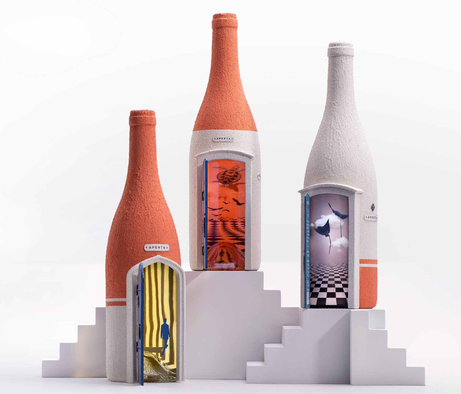
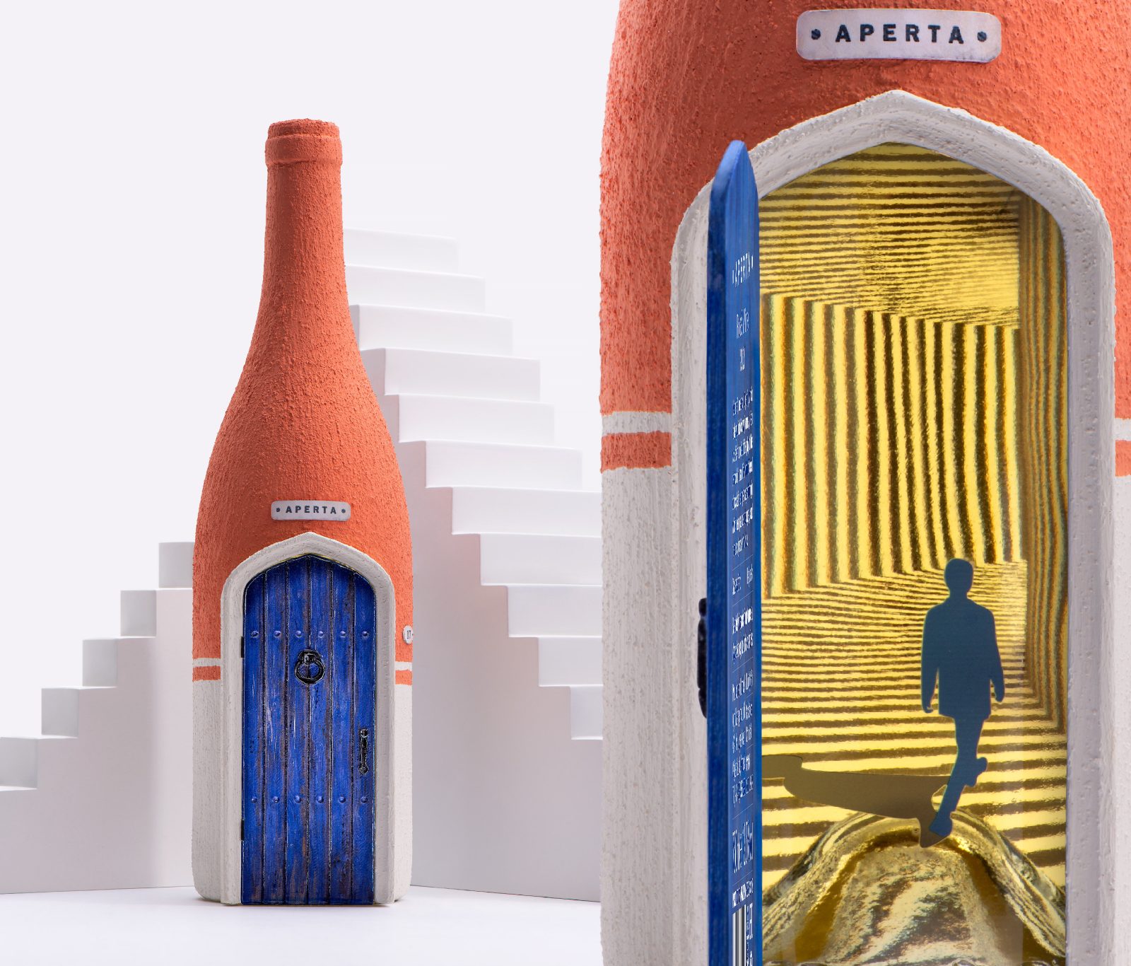
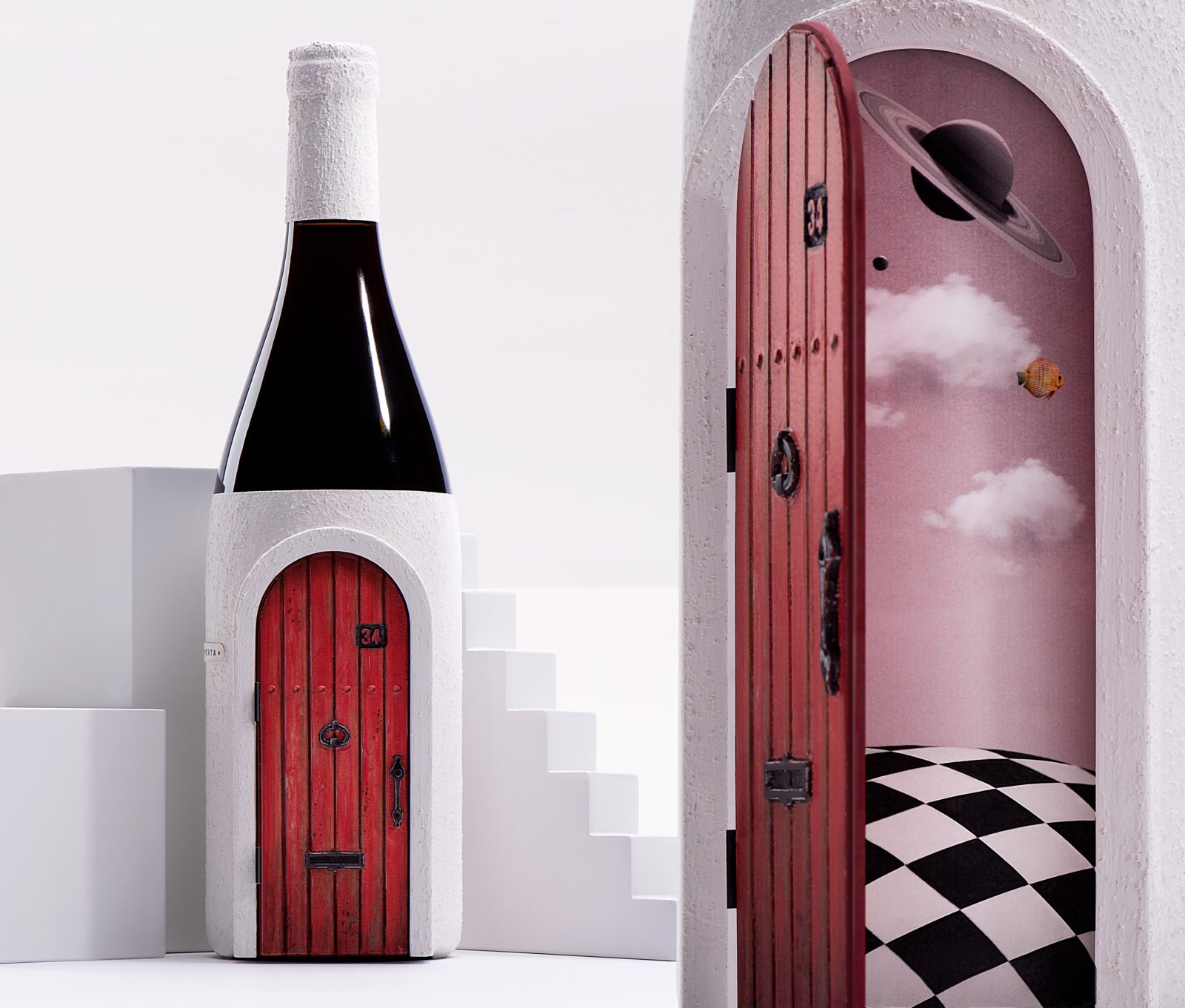
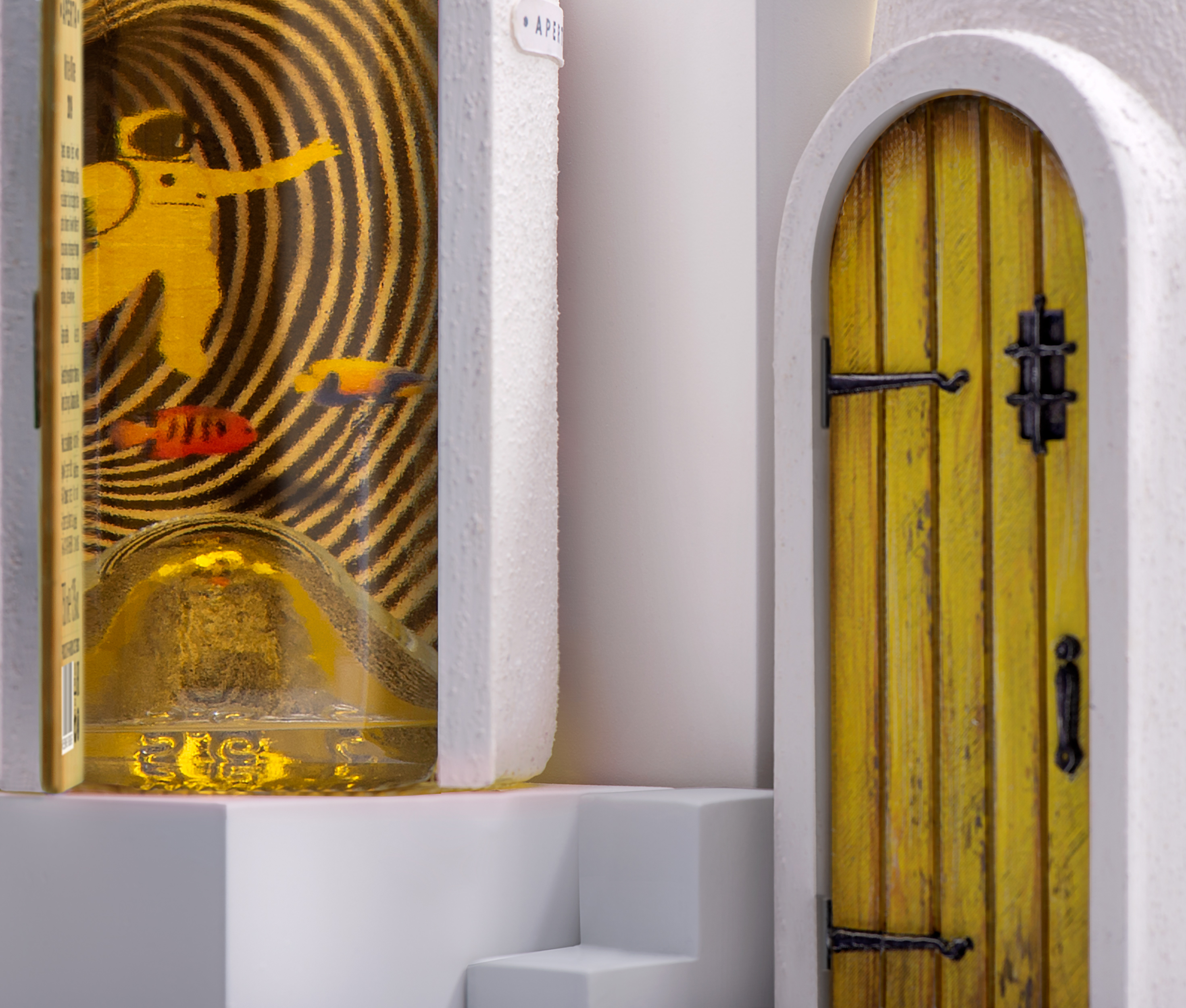
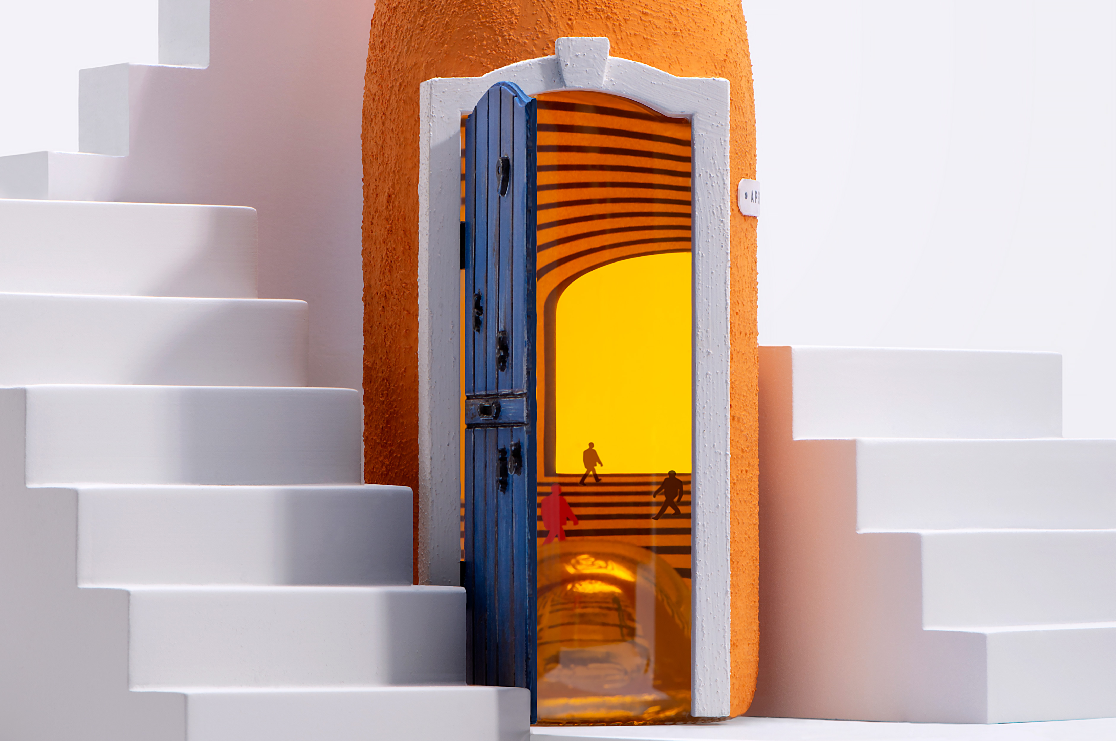
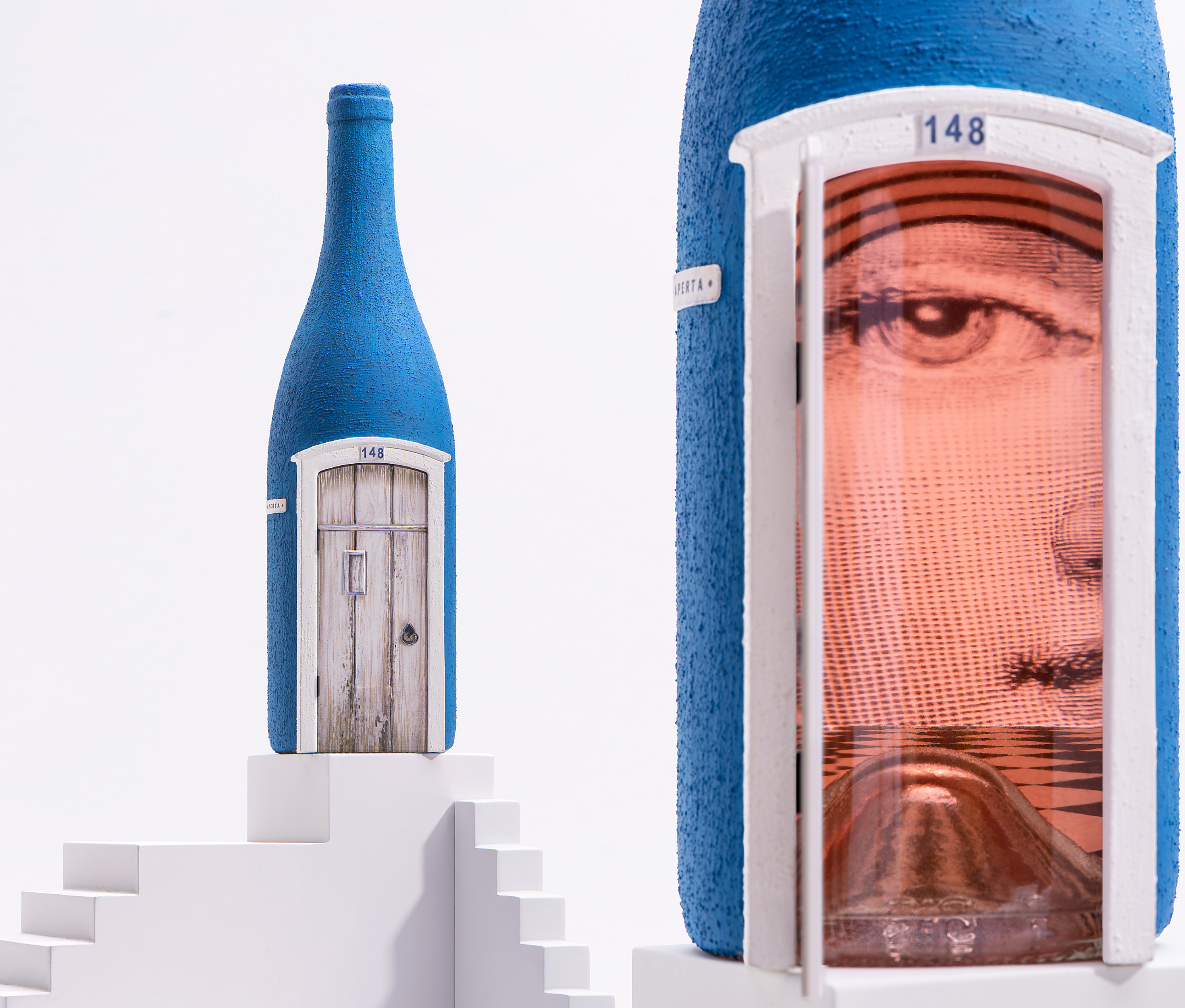
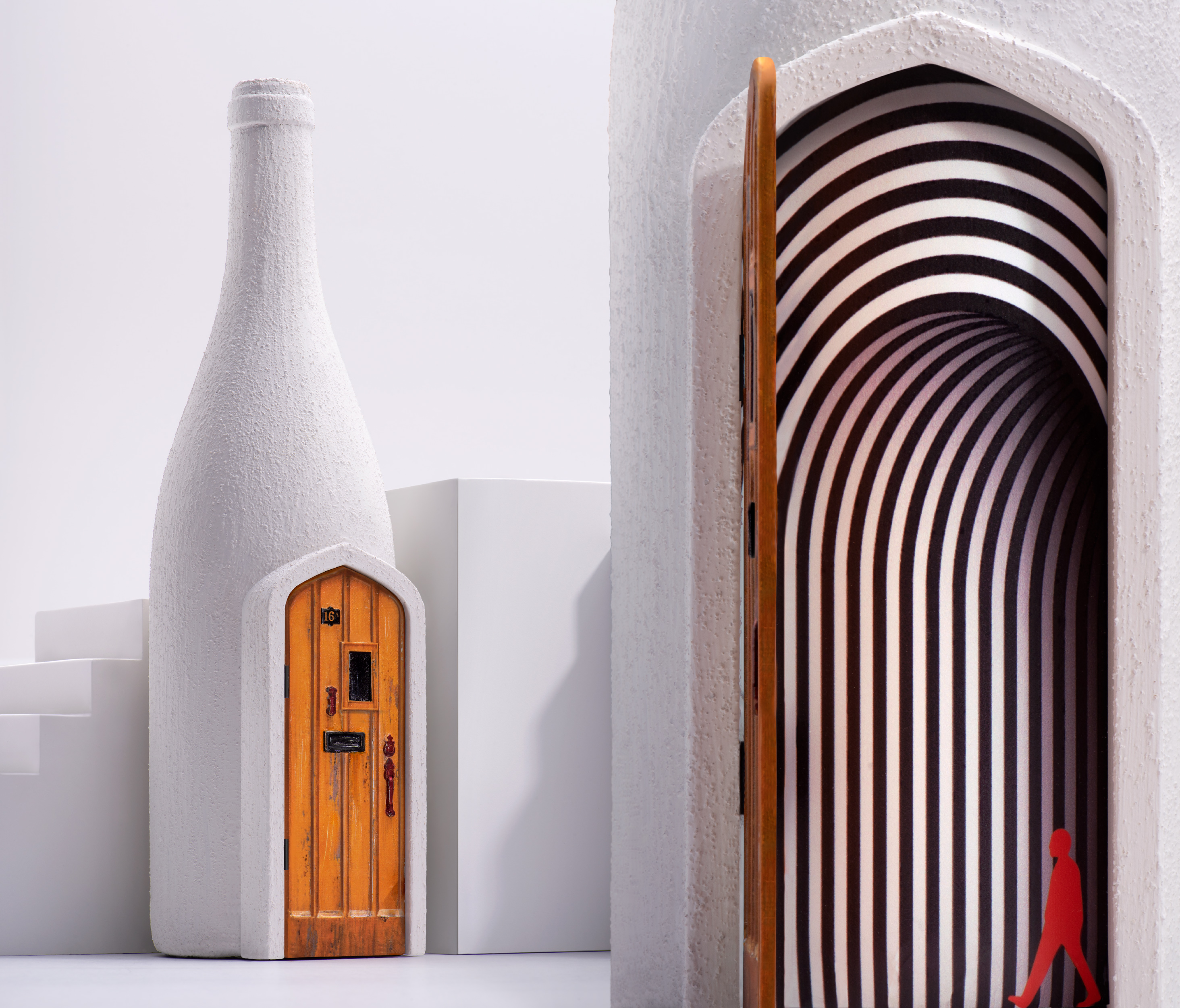
We have embodied our idea in a unique design where the magic, however, does not end when you open the door, but rather, it takes you to the Imaginarium – another dimension.
The Solution
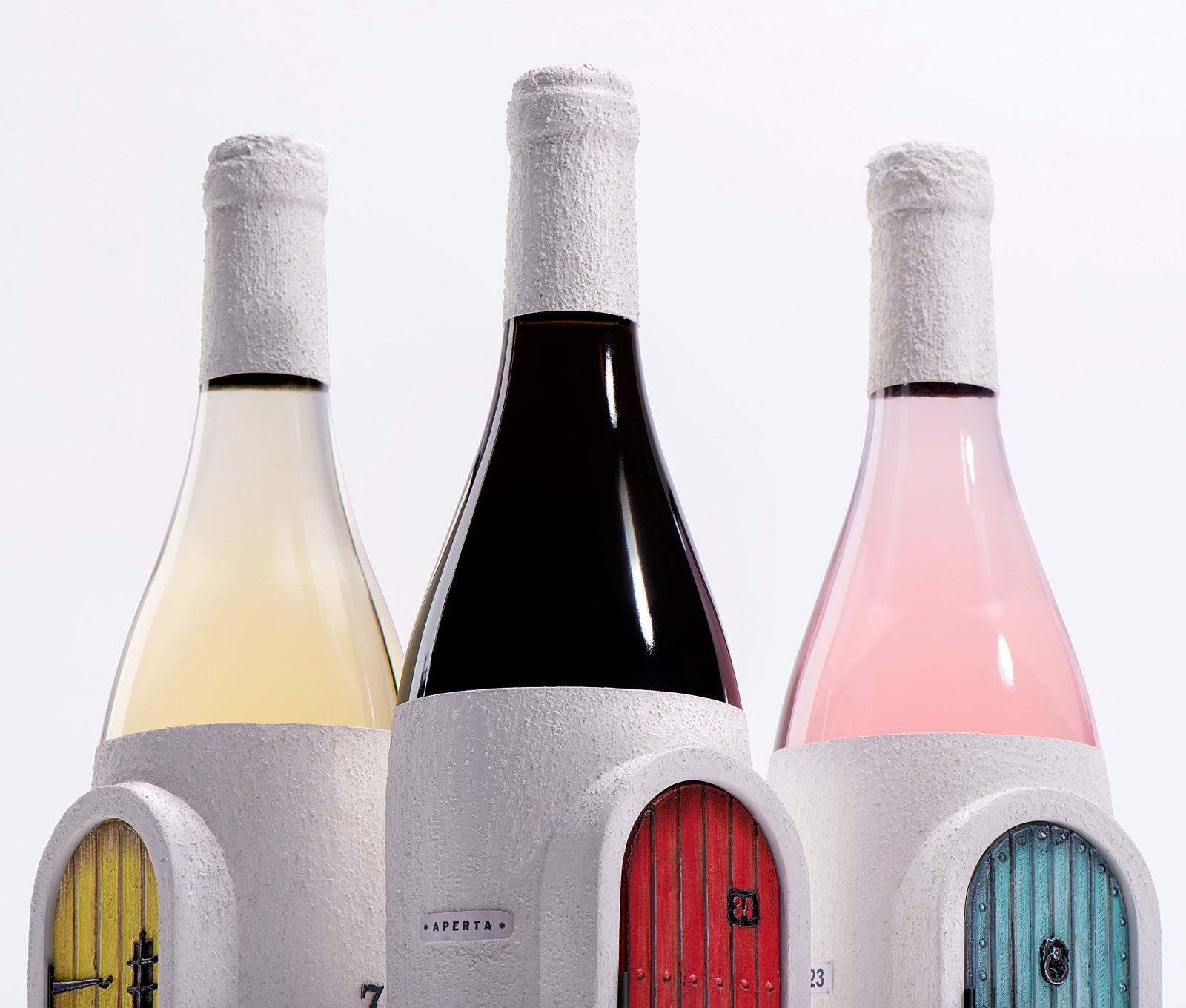
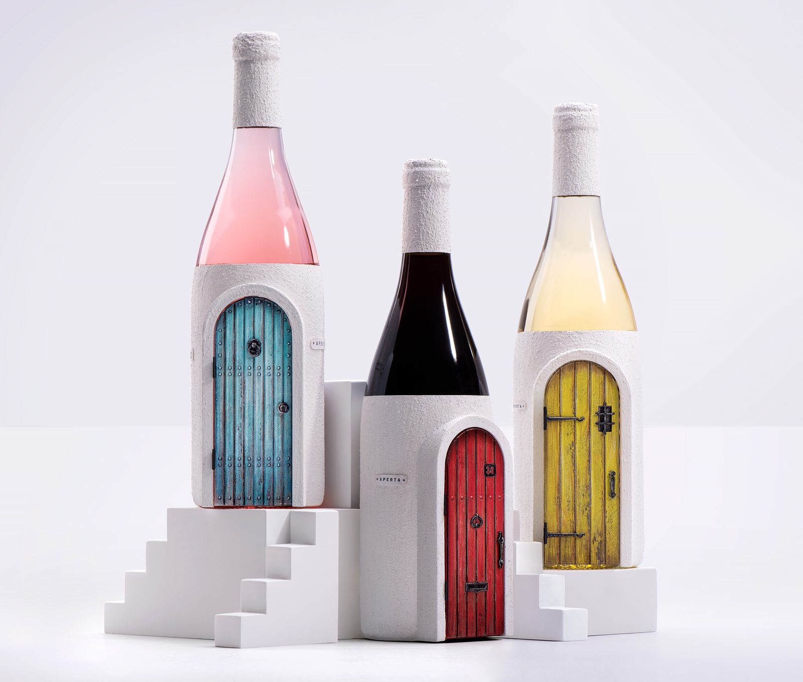
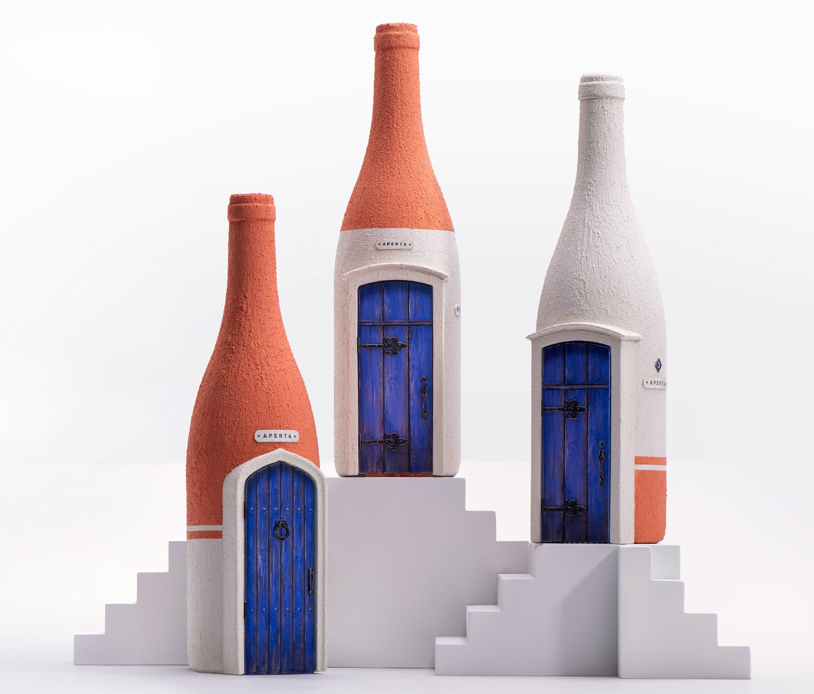
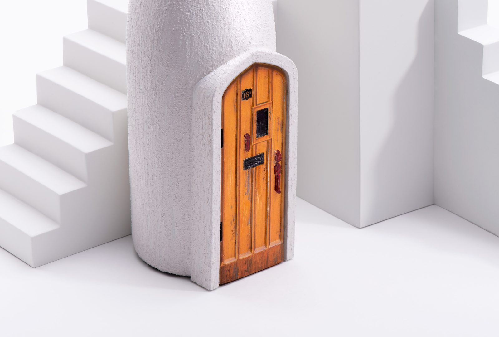
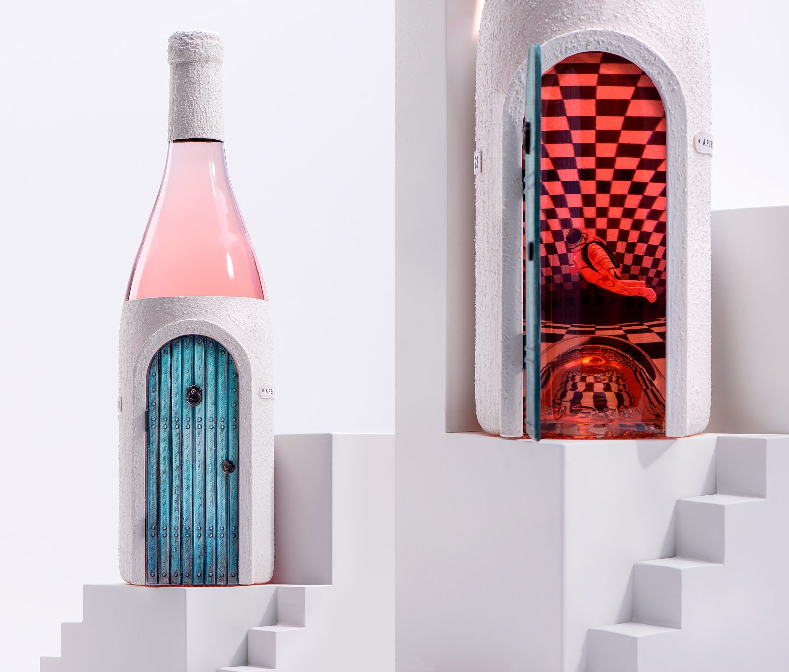
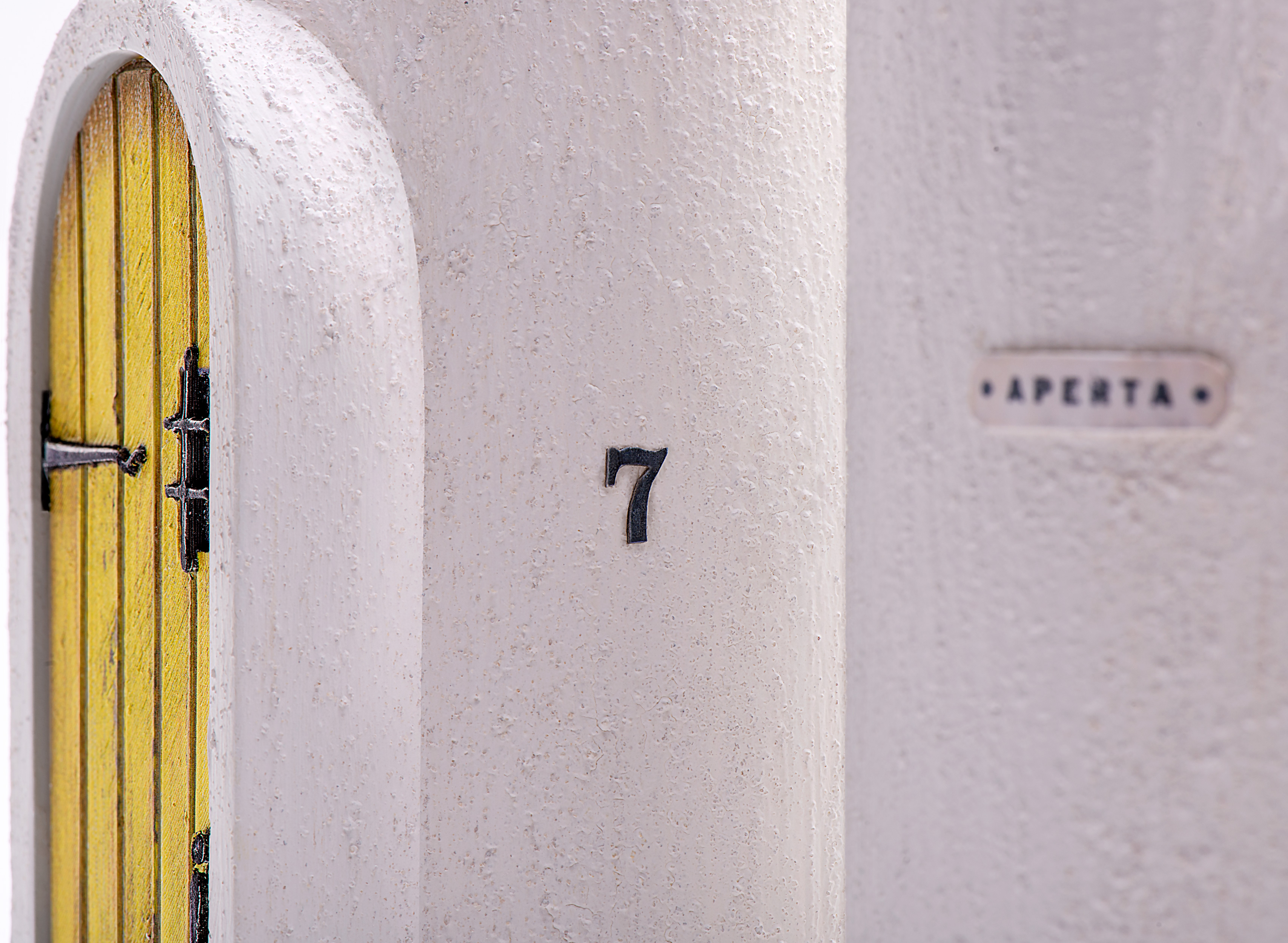
We were given the freedom to create without limits and designed a wine bottle and packaging portraying the unique history and flavor of low-intervention wine. We called it “Aperta”, meaning “open”, using doors on each bottle to lead you into each of their stories. We divided the wines by age – young, middle-aged, and old – each one presented in the three different types, namely rose, white and red wine.
The concept we have designed reflects the essence of the product – the taste of low intervention wine – unexpected, unique, intriguing. The overall design is a visualization of a philosophy of the paths of human life with different doors, stairs, and passages through which man passes, changes, and matures, just as with wine․
The illustrations and colors vary between the three age categories, depicting developing life journeys and different experiences and tendencies from age to age.
The illustrations and appearance of the young wine are light and the bottle is more transparent. The illustrations of the middle-aged wine depict situations of a more impactful life. The young and middle aged wine picture the desire to learn something new, (cosmonaut design, anti-gravity) and have bright, dynamic colors. The old wine uses a more philosophical, conscious approach with calmer colors and deep, mundane illustrations
CREDIT
- Agency/Creative: Backbone Branding
- Article Title: Aperta Wine Label Design by Backbone Branding
- Organisation/Entity: Agency
- Project Type: Packaging
- Project Status: Published
- Agency/Creative Country: Armenia
- Agency/Creative City: Yerevan
- Project Deliverables: Graphic Design, Packaging Design, Structural Design
- Industry: Food/Beverage
- Keywords: WBDS Agency Design Awards 2022/23
-
Credits:
Brand Strategist: Lusie Grigoryan
Creative Director: Stepan Azaryan
Art Director& Illustrator: Marieta Arzumanyan
Junior Designers: Lilit Hovhannisyan Liana Mazmanyan
Photos by: Backbone Branding, Suren Manvelyan


