Anvilar is a brand dedicated to the production of high-standard ACM doors. Technical, modern, and committed to quality, Anvilar was born with the mission of providing products with excellence, safety, and differentiated design for the civil construction sector. Due to the saturated and highly competitive market, it is extremely necessary for Anvilar to have a strong and consistent brand project to face the major players in the sector.
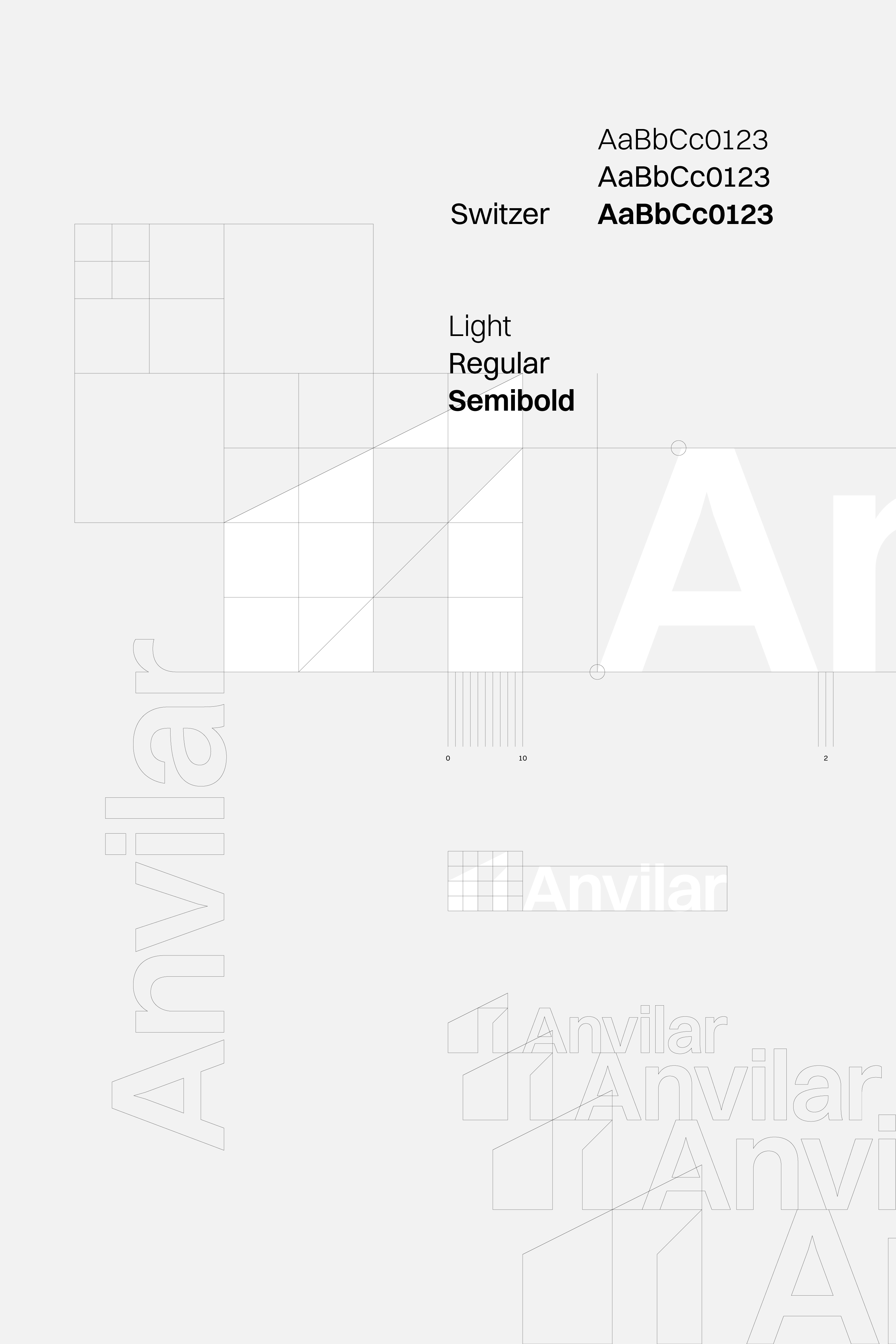
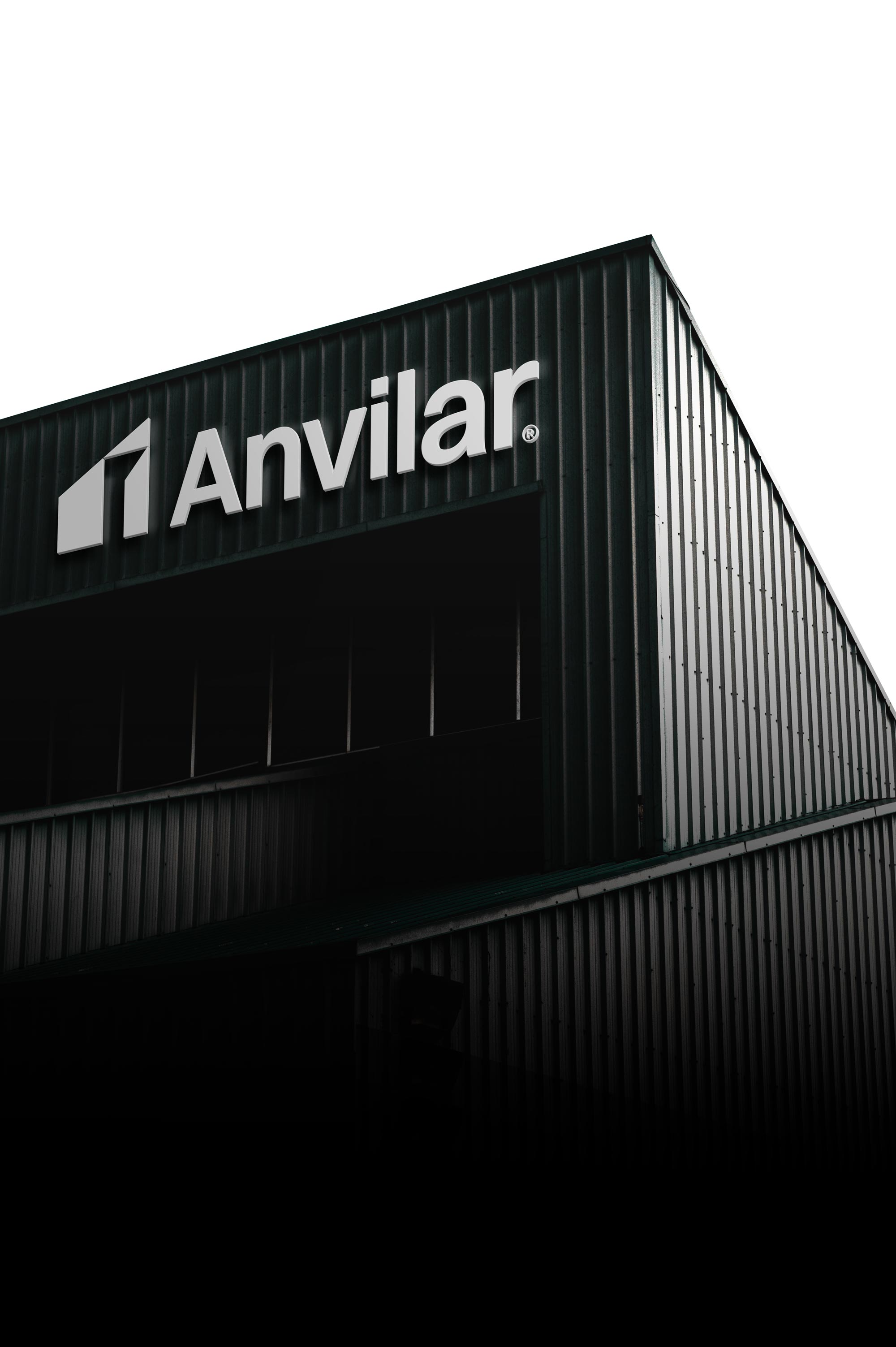
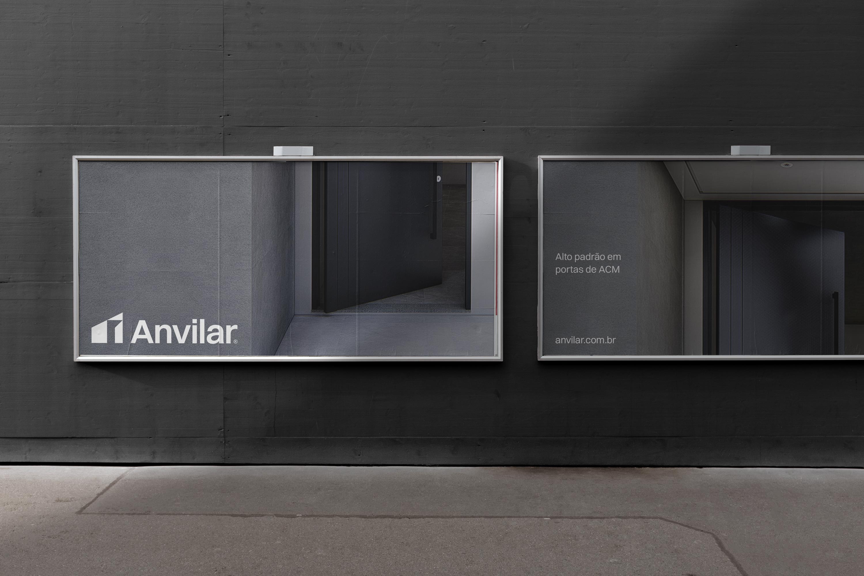
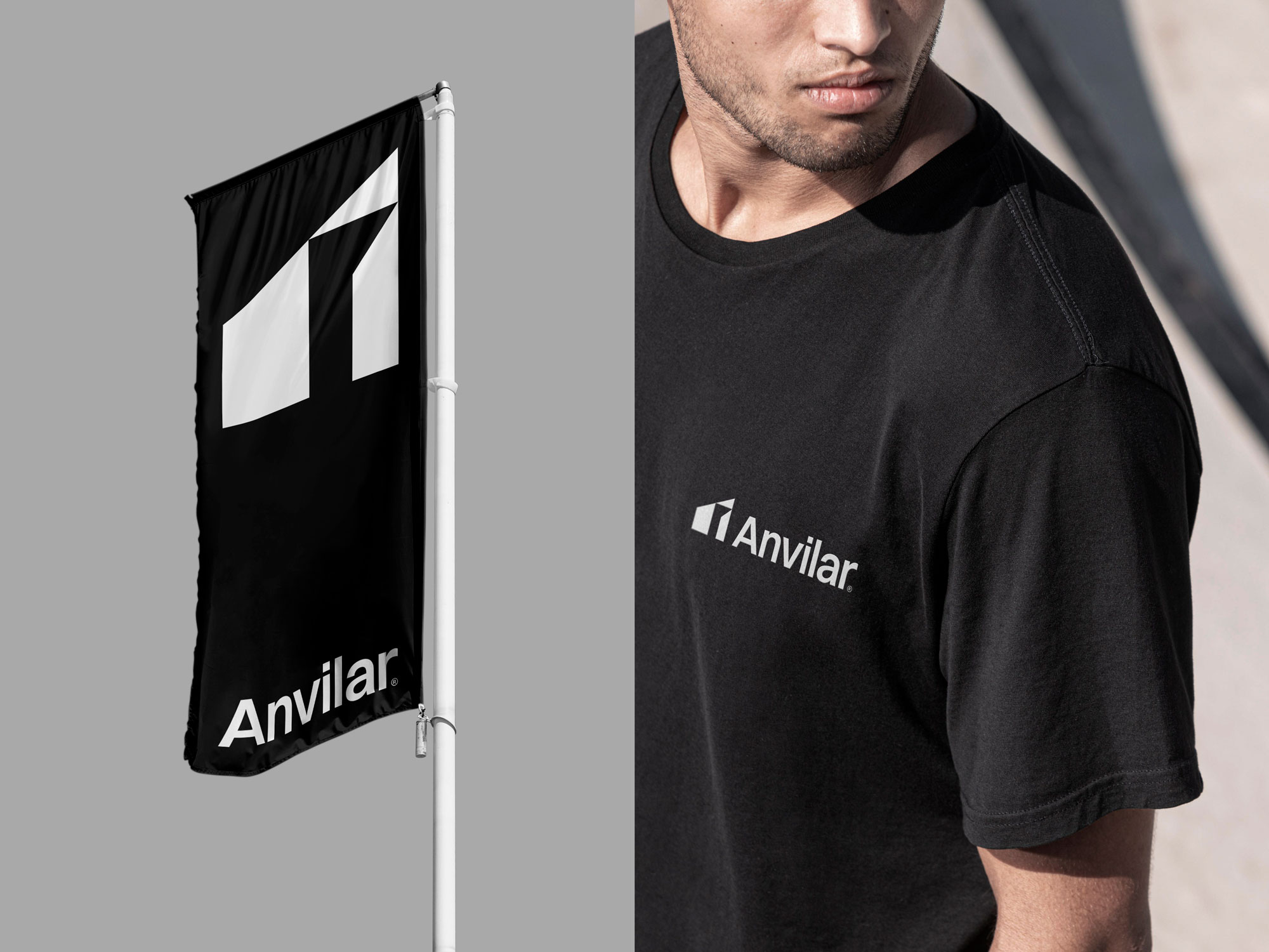
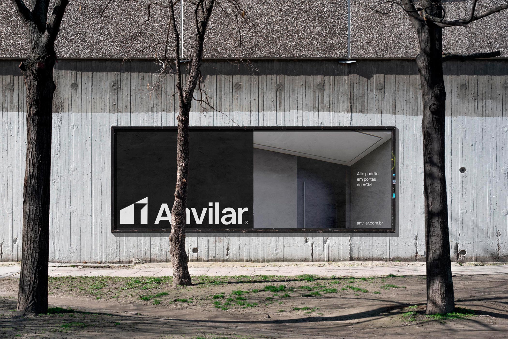
The visual identity developed for Anvilar is memorable, timeless, and distinctive. The visual language created for the brand is centered on two elements designed exclusively for the project: a strong logotype and a captivating symbol. The logotype is modern and elegant, but without looking overbearing. Written in Switzer, a timeless neo-grotesk style typography developed by Indian Type Foundry. Each letter of the logotype was carefully considered, to create a unique composition, without neglecting readability and performance criteria. Switzer is also adopted as Anvilar’s official typography and accompanies the project in all areas of the company’s communication. The symbol is a graphic representation of a modern architectural form. The symbol is designed from a basic modular structure. This structure also helps in the deployment of the entire visual language of the company, a fundamental concept for an integrated project. To complete the program, a neutral chromatic palette defined by black, white, and shades of gray was defined.
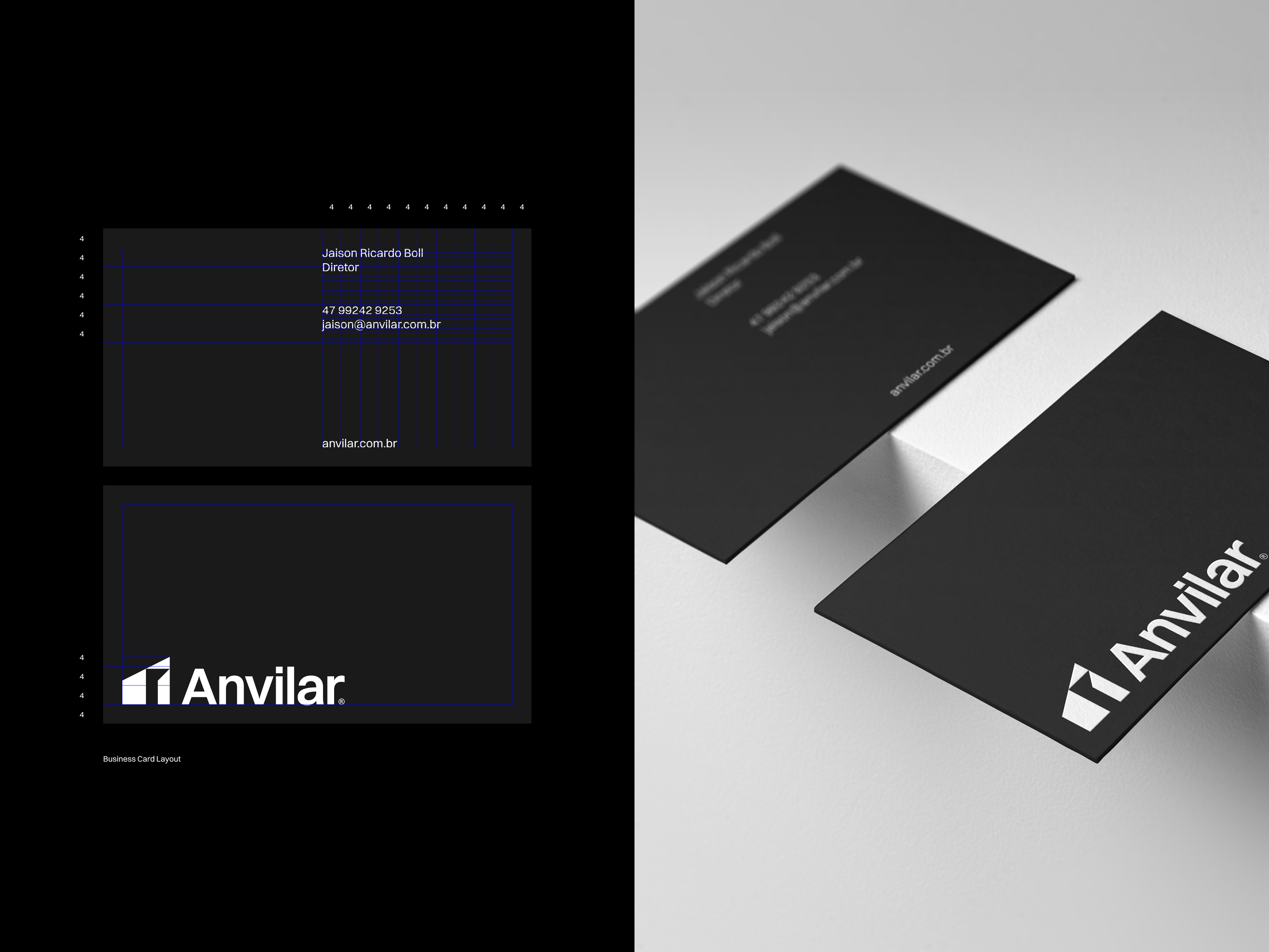
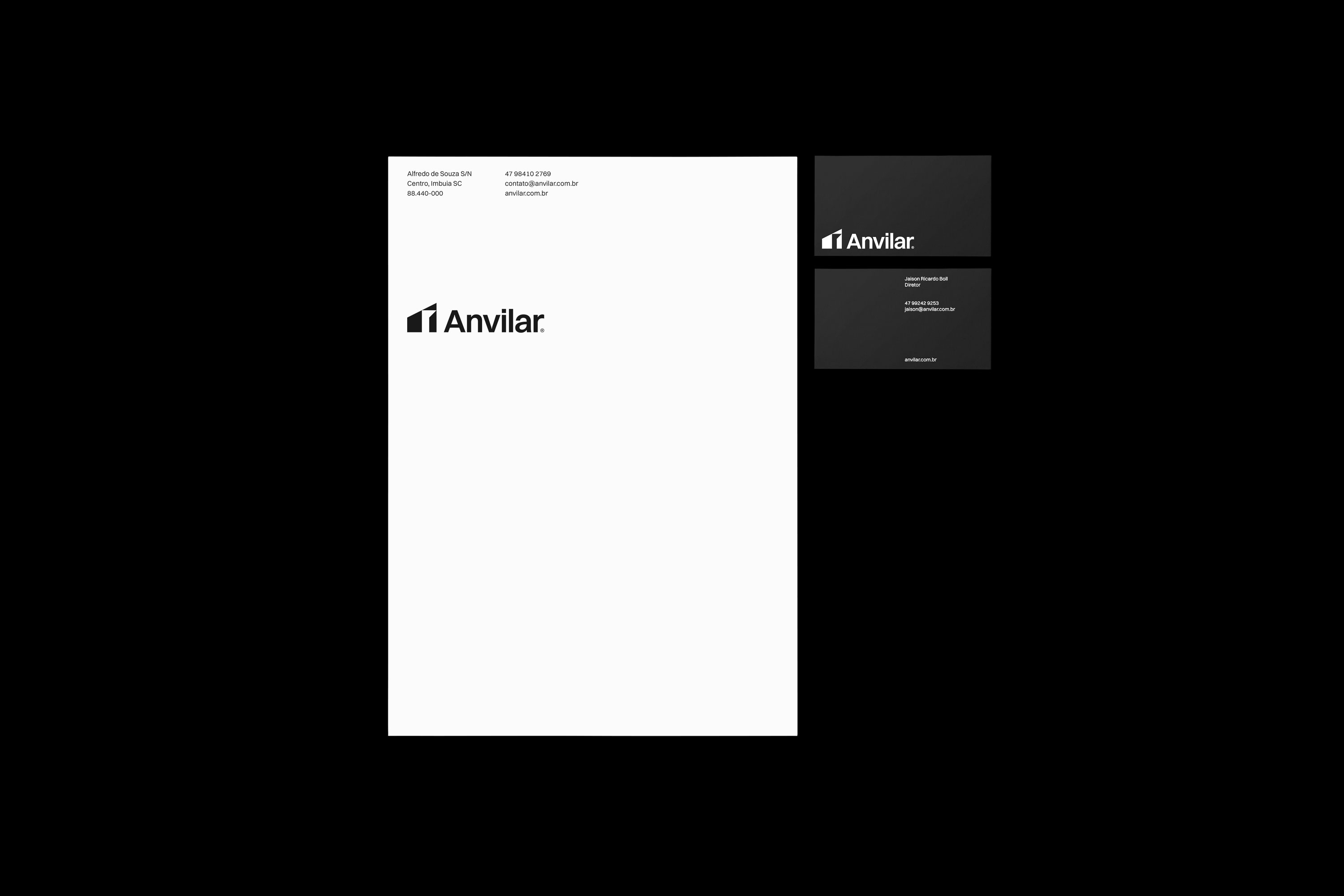
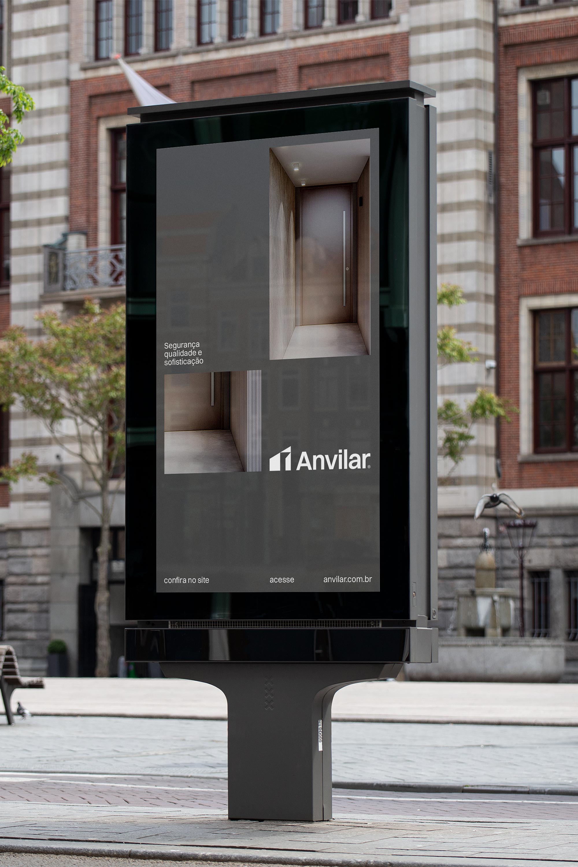
Large blank areas and photography of product details take center stage in the layouts of communication materials, which emphasize an elegant, modern, and organized company.
CREDIT
- Agency/Creative: Cássio Podgaietsky
- Article Title: Anvilar Brand Identity Created by Cássio Podgaietsky
- Organisation/Entity: Agency
- Project Type: Identity
- Project Status: Published
- Agency/Creative Country: Brazil
- Agency/Creative City: Rio do Sul
- Market Region: South America
- Project Deliverables: Brand Design, Brand Guidelines, Brand Identity, Branding, Logo Design
- Industry: Construction
- Keywords: branding, identity, grid, logotype, symbol, minimalism, minimal
-
Credits:
Director: Cássio Podgaietsky


