In the sun-kissed valley of Messinia, where Kalamata is centre, the olive trees have stood for millennia and olive oil is more than commodity; it’s an ancient good that has been passed down from generation to generation. Founded by a visionary farmer from Kalamata back in 1962, Faris Virgin Olive Oil embarked on a journey to share the bounty of this ancient land with the world. What began as a small venture to promote local produce soon blossomed into a pioneering force in Greek commerce, with export activities expanding across Europe by the mid-1970s. Today, Faris, under the stewardship of the third generation, stands as a beacon of quality and tradition in the Peloponnese region.
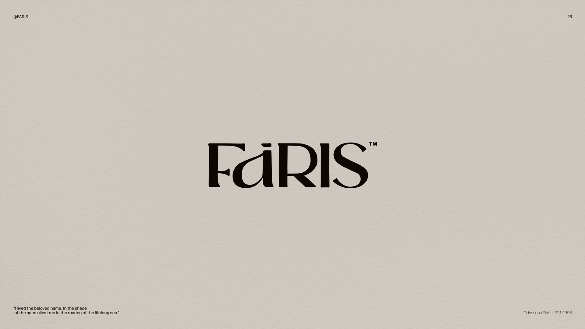
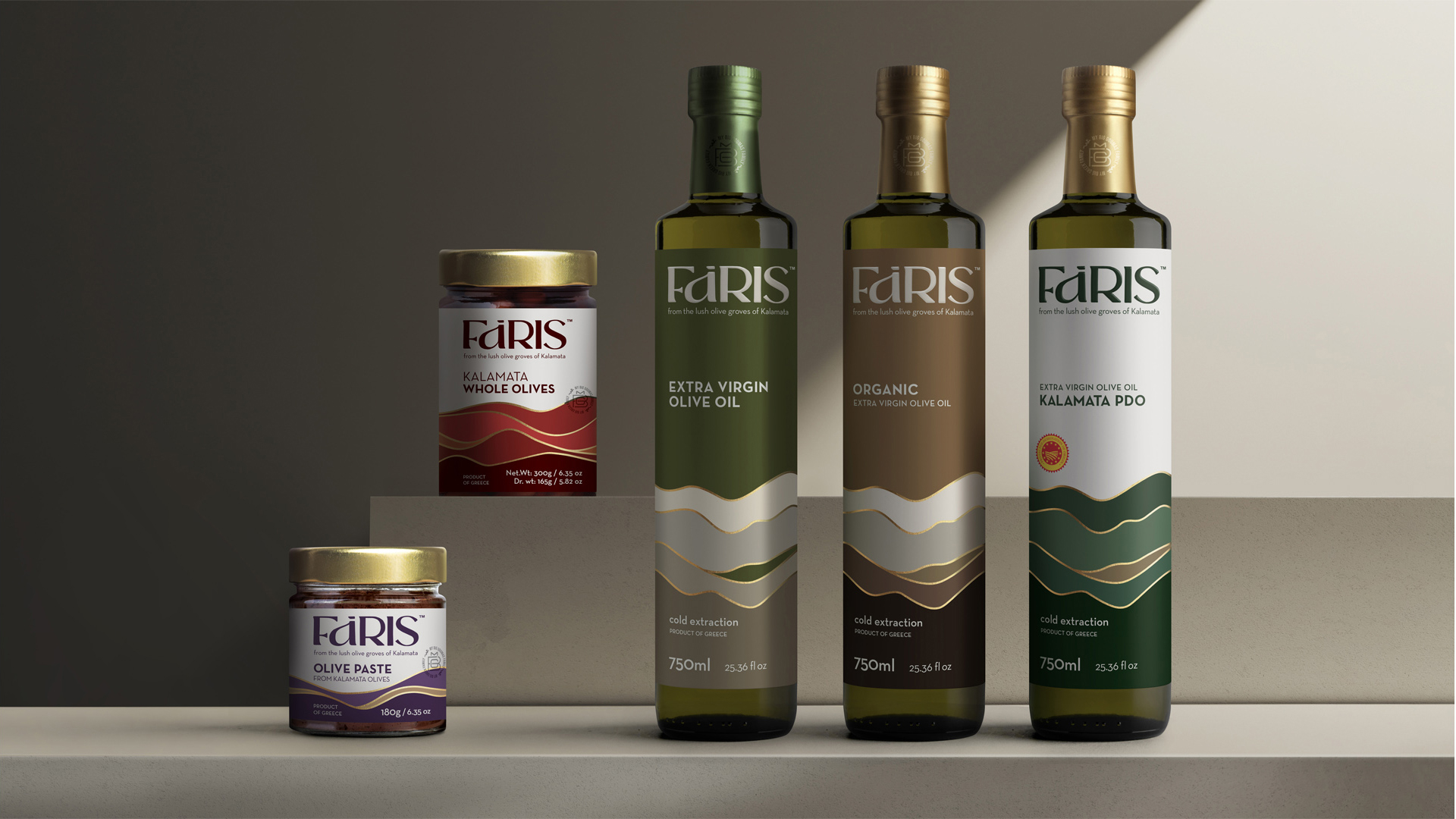
While the essence of Faris lies in its rich history and commitment to excellence, its visual identity serves as a testament to its enduring legacy. The brand’s logo evokes the ancient origins of olive cultivation in the region. The distinctive shape of the letter “a” echoes the form of traditional olive oil containers, symbolizing Faris’ deep connection to its heritage.
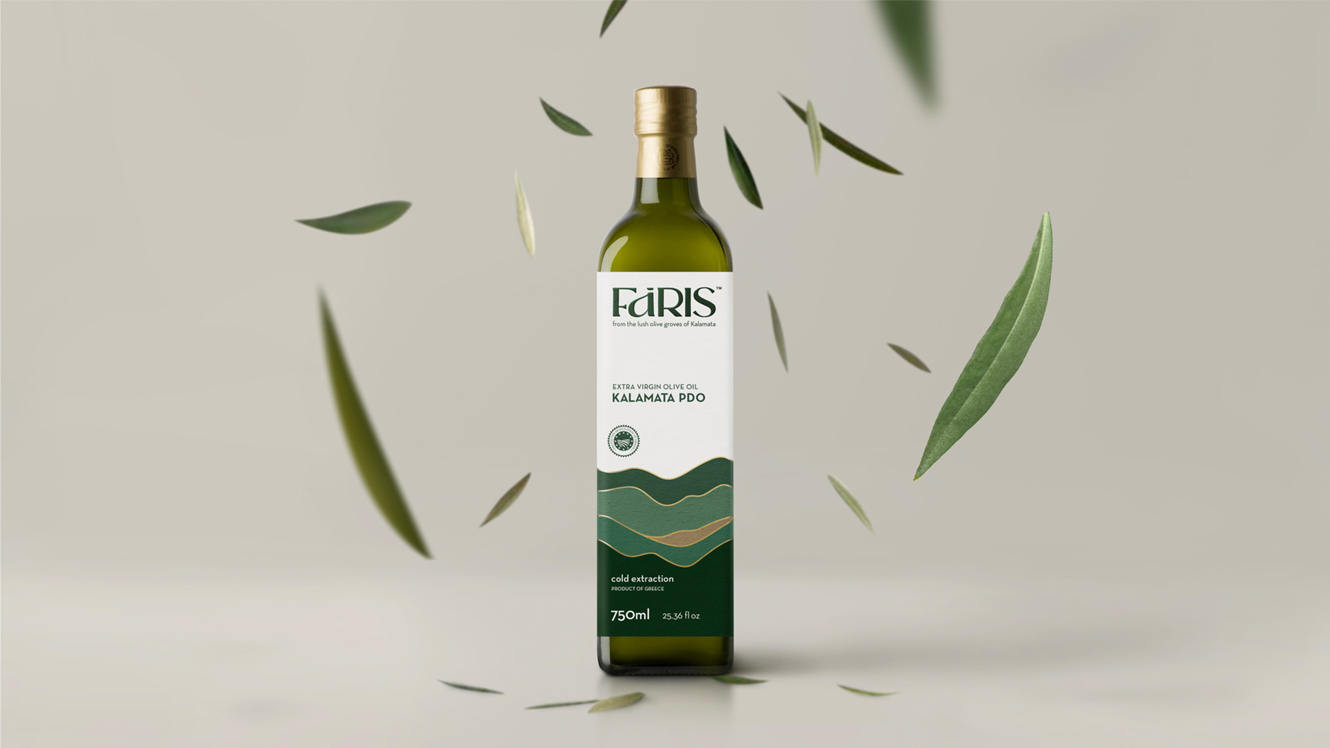
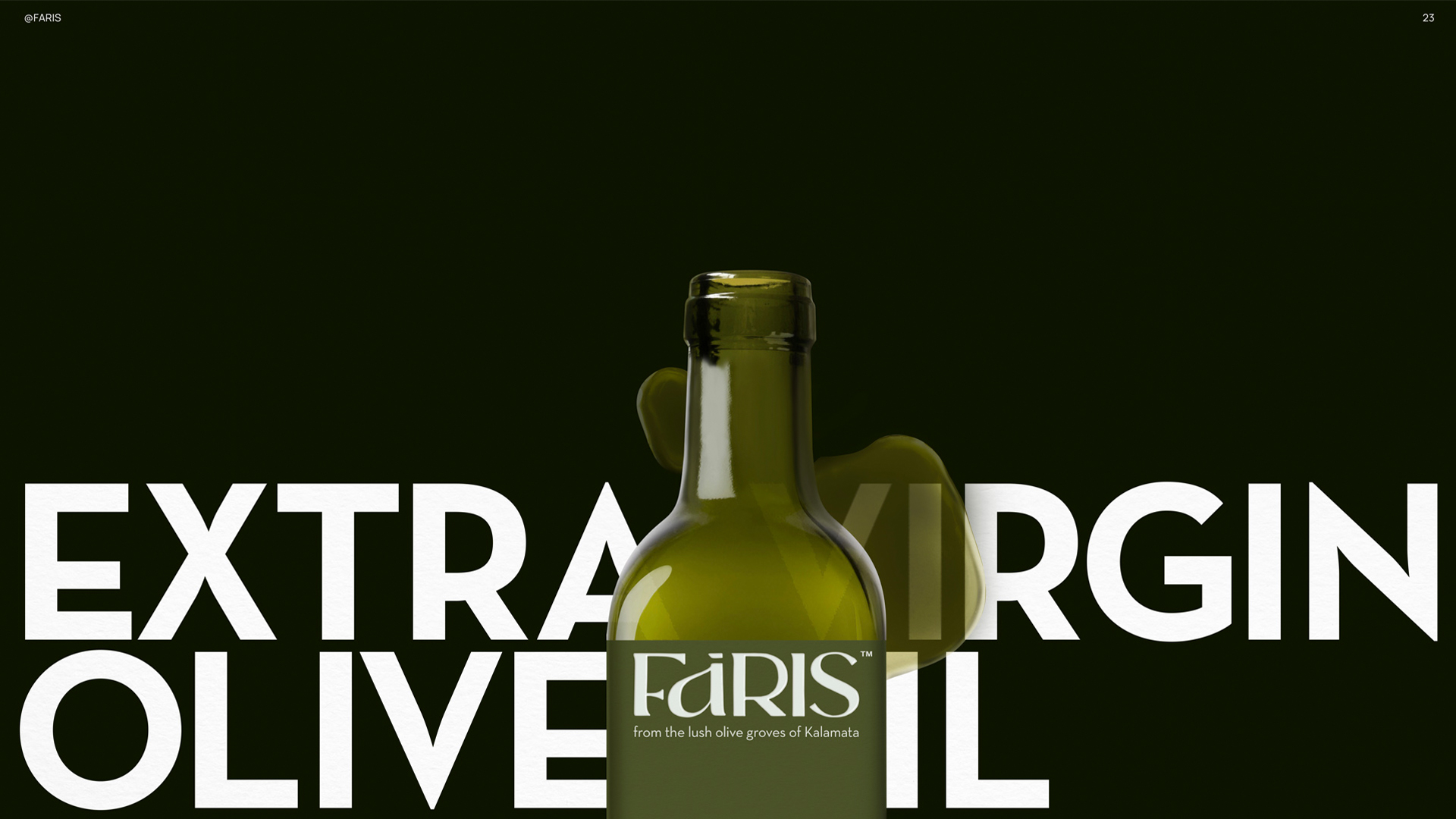
But the design narrative of Faris extends beyond its logo. Each element of its packaging tells a story of craftsmanship, authenticity, and the timeless allure of Messinian olive oil. From the choice of bottle shapes to the intricate details of label design, every aspect has been meticulously curated to evoke a sense of tradition and sophistication.
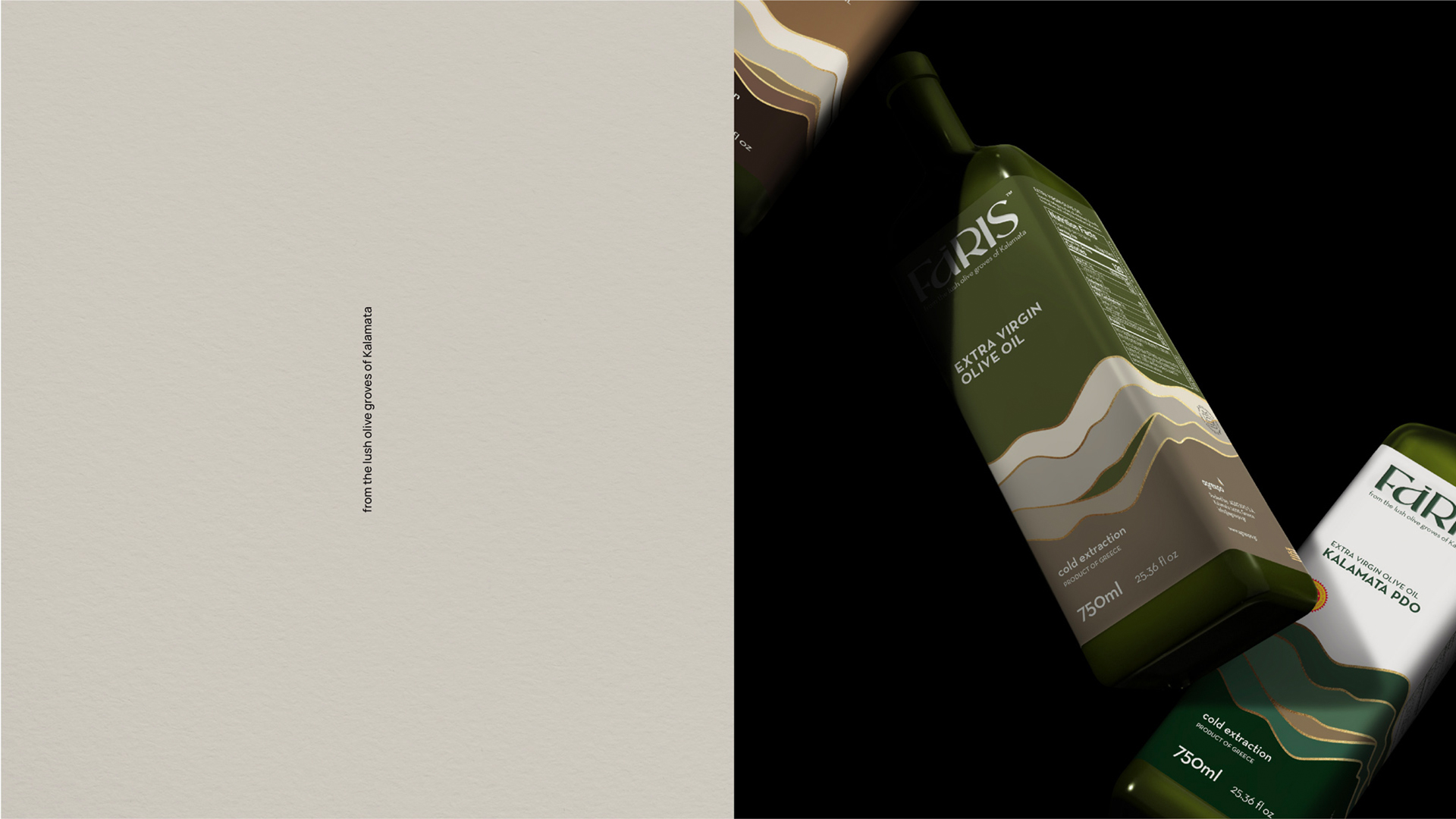
Faris’ commitment to quality is not only reflected in its products but also in its packaging. The Marasca and Dorica bottles, available in various sizes, are adorned with labels that pay homage to the picturesque landscapes of Messinia. The design serves as a bridge between the past and the future, where the beauty of tradition is conveyed through a simple yet powerful graphic: Lines. They resemble the undulating fields of the Messinian landscape with Mount Taygetos in the background or the movement of olive oil as it flows from clay and modern dispensers or the robes of ancient women fluttering in the wind as they harvest fruit from the trees or even the ever-changing waves of the sea in Kalamata. Among these shapes, the colour gold symbolizes both the sun and the premium quality of the brand while the fonts evoke a sense of elegance and refinement.
With every brushstroke, we celebrate not only the product and its creator but also the people of Messinia. Our design is more than just aesthetics; it is a heartfelt tribute to the land, culture, and history. It is a visual language that encapsulates the very essence of Faris Olive Oil – a product that transcends borders and speaks to the soul.
CREDIT
- Agency/Creative: A.S. Strategy Branding & Communication
- Article Title: Antonia Skaraki Creates Brand Identity and Packaging Design for Faris Virgin Olive Oil
- Organisation/Entity: Agency
- Project Type: Packaging
- Project Status: Published
- Agency/Creative Country: Greece
- Agency/Creative City: Athens
- Market Region: Europe
- Project Deliverables: Brand Design, Packaging Design
- Format: Bottle
- Industry: Food/Beverage
- Keywords: WBDS Agency Design Awards 2024/25 , Corporate Identity, Brand Strategy, Brand Development, Brand Growth, Brand Identity, Design Strategy, Typography, Visual Identity
-
Credits:
Creative Director: Antonia Skaraki
Art Director: Andreas Deskas


