


The conception and creation of the Anthony Clark logo were approached as an extensive branding initiative with a singular objective: to encapsulate the business’s core principles and inherent DNA. The project entailed a scrupulous process of research, brainstorming, and actualisation to create a logo that transcends a simple visual signifier.
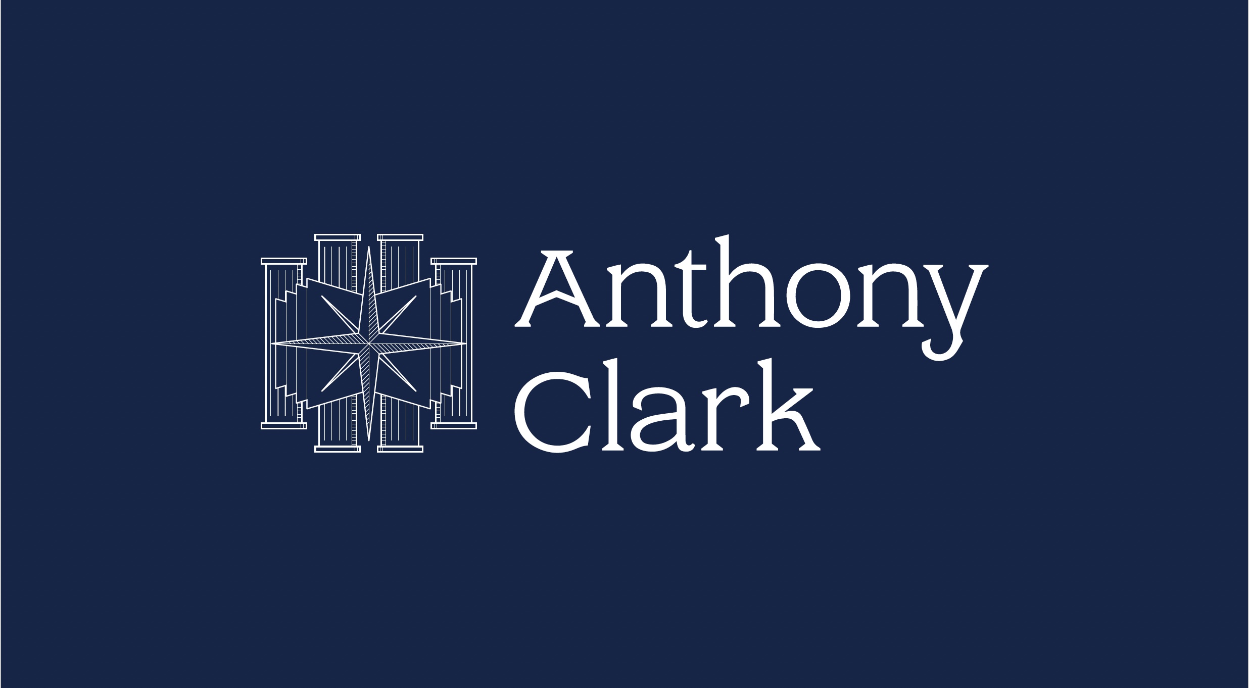
The logo was meticulously crafted to personify confidence and professionalism, the bedrock of the Anthony Clark brand identity. Its potent symbolism and typographic expressions leave a lasting imprint, personifying a unique brand persona that is easily identifiable and unforgettable.
Every element of the logo was thoughtfully designed to embody the brand’s principles, enabling it to shine brightly and convey a powerful message without uttering a single word. To maintain brand continuity across different platforms, a comprehensive brand guide was developed as part of the project. This guide rigorously delineates the standards, directives, and protocols for utilizing the brand elements, ensuring the brand’s consistency, effectiveness, and fidelity to its original vision, irrespective of its usage context.
Moreover, the project aimed to establish a unified visual narrative for Anthony Clark. Top-notch, consistent, and self-assured visuals were chosen to reflect the brand’s inherent professionalism. This bold and inviting imagery was selected to inspire feelings of fortitude, support, proficiency, and wisdom – the cornerstone values Anthony Clark strives to communicate to its audience.
In summary, the Anthony Clark logo project marked a bold attempt to create a brand identity that encapsulates the brand’s personality, harmoniously merging aesthetic allure with practical design. The final outcome was a testament to the brand’s pursuit of perfection and adherence to its fundamental principles, forming a sturdy brand image that is ready to endure the test of time.
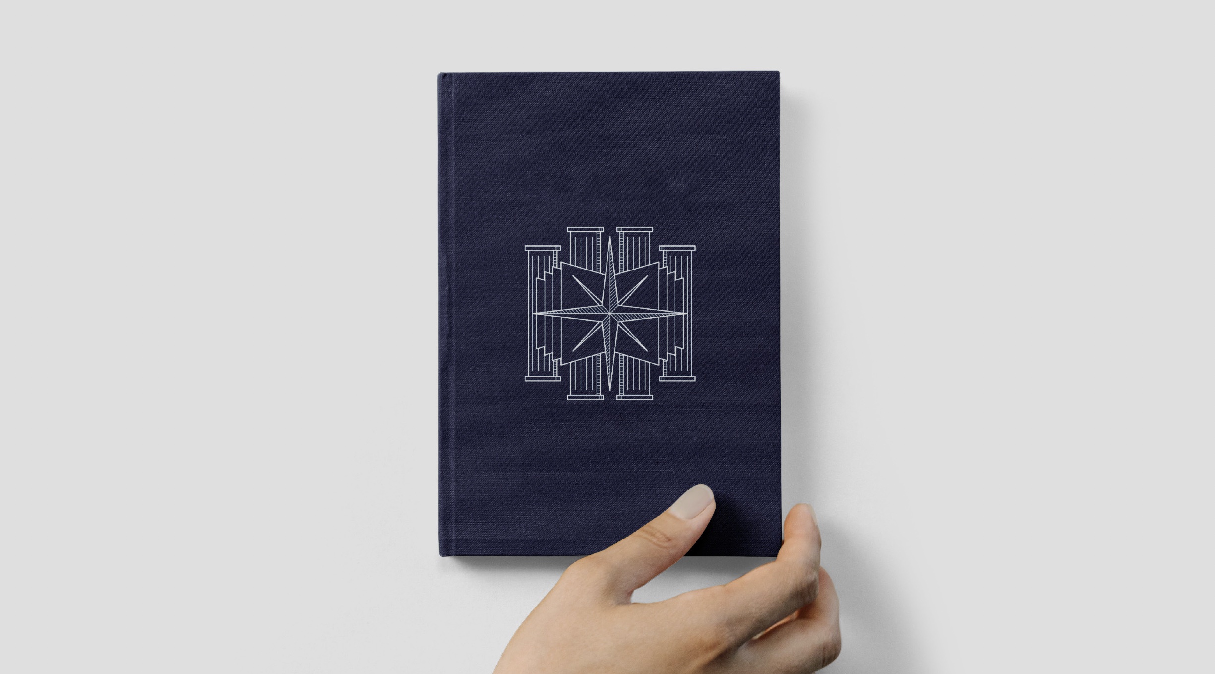
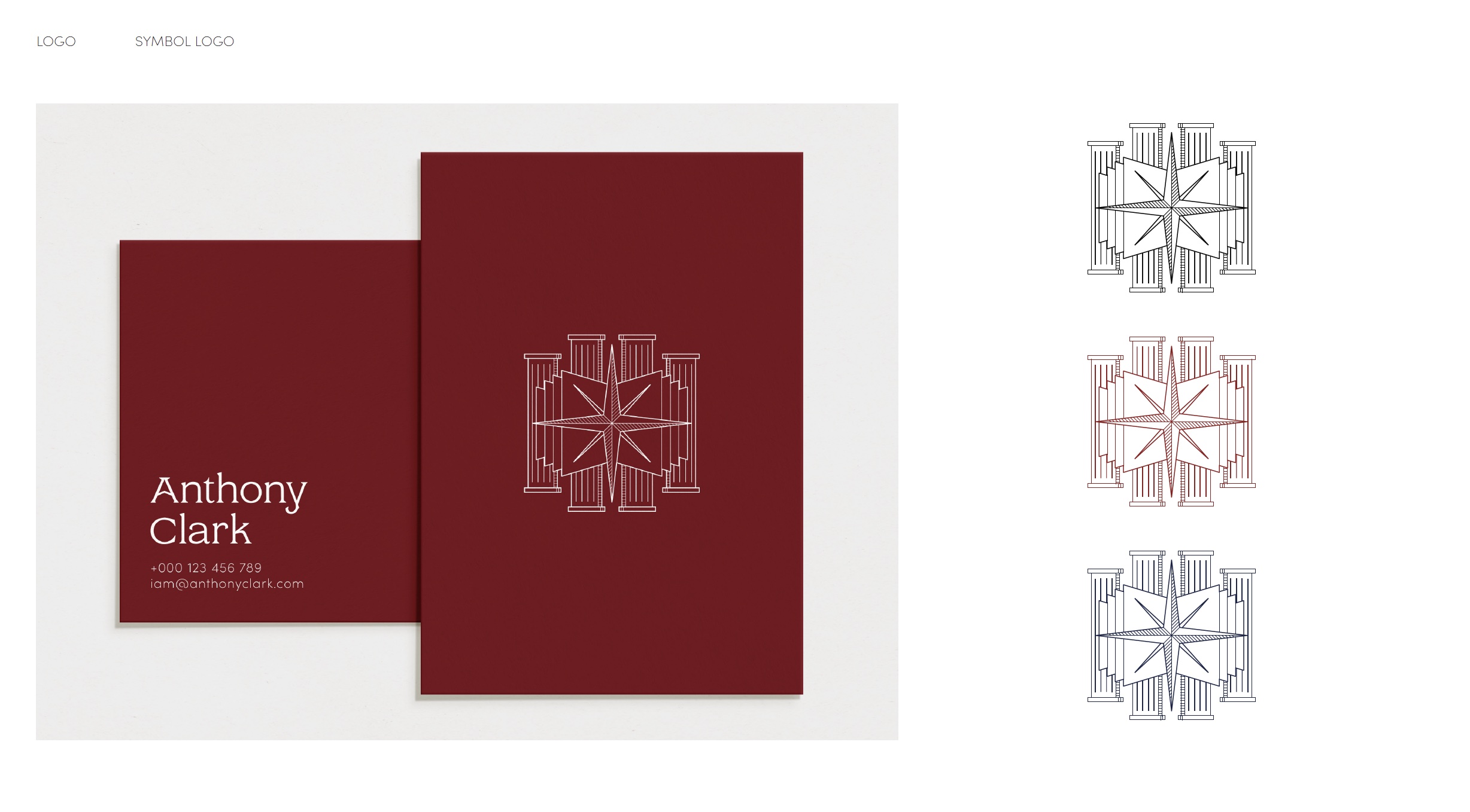
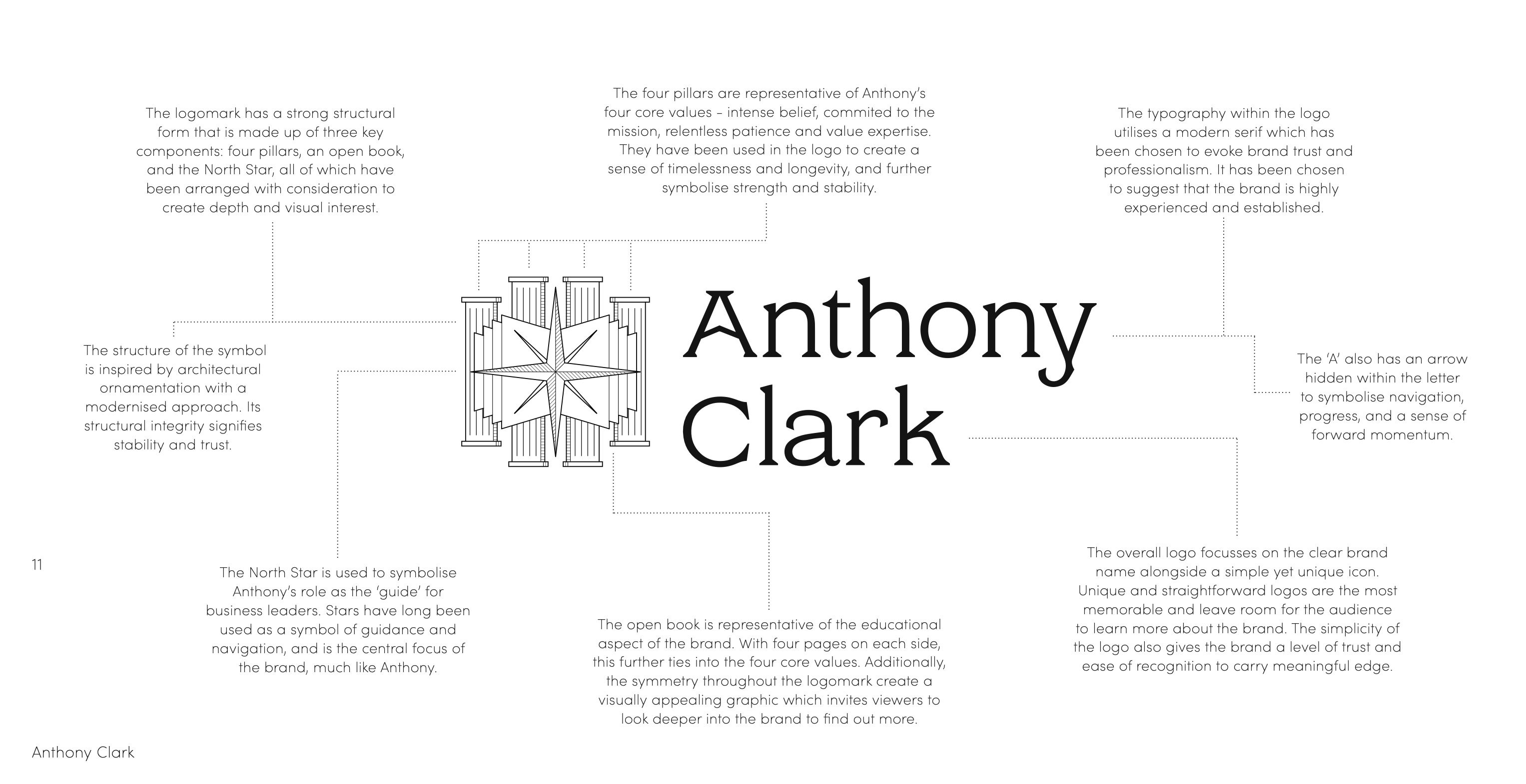
The logo’s four pillars symbolize Anthony’s four core values: intense belief, commited to the mission, relentless patience and value expertise. These pillars are incorporated into the logo to evoke a sense of timelessness and durability, further symbolising strength and steadfastness.
CREDIT
- Agency/Creative: Beinc
- Article Title: Anthony Clark Brand Identity
- Organisation/Entity: Agency
- Project Type: Identity
- Project Status: Published
- Agency/Creative Country: Australia
- Agency/Creative City: Kelvin Grove, Brisbane
- Market Region: Global
- Project Deliverables: Brand Identity, Logo Design
- Industry: Education
- Keywords: Identity, Brand Design Creation
-
Credits:
Design Agency: Beinc


