


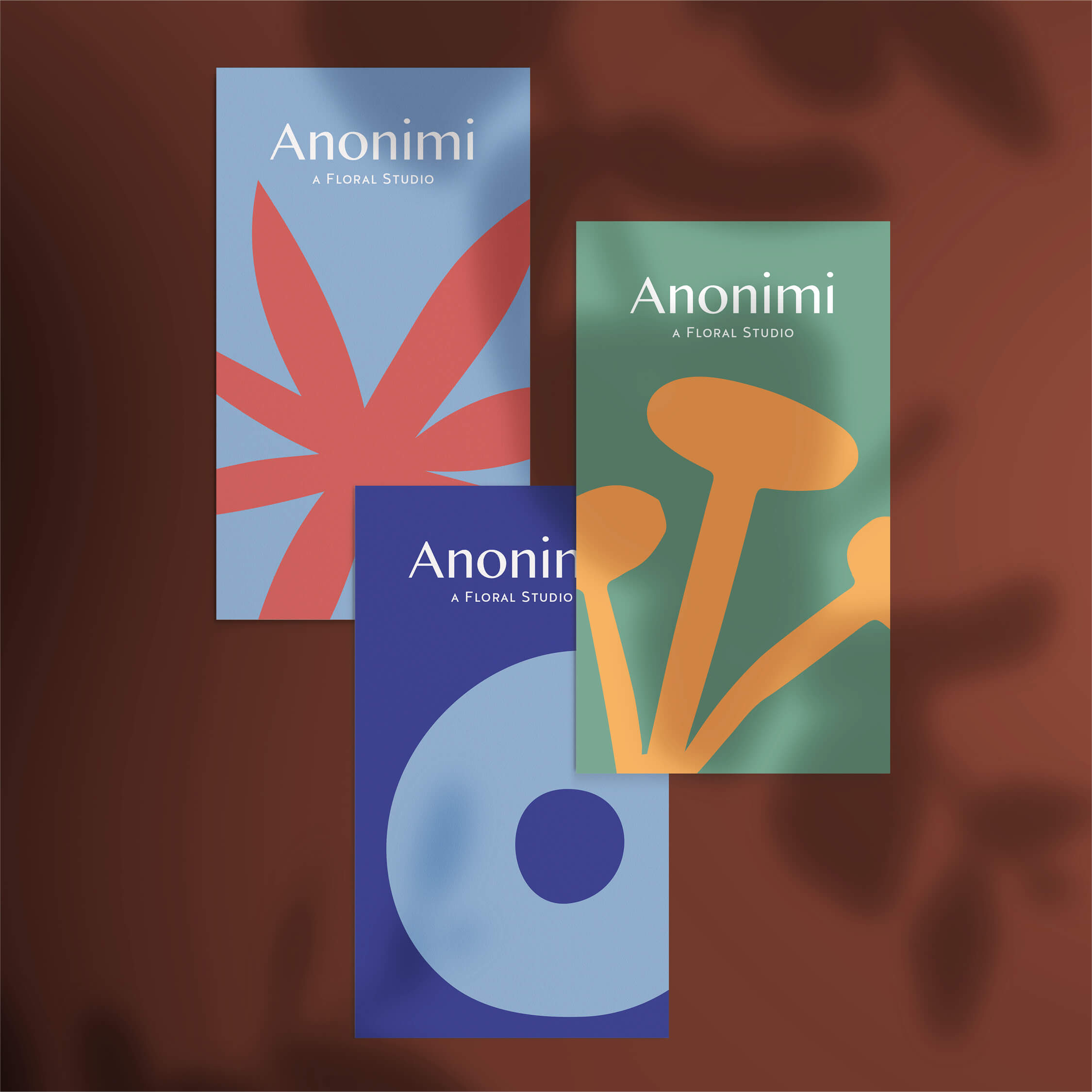
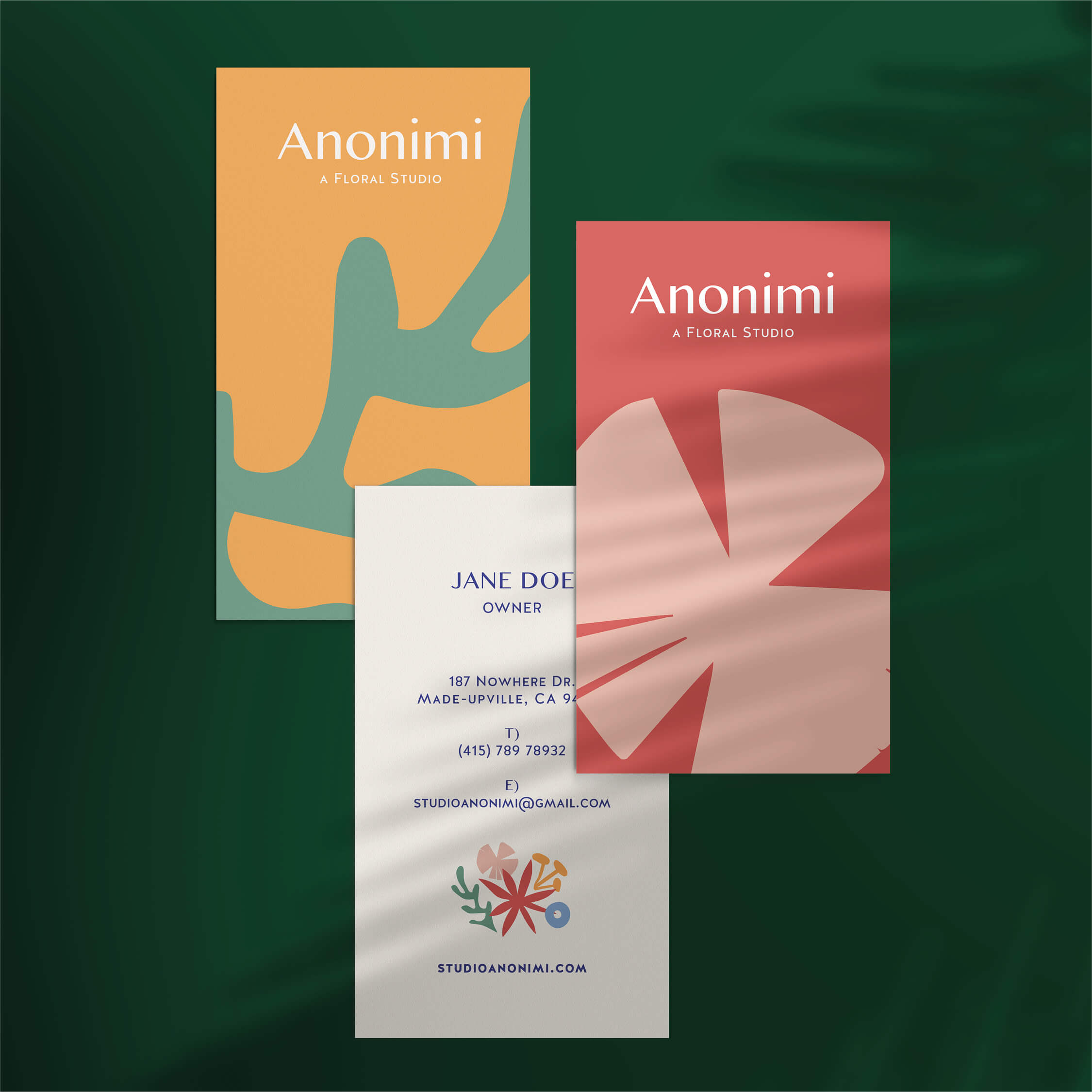
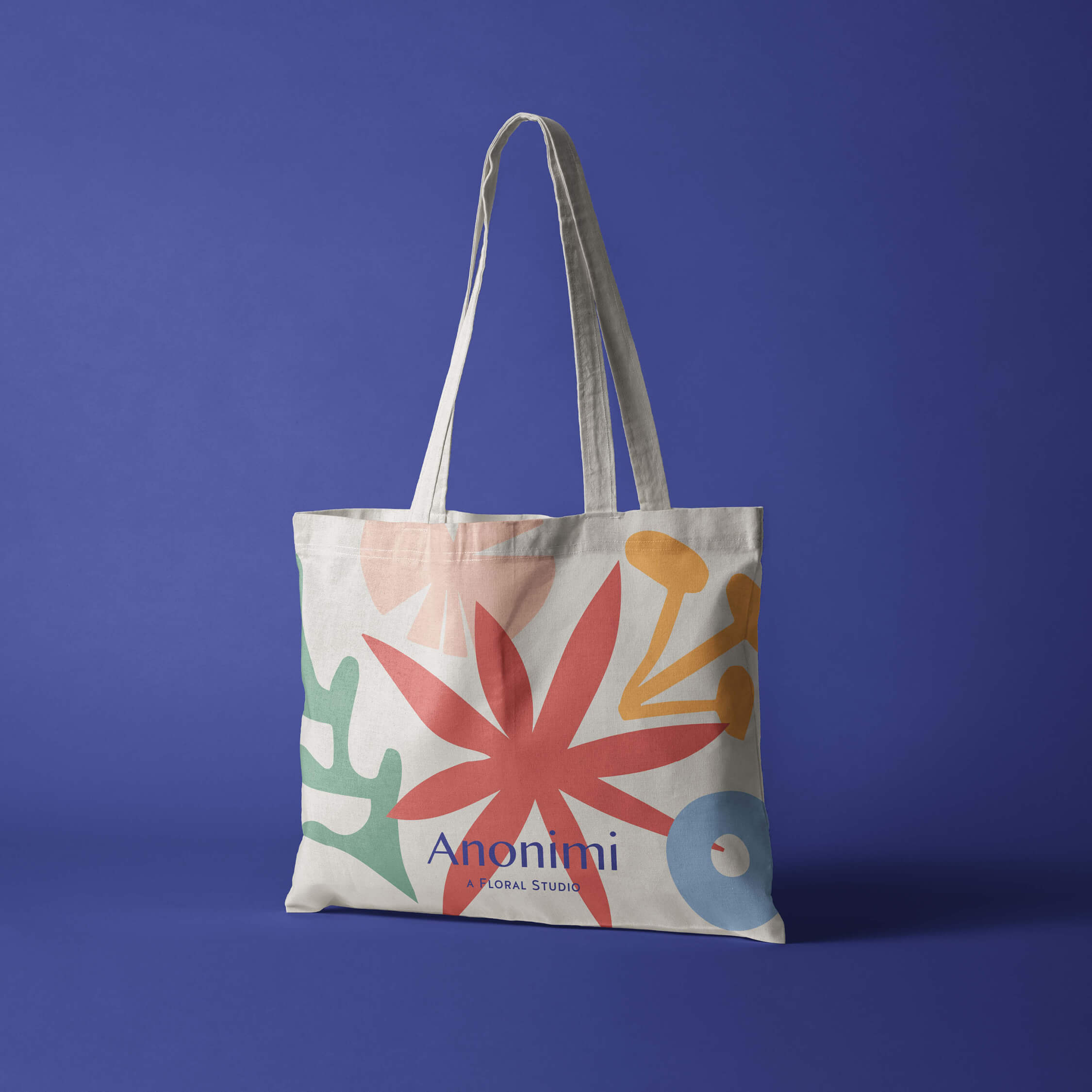
Studio Anonimi is an L.A Based Floral Studio, owned by Debbie and her B.F.F (best furry friend), Tofu. Studio Anonimi’s overall approach to floral designs are Romantic, Playful and Colourful but staying as true to nature as possible.
So, what is in the name Anonimi? It’s Italian for anonymous. “Anonymity allows me to renounce myself, but in renouncing myself I come to affirm myself more strongly. In the same way silence is a denial of [sound], but as a result, the slightest [sound] in silence becomes enormous.” — Joan Miró (One of Debbie’s fav artists).
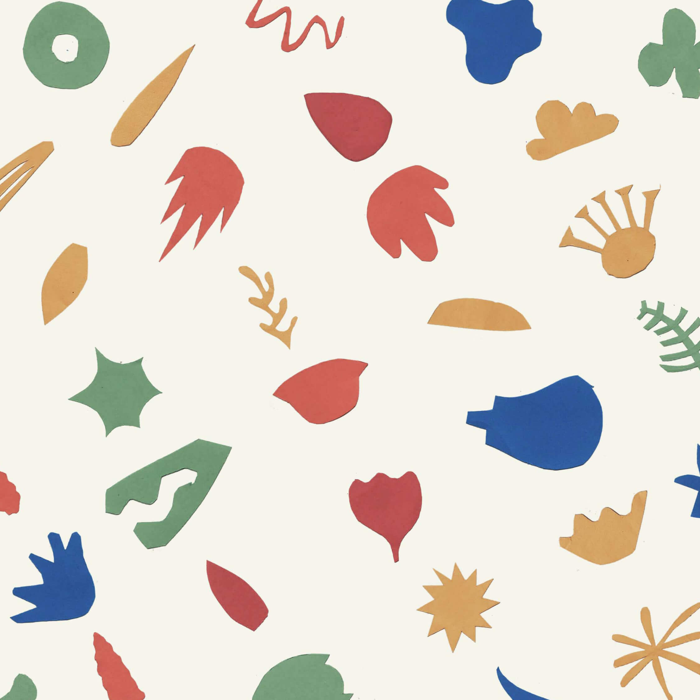
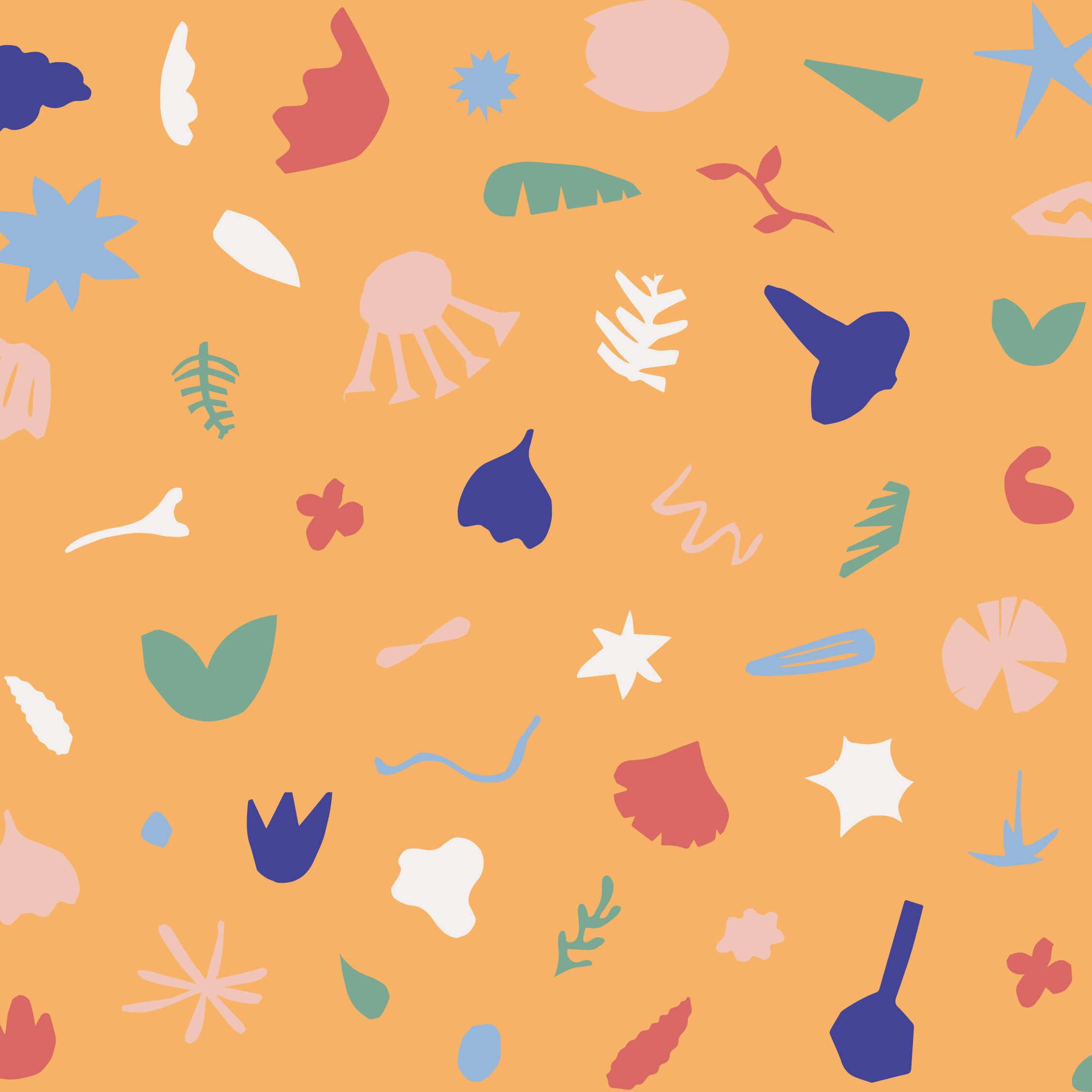
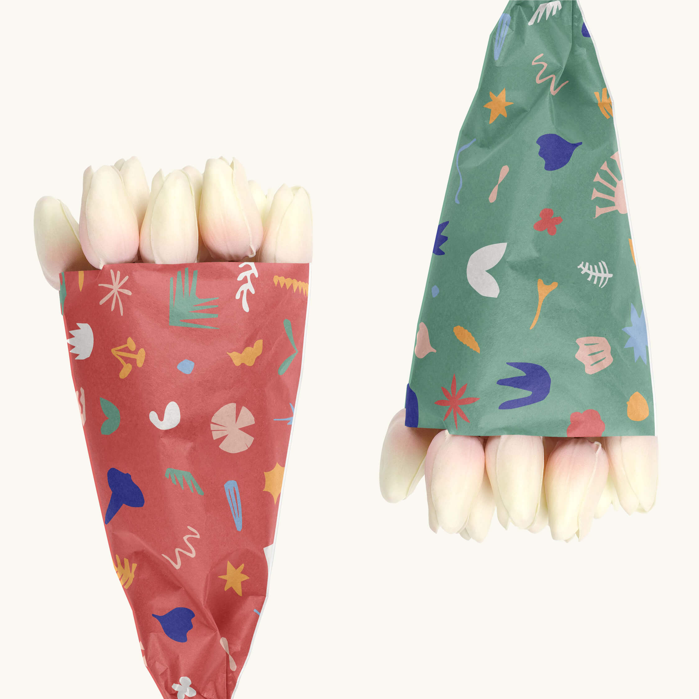
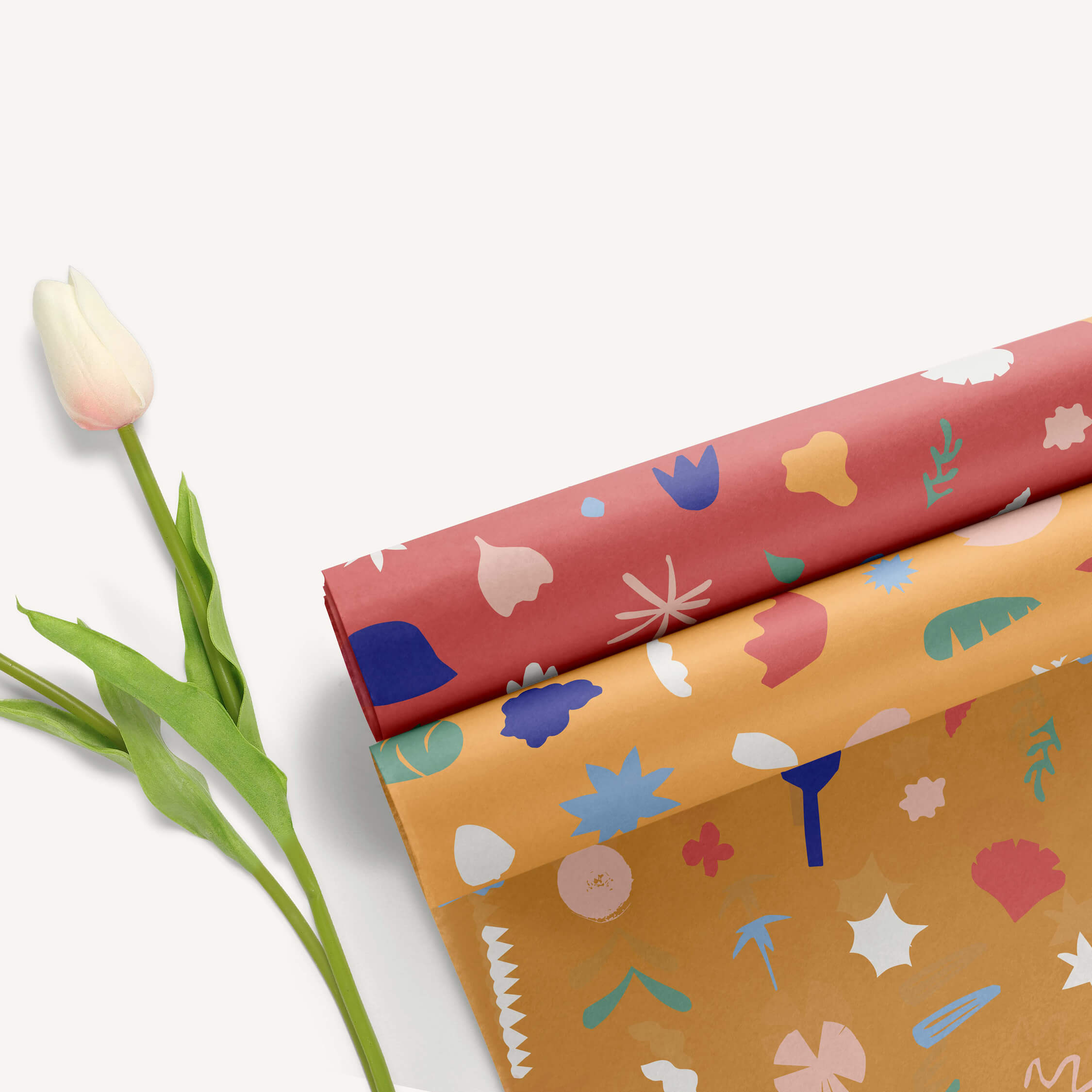
As an ode to the above mentioned (philosophy and style preference) we loved the thought of creating an Identity that represents flowers in its most Simple/Natural/Abstracted form. Each and every flower is so beautifully distinctive in its shape, smell and texture. There’s something interesting (aesthetically) in conveying this in a very graphically bold yet organic manner through biomorphic forms, geometric shapes, and semi-abstracted forms. To keep it as natural as possible we decided to create a bank of various ‘flower-y’ things as handmade paper cut-outs – the actual process of cutting, arranging and creating is also symbolic of the flower arrangement process.
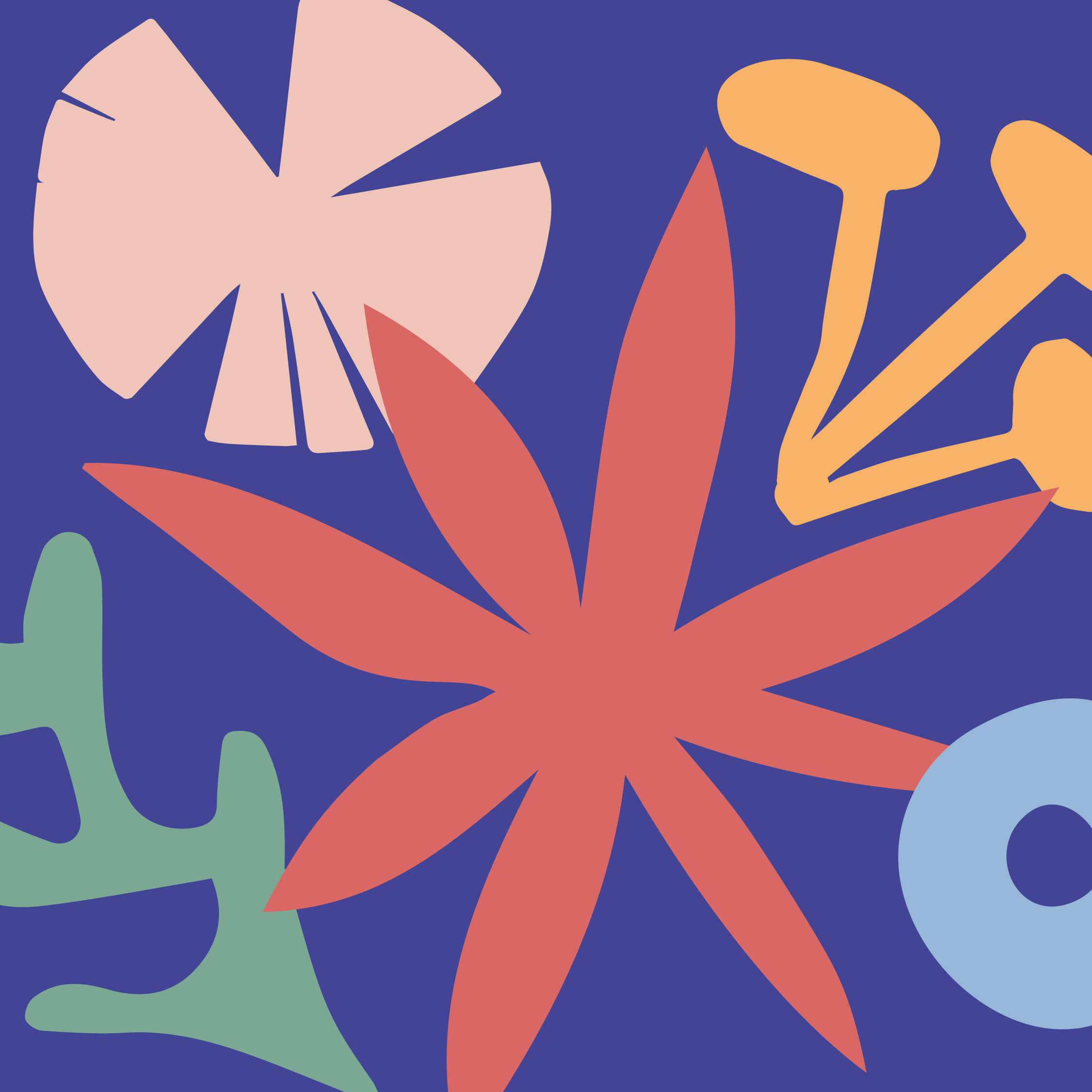
Imagine when viewing different types of flowers (eg. Rose vs. Tulip) from the side (or top), whilst squinting your eyes – you almost get a silhouette-type, solid shape from it…this is what we we’re aiming for. So we went down to the flower market, bought some inspiration and started playing. We ended up with a bank of ‘Unique Anonimi Flower Shapes’. Then this went from ‘Au Naturale’ to ‘Digitale’…..
The Identity end result is Contemporary with a sense of Fun, Spontaneity and Imperfection. Overall it feels Organic, Bold and Expressive with a subtle Feminine Touch.
CREDIT
- Agency/Creative: Blood, Sweat & Polony
- Article Title: Anonimi Floral Studio Logo and Identity
- Organisation/Entity: In-house, Published Commercial Design
- Project Type: Identity
- Agency/Creative Country: South Africa
- Market Region: North America
- Project Deliverables: Brand Identity, Branding, Graphic Design, Identity System, Illustration, Research
- Industry: Entertainment
- Keywords: Flowers / Floral Studio / Handmade / Natural / Organic / Logo / Identity / Contemporary / Graphic Design / Colourful


