


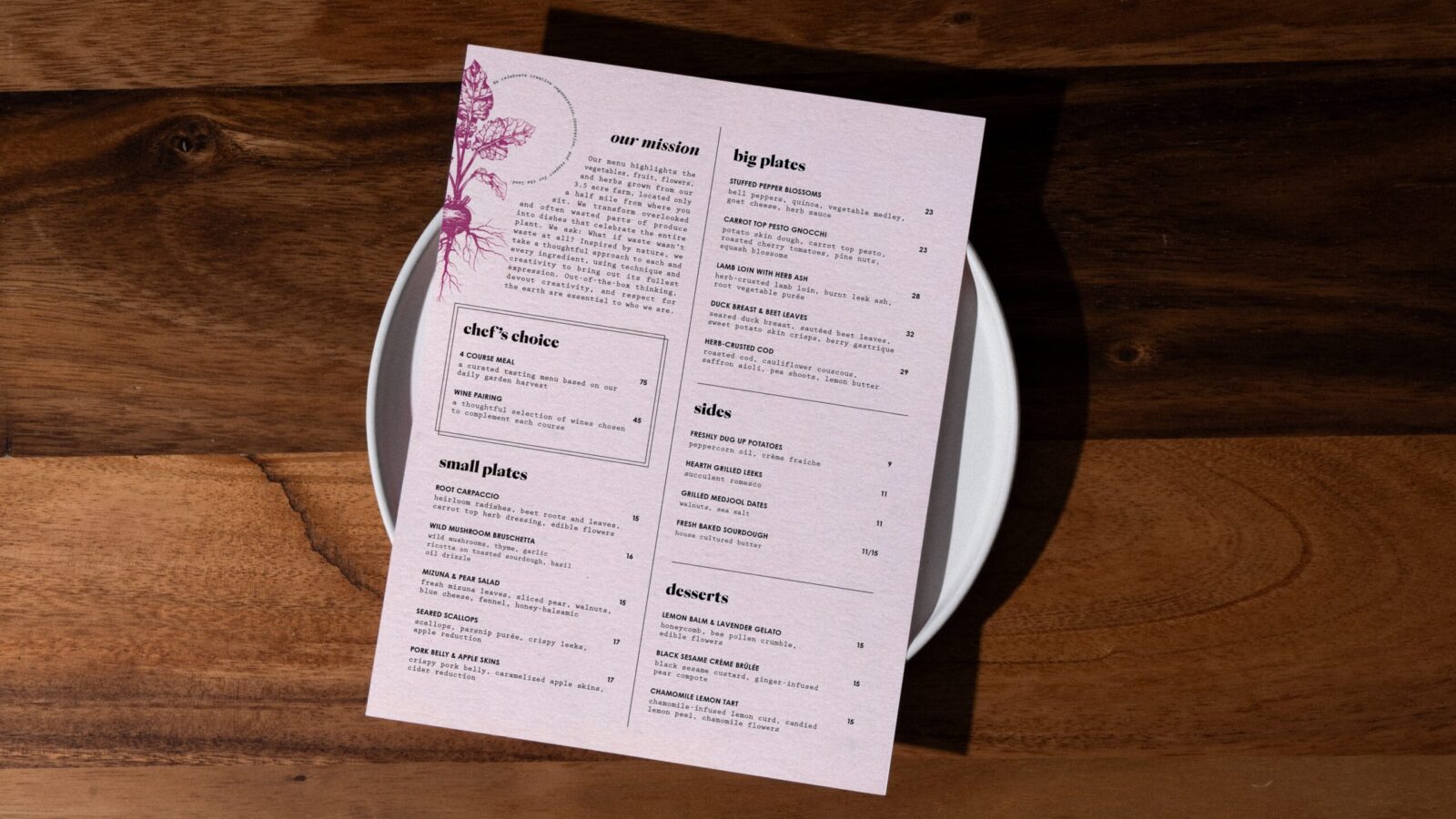
Mizuna is a restaurant concept that reimagines food waste as a source of creativity. It turns overlooked and often discarded parts of produce into thoughtful, upscale dishes. Carrot tops, beet leaves, citrus peels, and other secondary ingredients become the foundation of a menu that feels intentional, seasonal, and expressive. The food celebrates what is usually thrown away. The goal is to shift perception. Waste becomes possibility.
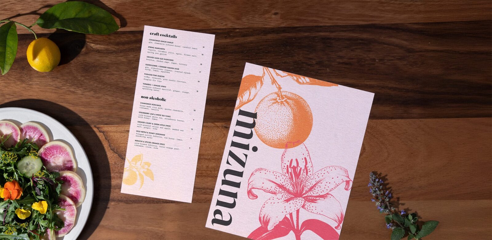
The menu highlights seasonal produce, edible flowers, and foraged elements. It pairs familiar ingredients with unexpected forms. A dish might combine roasted roots with a pesto made from their own greens. Another might use day lilies, an edible flower known for its delicacy, as both garnish and ingredient. These choices challenge assumptions about what belongs in fine dining. They create a new language for flavor, color, and texture. Mizuna is rooted in sustainability and taste at the same time. It proves that waste reduction can be refined, beautiful, and exciting.
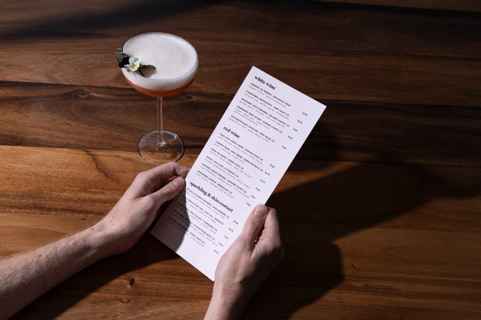
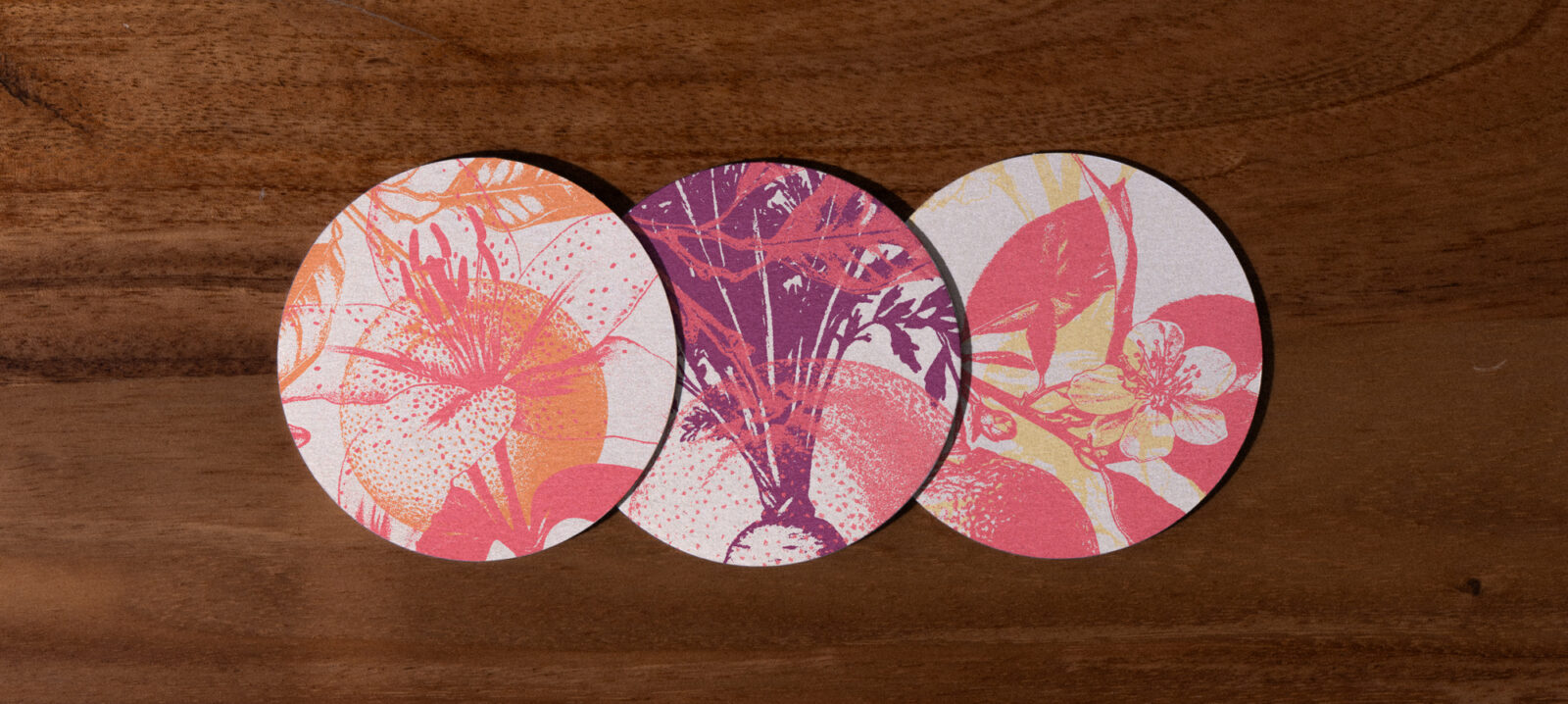
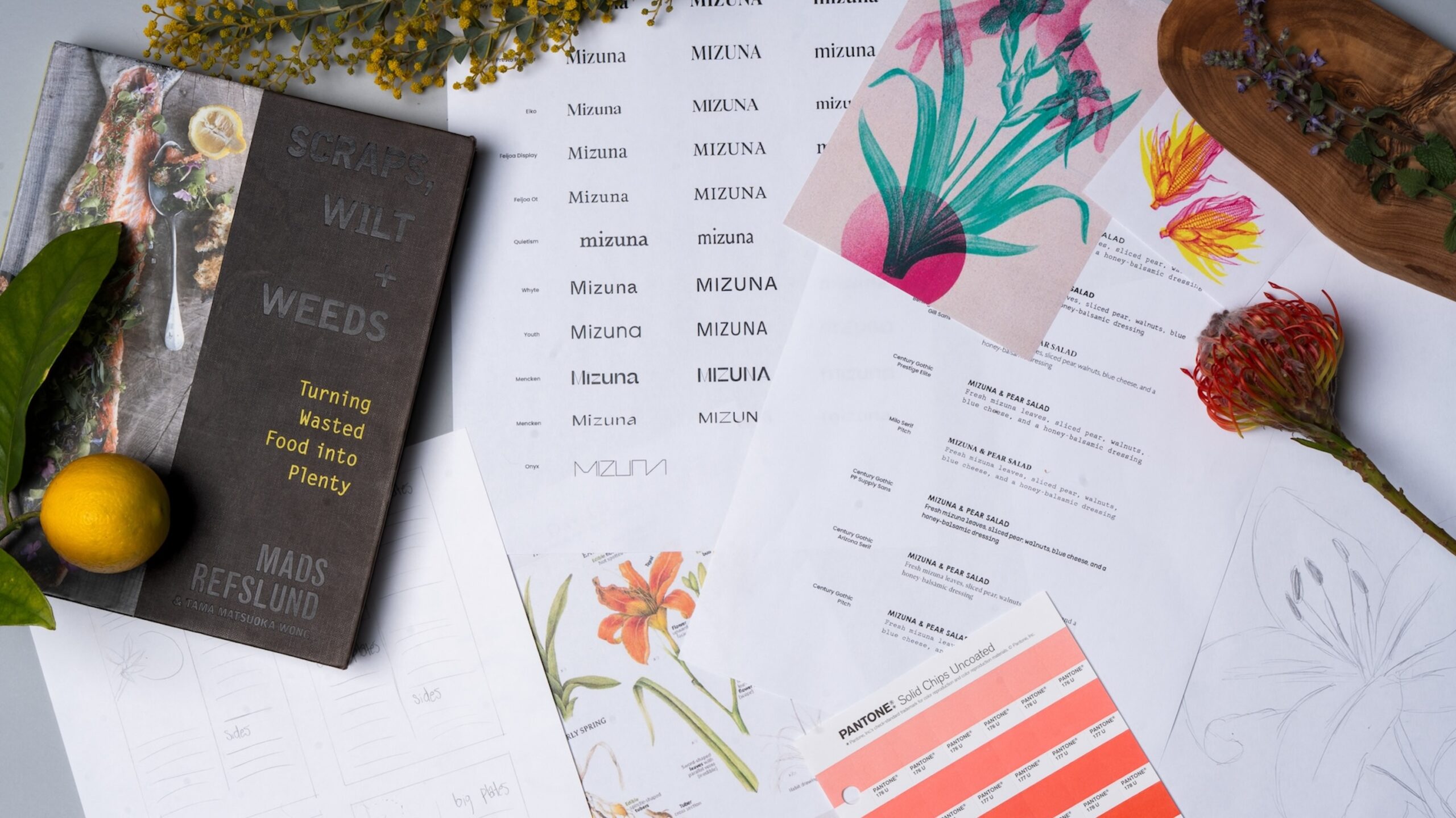
The visual identity reflects the same mindset. It is layered, organic, and built with intention. The palette is sun-washed and inspired by just-picked produce. Warm reds from beets. Soft greens from herbs. Muted yellows from citrus and flowers. Everything feels fresh yet grounded. Botanical illustrations flow across the system in translucent layers. They echo the way flavors overlap in a dish. They also suggest an ecosystem where nothing is wasted. Every piece interacts with another.
Typography plays an important role. It is refined but approachable. Elegant but not cold. Inspired by printmaking techniques, I experimented with textures and color layering. These explorations helped me build a system with depth and softness at the same time.
The day lily became a symbolic anchor. It is edible, beautiful, and ephemeral. It captures the spirit of Mizuna. Even the simplest ingredient can feel elevated with the right perspective. Mizuna invites diners to see food with new eyes. It turns sustainability into an experience that feels abundant rather than restrictive.
CREDIT
- Agency/Creative: Anna Barnett
- Article Title: Anna Barnett Reframes Sustainable Dining Through the Conceptual Restaurant Identity of Mizuna
- Organisation/Entity: Student
- Project Status: Non Published
- Agency/Creative Country: United States of America
- Agency/Creative City: San Diego
- Market Region: California
- Project Deliverables: Brand Creation, Brand Design, Brand Identity, Brand Mark, Brand Naming, Brand Strategy, Brand Tone of Voice, Branding, Creative Direction, Graphic Design, Identity System, Logo Design, Photography, Retouching, Typography
- Industry: Hospitality
- Keywords: WBDS Student Design Awards 2025/26 menu design, restaurant brand identity, sustainability, farm to table


