


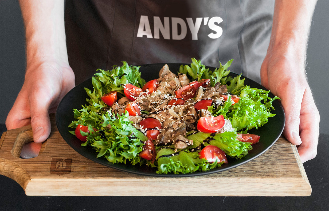
Client: Andy’s Pizza is a big restaurant chain in Moldova and Romania which totals about 50 restaurants. It positions itself as a family place for every day and specializes in serving popular dishes from all over the world at moderate prices.
Challenge: We had to reconsider all visual brand components, starting from the name and logo and ending up with interior design, branded products, and souvenirs. Our goal was to develop one strong and consistent visual brand identity for Andy’s Pizza.
Name and logo
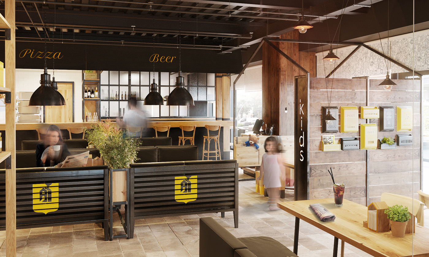
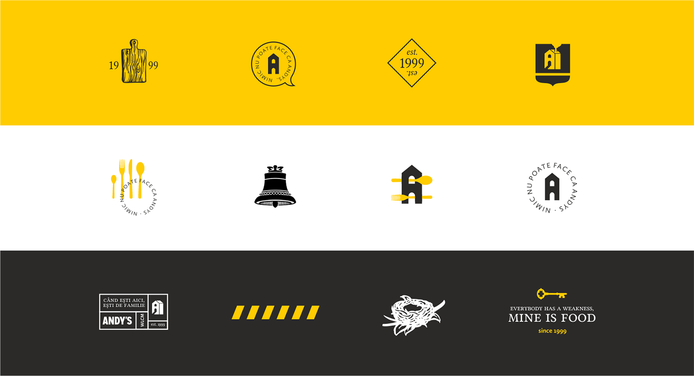
Preconditions: The first Andy’s Pizza was opened in the year 1999 and served pizza and beer mostly. In future years, the number of new restaurants increased together with a variety of dishes served. In a while, some new sub-brands were born under Andy’s Pizza trademark: Ciao-Cacao for self-made ice-cream and cookies, Alb & Rosu for wine, and Andy’s Pizza Club loyalty program. A few separate zones were formed within each restaurant: trattoria (family zone), pub (sports events and beer), cafe (Ciao-Cacao desserts), and a playground for kids.
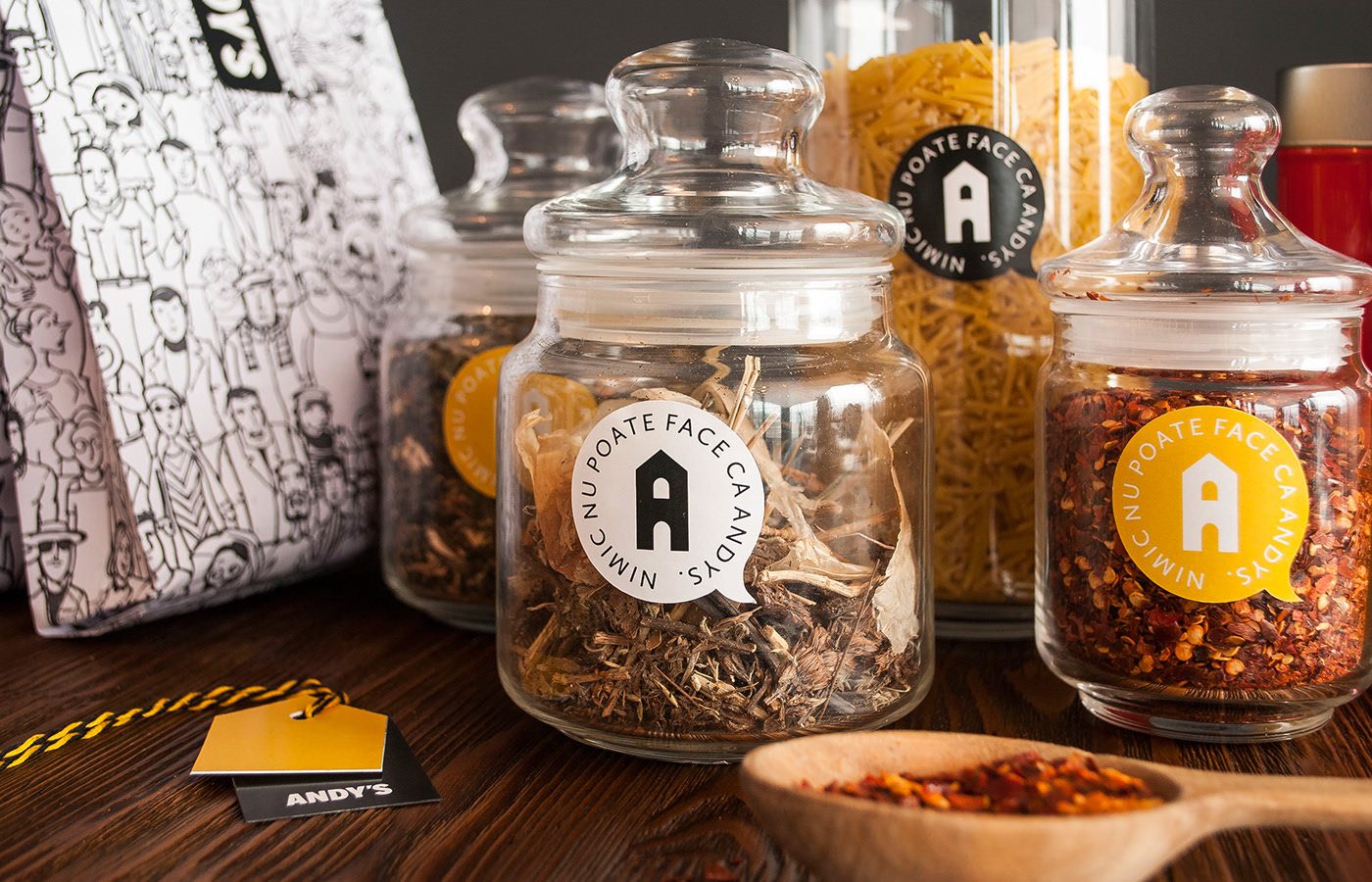
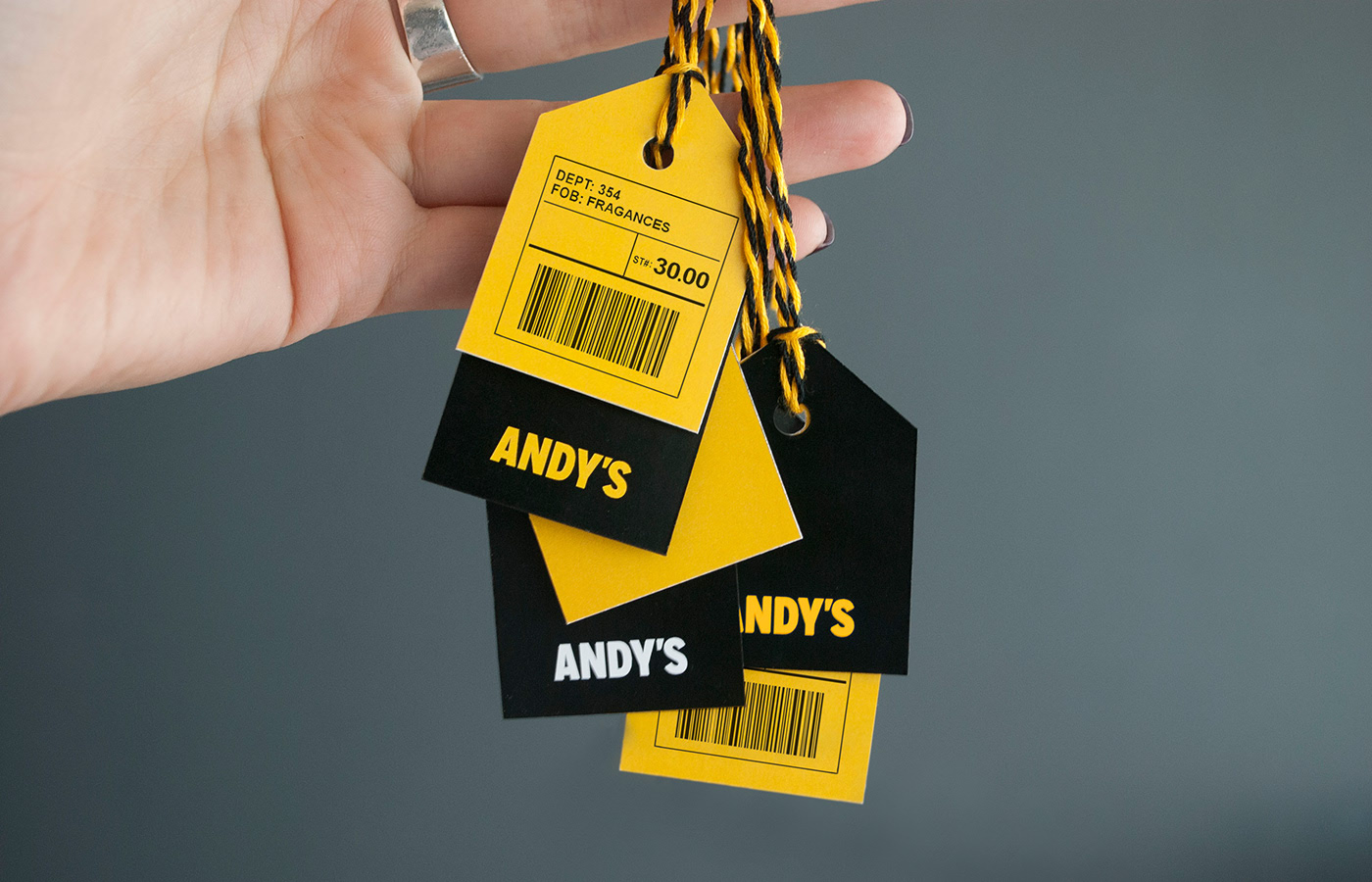
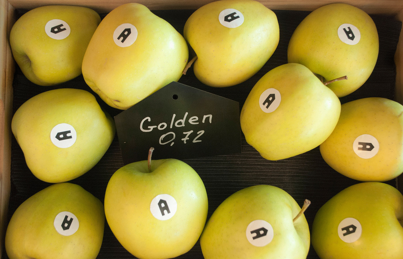
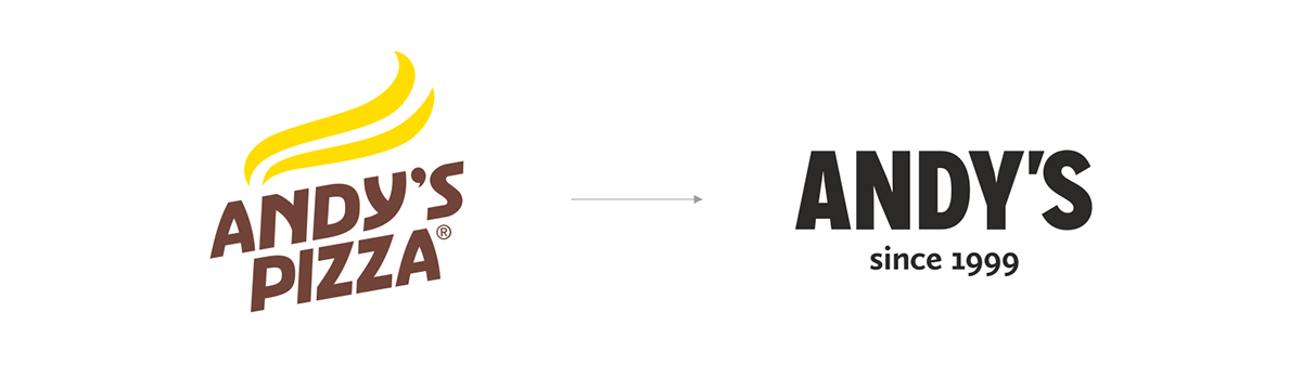
Name: In order to integrate everything together and to keep brand awareness we suggested to maintain the word “Andy’s” and to exclude the word “Pizza”. New perspective: In a row with already implemented innovations, there are few more, which are waiting for their own implementation down the line. It is the organization of a store area in each restaurant to sell wine, pasta, jams, fruits, cookies, and souvenirs.
Concept and brand identity
Concept: We proposed a concept based on a likeness between Andy’s network and a city. Both of them make all in one impression but contain diversity within themselves. Both of them have their unique atmosphere, consolidating different people with different characters, needs, and necessities. Both have their history and news, unite people on various occasions whether
it’s a romantic date, business lunch, family dinner, or hanging out with friends while watching football. Andy’s is a place that lives in the rhythm of a town.
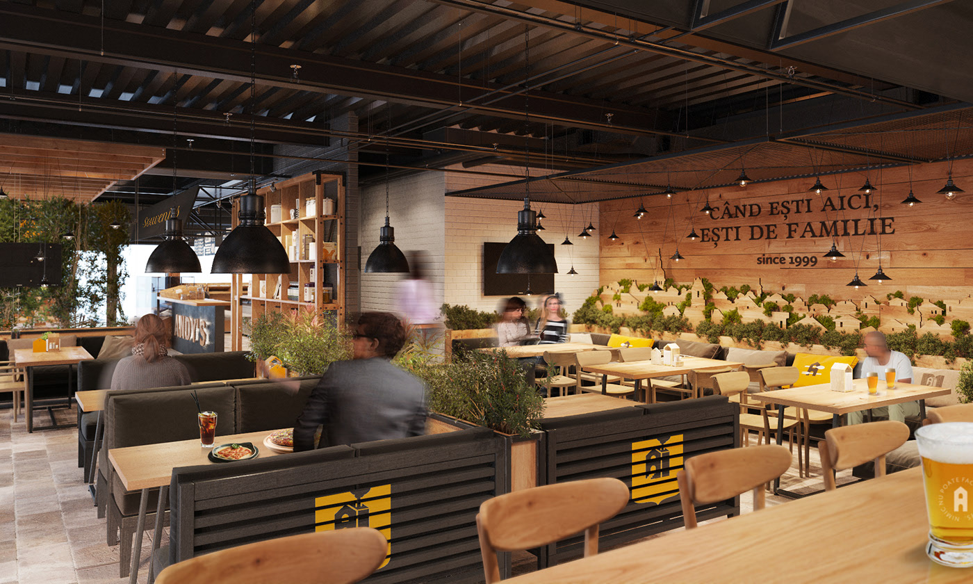
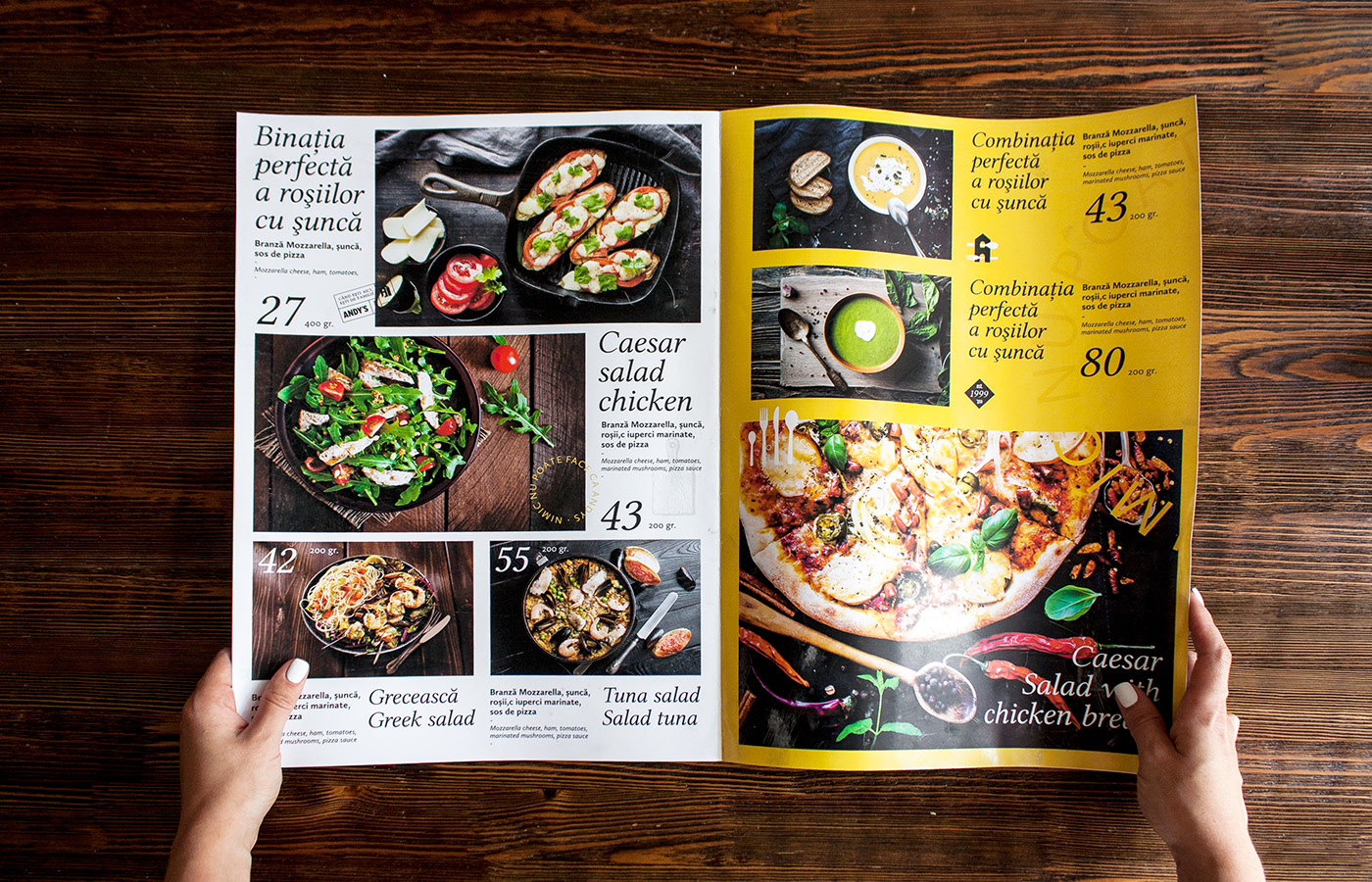
Brand identity: As a key-reference, we used a style of city news-papers and journals with its specific font compositions, headlines, layouts, and illustrations. Along with main logo, we developed a group of additional symbols and also added the year of foundation to some of them. We maintained the yellow color from the previous brand identity version, replaced the brown one with natural wood texture and brought-in more expanded use of the black and whites
colors.
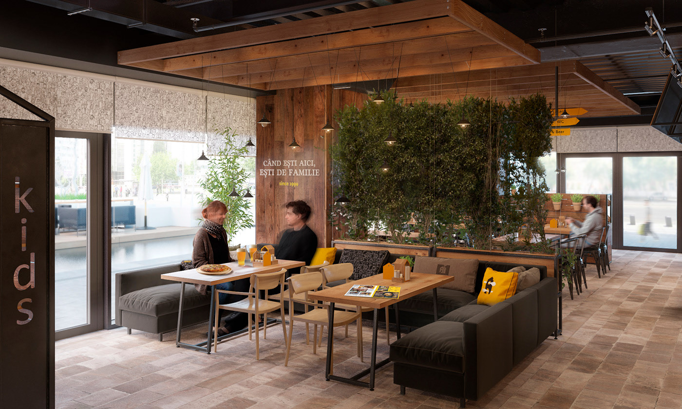
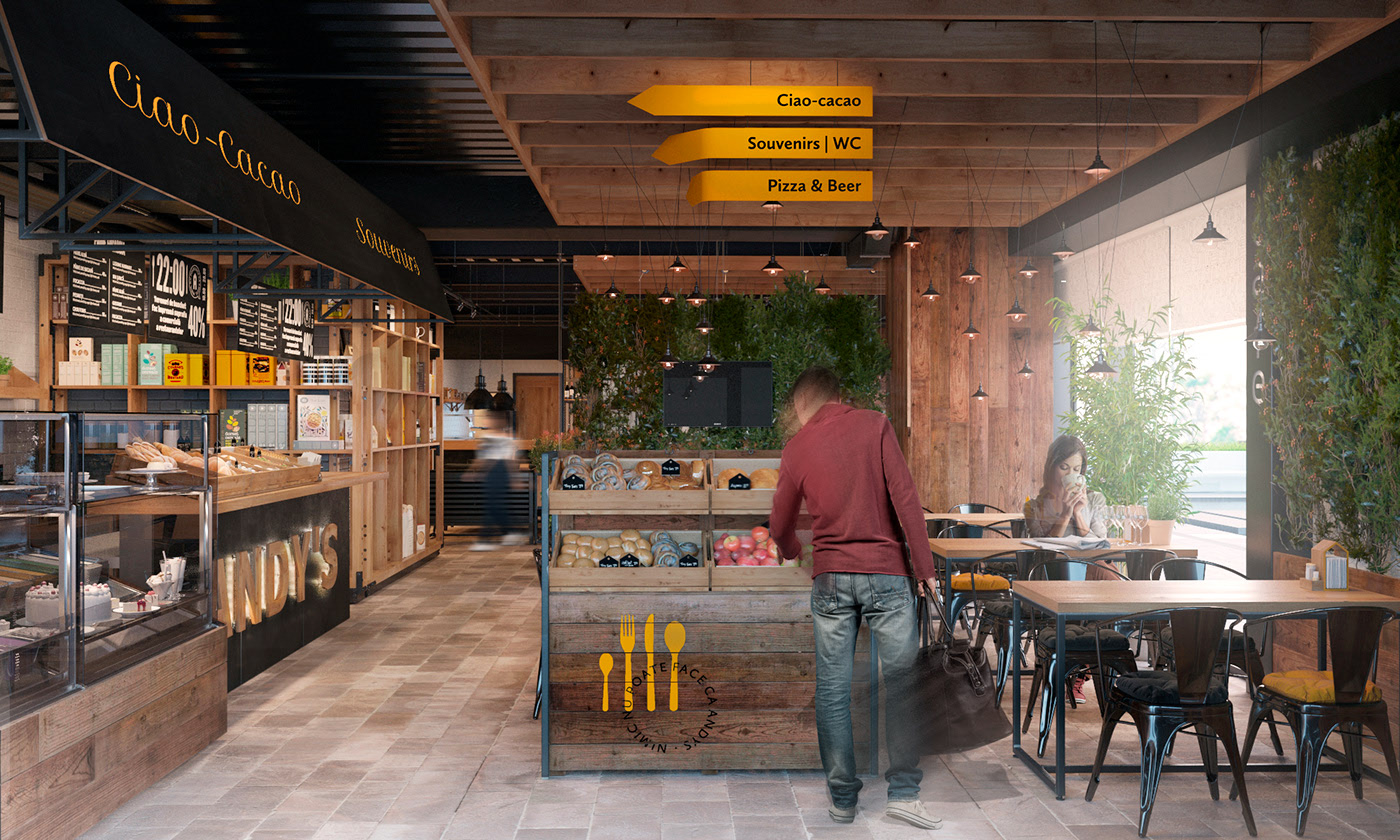
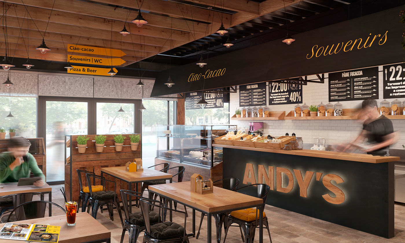
Interior design
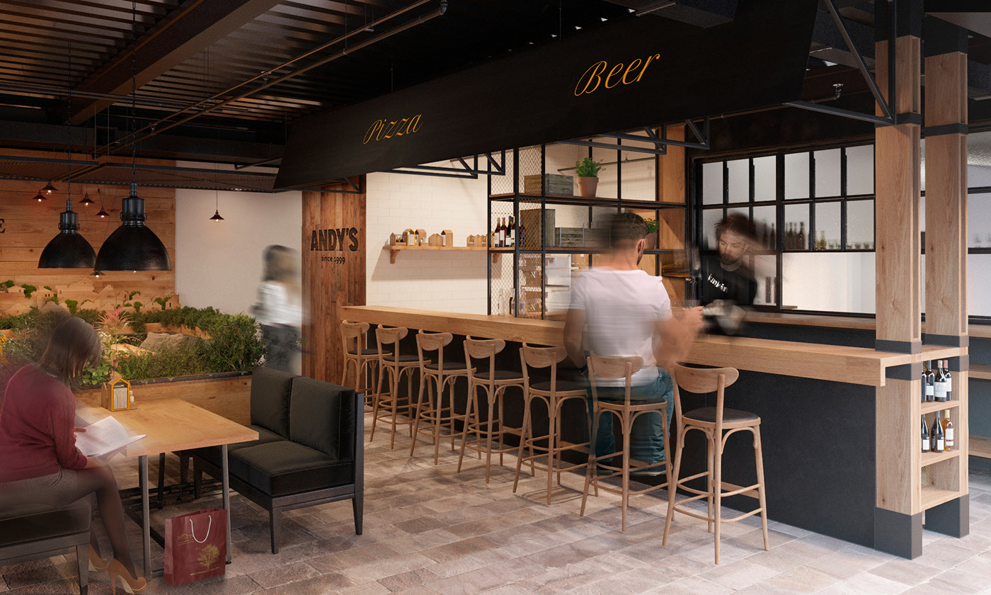
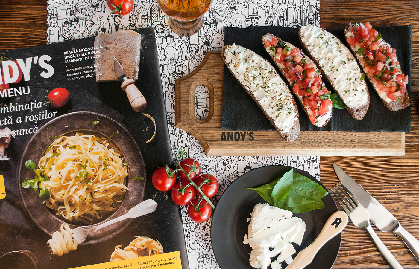
In order to follow the town concept we decided to use exterior finishes and attributes within the interior: paving stone, rough wood, clambering plants, street signs, and light. We aimed to organize the main space as if it was a central square in a small town. Sales areas symbolically show street stalls and counters that face the square. They look similar, but offer different products – there is a bar counter for beer and drinks, pizza counter that shows pizza manufacturing process, ice-cream stall, pastry, fruit and souvenir zones.
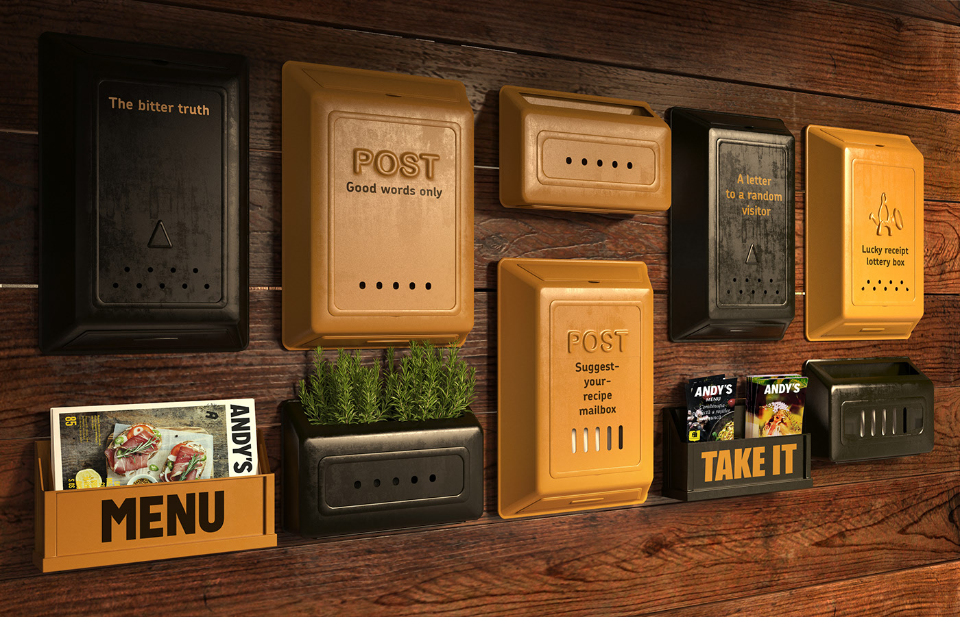
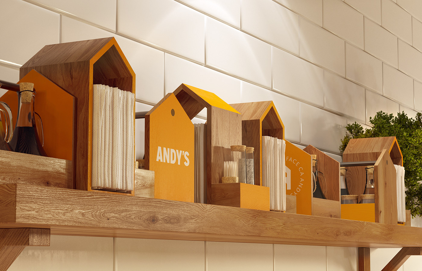
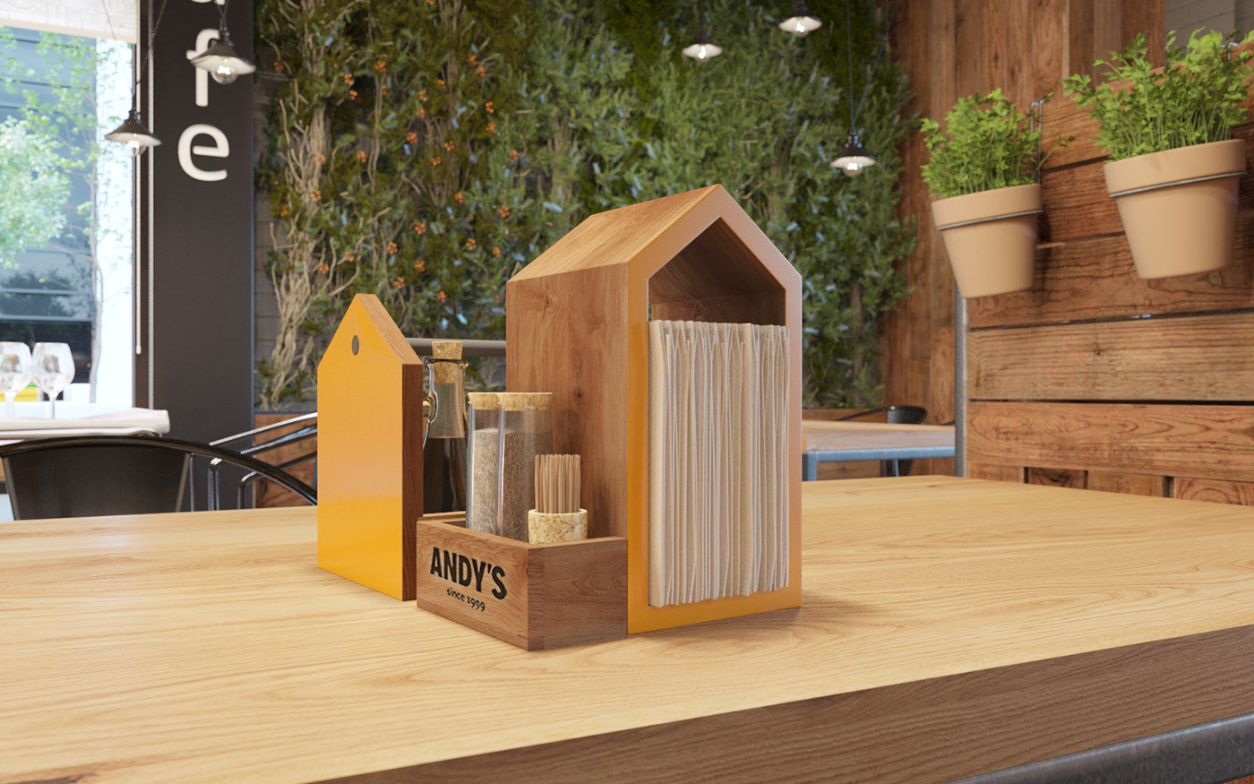
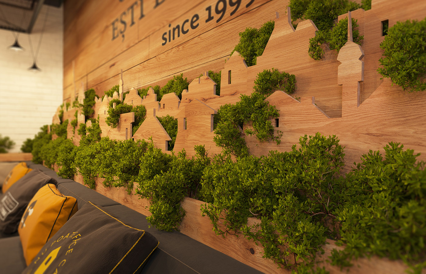
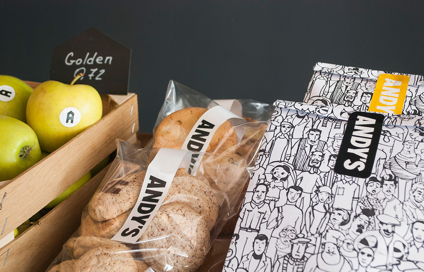
Elements, souvenirs and take-away. We paid attention to details in interior design trying to make them work for our concept. The table organizer and spices holder for pizza look like houses. Being stored on a shelf they form a town. The planters are also made in the shape of a town, seen afar from a terrace. There is a special wall with mailboxes for different kinds of interplay between the customers and the restaurant service. There is a box for good comments and reviews, one for the bad feedback, “suggest-your-recipe” box, “a letter to a random visitor”, “lucky receipt lottery box” and etc. Info brochures and takeaway menus are also in here.
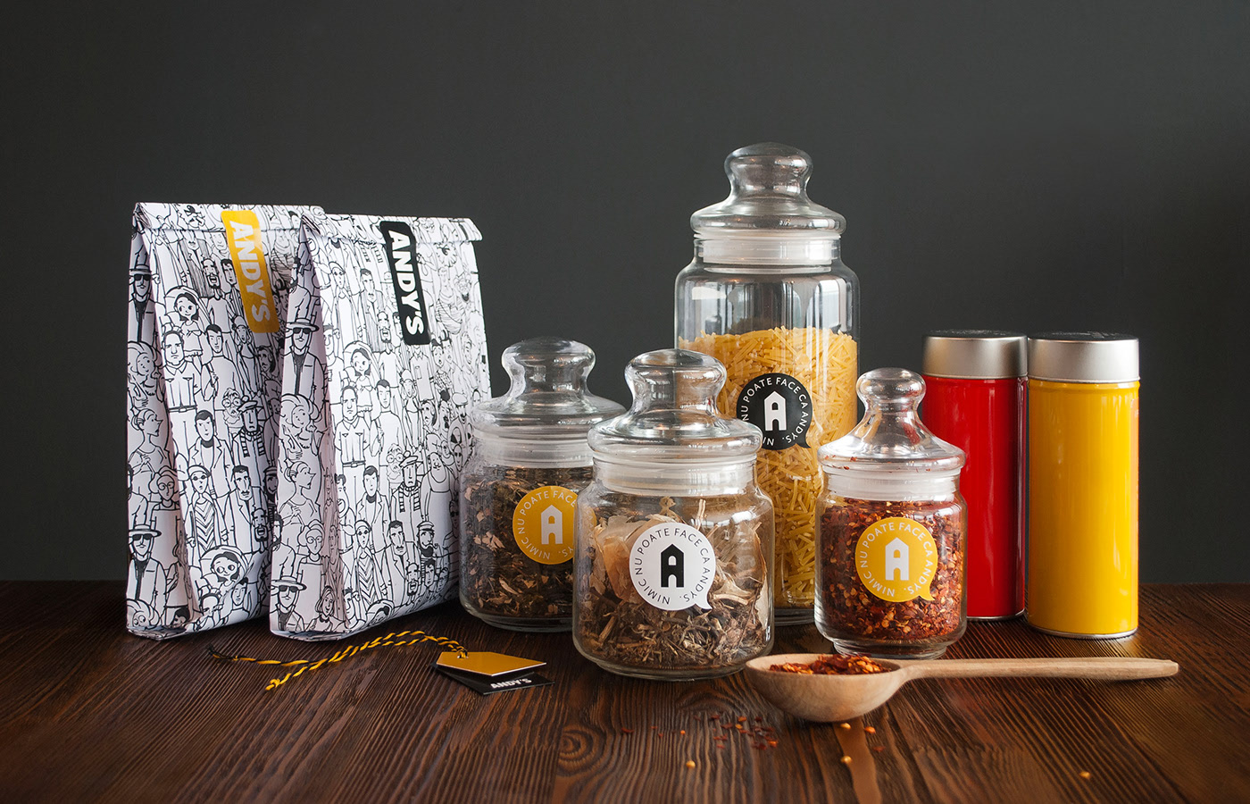
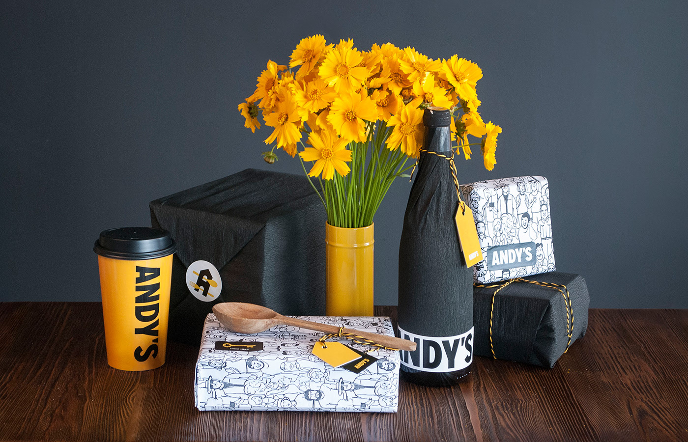
Souvenirs and take-away are packed as parcels
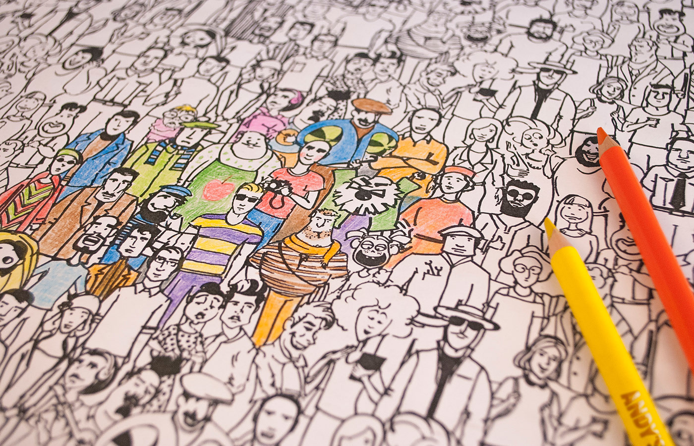
We’ve made a special pattern with different people – the town dwellers. It is used on the placemats, wrapping paper, window blinds, and etc. Each placemat easily becomes a coloring sheet for kids.

CREDIT
- Agency/Creative: Brandon Archibald
- Article Title: Andy’s Branding for Family Restaurants Chain
- Organisation/Entity: Agency, Published Commercial Design
- Project Type: Identity
- Agency/Creative Country: Ukraine
- Market Region: Europe
- Project Deliverables: Brand Guidelines, Brand Identity, Brand Naming, Graphic Design, Identity System, Illustration, Packaging Design, Rebranding, Retail Brand Design, Tone of Voice
- Industry: Food/Beverage
- Keywords: Branding, Identity, Interior Design, Architecture, Packaging Design


