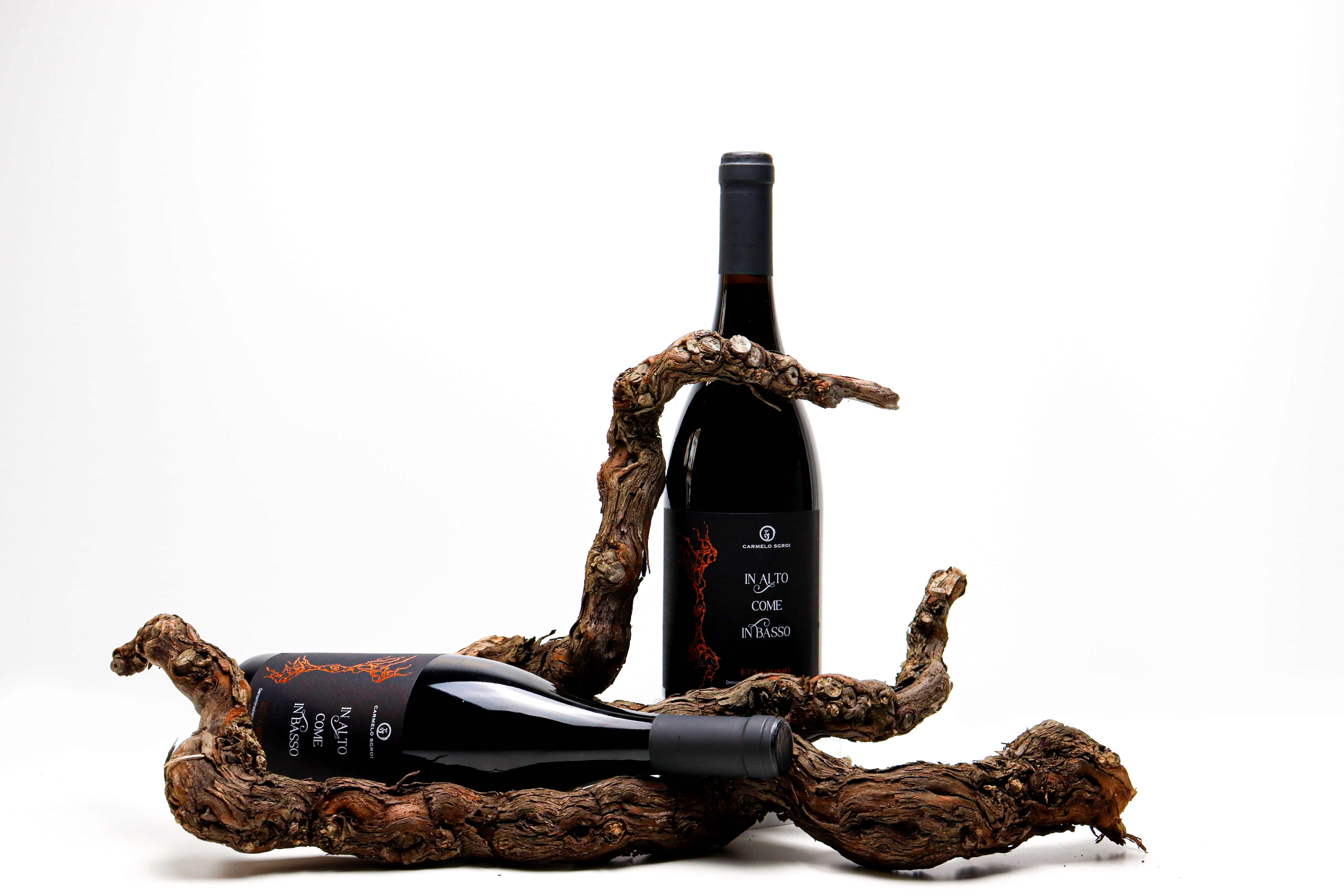
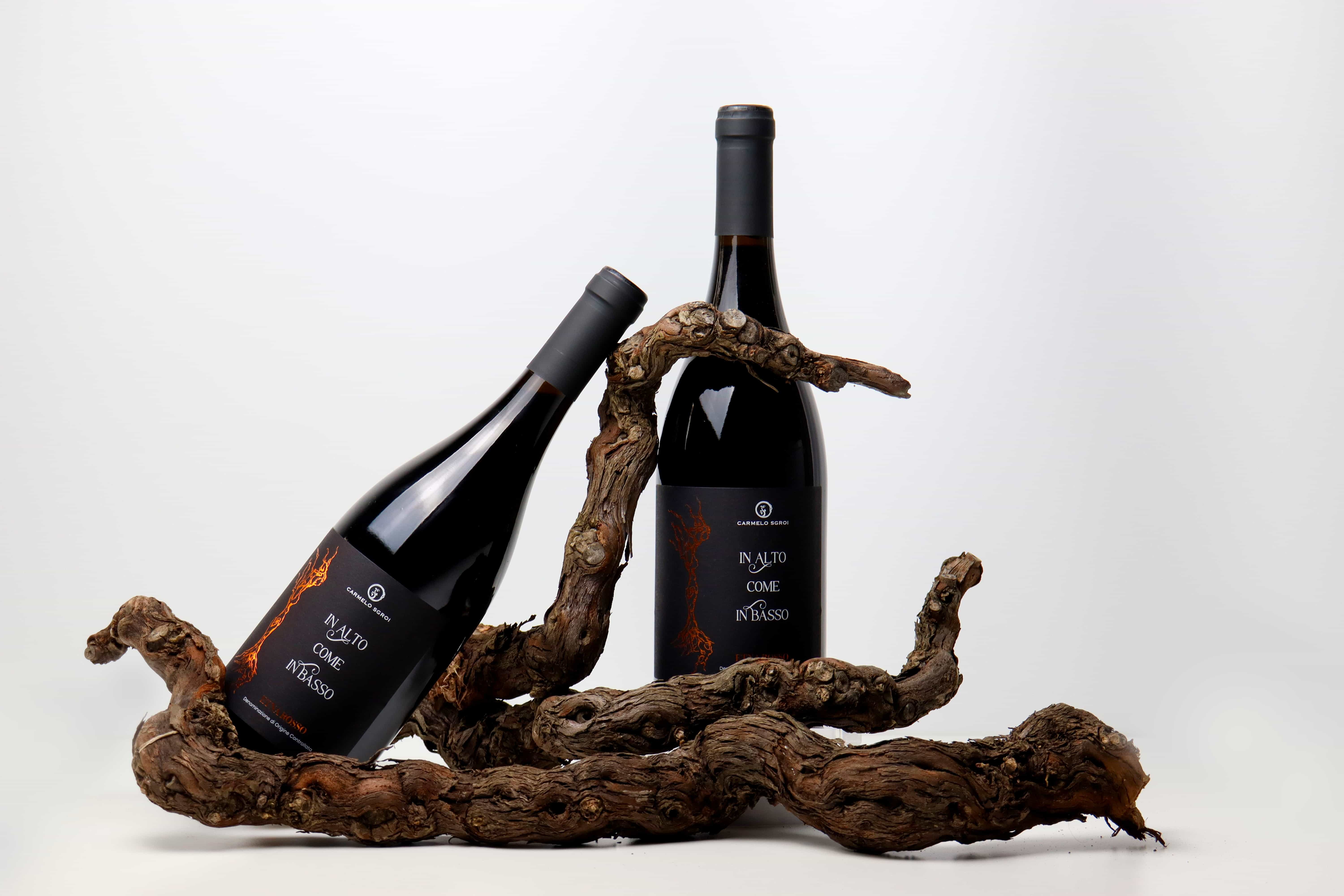
“In Alto Come In Basso” is an Etna Rosso DOC wine produced at 580 metres above sea level (1903 ft), on the south-eastern slope of Mount Etna, on Monte Gorna’s side in Viagrande (CT), Sicily. Crafted in a limited run of 1.900 numbered bottles (pictured here are bottles no. 1.755 and 1.756) it precisely expresses the character of its volcanic terroir: altitude, minerality and structural tension.
THE CONCEPT: As Above, So Below
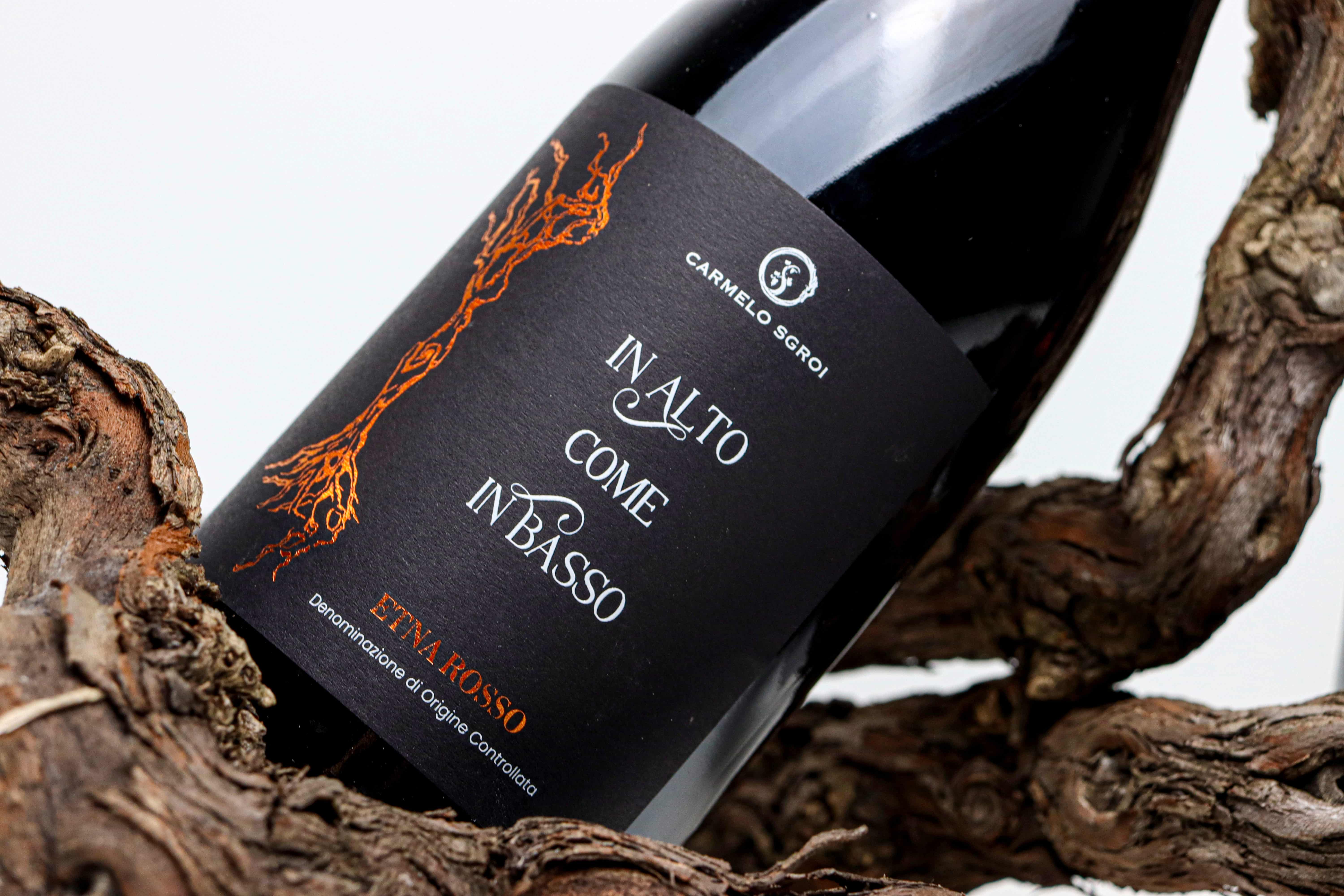
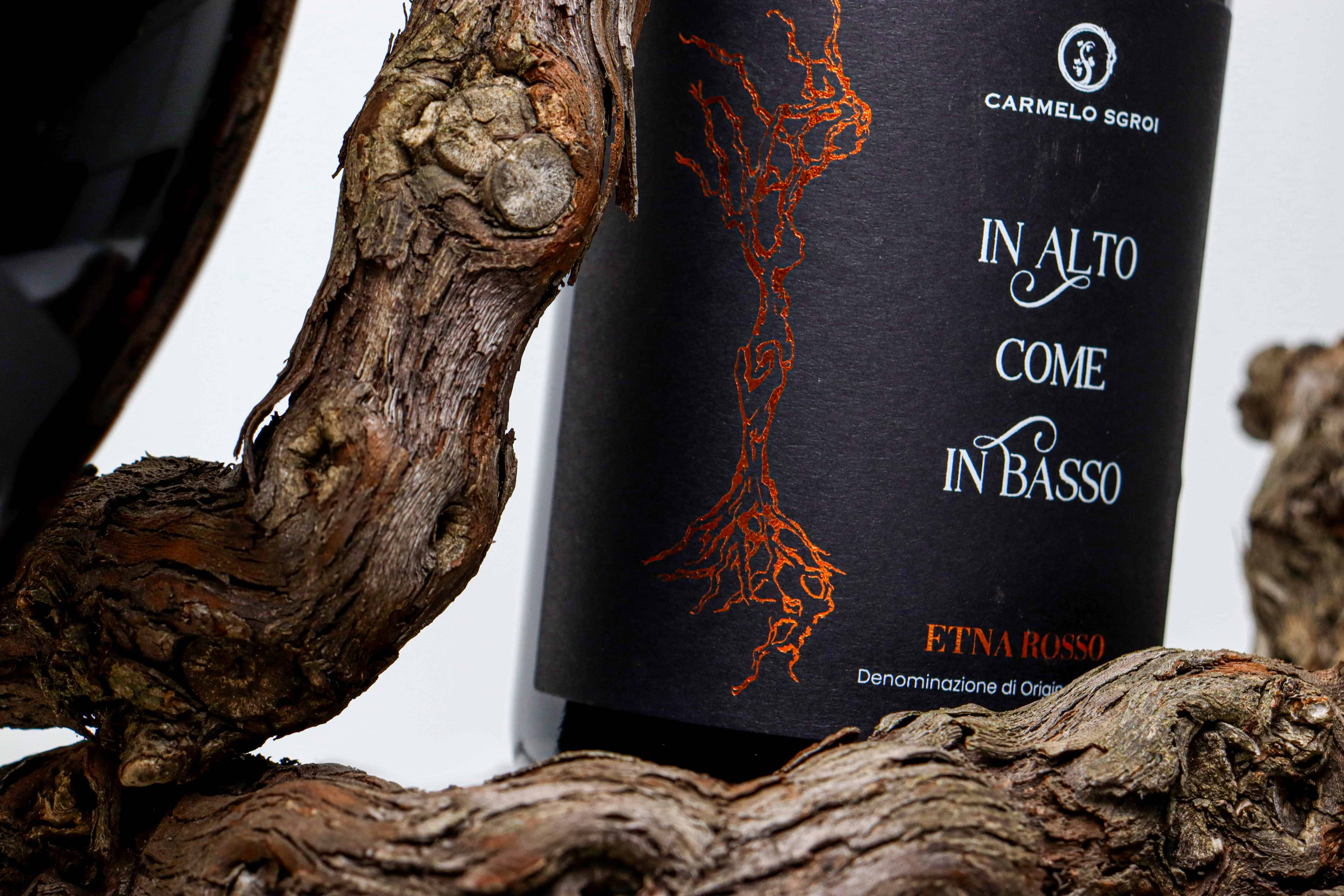
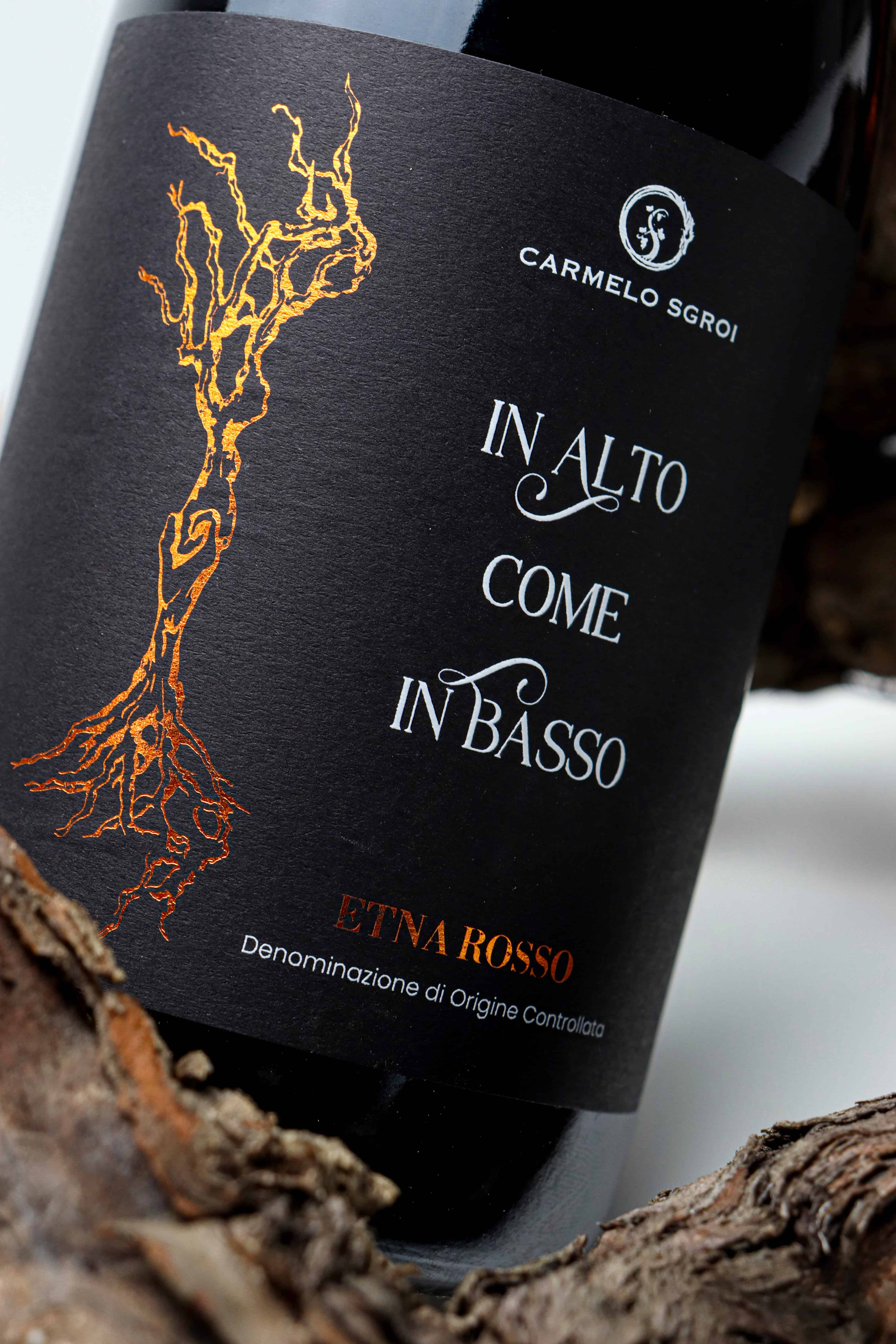
The name “In Alto Come In Basso” (As Above, So below) draws inspiration from the principle of correspondence and the idea of completion: what rises above is inseparably connected to what sustains it beneath. This philosophy takes shape in a powerful image: a vine holding hands with its own roots. The aerial and subterranean parts meet in a symbolic gesture that makes the invisible visible.
MATERIAL AND DETAIL
The illustration originates from a charcoal drawing on paper depicting a century-old vine that truly exists in the vineyard, created by artist Francesca D’Amico. Andrea Curto translates its organic expressiveness into a distinctive graphic sign, merging artistic sensitivity with a contemporary visual system.
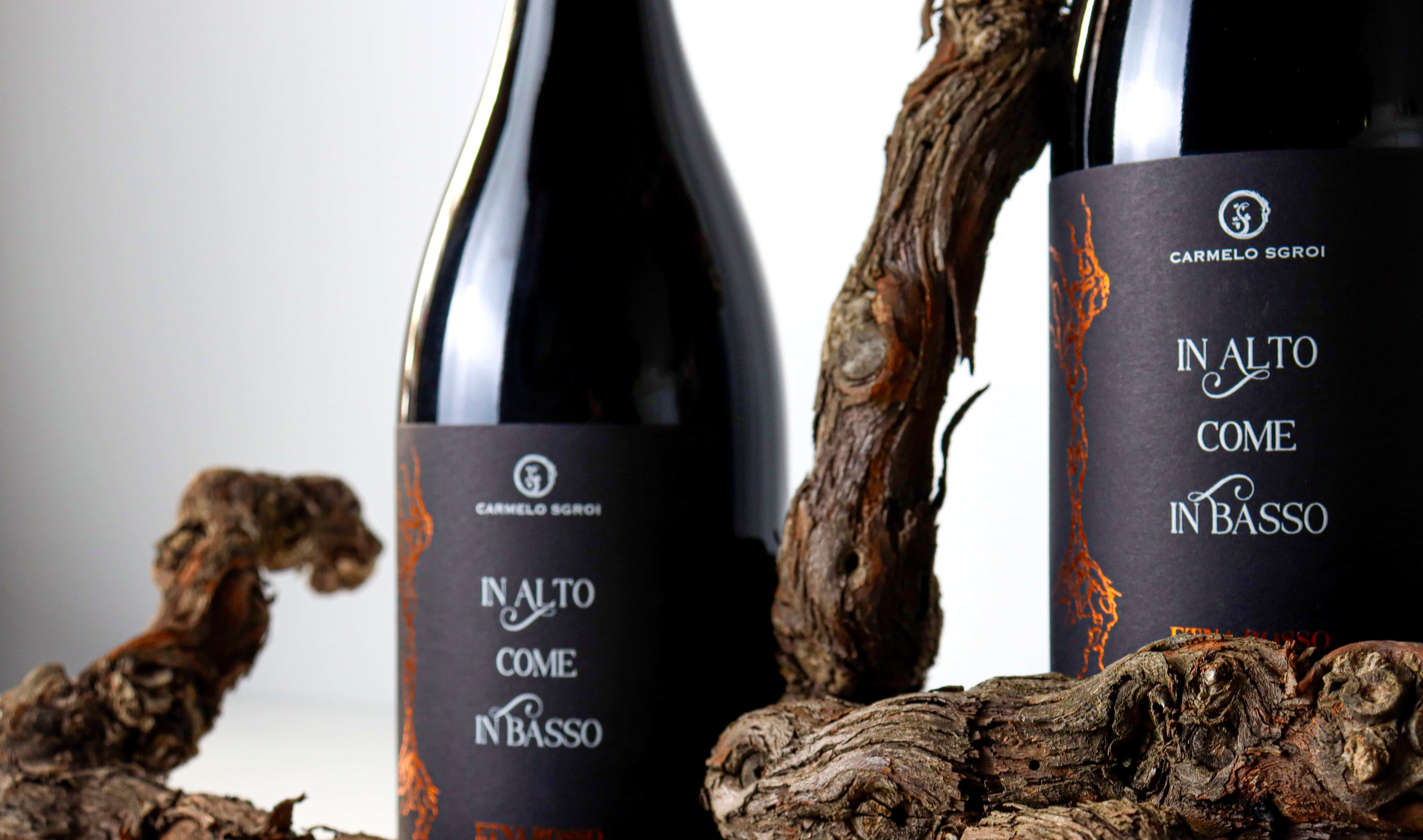
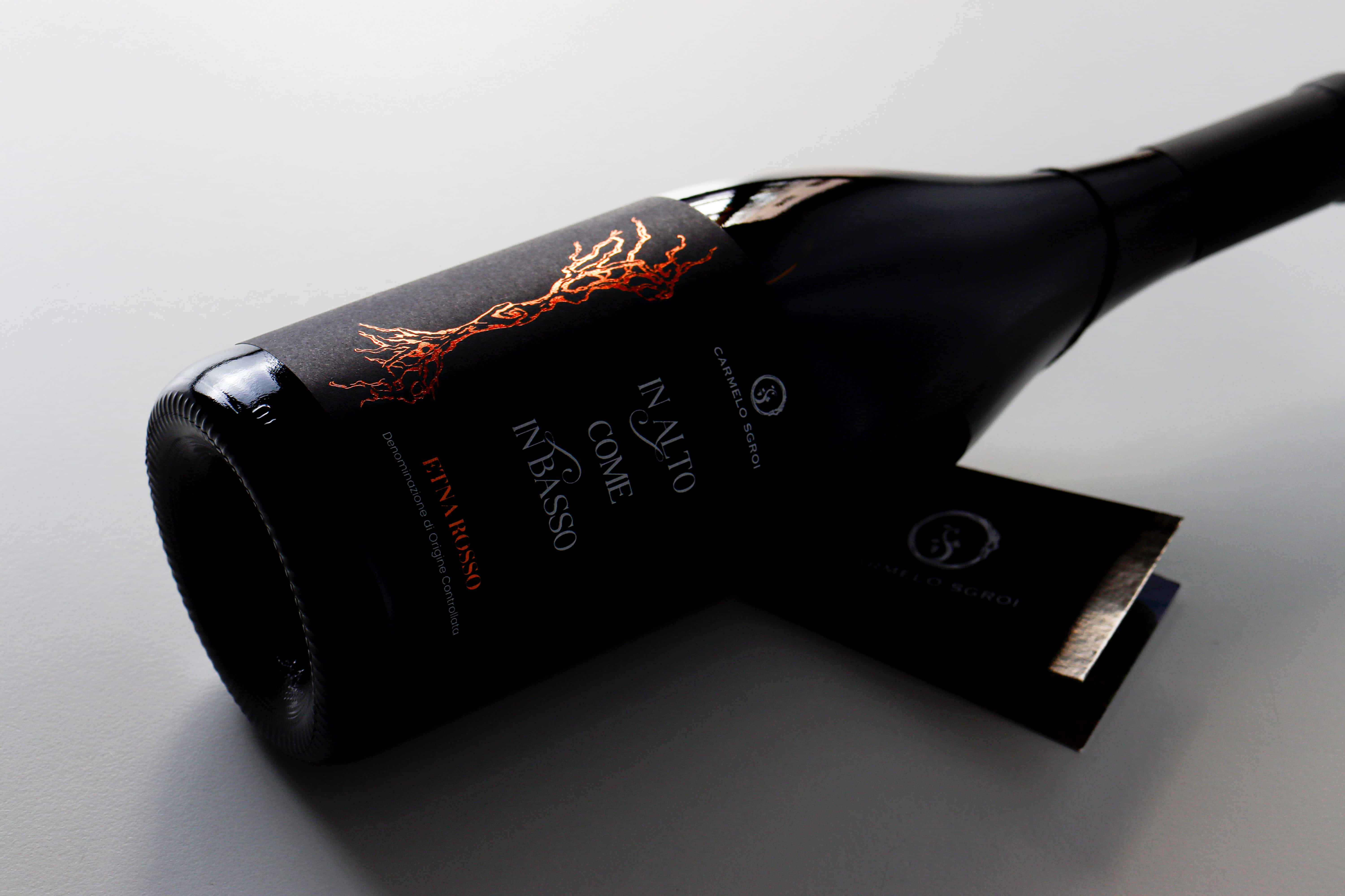
The label is printed on deep black-dyed paper, selected to maximise the intensity and fullness of the background. The vine illustration and the wording “Etna Rosso” are executed in copper hot foil stamping, a direct reference to lava and volcanic matter. The contrast between matte surface and metallic reflection creates a strong visual presence and immediate legibility.
The wine’s name is embossed in Braille, introducing a tactile dimension that enhances tridimensionality and reinforces the sensory experience.
The composition is essential and balanced, with every element calibrated to support the concept while enhancing the exclusivity of the limited, numbered production.
With “In Alto Come In Basso”, Andrea Curto delivers a project where concept, territory and material converge into a coherent vision, demonstrating how packaging design can transform a bottle into a contemporary manifesto of identity.
Produced in only 1.900 numbered bottles, the wine stands as a collectible object. The numbering strengthens the perception of exclusivity and craftsmanship, consistent with a project where nothing is left to chance.
Andrea Curto signs a work that goes beyond aesthetics to build a layered identity where concept, territory, art and technique coexist within a single vision. The result is a label that does not merely dress a bottle, but becomes the visual manifesto of an idea: the unity of the whole, the continuity between root and sky, matter and spirit.
A project that proves how packaging design, when guided by a clear direction and strong visual culture, can transform a wine into a total experience.
CREDIT
- Agency/Creative: Andrea Curto
- Article Title: Andrea Curto Transforms a Century-Old Vine Into a Sculptural Identity for “In Alto Come In Basso” Etna Rosso DOC Wine
- Organisation/Entity: Freelance
- Project Type: Packaging
- Project Status: Published
- Agency/Creative Country: Italy
- Agency/Creative City: Catania
- Market Region: Europe
- Project Deliverables: Label Design
- Format: Bottle
- Industry: Food/Beverage
- Keywords: Wine Label Design Graphic Vine
-
Credits:
Illustrator: Francesca D'Amico


