Andrea Antonio Curto, a visionary Visual Identity and Packaging Designer, pays homage to Sicily’s volcanic soul with Veneris, a wine label that fuses tradition, geography, and design innovation. Rooted in the powerful narrative of Mount Etna, Veneris encapsulates the elegance of the land while respecting its raw, untamed energy.
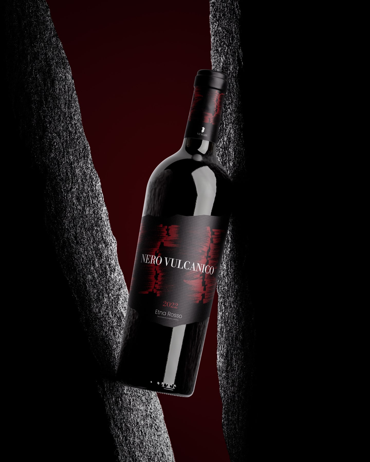
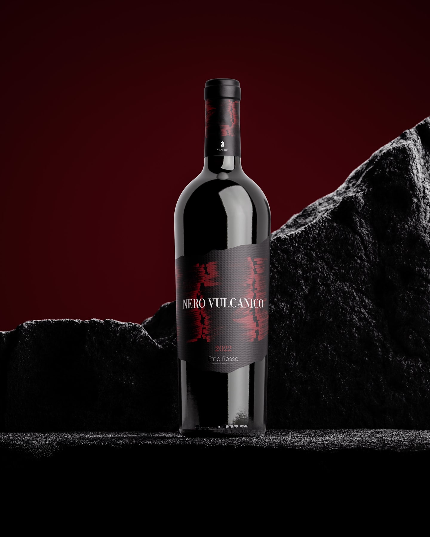
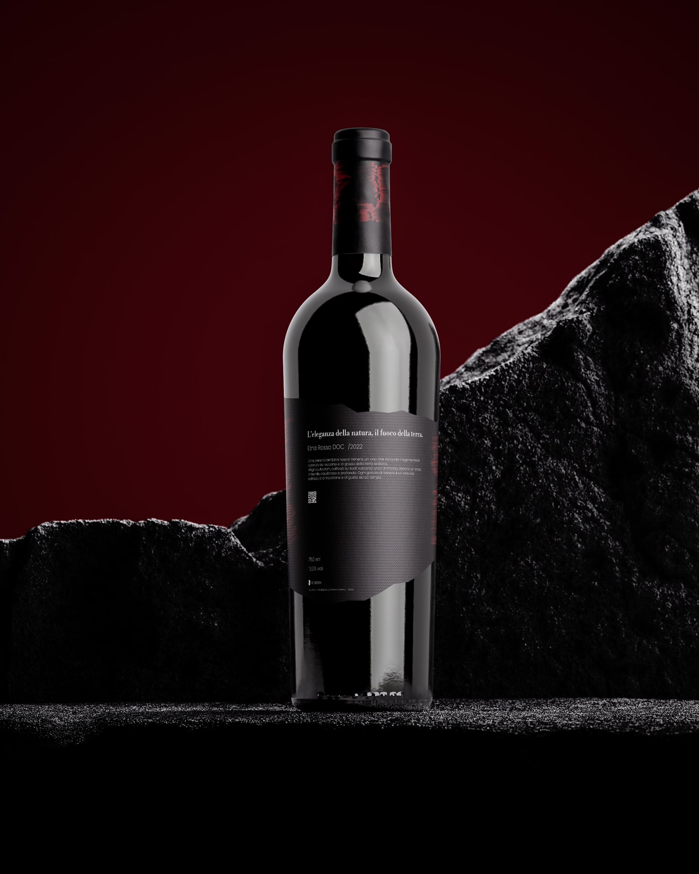
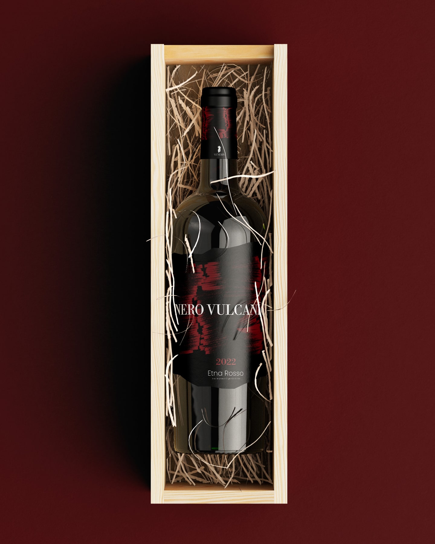
The design draws inspiration from the iconic silhouette of Mount Etna, one of the world’s most active volcanoes and a timeless symbol of Sicilian heritage. Curto reinterprets its rugged contours with a unique frastagliata (jagged) label shape, reminiscent of volcanic rock and the mountain’s irregular skyline. This physical detail creates an immediate tactile connection, inviting the user to explore the label as both a visual and sensory experience.
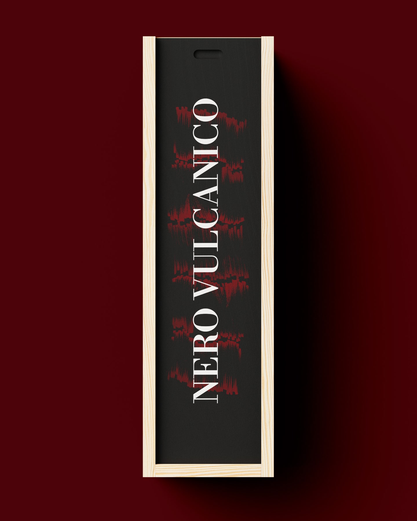
The color palette is equally intentional. A deep black background mirrors the volcanic basaltic soil of Etna’s slopes, while dark crimson brushstrokes streak across the surface, evoking magma flows that give life to the earth. These painterly touches, bold yet organic, reflect both the fluidity and power of the volcanic landscape.
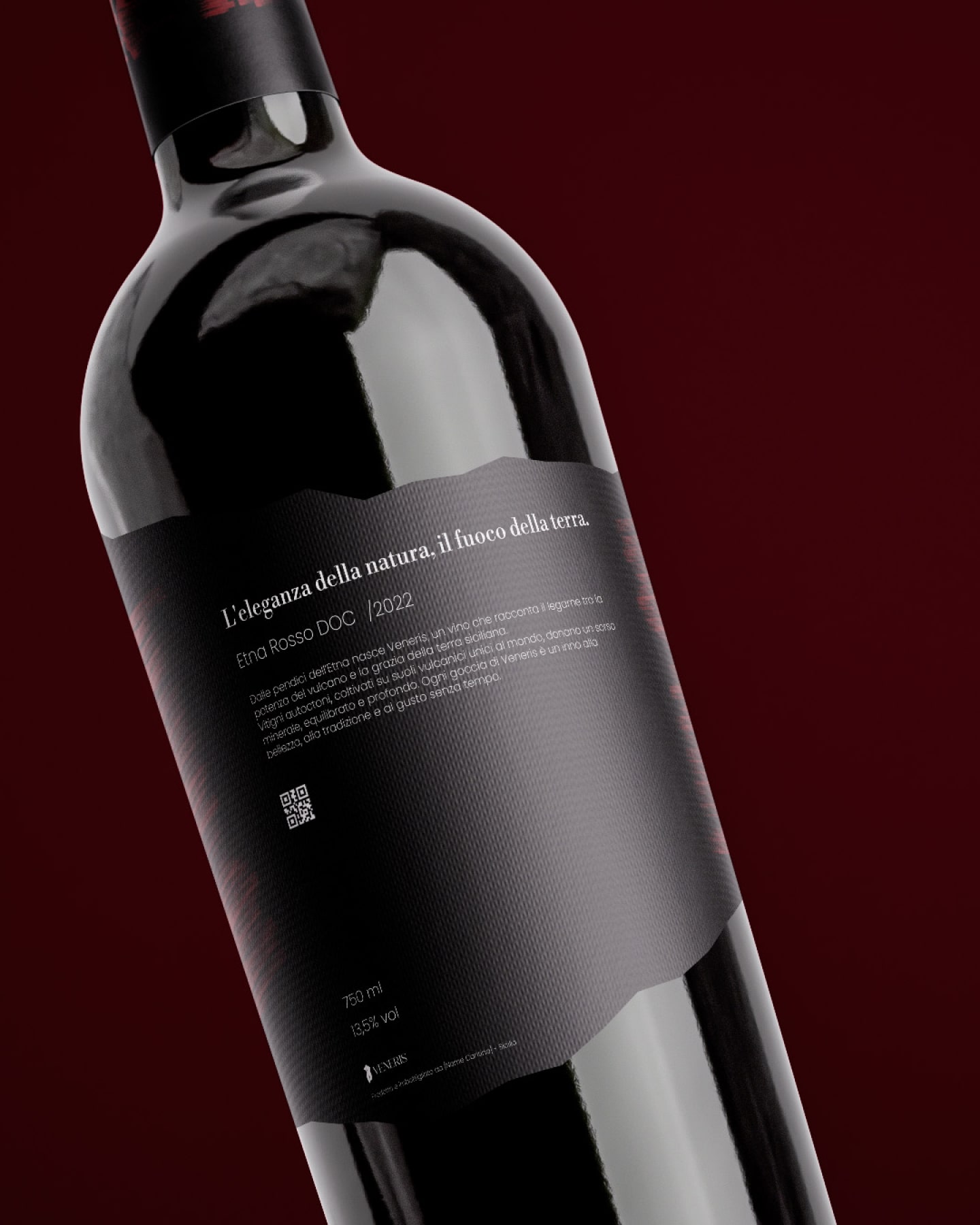
A delicate balance between history and modernity comes to life through carefully curated typography. The primary logotype, set in Libre Bodoni, celebrates the refined elegance of classic serif fonts while echoing the timeless qualities of the wine itself. To counterbalance tradition, Poppins, a clean sans-serif typeface, introduces contemporary precision and clarity for supporting information. The typographic hierarchy ensures legibility while adding a modern edge, perfectly suited for discerning wine enthusiasts.
The Veneris logo—previously unveiled as a stylized, minimalist Venus figure—symbolizes beauty, femininity, and the sensual experience of wine tasting. Set against the volcanic aesthetic, this juxtaposition highlights the wine’s dual nature: bold yet graceful, grounded yet ethereal.
Sourced from the mineral-rich vineyards of Mount Etna, Veneris carries the terroir’s distinct minerality and complexity. The label acts as an extension of this identity, providing not just a design but a story—one that honors the land and transforms it into a visual masterpiece.
The jagged edge of the label required precision in die-cutting to ensure clean, consistent results. Printed on textured paper stock, the matte black finish enhances the tactile dimension, while embossed brushstroke details elevate the crimson marks, creating depth and dynamism. The result is a label that feels luxurious in hand while commanding attention on the shelf.
Andrea Antonio Curto’s Veneris transcends a simple wine label, evolving into a crafted experience where every choice—shape, color, typography, and texture—tells a cohesive story. By marrying the heritage of Mount Etna with modern design sensibilities, Curto proves that great packaging can elevate a product into an enduring work of art.

CREDIT
- Agency/Creative: Andrea Curto
- Article Title: Andrea Curto Captures the Majesty of Mount Etna With ‘veneris’ Wine Label Design
- Organisation/Entity: Freelance
- Project Type: Packaging
- Project Status: Published
- Agency/Creative Country: Italy
- Agency/Creative City: Catania
- Market Region: Europe
- Project Deliverables: Label Design, Logo Design
- Format: Bottle
- Industry: Food/Beverage
- Keywords: wine, Wine Label Design, Packaging Design, Mount Etna, Sicilian Wine, Visual Identity, Volcanic Aesthetics, Modern Typography, Libre Bodoni, Poppins Typeface, Die-Cut Label, Embossed Finish, Tactile Design, Luxury Wine Packaging, Italian Design, Andrea Antonio Curto, Frastagliata Label, Brushstroke Details, Minimalist Logo Design, Sicily Heritage, Terroir Storytelling
-
Credits:
Graphic Designer: Andrea Curto


