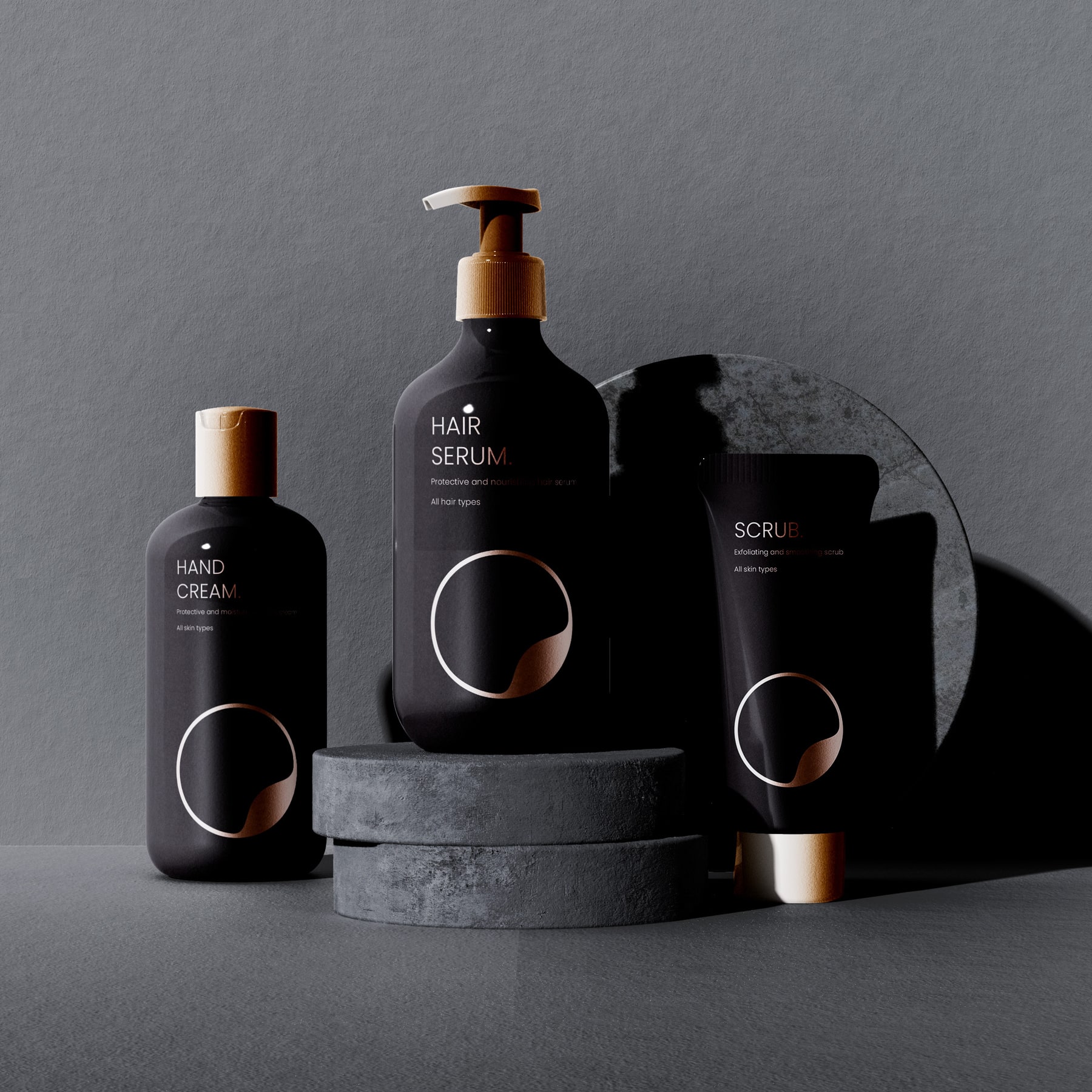
The worlds of premium cosmetics and modern packaging design have collided in spectacular fashion with the rebranding of House of Senses. Known for its commitment to high-quality products, the Australian brand has taken a bold step forward, unveiling a visual identity that marries timeless elegance with the evocative beauty of its homeland.
The foundation of the new identity lies in its striking color palette. A dominant black sets the stage, evoking sophistication and mystery, while metallic bronze accents inject warmth and depth. The bronze tones are more than an aesthetic choice—they are a nod to the hues of the Australian desert, a place where raw natural beauty meets serene minimalism. This contrast embodies the duality of House of Senses: luxurious yet grounded, modern yet timeless.
At the heart of the rebrand is the logo, a contemporary exploration of geometry and symbolism. Constructed from two overlapping circles, the logo features a sphere enveloping a diagonal wave, a design that is as conceptual as it is captivating. The wave represents fluidity and sophistication, echoing the undulating sand dunes of Australia’s outback and the creamy textures of the brand’s premium products. This simple yet profound design creates a lasting impression, striking the perfect balance between natural inspiration and modern aesthetics.
To accompany the emblem, House of Senses chose Poppins, a sans-serif font celebrated for its clean lines and versatility. This typeface reflects the brand’s modern, minimalistic philosophy while ensuring readability across all applications. Whether featured on packaging, digital media, or printed materials, the typography reinforces the brand’s message of understated elegance.
The new visual identity extends far beyond the logo and color palette. Every aspect of the packaging has been meticulously crafted to deliver a multi-sensory experience. The matte black surfaces exude sophistication, while subtle bronze details catch the light, offering a tactile and visual connection to the product’s premium quality.
This careful attention to detail creates an emotional bond between the consumer and the product, elevating unboxing into a ritual of discovery and indulgence. Each element tells a story—not just of the product, but of the brand’s origins and values.
House of Senses’ rebrand sets a new standard in luxury packaging design. By seamlessly blending minimalism, elegance, and a deep respect for its Australian roots, the brand has created a visual identity that transcends trends. It is a masterclass in how thoughtful design can not only capture attention but also build lasting connections with consumers.
For those who believe that packaging is an art form, House of Senses is a prime example of design as a storytelling medium—one that invites you to explore, experience, and savor every moment.


CREDIT
- Agency/Creative: Andrea Curto
- Article Title: Andrea Curto Captures the Essence of Australian Luxury with House of Senses Packaging Design
- Organisation/Entity: Freelance
- Project Type: Packaging
- Project Status: Published
- Agency/Creative Country: Italy
- Agency/Creative City: Catania
- Market Region: Oceania
- Project Deliverables: Logo Design, Packaging Design
- Format: Blister-Pack, Box, Tube
- Industry: Beauty/Cosmetics
- Keywords: Visual Identity, Luxury Packaging, Rebranding, Brand Storytelling, Premium Cosmetics
-
Credits:
Graphic Designer: Andrea Curto


