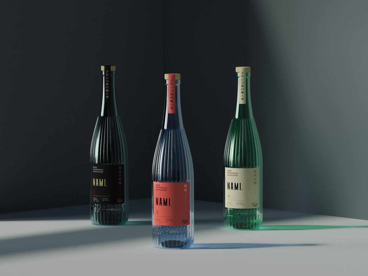
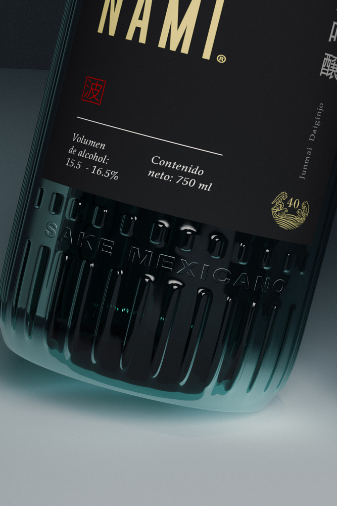
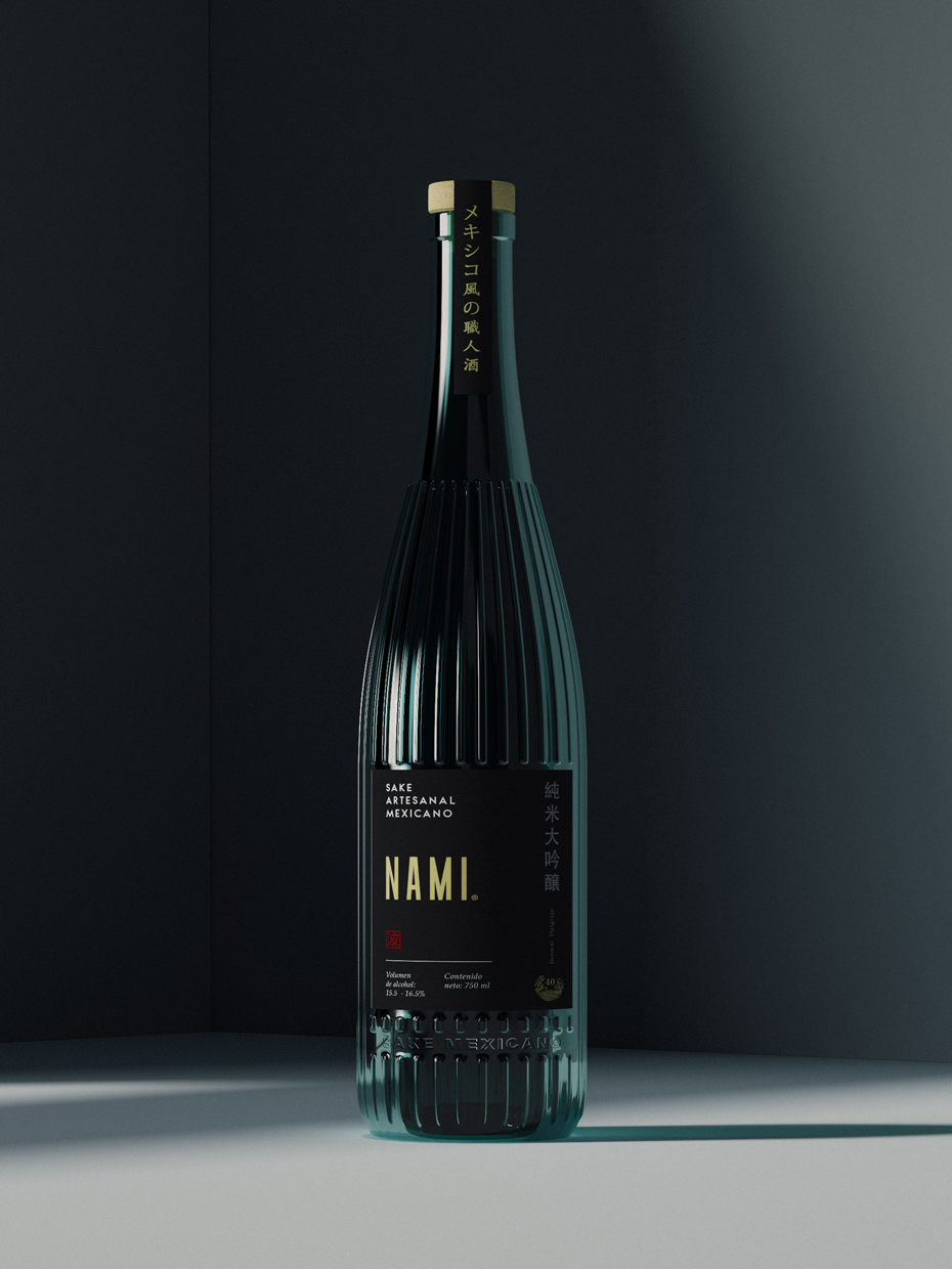
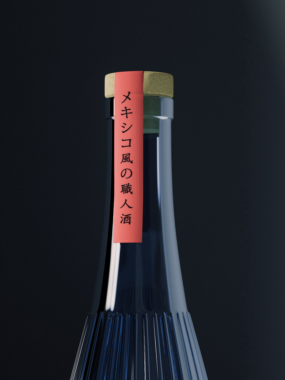
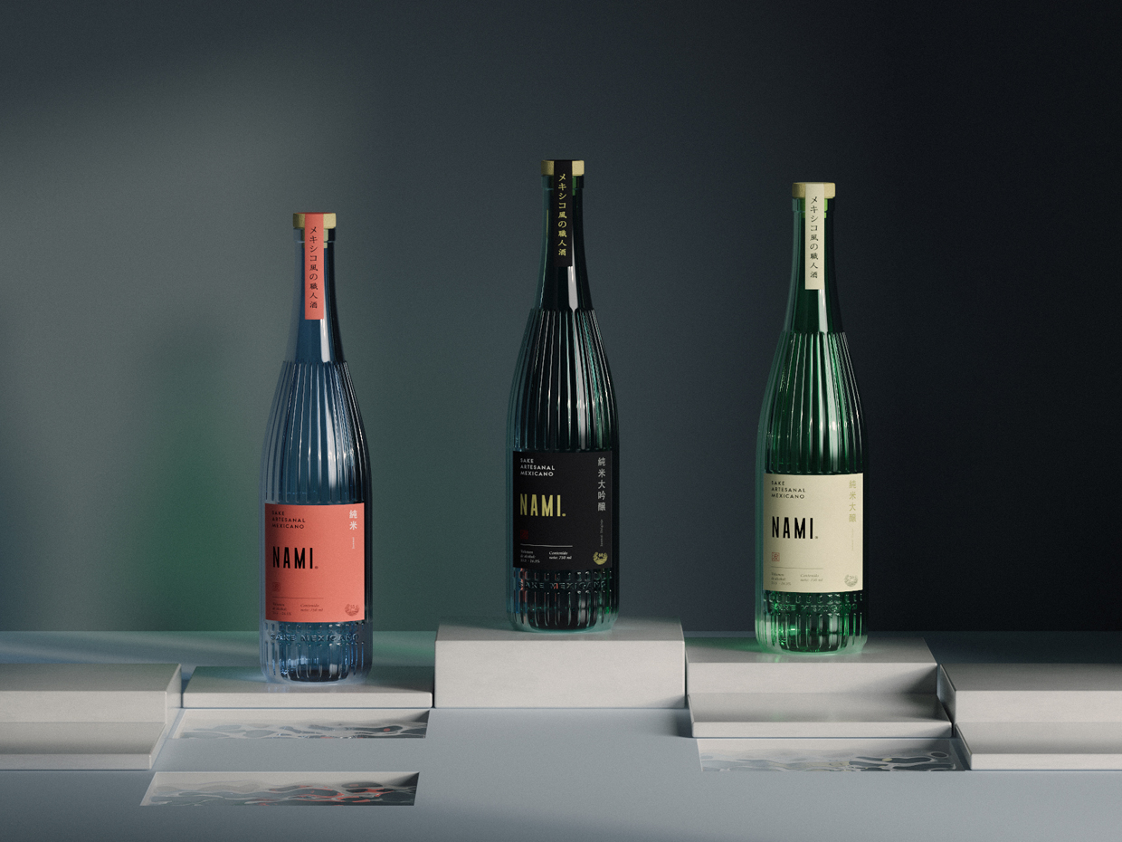
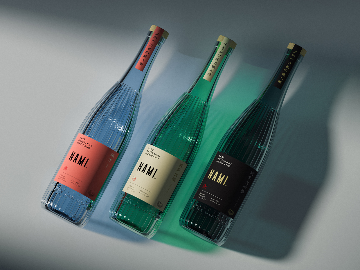
We had the honour of designing the first edition of Nami® “El primer Sake Mexicano” and recently we were invited to make a whole new concept for their second edition. In this new proposal we designed the packaging (Glass bottle) and the label, aiming for a fusion between two different concepts: Japan + Mexico. For the bottle design we incorporated raised lines in the glass to portray the characteristic geometry of the wooden barrels that were used in old Japan to fermentate Sake. In addition to it we separated the different levels of rice polishment by a beautiful spectrum of mexican color categories.
This redesign is looking to present Sake in a innovative way which the Mexican client is not used to consume this type of drink and would feel invited to taste it and experience new flavours, this is why we changed the language of the traditional Sake bottles, breaking the taboo behind it as a strong drink, we reached this through a semi transparent bottle which gives the sense of lightness and at the same time is competing with other categories such as Gin, Tequila and Mezcals.
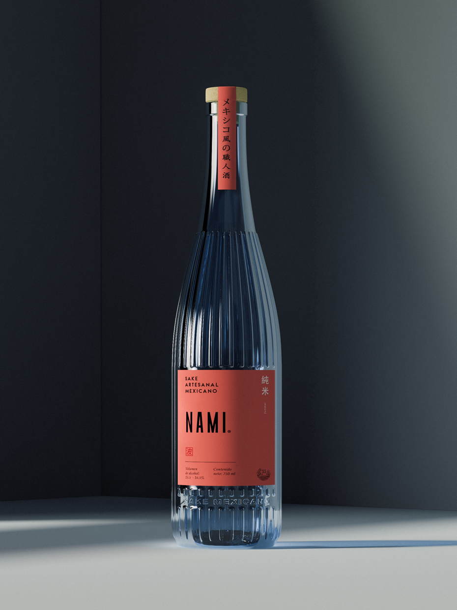
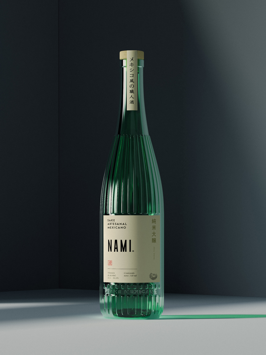
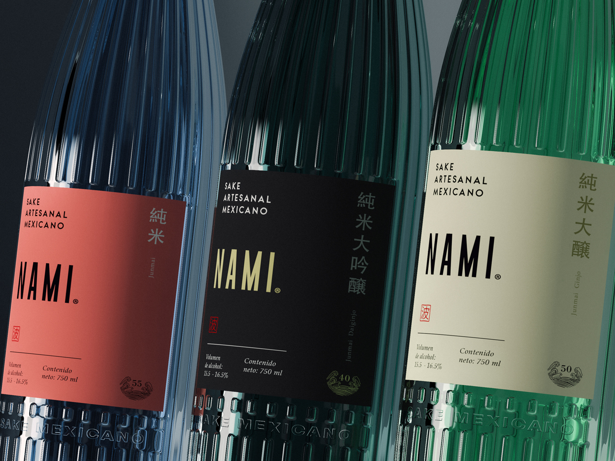
Nami® Sake is divided into three categories or qualities of sake that are defined based on the level of polish of the rice. To distinguish them we use 3 different crystal pigmentations and 3 label colors that match the glass. Jumnai is represented with a blue crystal color and mexican pink label followed by Junmai Ginjo which uses Mexico’s flag green on the glass contrasted by a beige on the labeling body, and we finished with the premium category Junmai Daiginjo with a dark crystal and black label with golden touches that give it that classic feeling.
CREDIT
- Agency/Creative: Ancla Studio
- Article Title: Ancla Studio Design the First Edition of Nami Sake
- Organisation/Entity: Agency
- Project Type: Packaging
- Project Status: Published
- Agency/Creative Country: Mexico
- Agency/Creative City: Culiacan
- Market Region: North America, Global
- Project Deliverables: 3D Art, Brand Redesign, Label Design, Packaging Design
- Format: Bottle
- Substrate: Glass Bottle
- Industry: Food/Beverage
- Keywords: Bottle design, Label design, Packaging, Graphic design, Mexican sake, Ancla work, Art direction
-
Credits:
Designer: Chris Rodriguez
Art direction: Adrian Espinoza
3D Artist: Daniel Maldonado


