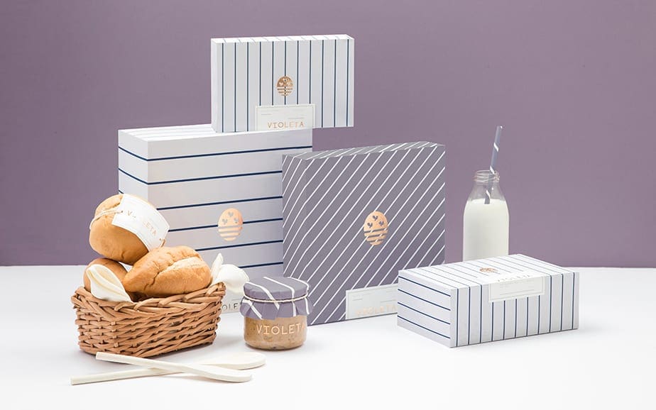
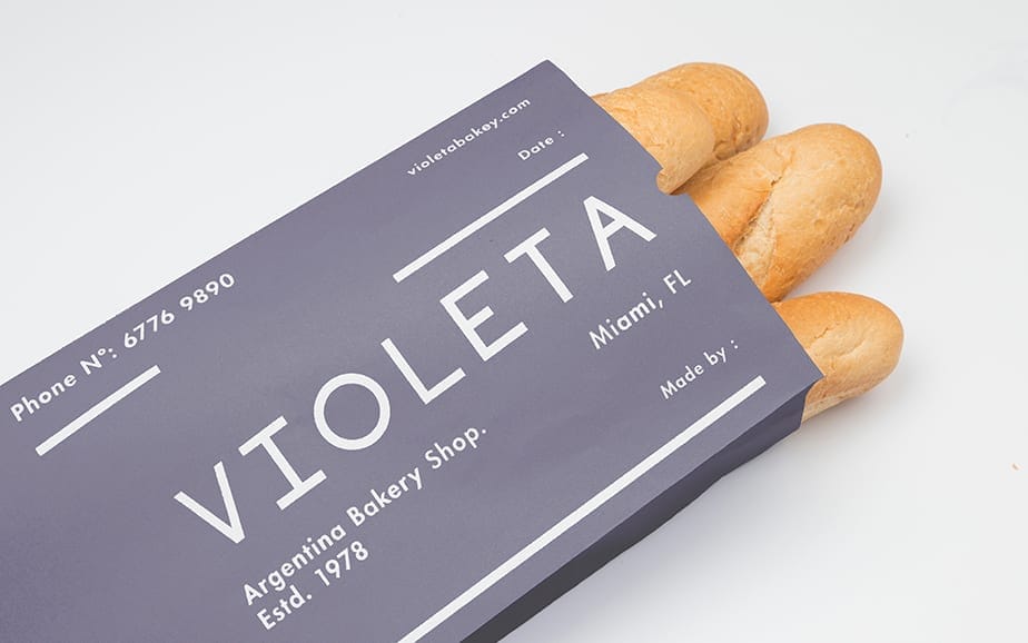
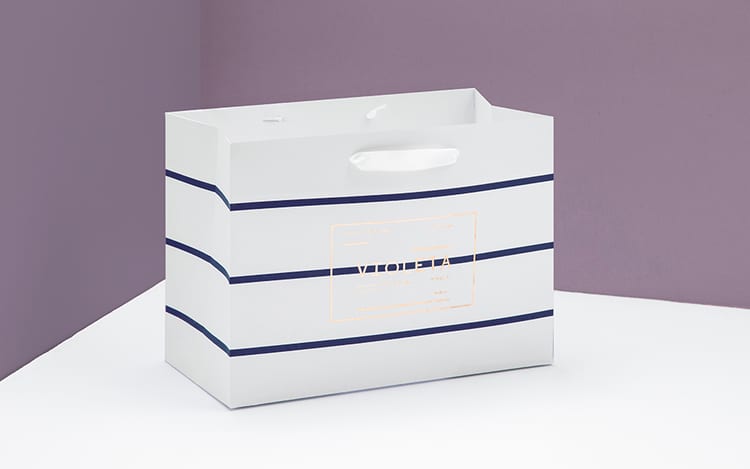
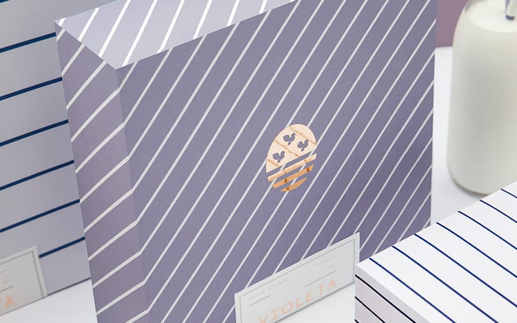
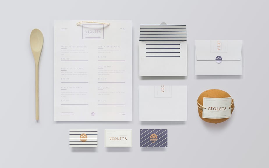
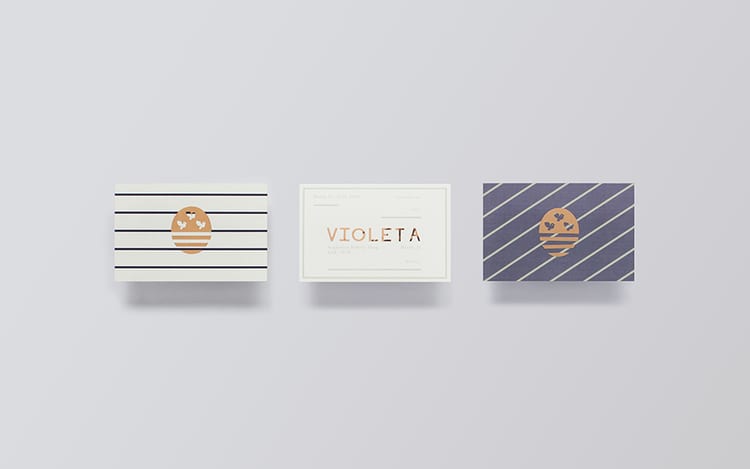
Mexico based Anagrama has designed a new identity and packaging system for Violeta, a traditional Argentine bakery located in the affluent neighborhood of Las Lomas de San Isidro in the outskirts of Buenos Aires. Violeta is named after its founder, who plans on expanding the bakery to Miami, Florida.
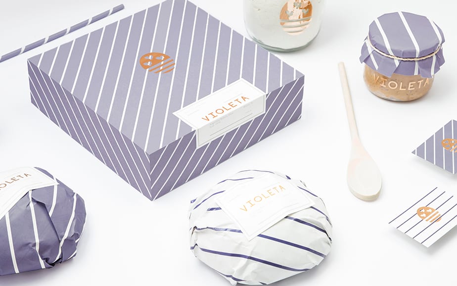
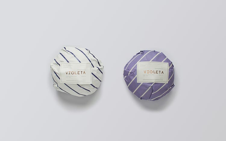
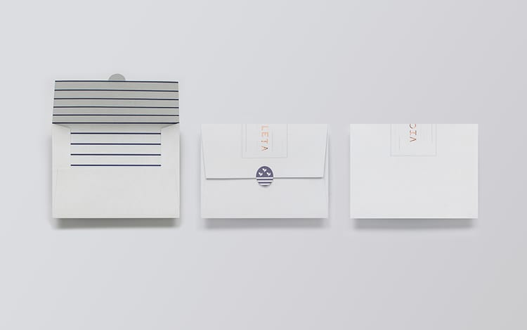
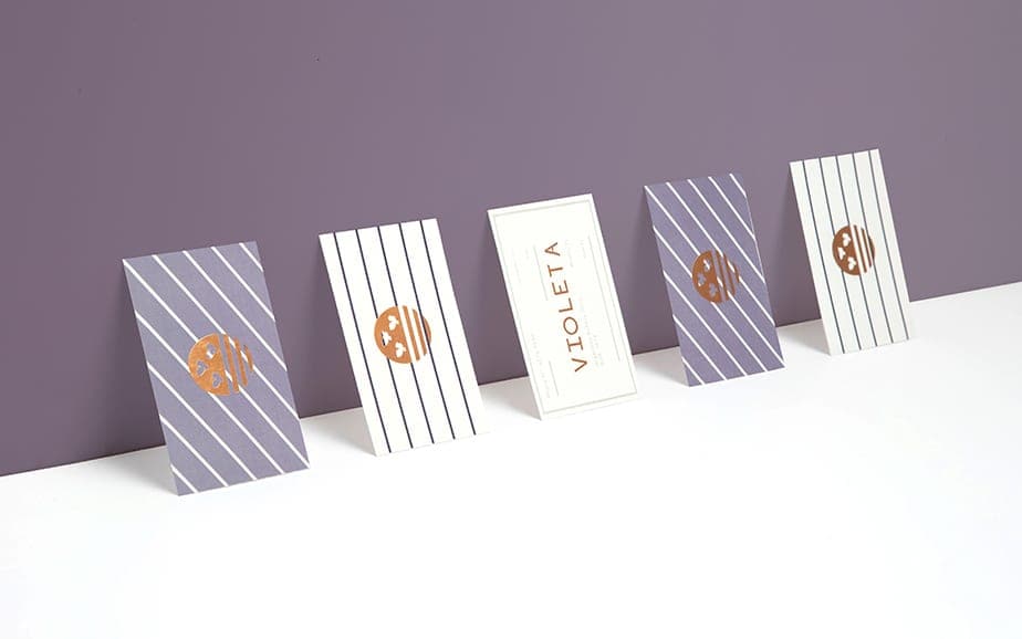
The overall look is sophisticated with a focus on craft and quality. The core brand color is Violet, an obvious choice. The logo draws its inspiration from Buenos Aires’ coat of arms, with lines at the bottom to represent the Rio de la Platariver. The lines carry through to all aspects of the brand, from the packaging to all marketing materials.



CREDIT
FEEDBACK
Relevance: Solution/idea in relation to brand, product or service
Implementation: Attention, detailing and finishing of final solution
Presentation: Text, visualisation and quality of the presentation


