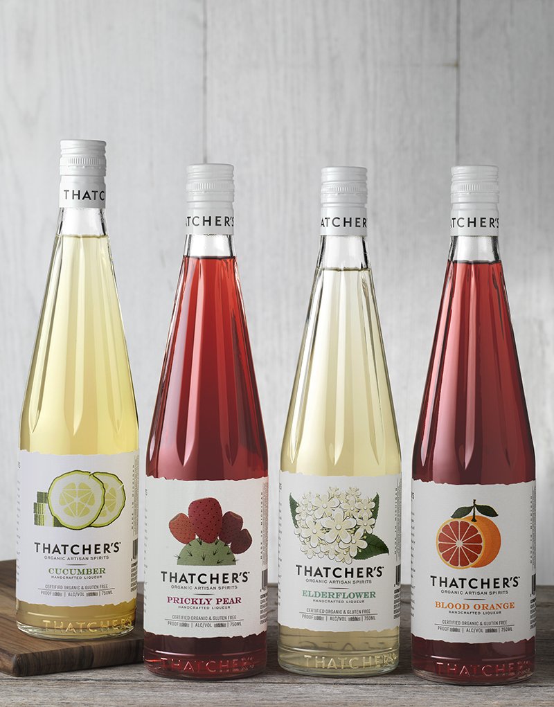
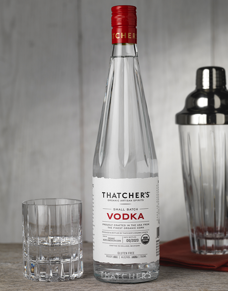
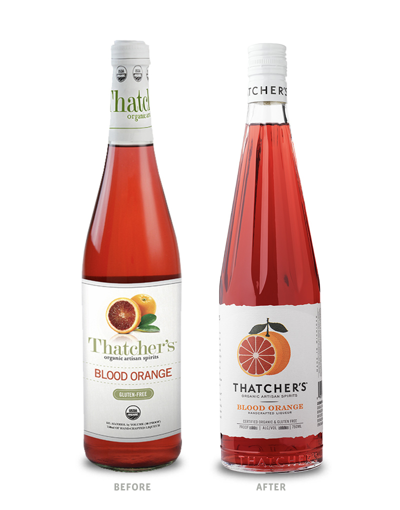
Thatcher’s Organic Artisan Spirits came to CF Napa Brand Design to refresh their line of organic flavored liqueurs – Blood Orange, Prickly Pear, Cucumber, Elderflower and Peach – and their small batch vodka. The goal of the project was to restage the spirits brand to be more premium without losing its signature approachableness and handmade feel. The new spirits packaging design would need to reinforce the brand’s farm-to-table sensibility, Michigan roots, gluten-free status and organic quality.
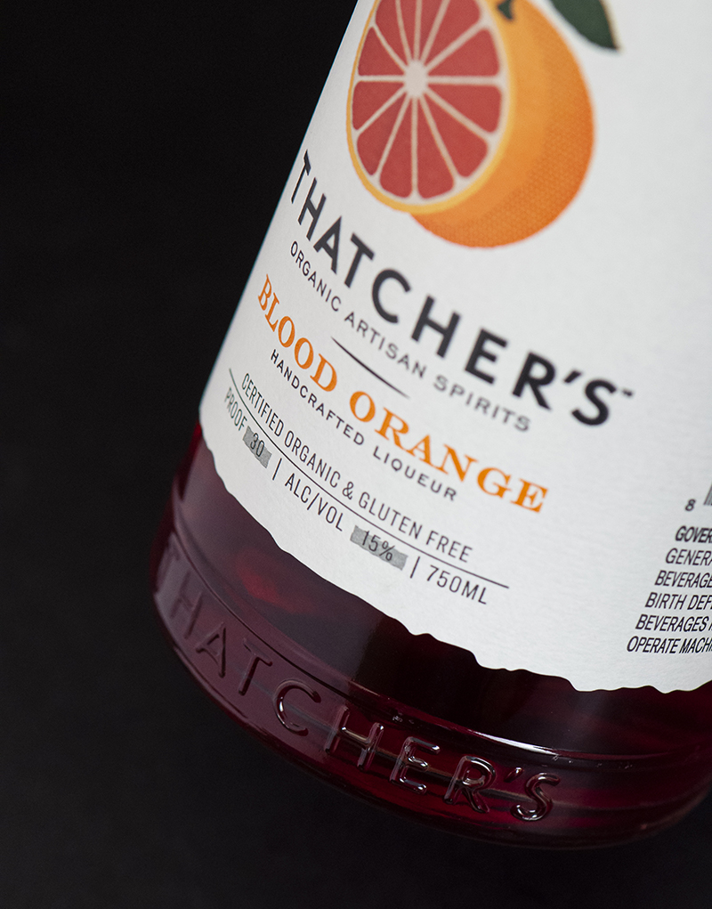
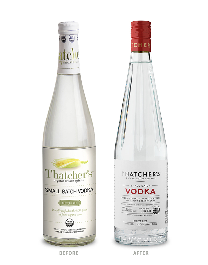
CF Napa Brand Design’s custom glass bottle design for the brand was inspired by the beautiful, yet utilitarian French lemonade bottles that evoke a farmer’s market sensibility. The neck of the bespoke bottle was designed to capture the faceted shape of vintage citrus juicers. A cartouche of the Thatcher’s wordmark is embossed along the bottom of the custom glass. The bottle was created in a 750ml size for the liqueurs and vodka. The glass bottle design was extended into a 1L and 1.75L bottle for the brand’s large format vodkas.
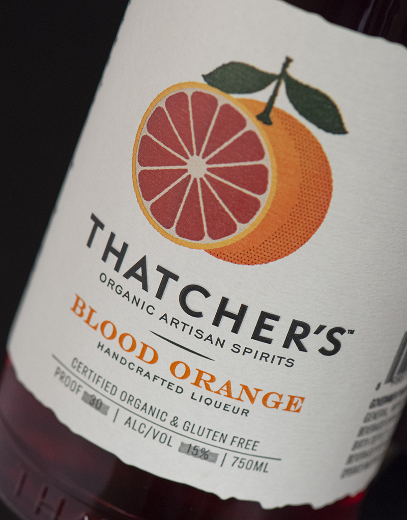
For the liqueur labels, CF Napa Brand Design drew custom, in-house illustrations representing each of the refreshing flavors and reinforcing the brand’s motto – organic spirits the way nature intended. The side panel of the liqueur labels incudes a unique cocktail recipe that utilizes the respective spirit flavor. The vodka label was distilled down to a very clean, information-driven design in order to emphasize the purity of the vodka. The side panel of the vodka label includes the recipe for the classic Moscow Mule cocktail.
While the label designs for the liqueurs and vodka differ, they are made cohesive through consistent elements. Both the liqueurs and the vodka include a personal note from the Thatcher’s founder and a grid system that provides a clean presentation of legal and ingredient information. Each bottle is finished with a customized screwcap with the Thatcher’s wordmark on the side and the USDA Organic logo on the top.
CREDIT
- Agency/Creative: CF Napa Brand Design
- Article Title: An Organic Redesign for Thatcher’s Created by CF Napa Brand Design
- Organisation/Entity: Agency, Published Commercial Design
- Project Type: Packaging
- Agency/Creative Country: United States
- Market Region: North America
- Project Deliverables: Brand Architecture, Brand Identity, Brand Redesign, Brand Refinement, Brand Rejuvenation, Brand Strategy, Branding, Graphic Design, Identity System, Illustration, Packaging Design, Rebranding
- Format: Bottle
- Substrate: Glass, Glass Bottle, Metal, Pulp Paper


