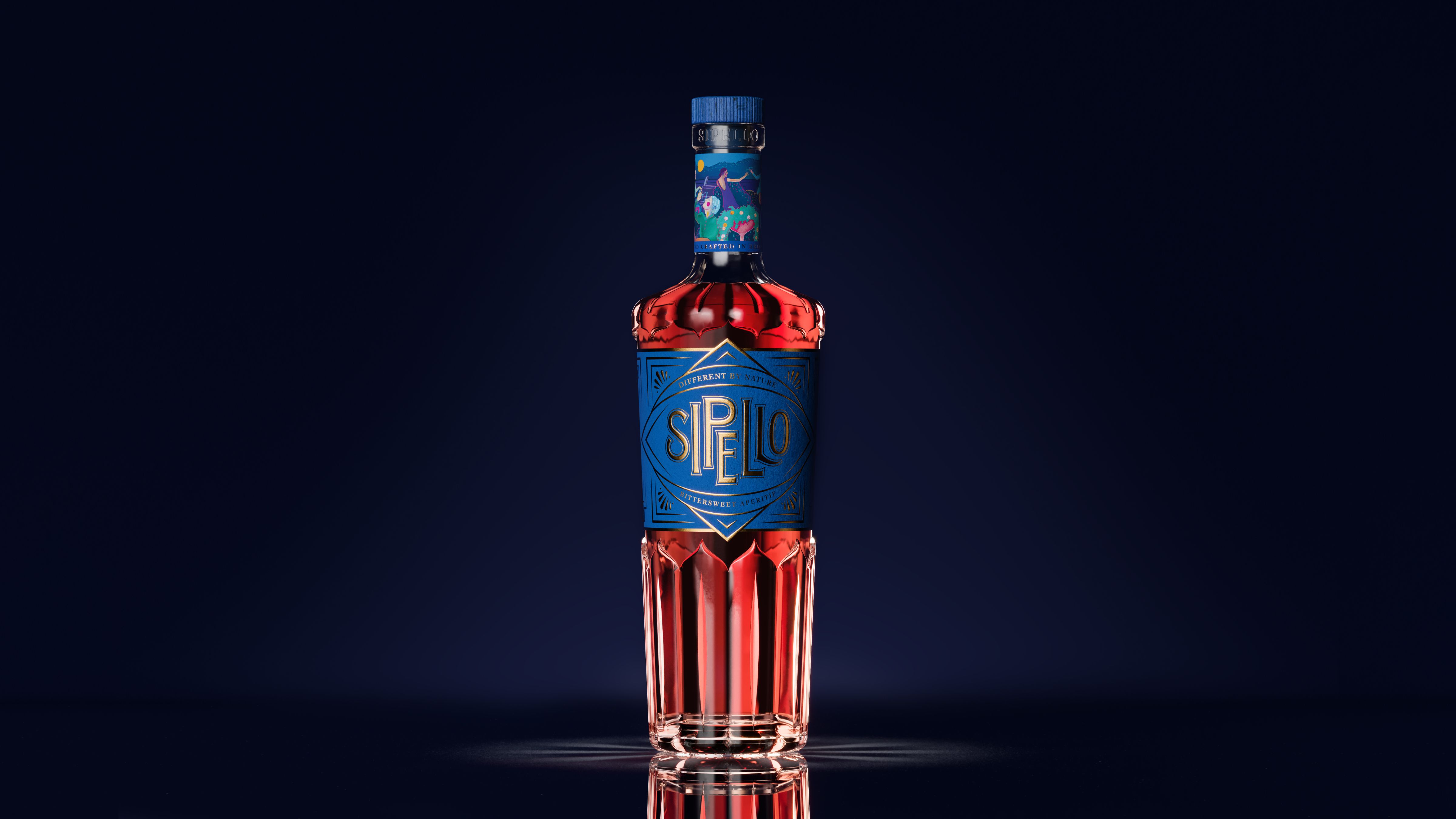
How can a premium, progressive aperitif truly engage people in an overly traditional but growing category? Sipello founder Tim came to us in 2020 having created an exquisite, gooseberry-led, Italian-style aperitif, made in Britain with British ingredients – and had big ambitions for it to become a must-stock in the world’s top cutting edge cocktail bars. To sit in this space we knew it needed to be modern-but-timeless, and bring something of the daring, debonair creative British spirit to the brand.
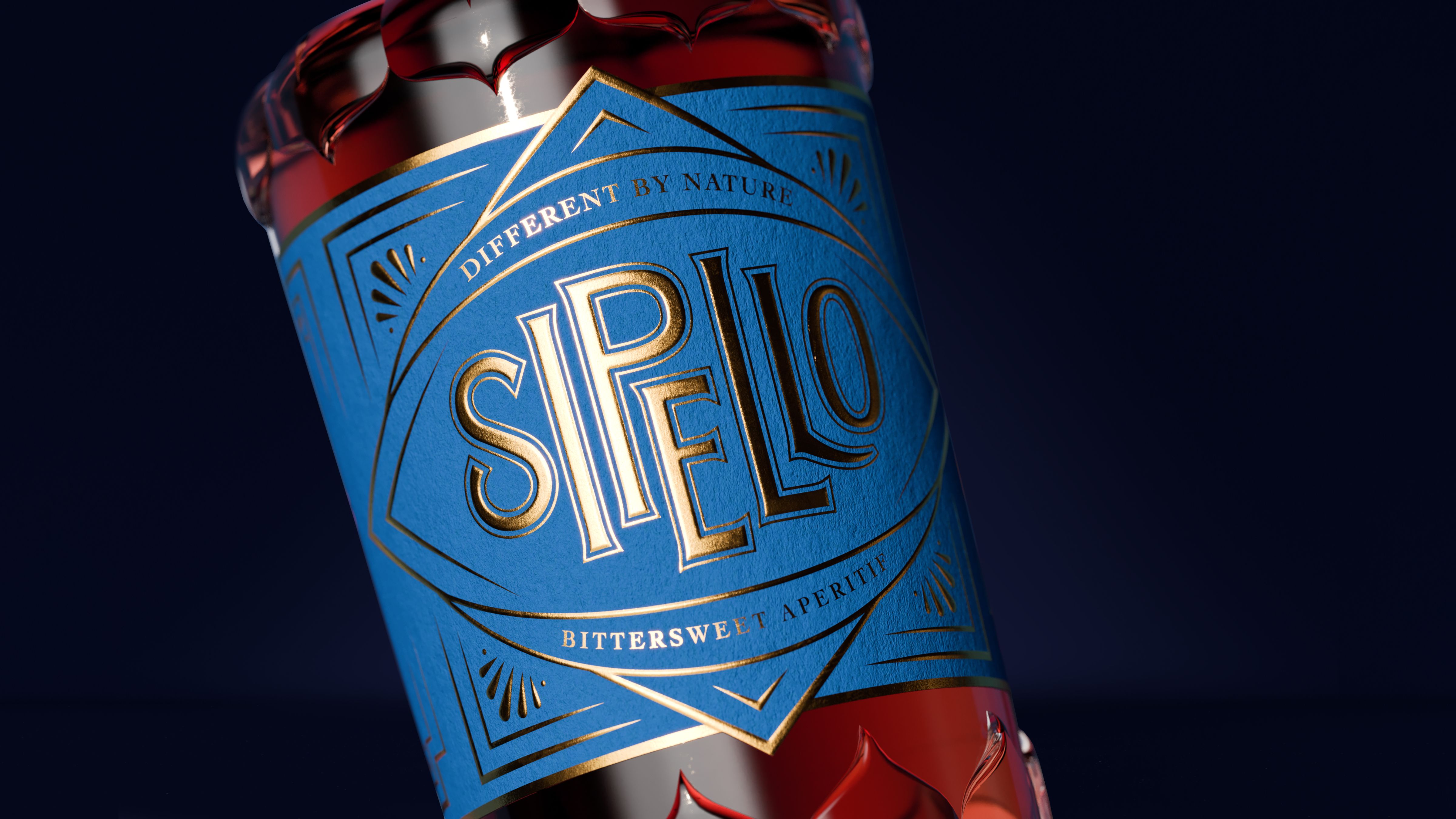
To capture Sipello’s British twist on the traditional Italian aperitif, we developed the brand proposition and tagline ‘Different by nature’ and created an imaginative, distinguished and subtly avant-garde personality.
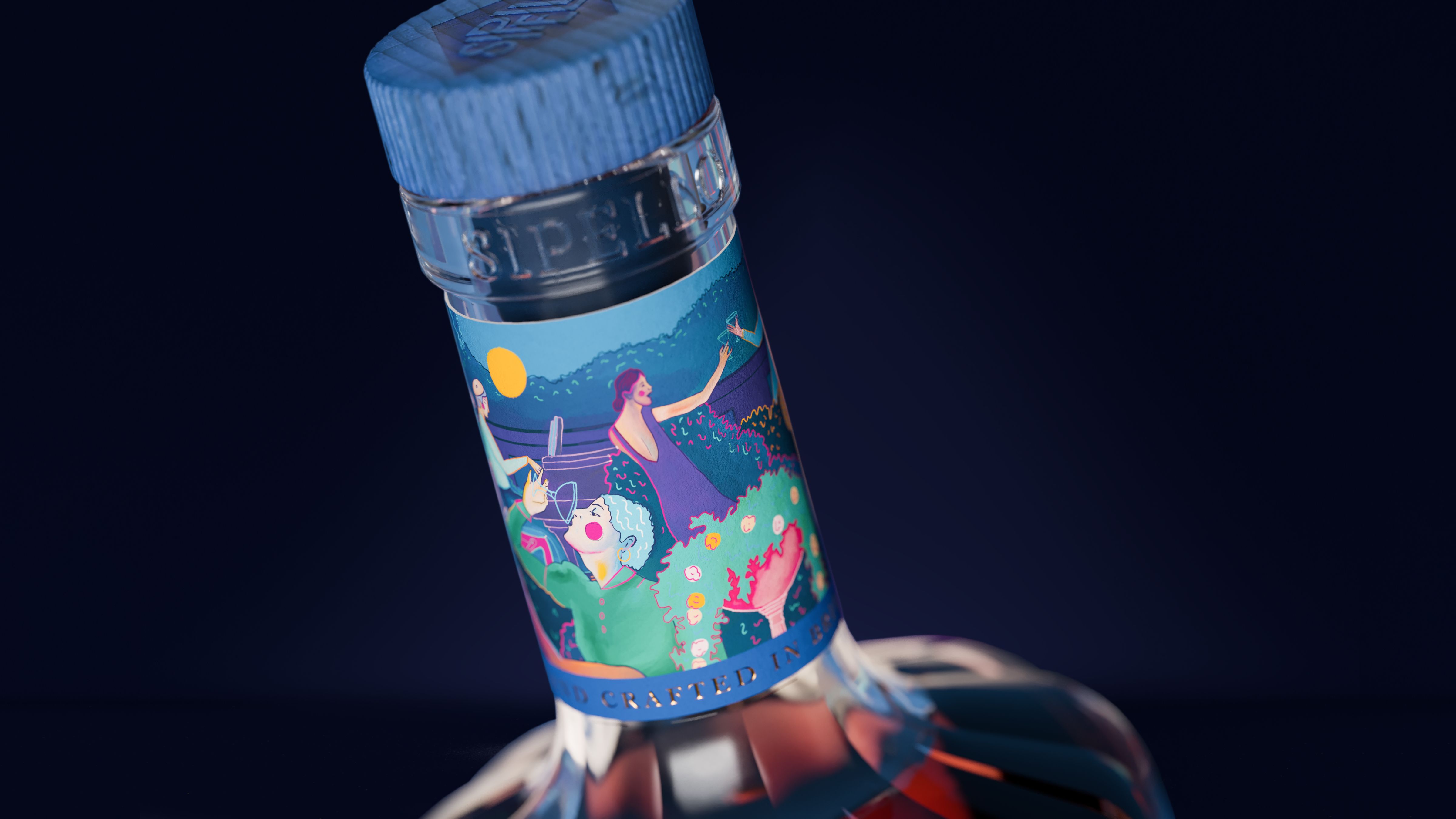
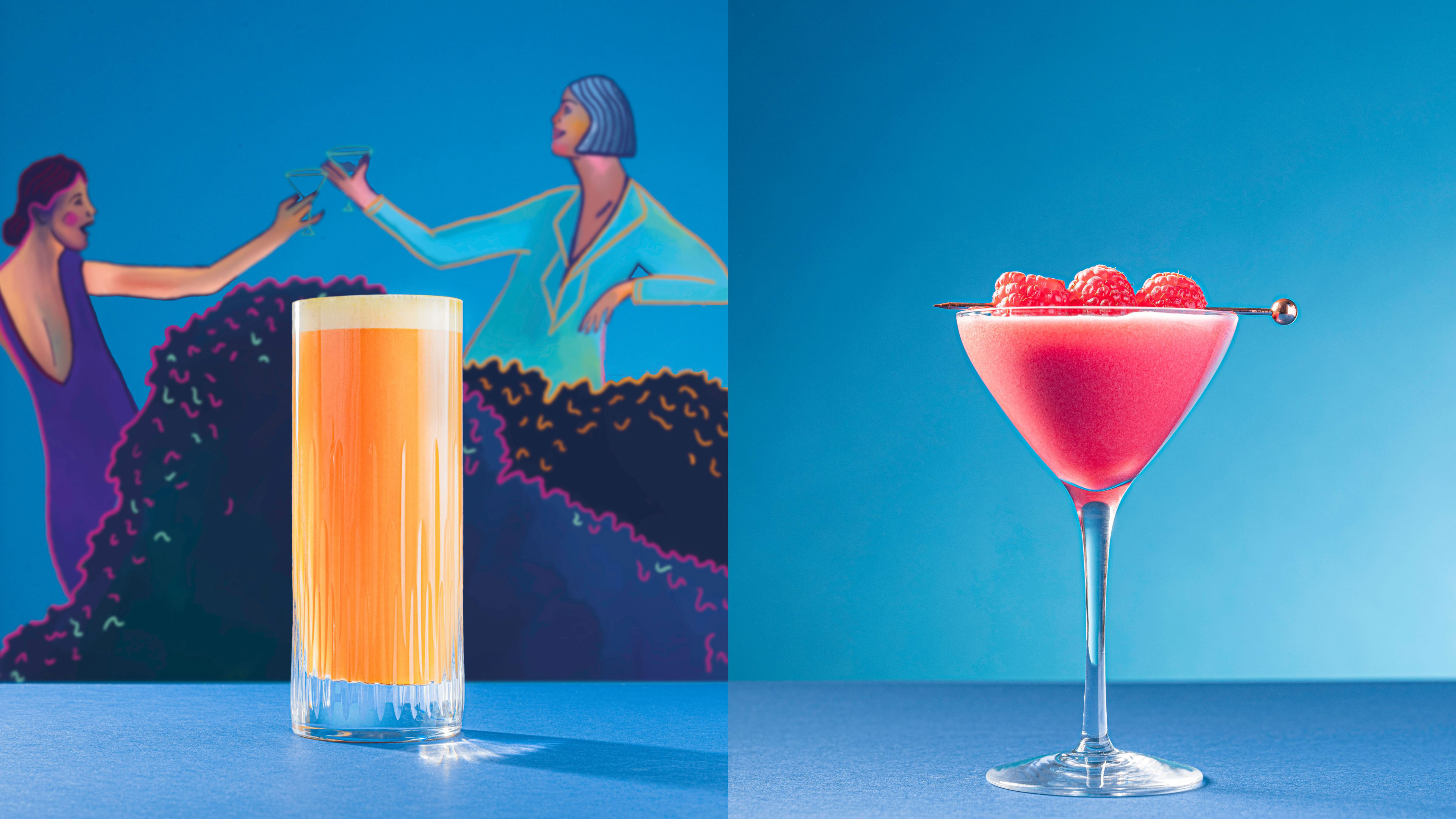
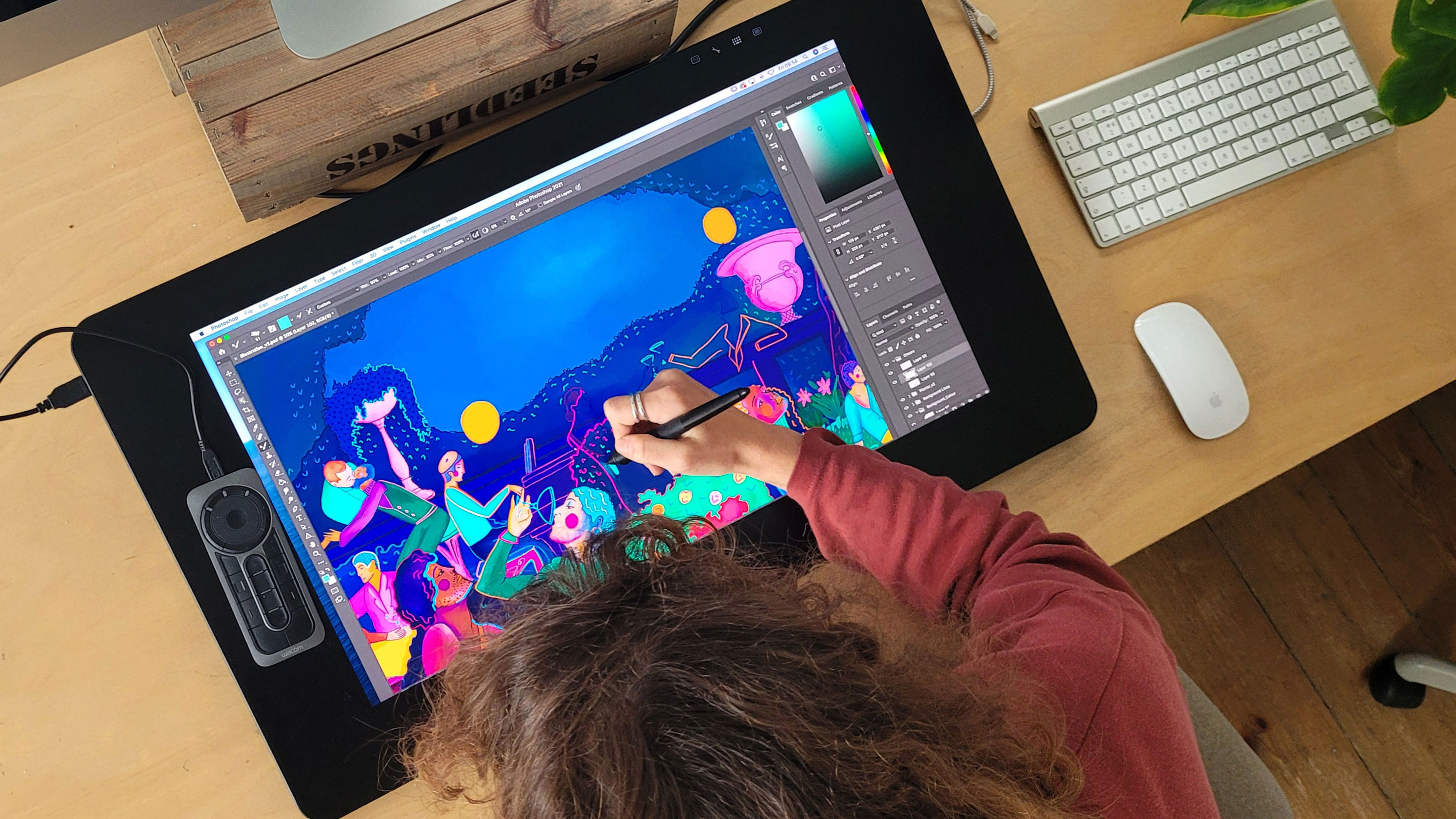
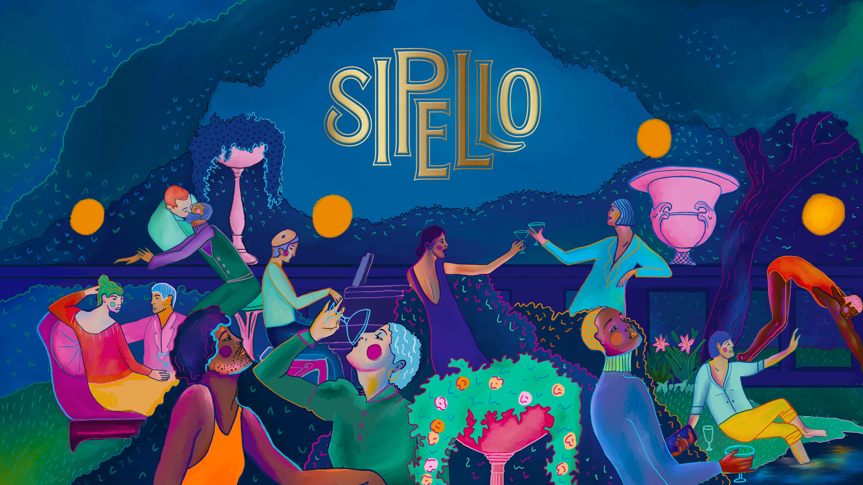
The Sipello cocktail occasion is all about socialising, so we centred the identity around enjoyable but high-end social experiences. A vibrant hand-painted party scene, featured on the neck label and in brand communications, tells the occasion story and captures the brand’s modern, inclusive ethos.
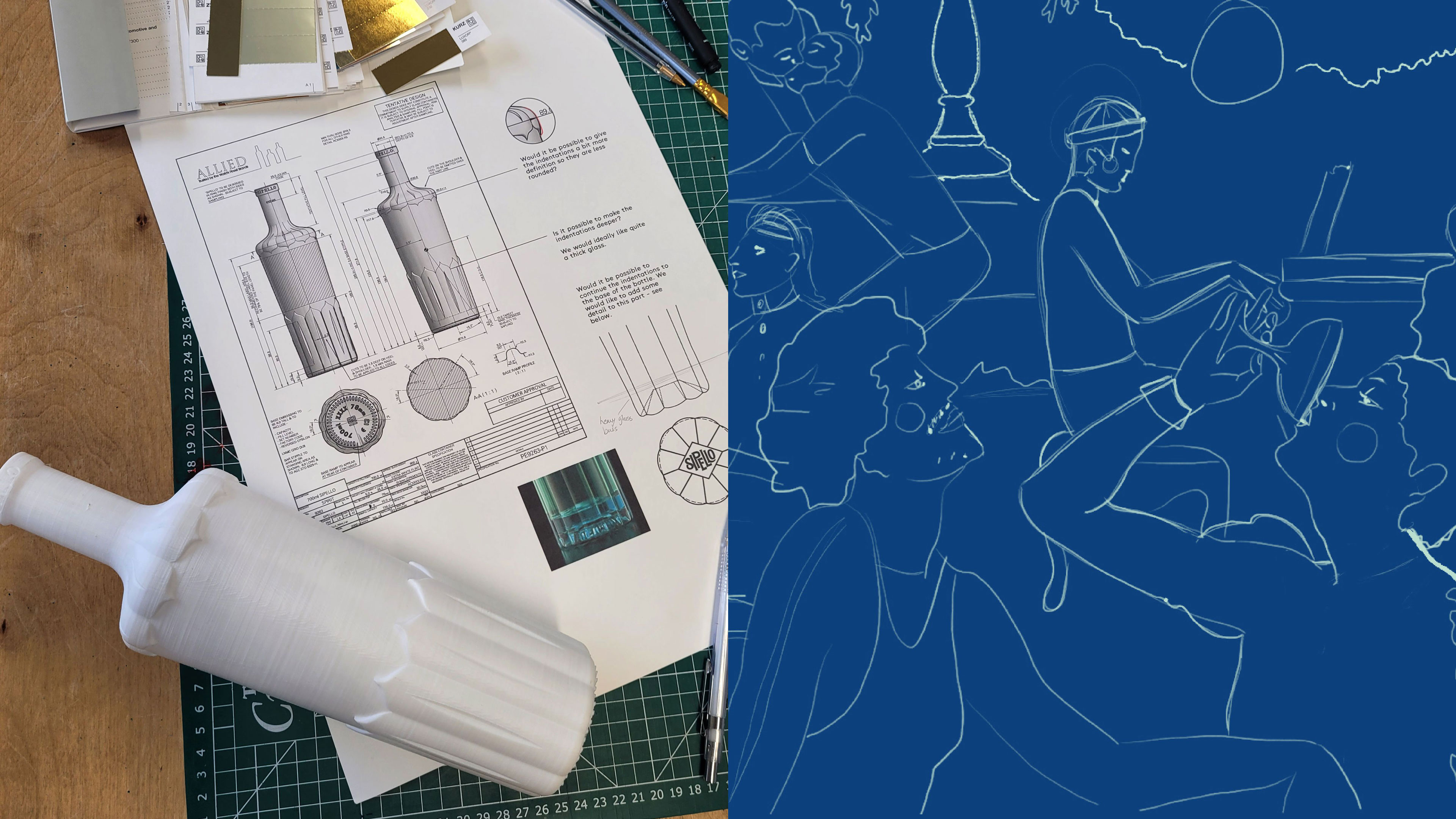
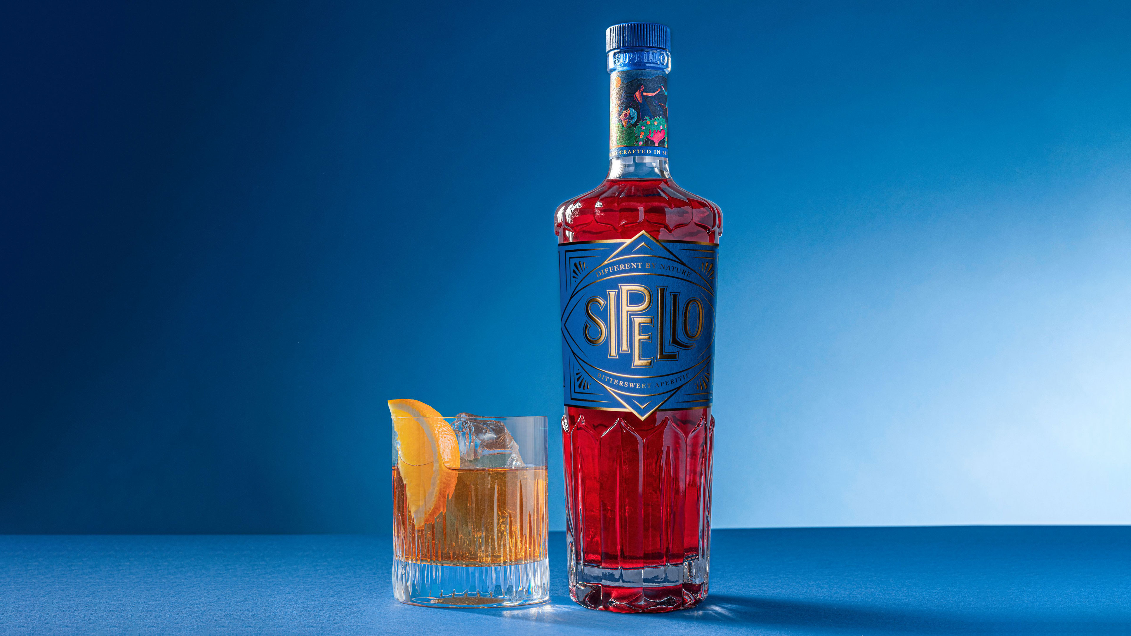
We paired an opulent gold logo mark with a prominent rich blue to contrast the red liquid and stand out on the bar. And alongside Allied Glass we crafted a bespoke bottle, with a bold silhouette inspired by flower and petal shapes, emphasising the natural ingredients and a nod to Tim’s daughters, Lily and Iris.
“Working with K&S was a wonderful experience. They bring so much more to the table than just design and strategy. First class creative minds married to the kind of pragmatism needed as a foundation to any new product. I found them to be a great sounding board for all my good and bad ideas. Every detail is poured over, weighed and measured so the result is always deliberate, original and in the case of Sipello, stunning.” – TIM SIMMONS, FOUNDER OF SIPELLO
CREDIT
- Agency/Creative: Kingdom & Sparrow
- Article Title: An Opulent British Twist on the Traditional Aperitif
- Organisation/Entity: Agency
- Project Type: Packaging
- Project Status: Published
- Agency/Creative Country: United Kingdom
- Agency/Creative City: Falmouth
- Market Region: Europe
- Project Deliverables: 3D Design, Art, Art Direction, Brand Creation, Brand Design, Brand Guidelines, Brand Identity, Brand Strategy, Brand World, Branding, Design, Graphic Design, Illustration, Label Design, Logo Design, Packaging Design, Typography
- Format: Bottle
- Substrate: Glass Bottle
- Industry: Food/Beverage
- Keywords: WBDS Agency Design Awards 2021/22
- Keywords: spirit branding, branding, illustration, brand creation, graphic design, aperitif design, bespoke bottle design, label design,
-
Credits:
3D Visuals: Where Giants Roam


