


Brand Development for Doto by StudioDraft.
A modern identity built around duality, clarity, and the many lives of today’s woman.
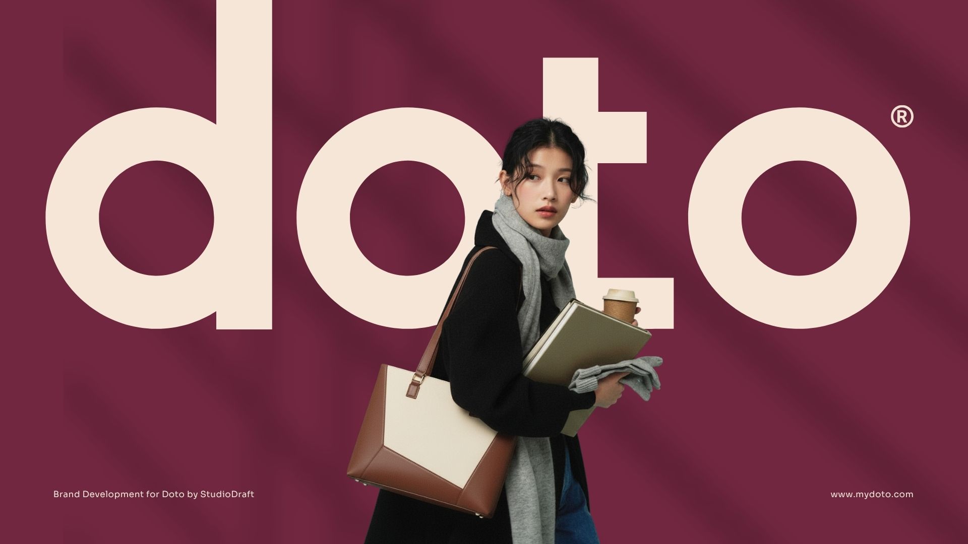
StudioDraft partnered with Doto to build a brand that stands for complexity, contrast, and character. Rooted in the idea of “dual-tone” as both a design language and a cultural insight, Doto emerges as a premium accessories brand crafted for women who move through multiple roles, identities, and emotional palettes in a single day. The goal was to create a brand that reflects who she is—not in a simplified form, but in her layered, everyday reality.
Strategic Foundation: Duality as a Way of Life
Our strategic direction began with an in-depth audit of India’s evolving fashion landscape and the gap between aesthetic-first brands and function-forward ones. Through extensive research, we identified a powerful human truth: modern women live with quiet complexity. She shifts between roles—professional, personal, emotional—with fluidity and intention.
Doto’s brand strategy, therefore, frames duality not as an aesthetic choice but as a lived experience.
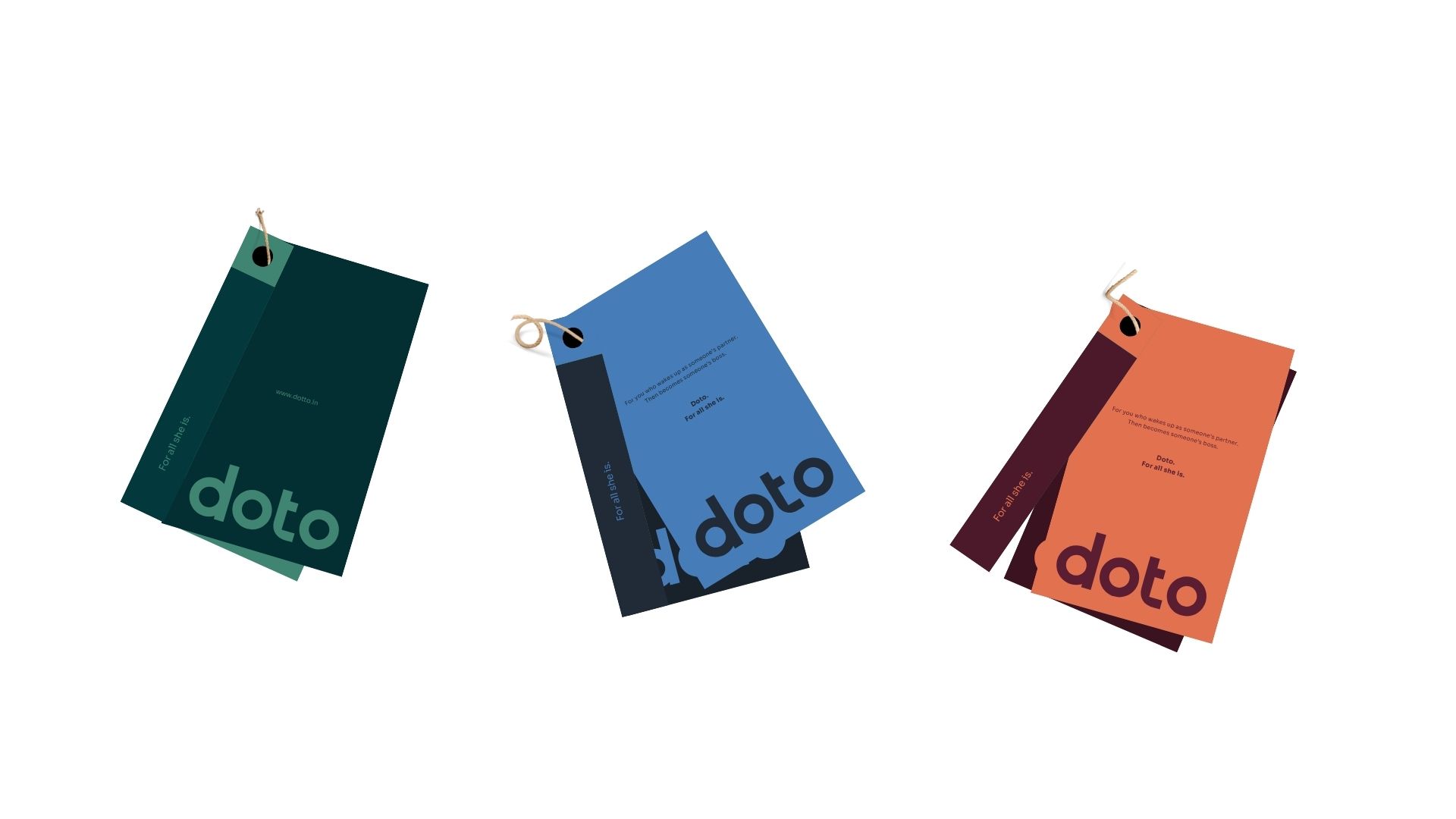
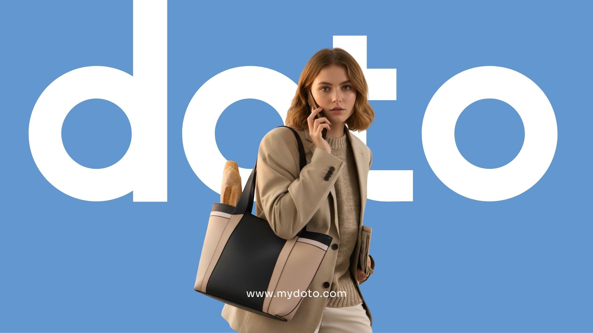
We articulated Doto’s positioning around “For all she is,” a line that anchors the brand’s philosophy, storytelling, and product purpose. Every design and narrative choice flows from this belief.
Verbal Identity: Honest, Sharp, and Deeply Relatable
StudioDraft built an extensive verbal identity system that rejects clichés and embraces a voice that is witty, grounded, and real.
The language acknowledges her chaos, her clarity, her moods, her multitasking—and most importantly, her many versions.
Manifestos, taglines, and ad copies were developed to create emotional recall while maintaining an intelligent, contemporary tone.
Lines such as “A dual-tone bag for a woman with a dual-core processor” and “You’ve never been just one thing. You don’t need a bag that tries to make you one.” became signature expressions of the brand.
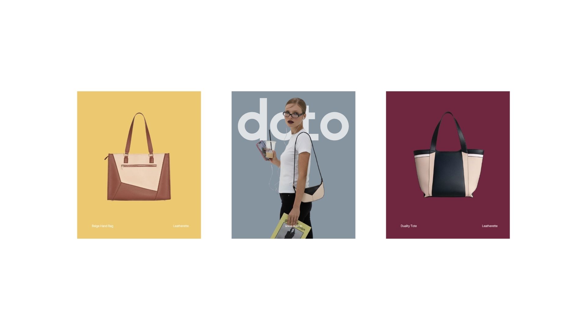
Visual Identity: Minimal, Modular, and Contrast-Driven
Visually, Doto balances expressive minimalism with functionality—a translation of duality into form.
Key elements include:
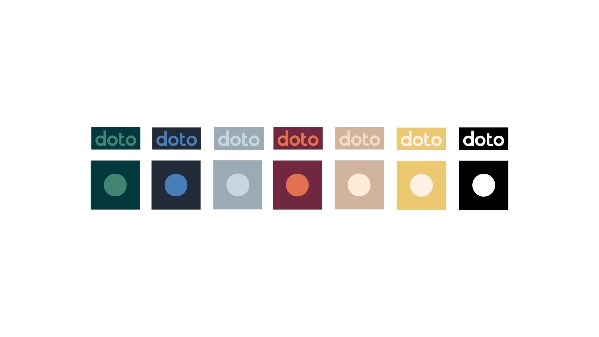
A clean, contemporary wordmark supported by a geometric favicon—circle within a square—symbolizing internal and external contrast.
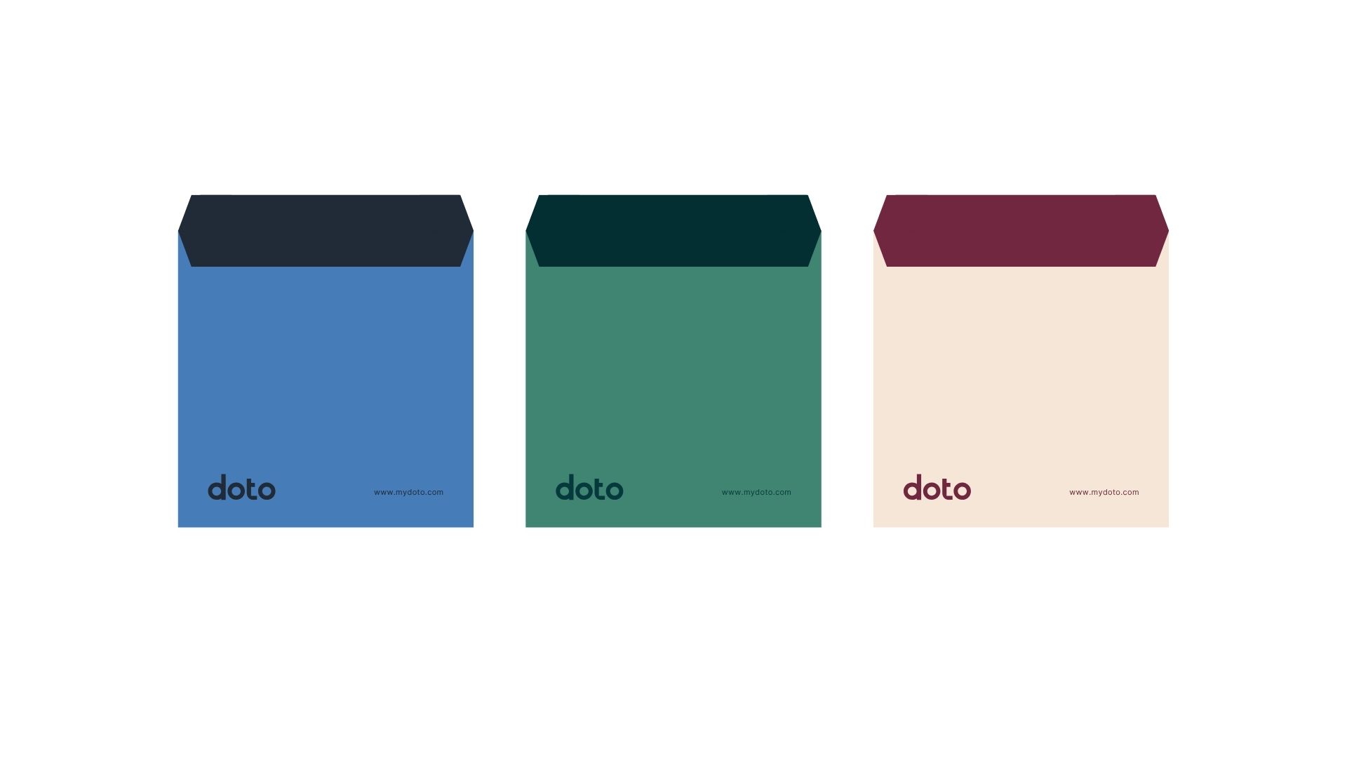
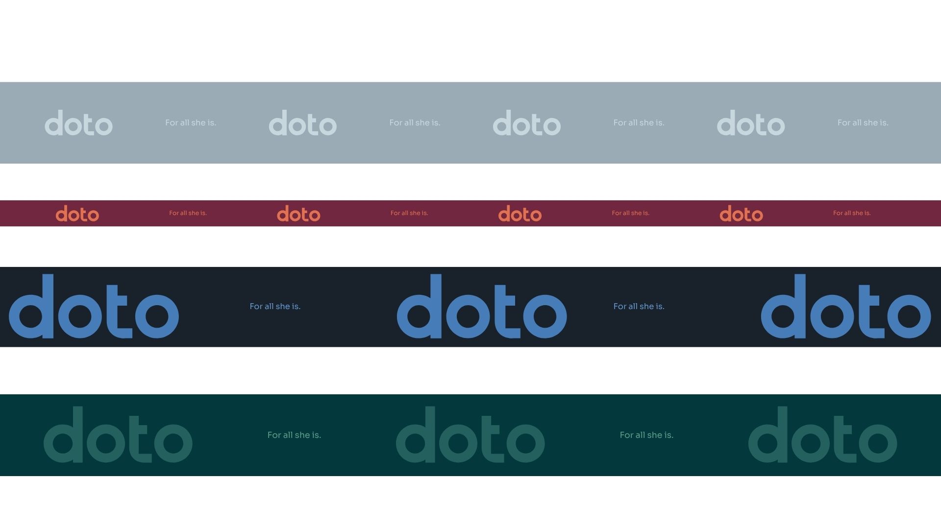
A rich color system blending deep teals, navy, and warm neutrals, contrasted with clear blacks and whites to establish emotional and structural duality.
A modern type system combining Sora (expressive) and Inter (functional) to bring clarity, rhythm, and versatility across digital and print applications.
A pattern language inspired by repetition and tonal variation, reinforcing the brand’s core idea through subtle rhythm.
The identity is designed to scale seamlessly across product, packaging, retail, and digital surfaces while maintaining distinctiveness.
Brand Experience & Packaging: Designed for Everyday Rituals
StudioDraft developed a comprehensive packaging ecosystem—tote bags, boxes, pouches, ribbon styling, tags—each carrying small, intentional moments of storytelling.
Every touchpoint reinforces the brand’s empathy and understanding of how real women carry their world—literally and emotionally.
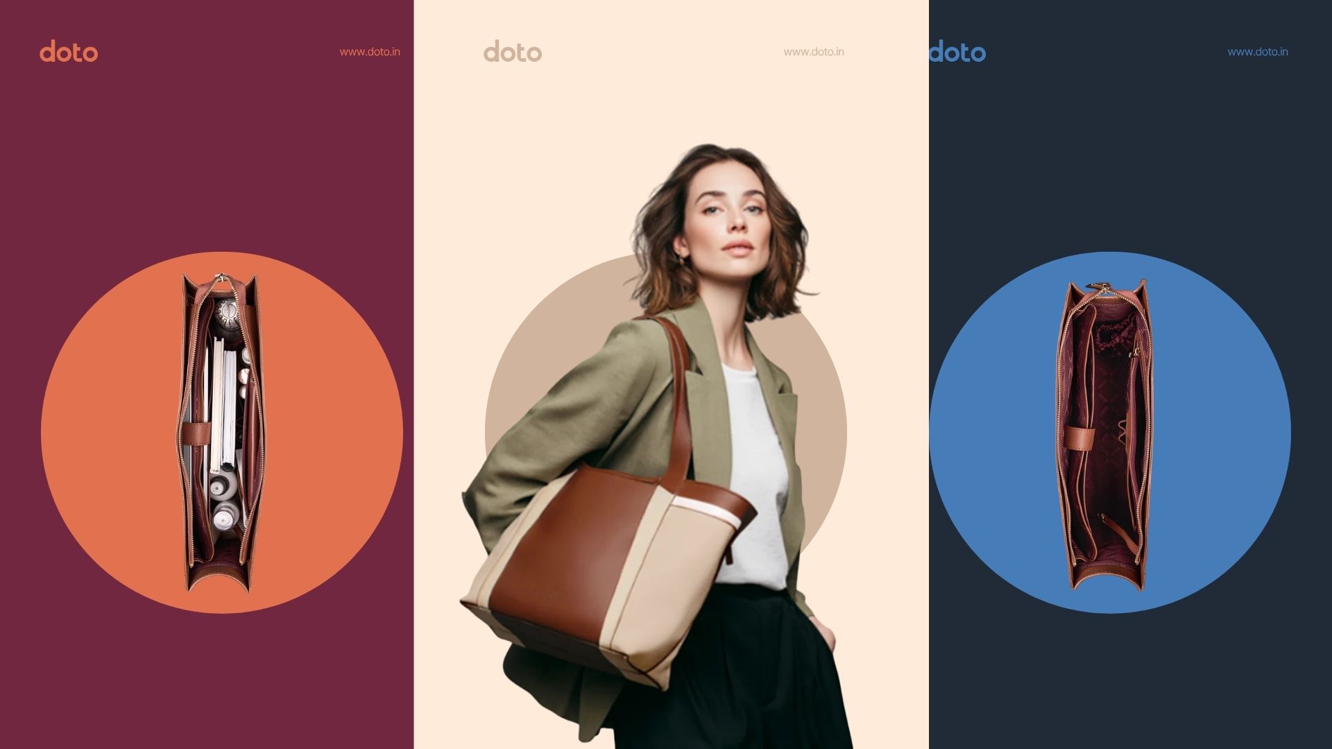
Communication System: Split-Frame, Dual Narratives, Real Lives
We introduced a vertical and horizontal split-frame visual language to emphasize Doto’s thematic duality.
This system anchors social media, advertising, and campaign design, offering a timeless and easily expandable structure for future collections.
Outcome: A New-Age Indian Brand with Global Sensibilities
Doto’s identity is built to stand shoulder-to-shoulder with global names like Charles & Keith while staying culturally grounded and emotionally resonant in the Indian market. It bridges accessible luxury with design intelligence and storytelling depth—allowing the brand to scale across platforms and seasons without losing its core DNA.
StudioDraft’s work ensures that Doto isn’t just a fashion label, but a brand that speaks to the complex, beautiful, multi-layered lives women live today.
Doto, For all she is.
CREDIT
- Agency/Creative: StudioDraft
- Article Title: An Identity Where Contrast Meets Clarity Crafted for Women Living Many Lives by StudioDraft
- Organisation/Entity: Agency
- Project Type: Identity
- Project Status: Published
- Agency/Creative Country: India
- Agency/Creative City: Bangalore
- Market Region: Asia
- Project Deliverables: Art Direction, Brand Guidelines, Brand Identity, Brand Strategy, Branding
- Industry: Fashion
- Keywords: Doto, Women's bag branding, Duality, StudioDraft, Fashion branding, Visual Identity
-
Credits:
Creative Director: Martin Thomas
Verbal Director: Ishmeet Kaur
Project Manager: Abdul Rahman


