


Saul studio – ideasmiths
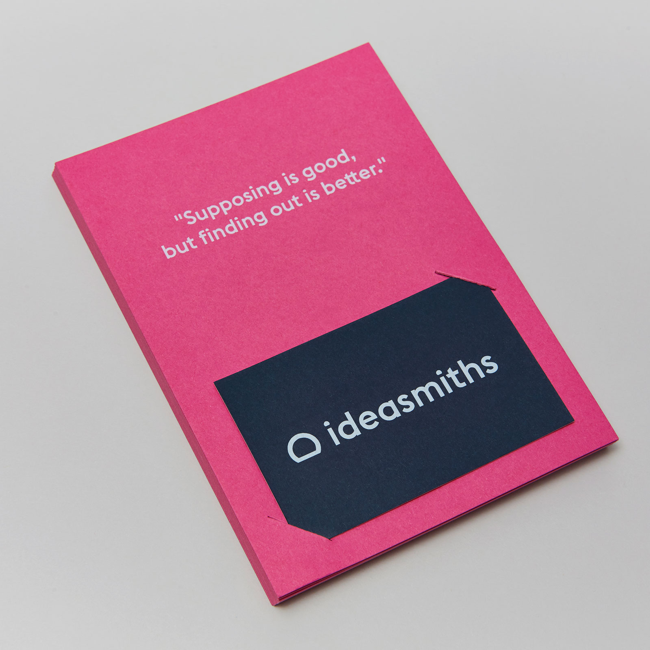
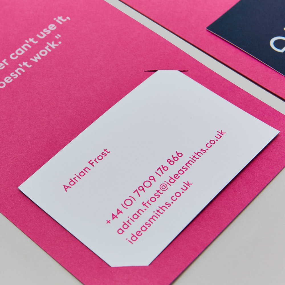
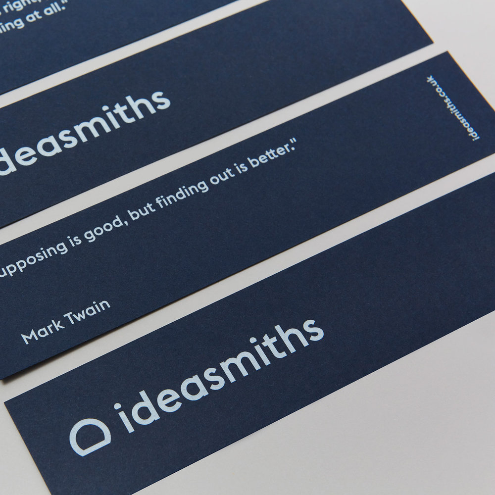
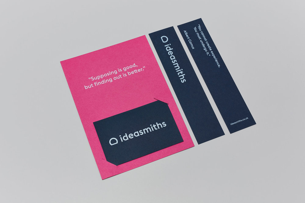
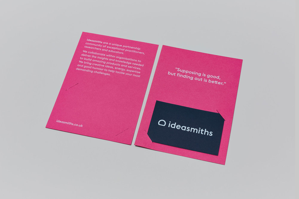
“ ideasmiths are a unique partnership community of exceptional practitioners, researchers and educators. They collaborate within organisations to deliver the insights and knowledge needed to build amazing products and services.By combining creative ideas with energy, expertise and good humour, they help their clients to make lovely things that tackle the most demanding challenges.The studio were invited to rebrand ideasmiths in order to realign their identity with their key values: ideas, energy and creativity. The two primary colours – fuchsia and dark blue – represent the stages of a ‘light bulb moment’.Deliverables include: bookmarks, business cards, flyers, icon and wordmark, merchandise, pop-up banners and quote cards. Print collateral uses G . F Smith’s Colorplan Fuchsia Pink and Imperial Blue.”


CREDIT
- Agency/Creative: saul studio
- Article Title: An Energetic and Creative Identity that Realigning Core Values
- Project Type: Packaging
- Agency/Creative Country: United Kingdom
- Market Region: Europe
- Industry: Information


