


Every brand designer goes through this moment someday: sleepless hours, months of intense work, countless revisions, reworks, and restarts. It’s a seemingly endless and often frustrating process, but it’s part of every creator’s journey. The struggle to capture the essence of our “self” and translate it into a visual brand is both a challenging and rewarding task. If you haven’t reached this stage yet, rest assured that you will someday.
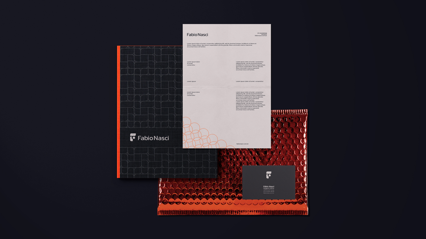
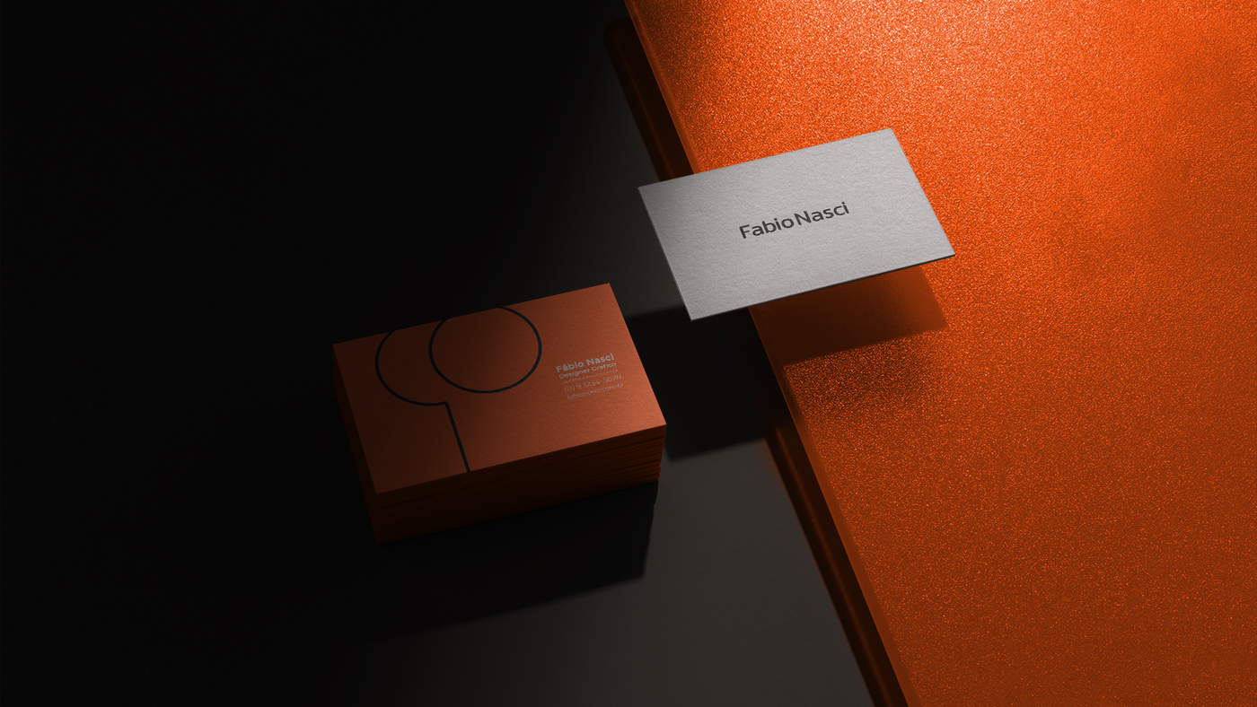
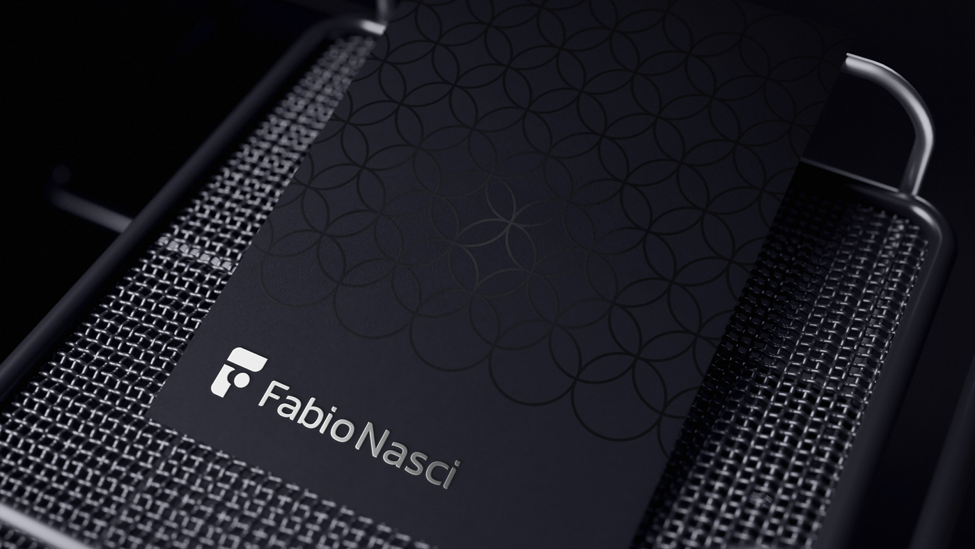
For my symbol, I chose the letter “F”. This was not a random choice, but a carefully planned decision. The letter was developed within a rectangle with a √2 proportion, a choice that harkens back to the classic and harmonious proportions of design. This rectangle, known for its mathematical and aesthetic properties, provides a solid and balanced foundation for the symbol’s construction.
The “F” I created conveys several essential qualities: transformation, dynamism, elegance, and simplicity. Every curve and line was designed to reflect these values. Transformation is present in the way the lines of the “F” meet and move, suggesting constant motion and change. Dynamism is evidenced by the sense of fluidity and energy the letter exudes. Elegance manifests in the simplicity and purity of the forms, avoiding excess and focusing on the essential.
From the beginning, my goal was to use classic design shapes, such as rectangles and ellipses. These shapes, present in nature and art for centuries, carry a sense of familiarity and timelessness. They are both modern and traditional, providing a solid foundation upon which to build something new and unique.
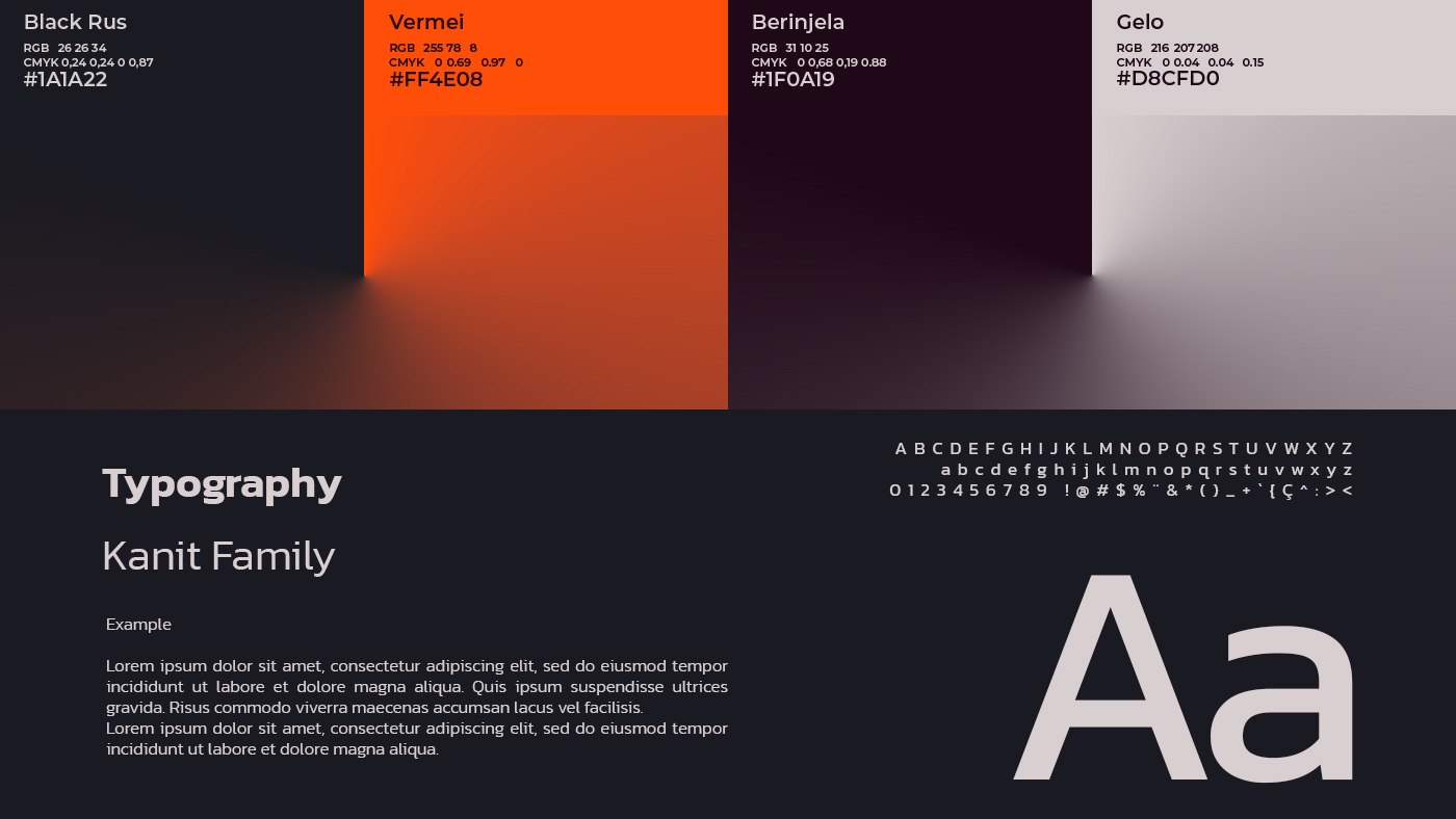
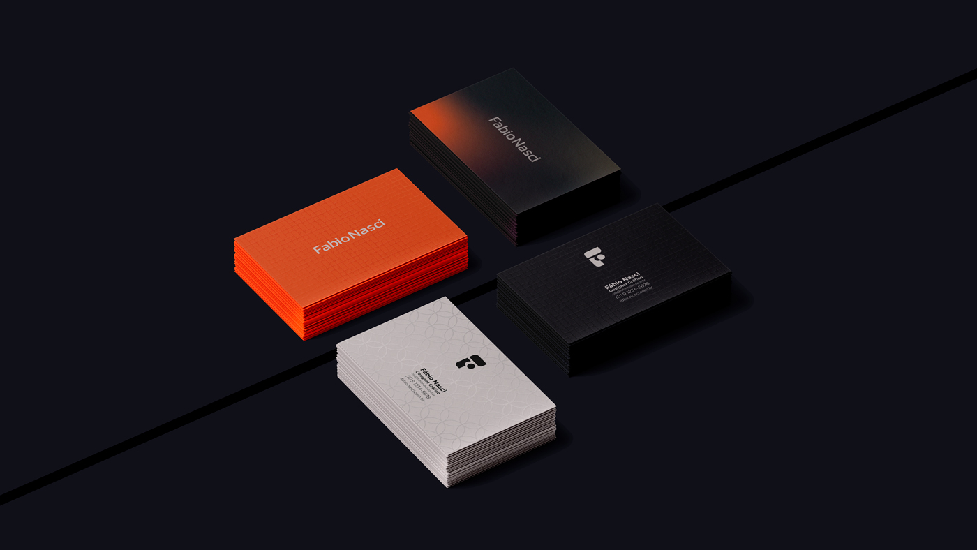
Simplicity is also the foundation of my wordmark. For this, I chose the Kanit Regular font, known for its clean and modern lines. However, to add a touch of personality and make the typography more friendly, I made some subtle modifications. I added rounded points in certain strategic places, softening the forms and creating a sense of warmth and approachability. These small changes make a big difference, transforming the written word into something more accessible and human.

CREDIT
- Agency/Creative: Fabio Nasci
- Article Title: An Elegant Personal Brand for a Fabio Nasci
- Organisation/Entity: Agency
- Project Type: Identity
- Project Status: Published
- Agency/Creative Country: Brazil
- Agency/Creative City: São Paulo
- Market Region: South America
- Project Deliverables: Brand Identity
- Industry: Professional Services
- Keywords: Elegant, Sophisticated, Logo, Visual Identity, logotype, logo design, personal brand
-
Credits:
Creative Director: Fu00e1bio Nasci


