


Bite; — Where Design, Flavor, and Rebellion Meet
In the heart of Kuta, Bali’s vibrant playground of surfboards, scooters, and spontaneous laughter, something different was cooking. A place that wasn’t just about food, but about attitude. It was about taking something ordinary and turning it into a social ritual. That is how Bite; was born: a cheeky, confident sandwich club where humor, design, and flavor collide in one unapologetically loud experience.
From the start, Bite; was never meant to be a restaurant in the usual sense. It was built as a creative playground disguised as a sandwich shop, a space that didn’t just serve food but served ideas. It was meant to provoke smiles, spark conversation, and remind people that eating can be an experience filled with joy, laughter, and connection. In a world obsessed with quiet minimalism and polished perfection, Bite; dared to be loud. It spoke in bold typography, saturated colors, and witty one-liners that made you laugh before your first bite.
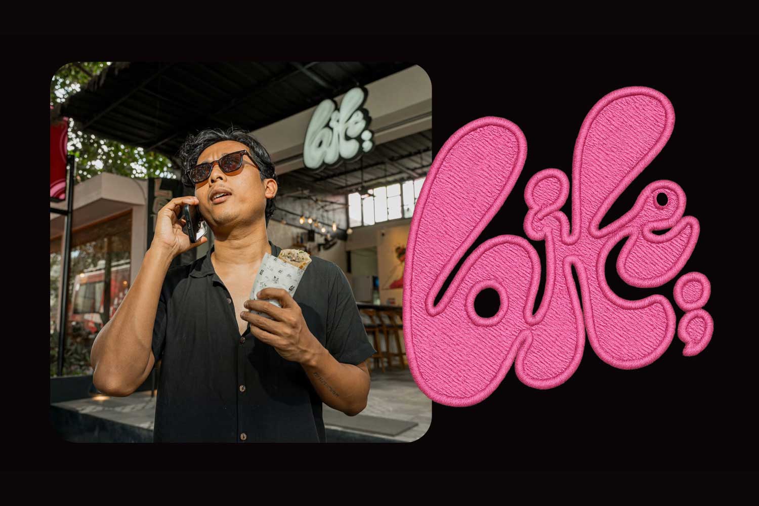
The name itself, Bite;, tells a story. The semicolon is not decoration; it is the heartbeat of the brand. It represents a pause between moments, the beat between one flavor and the next. It is a continuation, a promise that something new is always coming. At Bite;, every layer, every ingredient, and every design detail is meant to lead you somewhere unexpected—another taste, another twist, another surprise.
A Club, Not a Café
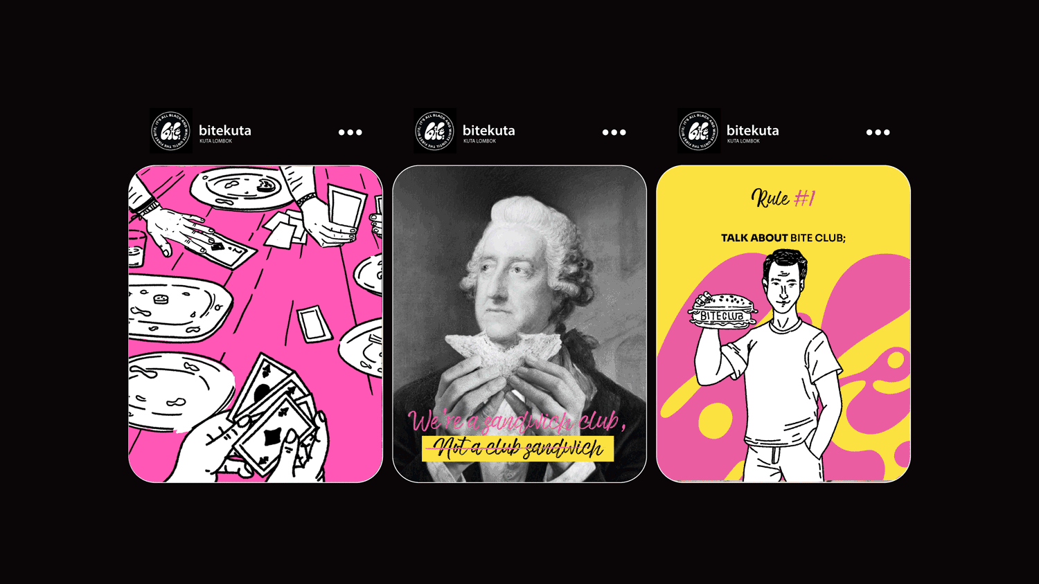
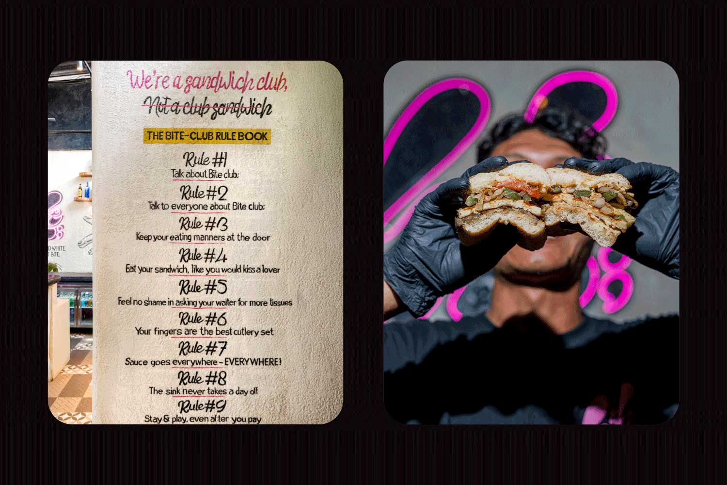
The idea began with a simple, rebellious phrase: “We’re a sandwich club, not a club sandwich.” It started as a joke but became a manifesto. Bite; was built on the belief that food could be fun, that a sandwich could be a statement, and that humor could be part of design. This playful defiance shaped everything that followed.
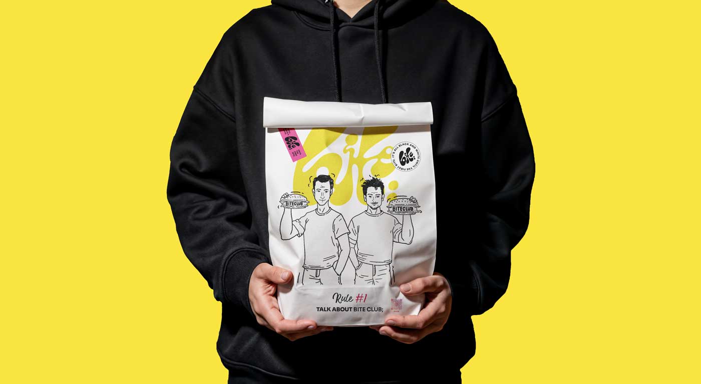
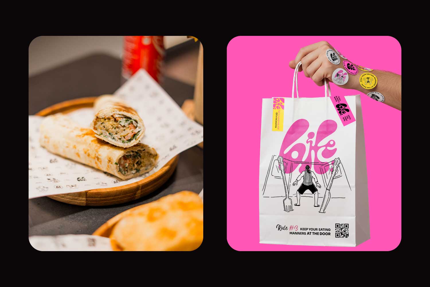
The brand drew its spirit from the cult film Fight Club, yet traded fists and soap for flavor and laughter. In Fight Club, the first rule is you do not talk about Fight Club. At Bite; Club, the first rule is the opposite—talk about it loudly. Tell your friends, your mom, your neighbor’s cat; everyone is invited. What was once a rule of secrecy became a celebration of sharing. The rebellion became the conversation.
That inversion defined Bite;’s tone of voice. Every sign, caption, and poster spoke with a wink—confident but never arrogant, mischievous but never cruel. The humor was sharp yet kind, bold yet human. Beneath the jokes and cheeky remarks was a warm invitation: come in, relax, laugh, and eat. Bite; became a social experience built on the simple joy of connection.
Design as Flavor
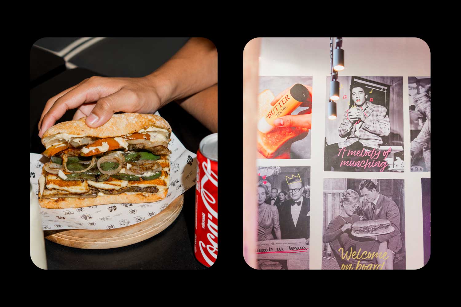
Visually, Bite; lives in a world of contrast. Its palette begins in crisp black and white, echoing clarity and order. Then, when the first bite happens, color bursts across the scene. Neon pinks, citrus yellows, and electric blues invade the calm, transforming simplicity into chaos. This shift mirrors the brand’s philosophy: design and flavor are both built on balance, rhythm, and surprise.
The logo captures this energy perfectly. The semicolon is more than punctuation—it is a symbol of continuation. It marks the pause before excitement, the breath before laughter, the moment before everything explodes in flavor. It is design behaving like emotion.
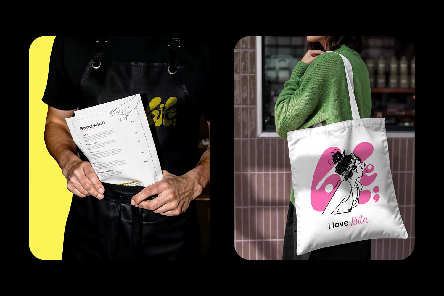
Typography also carries personality. The custom logotype is geometric and confident, designed to hold its own even in silence. The supporting typefaces echo vintage zines and street posters, bringing edge and authenticity. Together, they form a visual voice that feels as confident as it sounds.
Bringing the Brand to Life
When Bite; moved from concept to space, the challenge was to make every corner feel alive. The interior was not meant to be decorated but directed like a film scene. The design team wanted people to walk in and feel like they had stepped into a story.
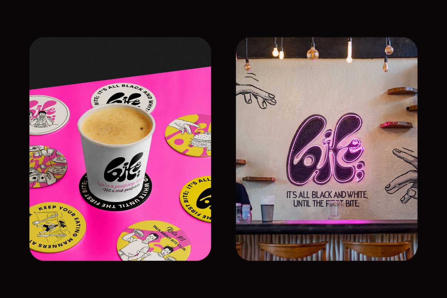
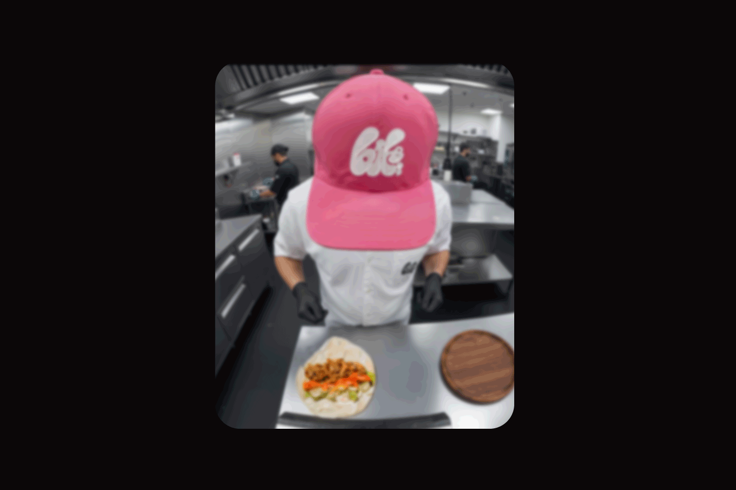
The space became a physical manifestation of the brand’s character—raw, colorful, and full of energy. Exposed concrete and rough textures grounded the design in authenticity, while flashes of color and glowing neon signs added rhythm. Hand-drawn illustrations crept across walls. Sharp track lights spotlighted the food like movie props. Every surface invited touch, every corner invited a photo, and every detail whispered humor.
One of the most iconic features is the “Frame of Fame,” a playful homage to John Montagu, the 4th Earl of Sandwich, who unknowingly started the food revolution that Bite; now celebrates. His portrait, treated with irony and reverence, stands as a reminder that even tradition can have a sense of humor. Bite; treats the sandwich not as fast food but as an art form—one you can eat with your hands.
The Spirit of Kuta
Kuta isn’t just the setting; it is the flavor running through the veins of Bite;. The energy of the town—its street music, beach chaos, and carefree conversations—became the emotional blueprint for the brand. Bite; captures the collision of cultures that defines Kuta: the surfers, the locals, the wanderers, and the artists who fill the air with stories.
Every design element channels that vibe. Stickers resemble travel badges collected from adventures. Illustrations borrow from Balinese street murals. The photography style feels candid, never staged. Sweat, laughter, and sunlight are part of the brand language. Even imperfection is intentional, because in Bite;, perfection would feel fake. The real beauty comes from energy and spontaneity.
Rebellion With a Smile
At its heart, Bite; celebrates rebellion—but a kind that brings people together. It defies what a food brand should look like or sound like. It rejects politeness for playfulness. The sandwiches are intentionally overstuffed. The sauces drip on purpose. The laughter is loud. The mess is part of the design.
This philosophy lives in the tagline: “It’s all black and white till the first bite.” It expresses the moment when design meets chaos, when control gives way to emotion. The experience starts structured but ends wild, just like the best nights out.
A Brand With a Personality
What makes Bite; unforgettable isn’t just its visual identity but its behavior. The brand talks like a real person—confident, funny, and sometimes teasing. It tells jokes, writes love notes on napkins, and speaks directly to its audience. The humor feels effortless but is carefully crafted to stay warm and inclusive.
This personality makes Bite; feel alive. Customers become participants, not just visitors. They take photos, share moments, and use the brand language in their captions. The entire dining experience becomes a social ritual, designed to spark conversation both in person and online.
The walls talk, the packaging talks, even the menus have punchlines. Every word reinforces the club mentality: everyone belongs, as long as they bring an appetite and a sense of humor.
The Craft Behind the Chaos
Behind every joke and playful detail is a serious design process. Bite; was built with the same care as fine dining, even though it hides behind a cheeky smile. Each visual decision, from font size to mural composition, was intentional. Every touchpoint was tested to make sure it worked both physically and emotionally.
The creative team faced a constant balancing act: how to stay fun without losing refinement. Too much structure and the life disappears. Too much humor and the sophistication fades. Finding that equilibrium required collaboration between designers, copywriters, and architects who worked as one. Together they built not just a visual system but a living personality.
Even the mess had to be designed. The dripping sauces, smudged prints, and overlapping graphics were crafted carefully to feel spontaneous. The goal was not perfection, but the illusion of beautiful imperfection.
A Playground for the Senses
Stepping into Bite; is like walking into a movie scene. The contrasts guide the eye; the lighting makes every dish look cinematic. The textures and sounds form part of the experience. The design invites curiosity—you want to touch, photograph, and share everything you see.
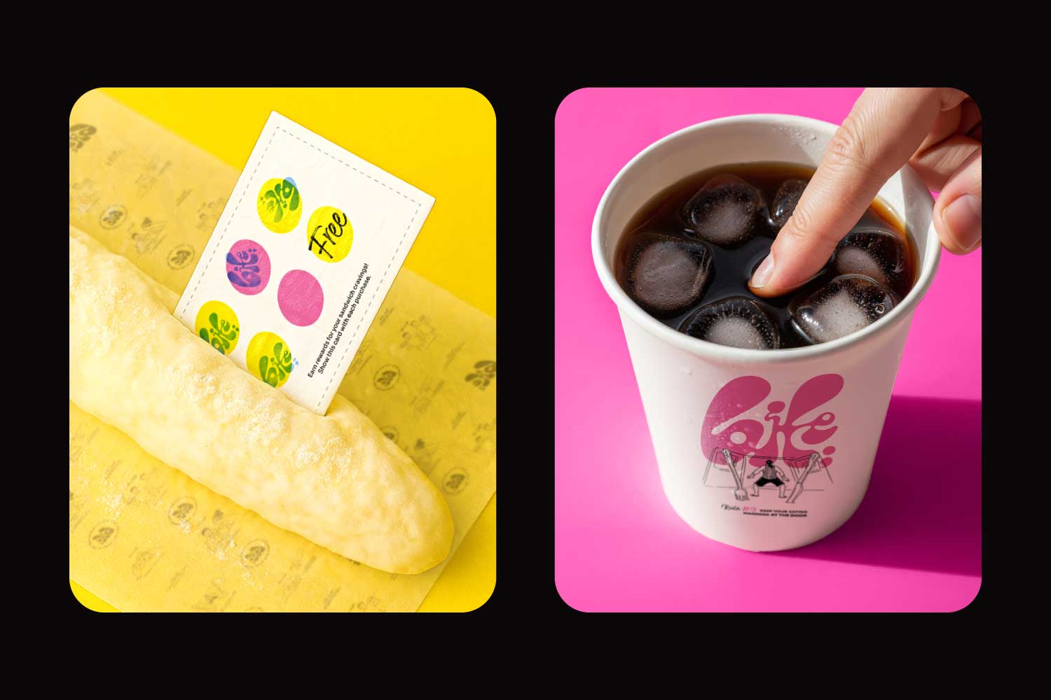
Packaging became an extension of that story. Sandwich wraps, stickers, and drink cups were filled with witty messages like “Caution: Contents May Cause Happiness” or “Too Hot to Scroll.” These small touches made the brand feel alive in people’s hands. Customers didn’t just eat the food; they documented the moment. That emotional connection turned design into conversation and humor into marketing.
The Balance of Opposites
The greatest challenge in creating Bite; was managing duality. The brand needed to feel spontaneous but still crafted, humorous but still intelligent. The team treated the design like a recipe, mixing equal parts wit, precision, and cultural understanding. The jokes never existed for their own sake; they always served a purpose. Every laugh deepened the brand story.
That discipline gave Bite; longevity. The identity could evolve across products, packaging, and spaces without losing coherence. It stayed true to its DNA: creative rebellion balanced by strategic design.
A Living Community
Within a year, Bite; became more than a sandwich spot. It turned into a local landmark and a cultural magnet. Travelers discovered it through word-of-mouth; locals returned because it felt like home. It didn’t just sell sandwiches—it built a club.
Social media became its natural extension. Posts felt organic, never forced. Photos of dripping sandwiches and witty signs spread like wildfire. People quoted taglines, remixed jokes, and turned Bite;’s humor into internet culture. The brand became part of the local conversation, echoing Kuta’s rhythm in digital form.
Bite; wasn’t performing marketing; it was sparking joy. And in doing so, it reminded people that branding could feel human again.
The Result
Critics, designers, and customers all recognized Bite; as something rare. It blurred the lines between food, art, and storytelling. It proved that a small, playful brand could achieve emotional impact equal to major franchises. The design world praised its boldness, while visitors simply called it their happy place.
Every touchpoint worked together like a living ecosystem. The logo, interiors, humor, and experience formed a story that kept evolving with every visit. It became a symbol of how design can elevate something as simple as a sandwich into a cultural experience.
Why It Matters
In an industry filled with sterile branding and over-curated aesthetics, Bite; stands for authenticity. It celebrates imperfection, embraces humor, and uses design to create emotion. It reminds people that good design is not just about beauty—it is about behavior, feeling, and connection.
Bite; proves that food can be storytelling and that laughter can be strategy. It demonstrates that rebellion can be elegant and that playfulness can be powerful. It shows how branding, when done with sincerity and creativity, can shape how people eat, feel, and remember.
Because Bite; isn’t just a restaurant. It is a pause between two smiles. It is a club where laughter is the membership card and design is the language everyone speaks. It is the flavor of creativity itself, served between two slices of attitude.
At Bite;, it is all black and white till the first bite.
CREDIT
- Agency/Creative: Amr Eid
- Article Title: Amr Eid Transforms Bite; Into a Rebellious Celebration of Design and Flavor
- Organisation/Entity: Freelance
- Project Type: Identity
- Project Status: Published
- Agency/Creative Country: Egypt
- Agency/Creative City: Cairo
- Market Region: Global
- Project Deliverables: Animation, Art Direction, Brand Architecture, Brand Creation, Brand Design, Brand Experience, Brand Identity, Brand Tone of Voice, Branding, Character Design, Illustration, Logo Design, Typography
- Industry: Food/Beverage
- Keywords: Bite, Food, branding, logo, playful, illustrations, character design, sandwich, colorful, pink, yellow, typography, edgy, cool, gen z, fun, rules, fight club, modern, social, animation, unique, packaging, stickers, kuta, bali, Indonesia
-
Credits:
Art director: Amr Eid


