


Cội Coffee — A Journey Back to the Roots of Coffee and the Self
Brand Story:
Cội Coffee is more than a coffee brand — it is a mindful journey. A quiet return to nature, to the pure essence of the coffee bean, and more profoundly, to the essence of the self. Founded by a teacher and an athlete — two individuals grounded in discipline, honesty, and connection to the earth — Cội is a union of passion and lived experience. It reflects a deep desire to share inner values and spiritual clarity through the daily ritual of coffee.
In the vast landscape of Vietnamese folk wisdom, one line has guided generations:
“Each person has their lineage,
Just as a tree has its roots, just as a river has its source.”
From this verse, the name “Cội” was born — meaning “origin” or “roots.” It speaks of beginnings, ancestry, and the unseen threads that ground us. For Cội Coffee, this name is not just poetic. It is a principle. It stands as a reminder to return — not only to the origins of coffee but also to the foundation of who we are.
Every cup of Cội is an invitation to pause and breathe. Whether shared in quiet company or sipped in solitude, the experience is meditative — a reconnection with memory, place, and purpose.
Logo Concept: One Drop, One Beginning
Cội’s logo is built on simplicity layered with meaning. A single drop — of water, of coffee — holds within it a tender sprouting seed. This tiny image tells a story of growth, life, and origin. It mirrors the belief that even in small, pure things, there is vast potential for transformation.
The accompanying logotype continues this motif of harmony. Inspired by the Eastern philosophy of Yin and Yang, its shapes are soft and circular, symbolizing unity and balance. Even the Vietnamese tonal marks in the name are carefully stylized to blend naturally into the form — merging culture, language, and design into a seamless whole.
This balance of symbolism and aesthetics allows Cội to speak to an audience that values subtlety, mindfulness, and depth — people who seek not only quality but meaning in what they consume.
Brand Philosophy: Stillness – Honesty – Nature
In a marketplace full of noise and ever-shifting trends, Cội stands firm in stillness. It values simplicity and authenticity over excess and spectacle.
Rather than racing after what’s fashionable, Cội walks a quieter path. Every stage — from bean selection to roasting, grinding, and packaging — is handled with care and presence. The process itself reflects the product: rooted, intentional, and grounded in truth.
To Cội, coffee is more than a drink. It’s a daily ritual. A bridge between past and present, self and surroundings, people and place. Each cup offers a moment of connection — to the land that nurtured the bean, to the culture that shaped its use, and to the inner clarity often lost in daily life.
This philosophy extends to every detail of the brand: from its tone of voice to the materials it uses. The message is consistent and quiet: slow down, live mindfully, stay grounded.
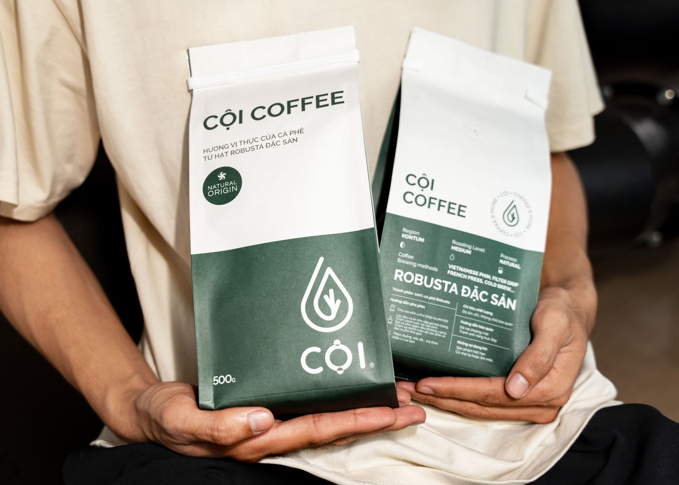
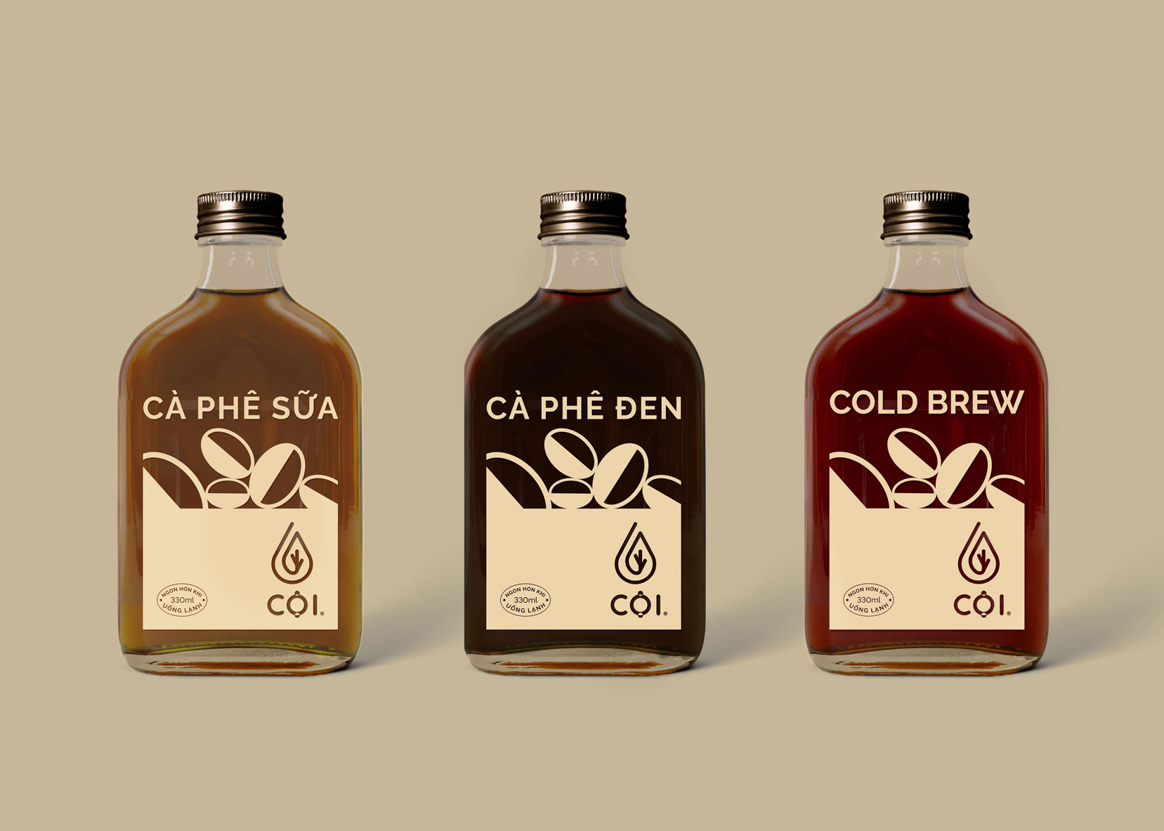
Packaging Design: Minimalism with Meaning
To express this spirit, Cội’s packaging follows a “clean and clear” design philosophy. Its visuals are minimal, structured, and intentional — drawing attention not to embellishment but to the coffee itself. The focus is on the Robusta variety — bold, resilient, and deeply embedded in Vietnam’s agricultural and cultural identity.
Robusta has long been overshadowed by Arabica in the global market. But for Vietnam, Robusta is foundational. Its strong flavor, durability, and versatility reflect the landscape and spirit of the people. Through minimal, elegant design, Cội celebrates Robusta not just as a bean but as a cultural icon — a living part of Vietnamese heritage.
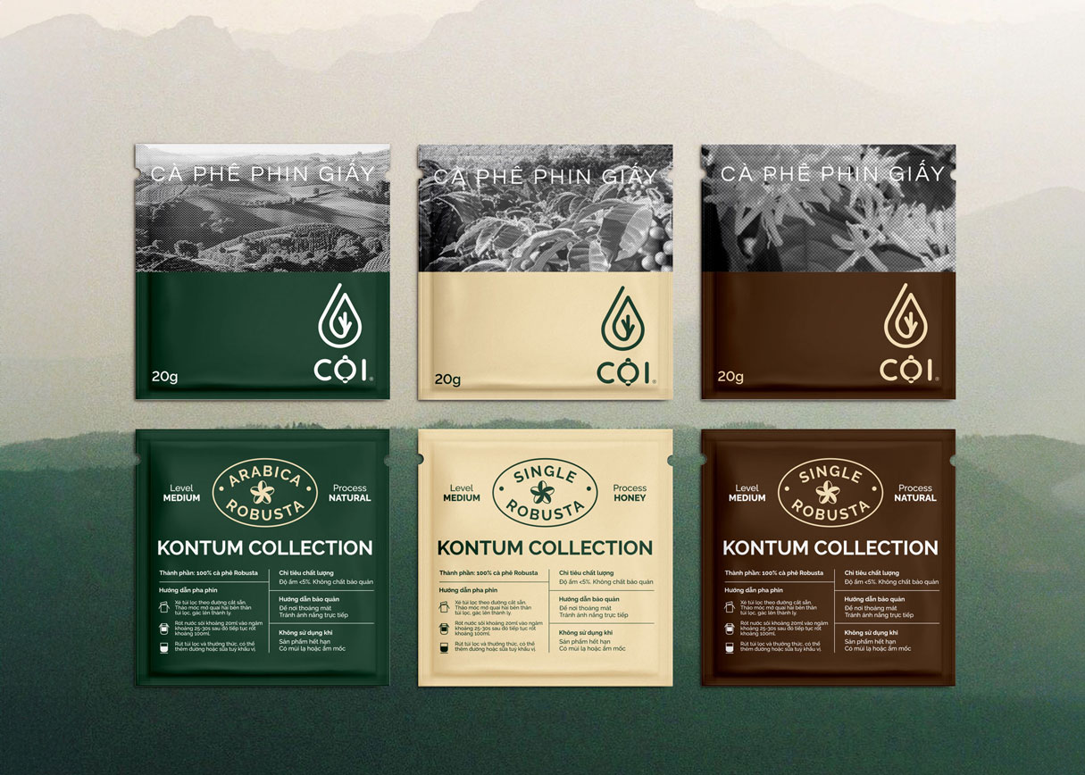
The drip bag line takes this further. Here, Cội uses visual storytelling to pay tribute to nature. Packaging illustrations are inspired by iconic Vietnamese landscapes — terraced rice fields, mountains, rivers, forests. These visuals are rendered using monochrome halftone effects, which create dynamic contrast between light and shadow, evoking a sense of rhythm and depth.
This style is more than aesthetic. It symbolizes the principles of balance and duality — mirroring the Yin–Yang philosophy that underpins much of Eastern thought. Light and dark, solid and void, nature and design — all existing in harmony.
The result is packaging that is not only beautiful but meaningful. It creates an emotional and visual link between the product and the land it came from, bridging function with feeling, and inviting consumers to engage with their coffee more mindfully.
Robusta — A Vietnamese Legacy Reclaimed
Cội’s focus on Robusta is both strategic and symbolic. While Arabica dominates global specialty markets, Robusta holds the heart of Vietnamese coffee culture. It is strong, earthy, and persistent — just like the hills and hands that produce it.
By choosing Robusta, Cội honors Vietnam’s legacy while challenging international preconceptions. Robusta in Cội’s hands is not mass commodity but a craft product — selected with care, roasted to highlight its complex notes, and offered with humility and pride.
Through thoughtful processing and refined presentation, Cội elevates Robusta to its rightful place — a source of national identity and sensory depth. The brand’s storytelling, design, and product quality work together to restore Robusta’s dignity and beauty.
More than just repositioning a bean, Cội is reshaping the narrative: from overlooked to essential, from industrial to artisanal, from generic to uniquely Vietnamese.
Conclusion: A Return to What Matters
Cội Coffee doesn’t try to impress with novelty. It invites you to remember. To remember where coffee comes from. To remember how stillness feels. To remember who you are when the world quiets down.
It is a brand built on memory and meaning — rooted in Vietnamese culture, nurtured by natural philosophy, and expressed through elegant design. Every element of Cội, from its logo to its flavor, offers a chance to return. Return to nature. Return to self. Return to Cội.

CREDIT
- Agency/Creative: Ampersand Creative
- Article Title: Ampersand Creative Builds a Meditative Brand Experience for Cội Coffee
- Organisation/Entity: Agency
- Project Type: Identity
- Project Status: Published
- Agency/Creative Country: Vietnam
- Agency/Creative City: Ho Chi Minh
- Market Region: Asia, Europe, Global
- Project Deliverables: 2D Design
- Industry: Food/Beverage
- Keywords: Branding, Packaging, Logo
-
Credits:
Creative Director: Nana Nguyen


