


Task: Our task was to create a label design for an exclusive spirits line – Špork Spirits, which are available for degustation only in one restaurant in Prague. The design had to emphasize the rarity and the uniqueness of the product. It had to be modern, yet at the same time, bear the reminiscence of the rich past associated with the brand.
History of the brand: Špork Spirits distillates were created for a very special occasion – the opening of a restaurant Red Stag right in the heart of historical Prague, in Špork Palace. Špork Palace has a rich history behind it. From the 17th century, it was a residence of the aristocratic family Sweerts-Špork. One of its representatives, Antonin Špork, was a patron of Czech artists for a long time. Apart from arts, Špork was known to enjoy hunting. He even founded a hunting society in 1695.
Red Stag restaurant that is now located in Špork Palace’s premises is a child of both the historical past associated with Sweerts-Špork, and modernity, incorporating cubist-modernist elements into its space. Its iconic drink – Špork distillates line – is also a result of the fusion of history and modernity. Our label design had to reflect this.
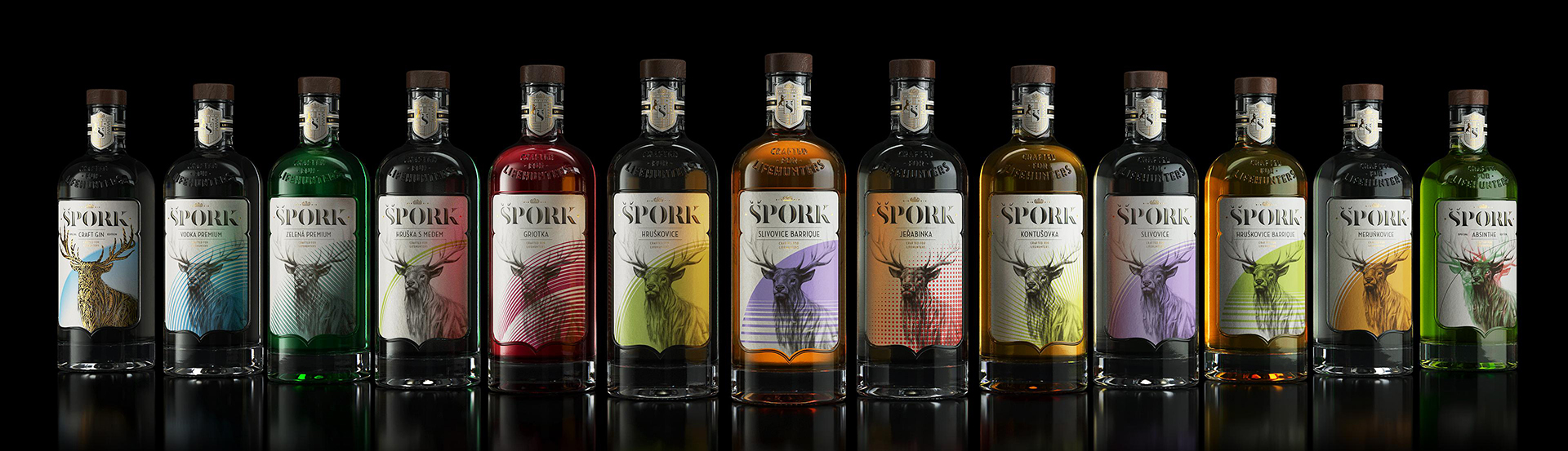
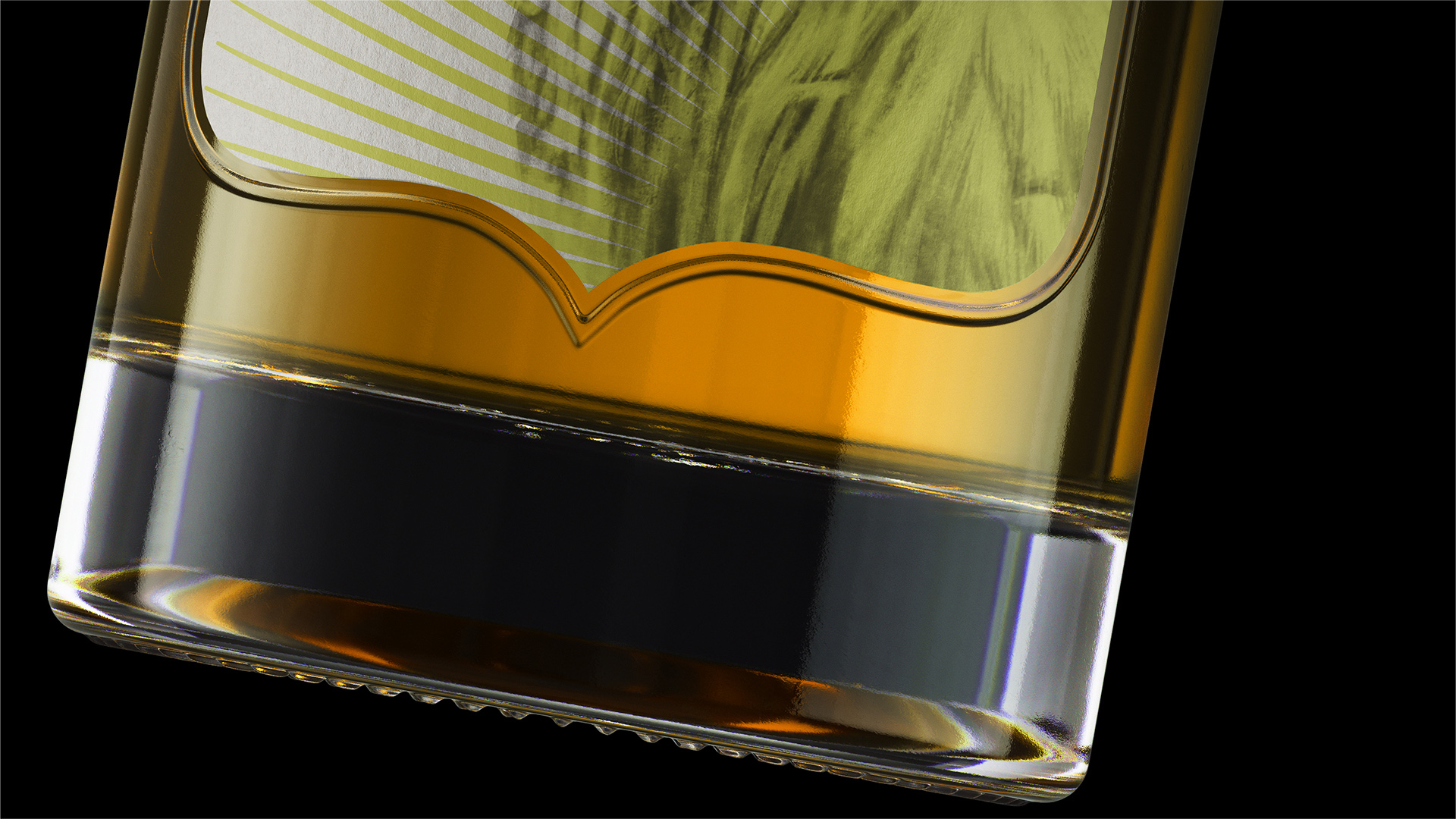
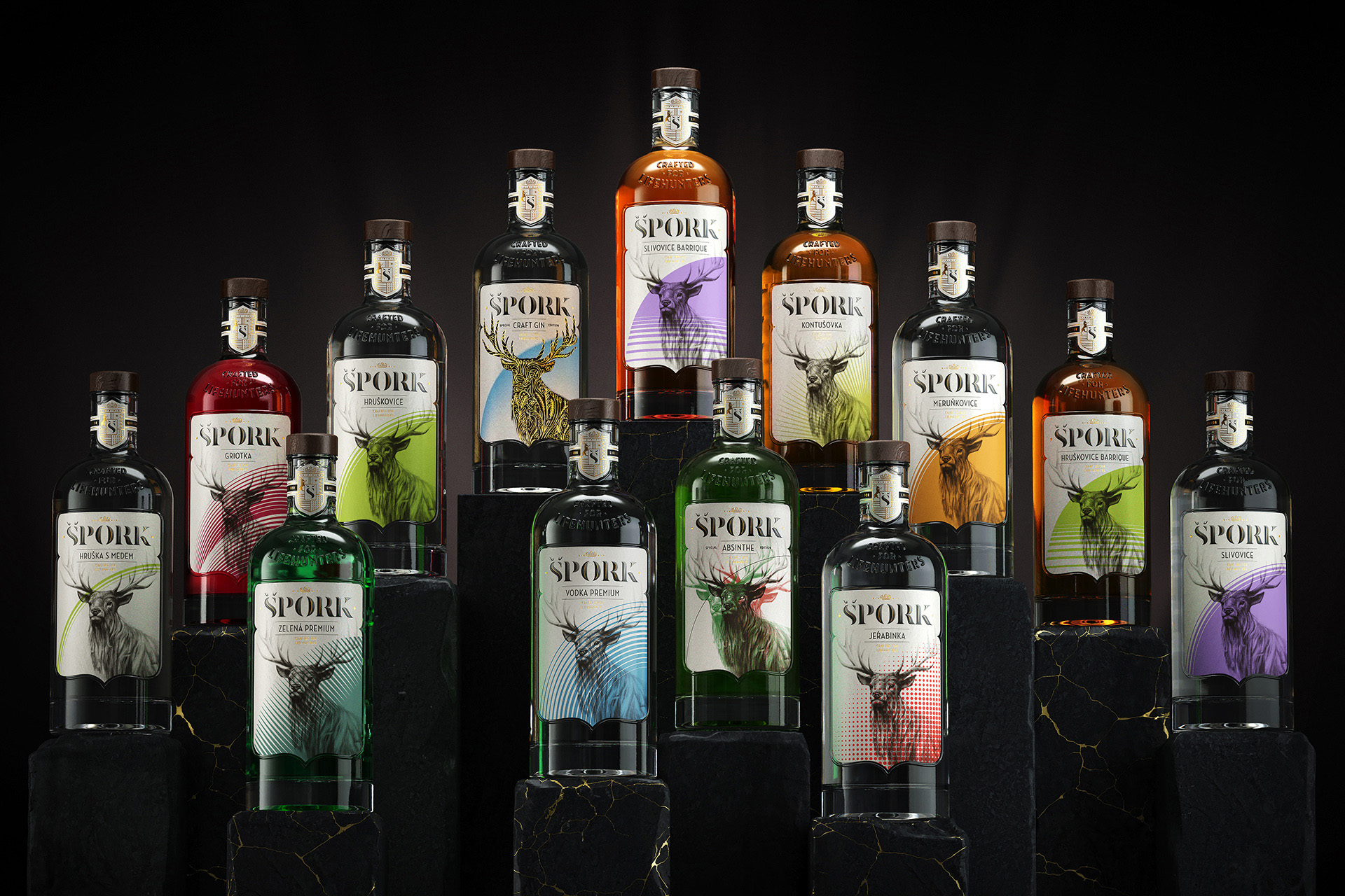
Design solution: Špork palace as well as its owners are known for their vivid history. We began by tracing and gathering some of its most interesting and important facts. We then translated these facts into visual language and combined them with the elements of contemporary reality. This is how the realistic illustration and abstract vector graphics came together on one label. Our design also had to accommodate different color codes for each of the eleven fruit spirits within the Špork line.
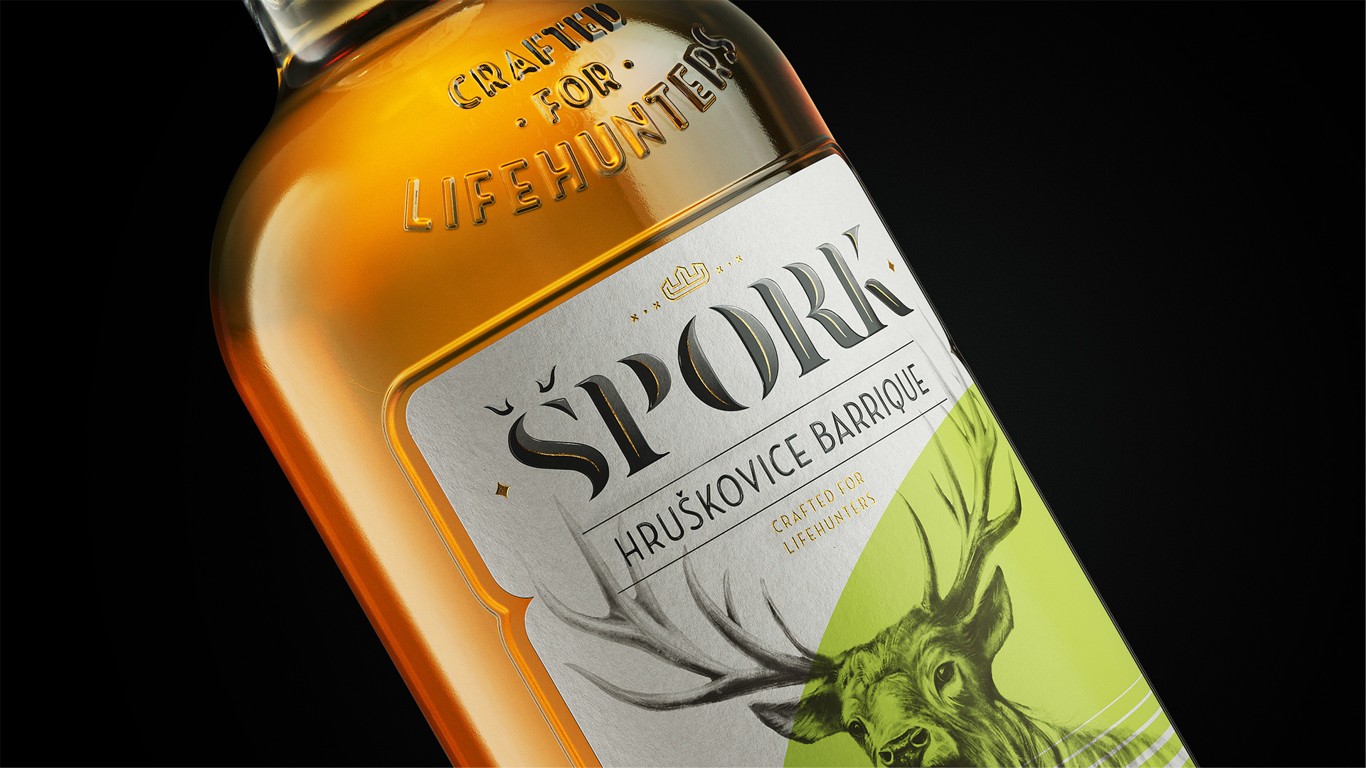
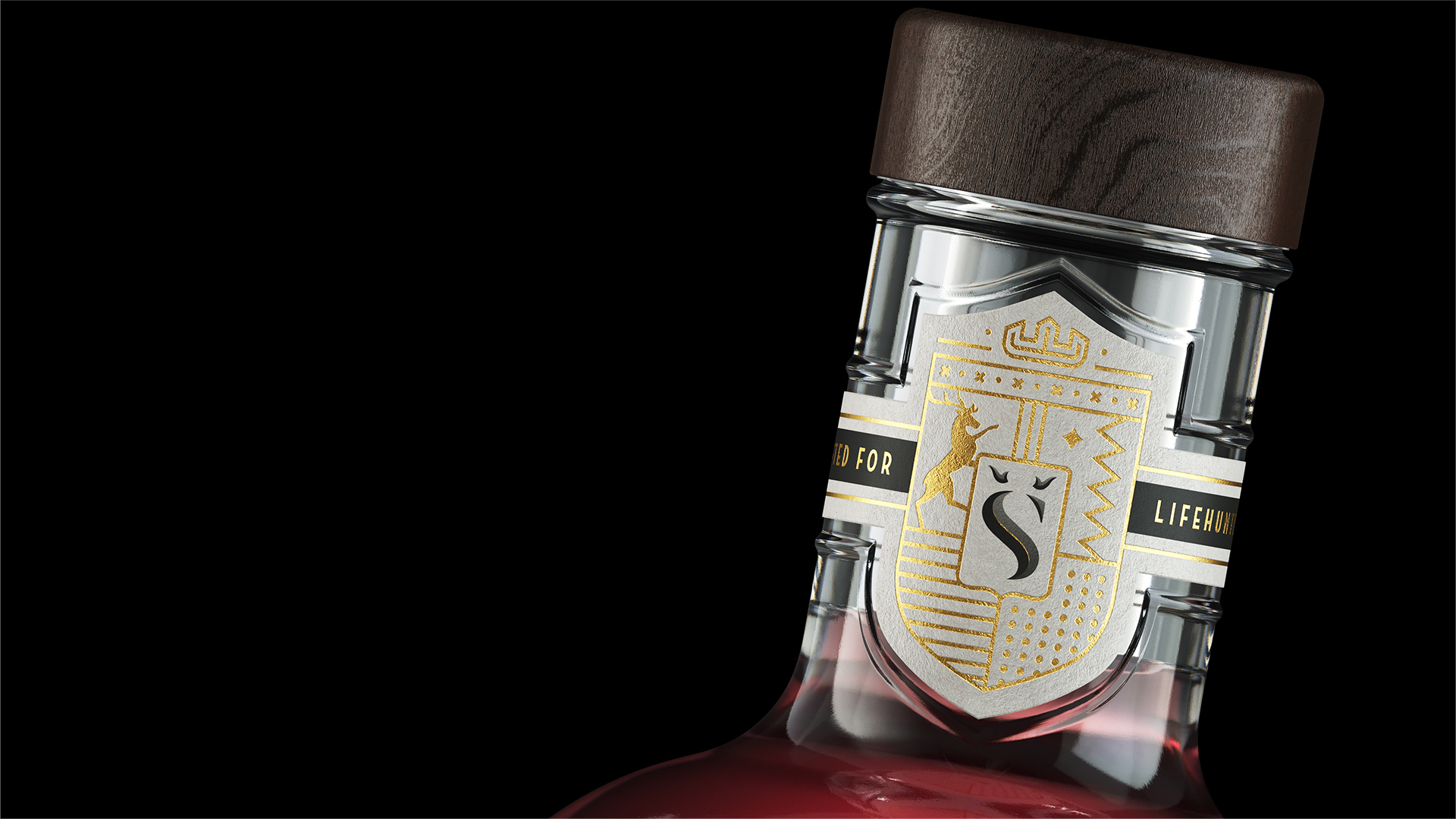
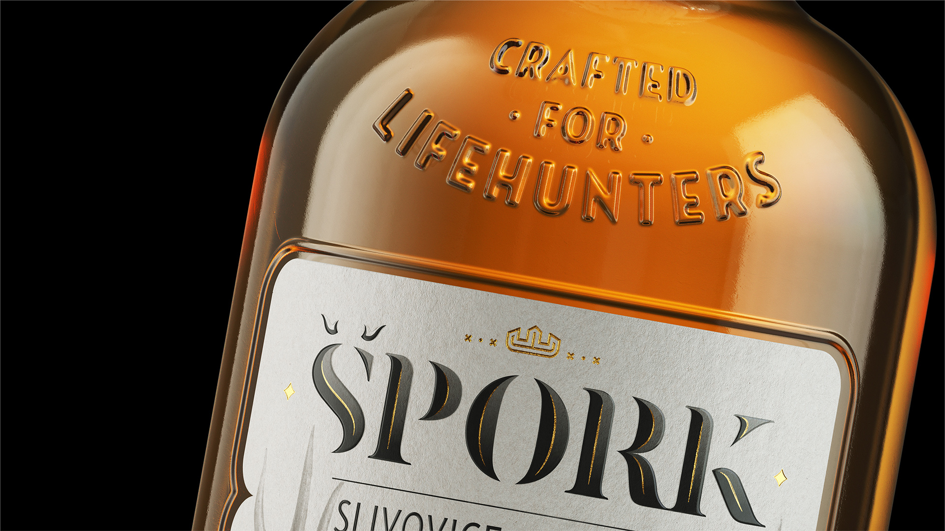
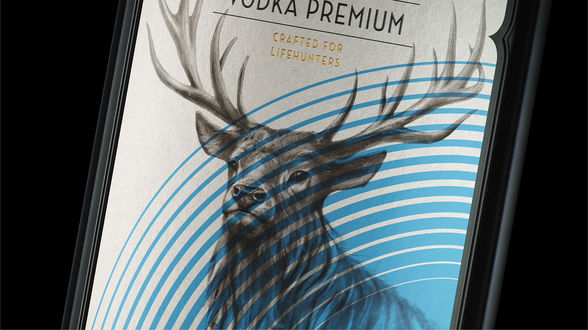
The unusual shield-like shape of the front label was inspired by the coat of arms of Sweerts-Špork. The label does not simply imitate the Sweerts-Špork’s coat of arms – it also brings out the characteristic features of the brand itself. The realistic illustration of the stag refers to the paintings of the 17th century and brings us back to Antonin Špork’s interest in arts. The vector graphics reflect the type and strength of each spirit within the line. The shield reoccurs in a slightly different representation on the neck label as well.
The slogan of the brand – “Crafted for Lifehunters” was inspired by Špork’s passion for hunting. When turned into a metaphor, it perfectly expresses the key message of the brand. Even though hunting is not as popular as it used to be in Špork’s times, its figurative meaning remains strong.
Lifehunters are those who have clear aims in front of them and are not afraid to overcome obstacles on their way to victory.
The main logo with an implication of deer antlers above the letter “Š” speaks to the same thematic. At the same time, it emphasizes the Czech origins of the product, adding an aristocratic touch to it.
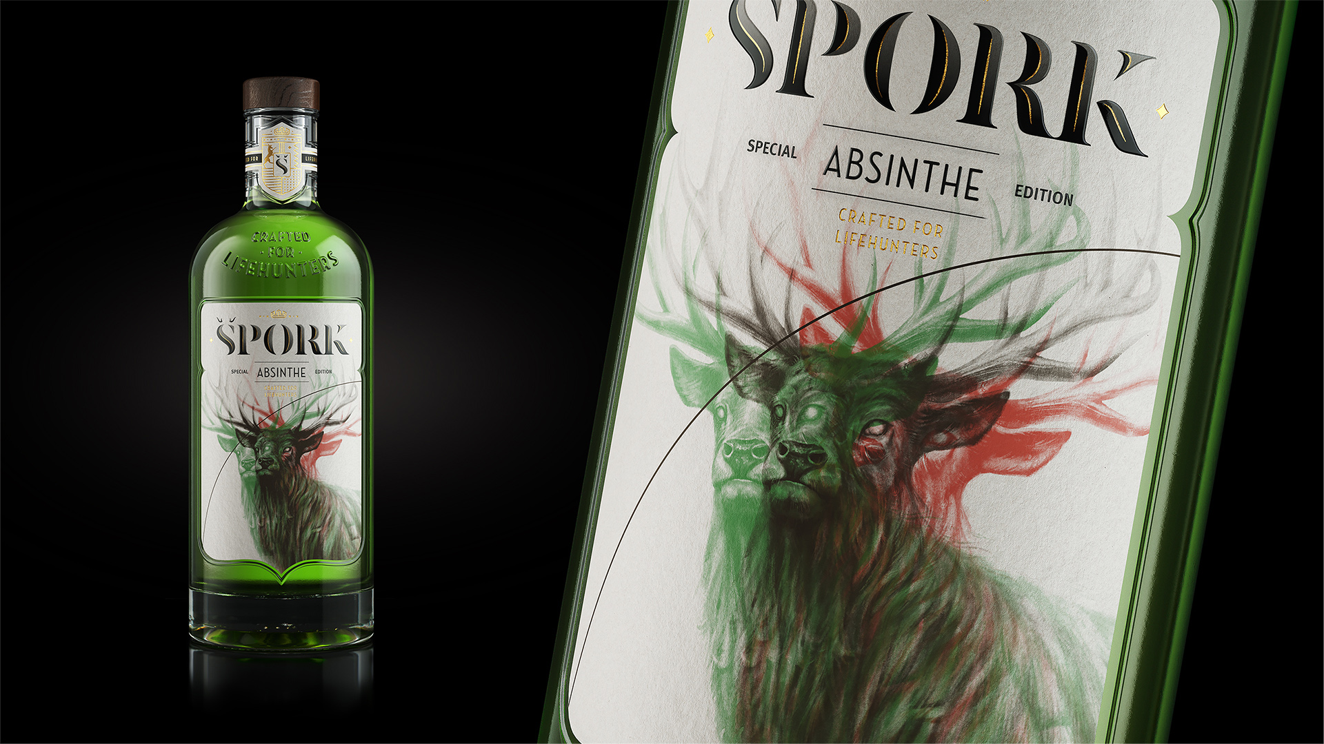
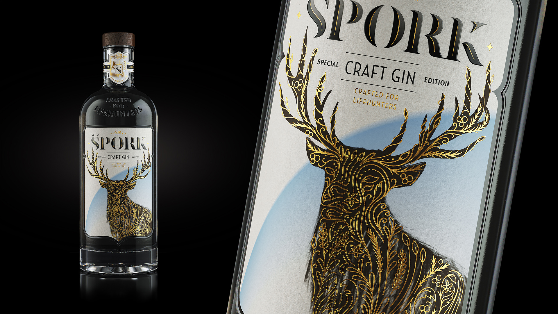
Special Edition: Apart from the main line comprising eleven spirits, a Special Edition of Špork Spirits was developed. The Special Edition line introduced two additional drinks – Absinthe and Crafted Gin. When designing the labels, we used the original layout as a foundation and altered the details based on the specificities and the character of each of the two drinks.
Absinthe: For the “green fairy”, the graphic element of the circle turned into a single black line, while the stag has been modified, impersonating the concept of hallucination. The outlines of the stag are blurred and dynamic, its eyes are empty as if from the effect of absinthe. The illustration, significantly differing from these of the main line, conveys the idea of absinthe being a potion that opens the doors to transcendent experiences and altered perception.
Craft Gin: For the special gin edition, the stag turned into a dark silhouette embellished with the illustrations of the plants that were used when making this particular spirit – juniper, lavender, linden, to name a few. The number of the herbs might differ, but namely their combination determines the unique taste of the drink. The label returns Špork Craft Ginv back to its nature and the natural elements that form it. The herbal ornaments are stylized and executed in the gold hot stamp technique. The circle in the background has lost its strictly geometric shape. Its blue color symbolizes the purity and the transparency of the gin.
CREDIT
- Agency/Creative: Amoth Studio
- Article Title: Amoth Studio Create Label Design for Špork Crafted Spirits Line
- Organisation/Entity: Agency
- Project Type: Packaging
- Project Status: Published
- Agency/Creative Country: Czech Republic
- Agency/Creative City: Prague
- Market Region: Europe
- Project Deliverables: Packaging Design
- Format: Bottle
- Substrate: Glass
- Industry: Food/Beverage
- Keywords: Absinthe, Gin, Fruit Distillates, Graphic design, Label design, Logo, Packaging, Spirits
-
Credits:
Art Director, Senior Designer & Illustrator: Sasha Sha
Senior Designer & Motion Graphics: Tania Sharavarava
Artworker: Robert Špecián
3D visualisation: Boo BY
Copywriter: Narmin Ismiyeva
Client: Red Castle Hospitality Group


