Branding a Rural Retreat
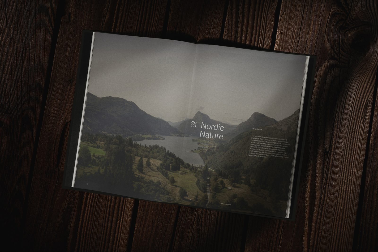
Far away from everyday life, you will find Åmot – A rural retreat, situated within a picturesque fjord landscape. Experience a pause away from the ordinary. Nestled between mountains, fjords and pastures, the heritage-filled estate is a unique private stay, hidden
in the serene Sunnfjord.
The historic farmyard has been in the Sørli for five generations, all the way since its built in 1885 by the current owners great-grandfather. It has gone from family home, to small farm to now one of Norways finest luxury lodgings. Within the heritage filled estate, the guests will experience a stay of contrasts – seasonal produce from our neighbours, prepared by Michelin chefs. Walking monumental mountains, and the serene bliss of our orchard. Authentic meetings with locals to private performance by the most genuine of regional talents.
Visiting Åmot is like stepping into a painting of tranquillity. A pause. A time to revitalize. A time to reflect and rediscover the finer
things in life.
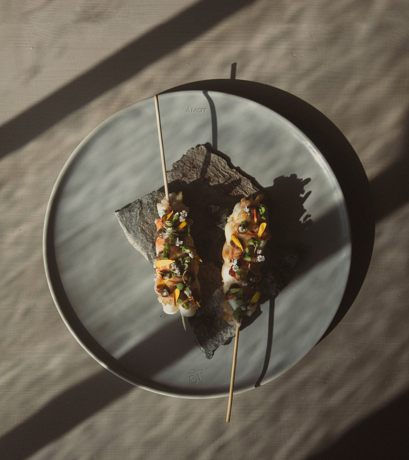
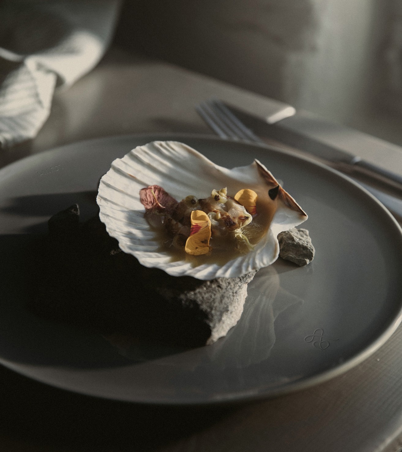
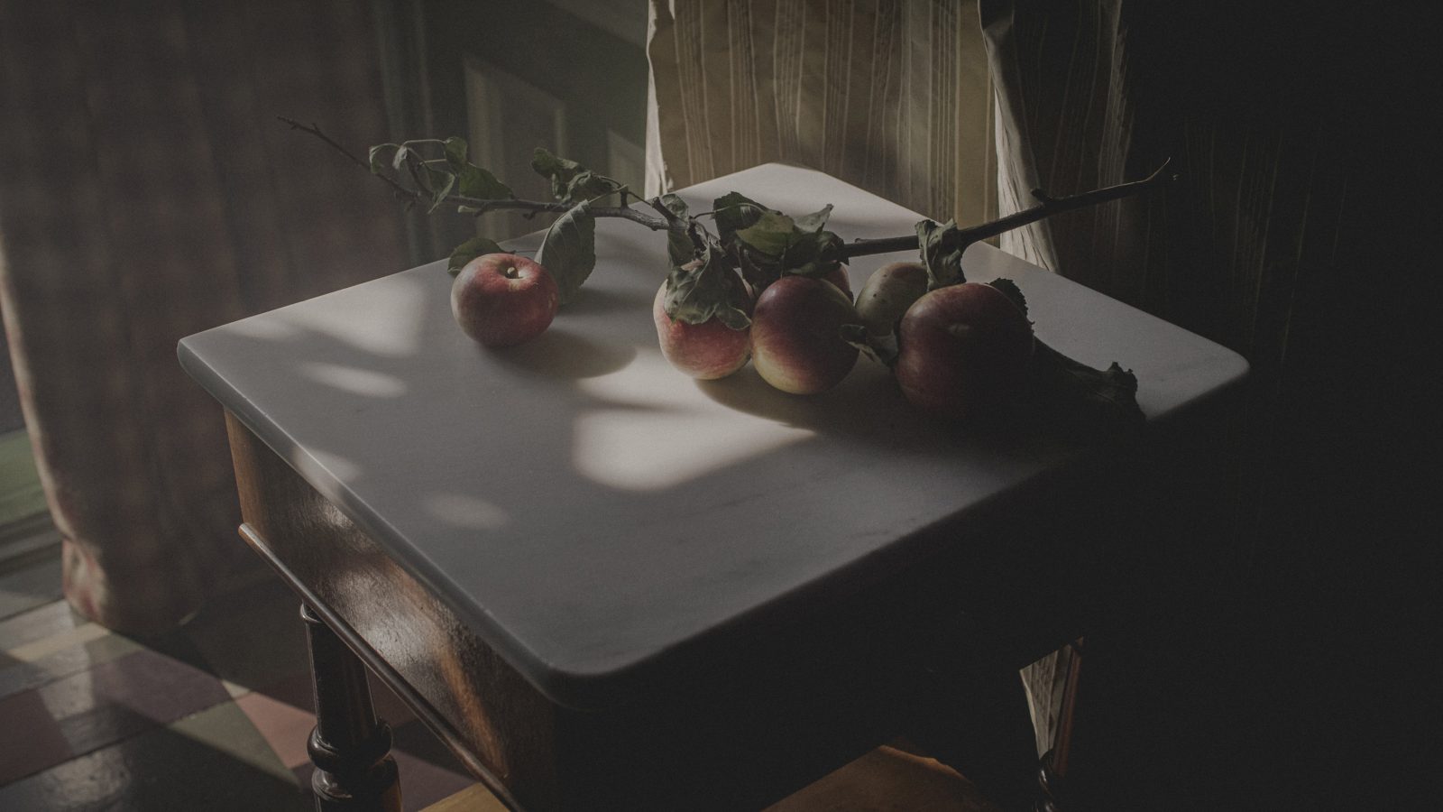
The branding revolves around the feeling of a pause as well as the estates heritage. Kind wanted to capture this through the photography. The image style needed to have traditional elements, feel authentic and give a sense of calm. It needed to be exclusive, but also warm.
A Hearty Heritage
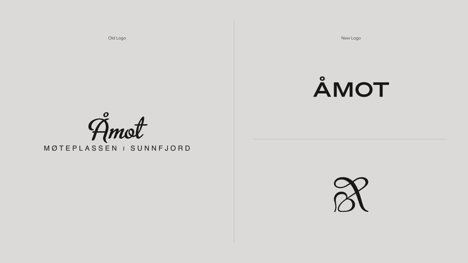
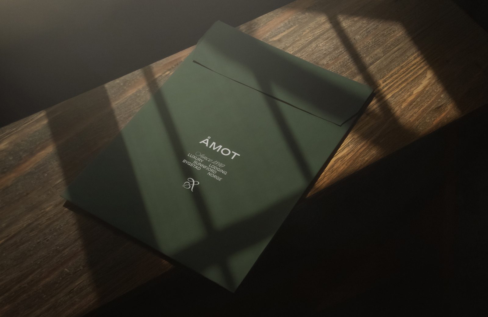
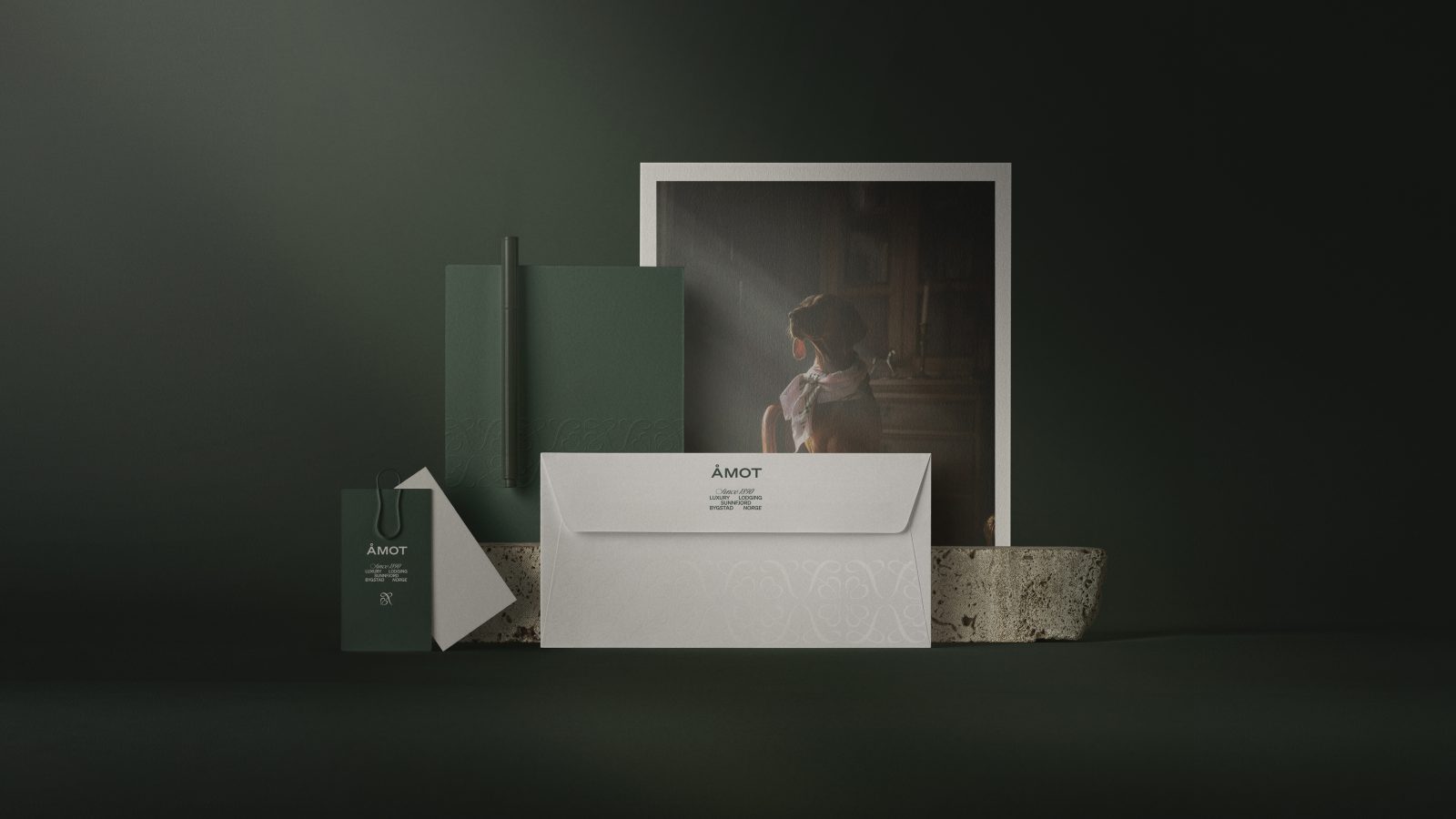
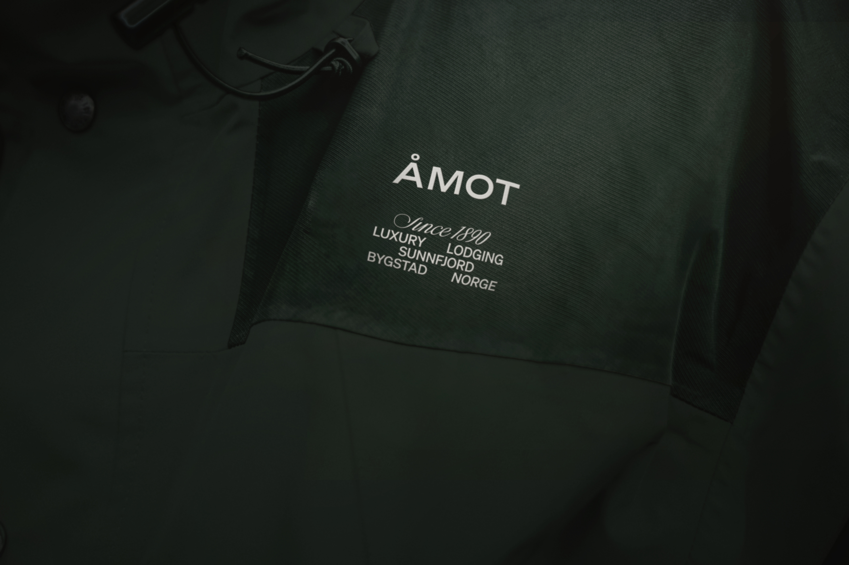
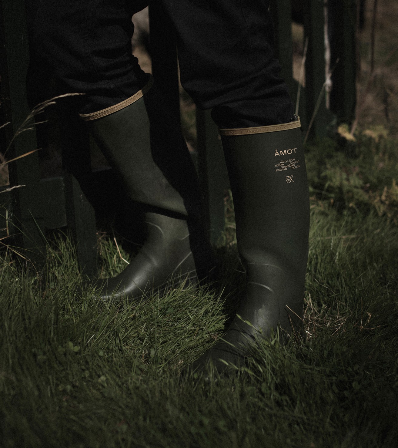
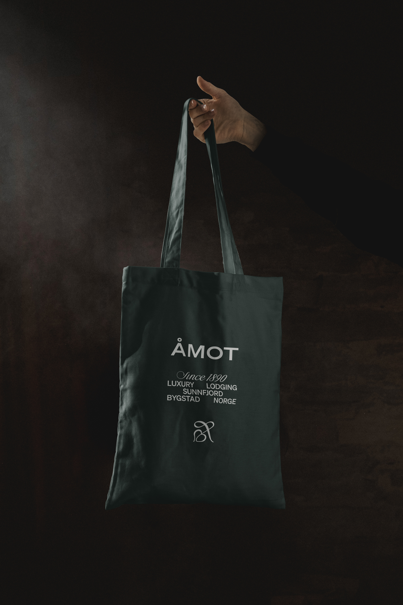
The typography is inspired by 1800s typesetters, and a hand-drawn monogram of the Norwegian letter “Å” combined with a floral shape that creates a hearty heritage. The Monogram is also used as an integrated part of the writen communication.
The communication is warm and inclusiv, shaped by headlines with alliteration, that sums up the experience in a memorable way.
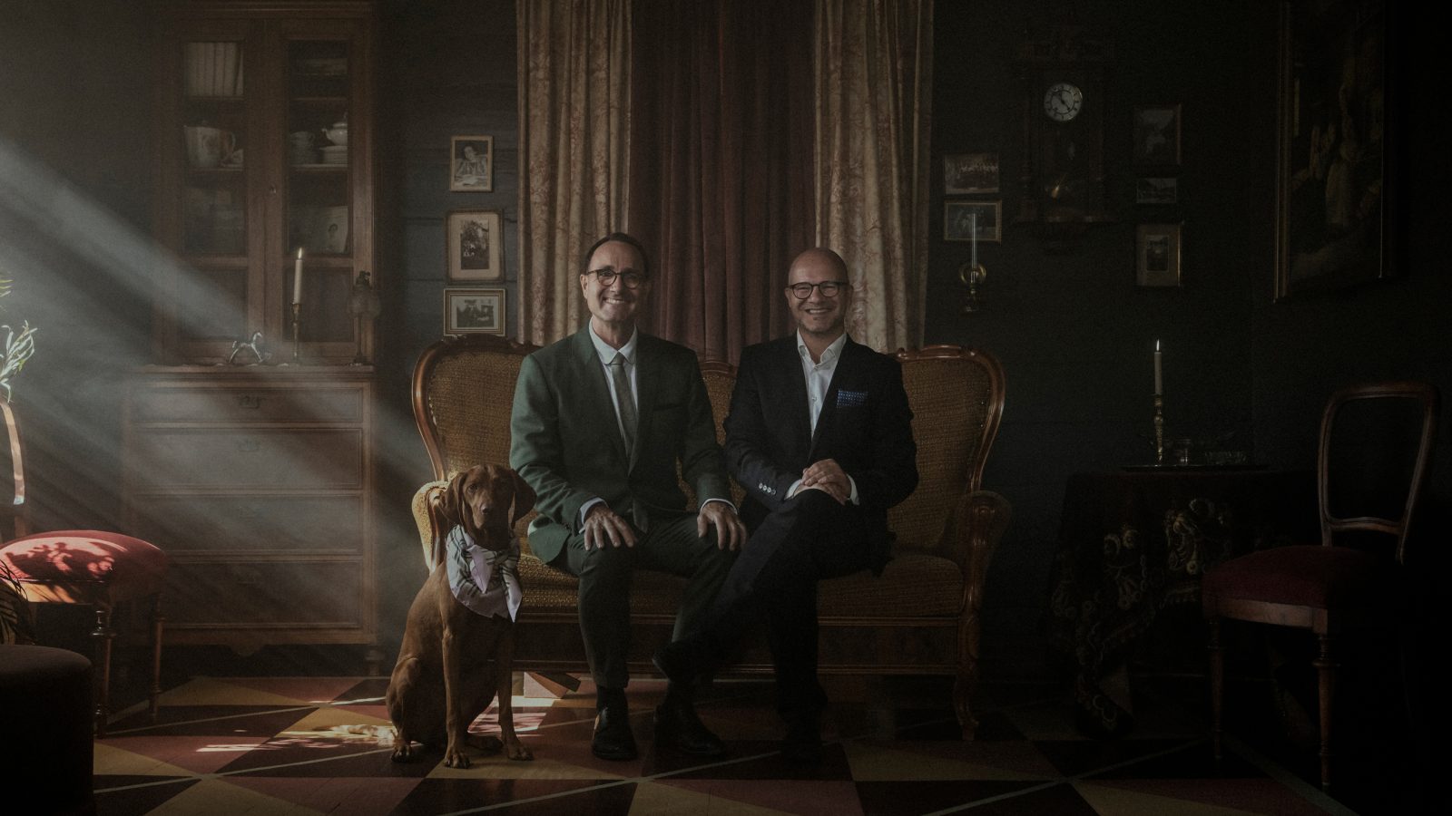
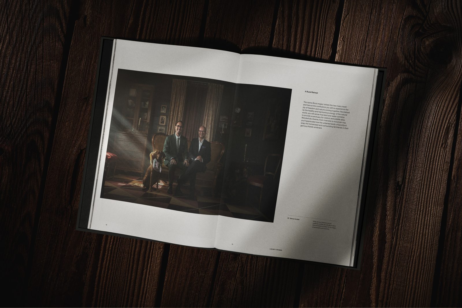
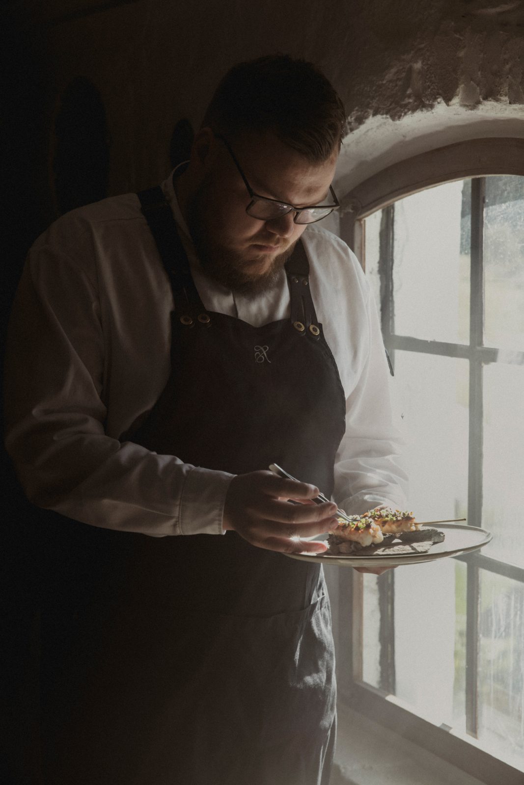
It was important to not have any recognizable models as faux guests, as this is a big no-no in this scale of luxury. To add some humanness to the imagery we focused on photographing the owners, the chef and the sommelier.
We wanted the identity and photography too have a renaissance feel. To achieve the desired look, we used the low morning light, and brought it out with haze. The clear direction of the beams, create a dramatic spotlight and dark shadows in the interior.
For outdoor photography we wanted to capture the early mornings, with its soft light and the mysterious fog. We captured
moments from the surrounding area, its animals and the Åmot farm itself.
To enhance the picturesque renaissance look, we removed the blues, which let the brown, warm tones seep through.
Step back in time, breathe, discover, savour and remember.


CREDIT
- Agency/Creative: KIND
- Article Title: Åmot Luxury Logding Brand Redesign
- Organisation/Entity: Agency
- Project Type: Identity
- Project Status: Published
- Agency/Creative Country: Norway
- Agency/Creative City: Bergen
- Industry: Hospitality
- Keywords: WBDS Agency Design Awards 2022/23
-
Credits:
Chief Creative Director: Tom Emil Olsen
Design Director: Knut Harald Longva
Senior Designer: Saurabh Kumar
Designer: Emil Olsen
Designer: Camilla Balulu
Designer: Kristine Flatland
Director of Photography: Christoffer Meyer
Video/Photographer: Isak Norum
Strategic Brand Director: Thomas Danielsen
Project Manager: Beate Myren Romslo
Stylist: Per Olav Sølvberg


