Branding a Rural Retreat
The historic farmyard has been in the Sørli for five generations since it was built in 1885 by the current owner’s great-grandfather. It has gone from a family home to a small farm to one of Norway’s finest luxury lodgings. Within the heritage-filled estate, the guests will experience a stay of contrasts – seasonal produce from our neighbours, prepared by Michelin chefs. Walking monumental mountains and the serene bliss of our orchard.
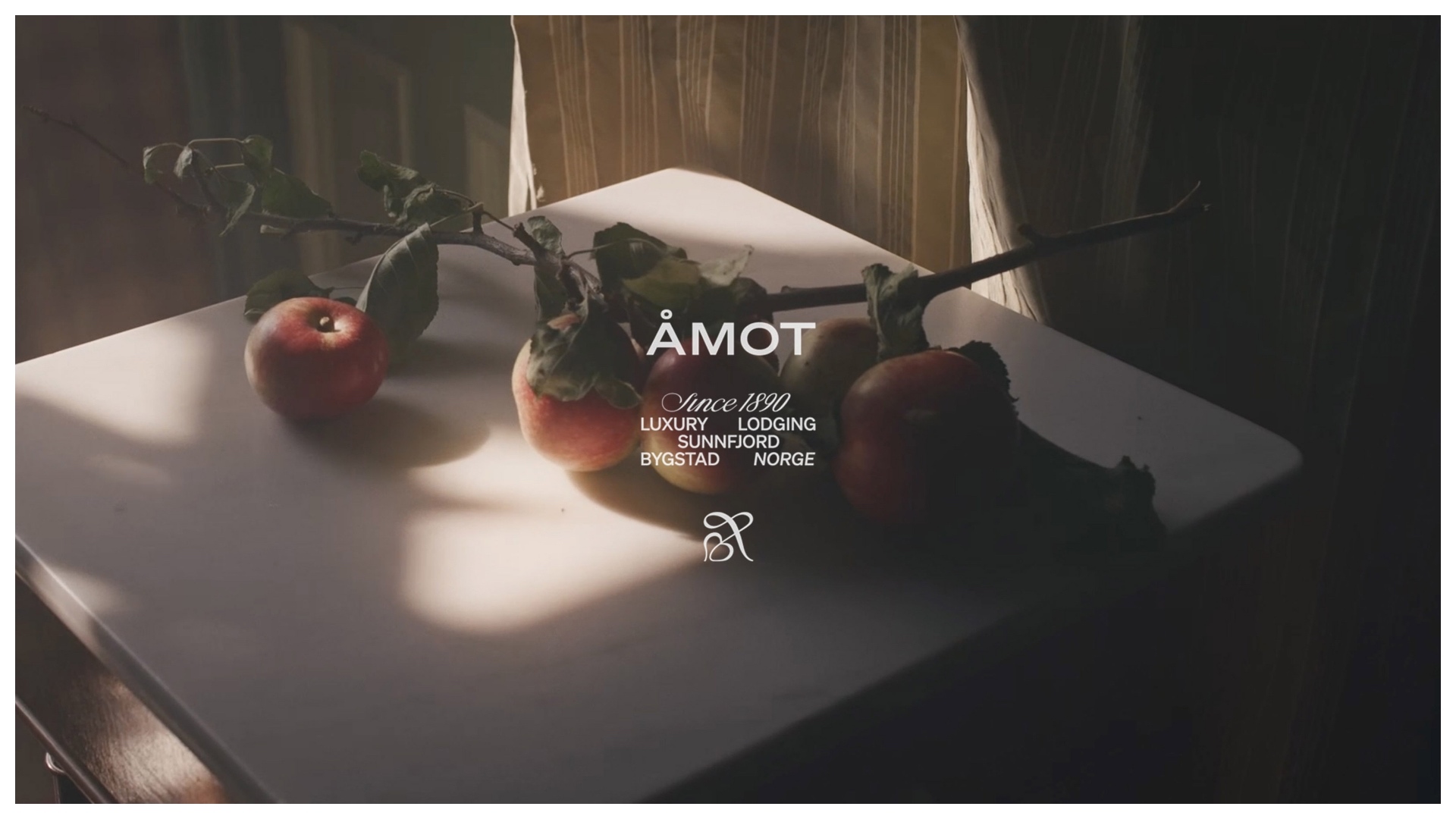
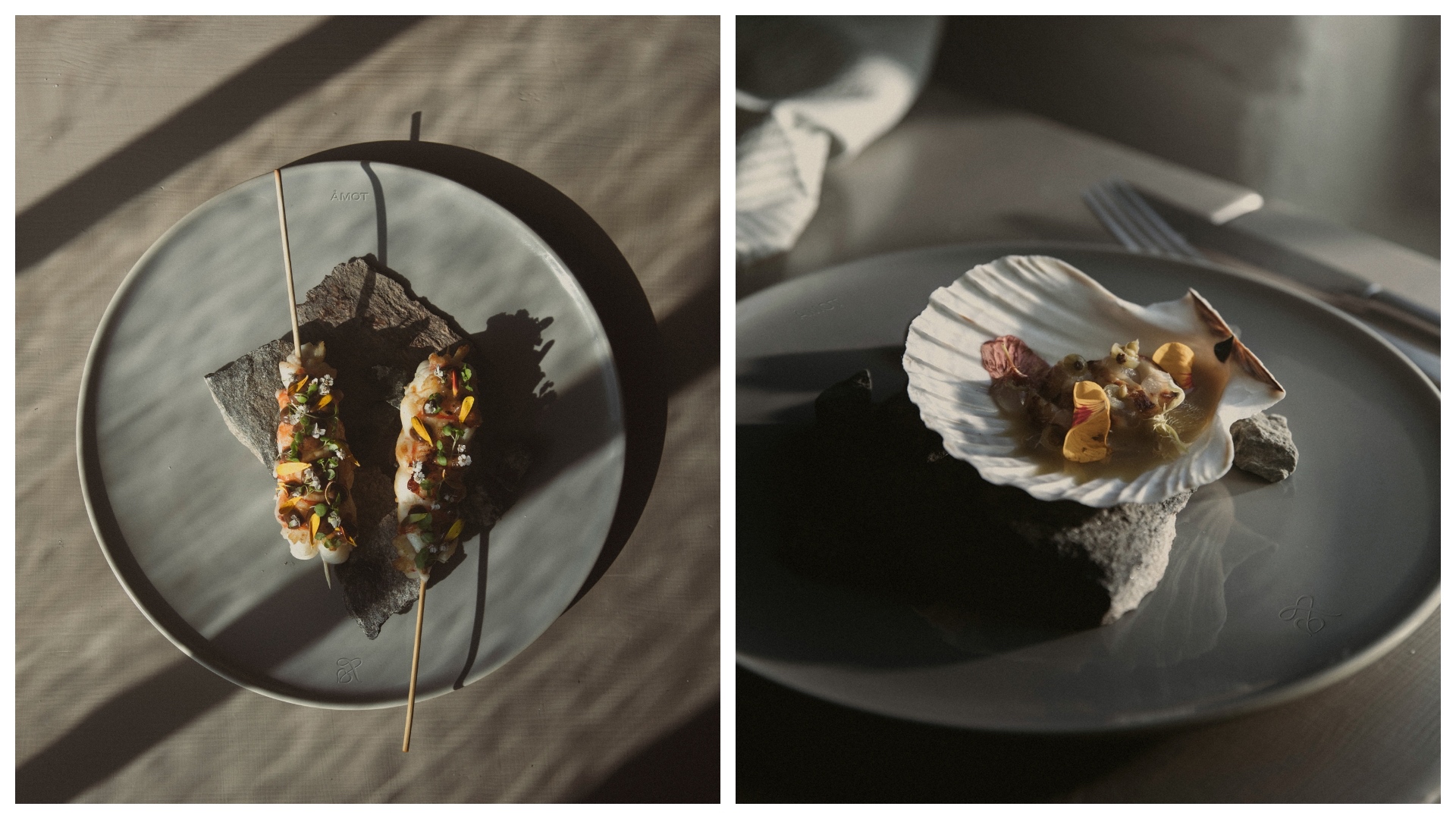
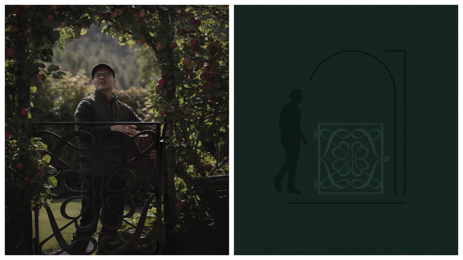
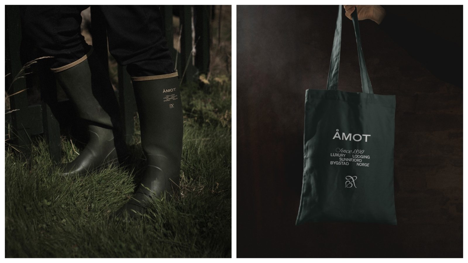
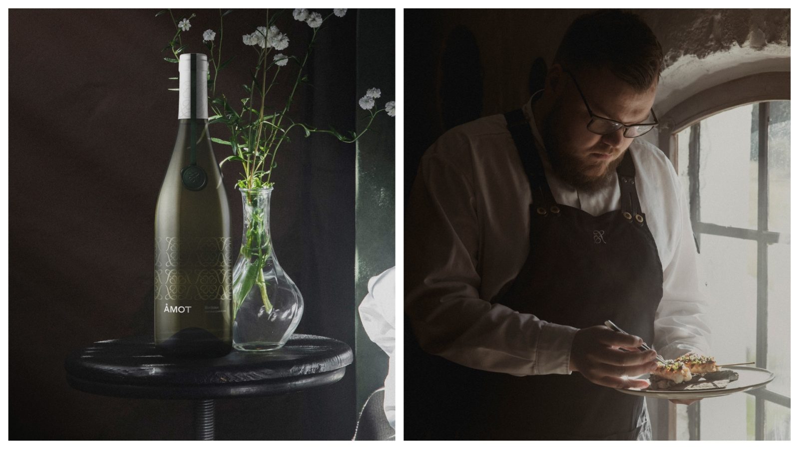
Authentic meetings with locals to private performances by the most genuine regional talents. Visiting Åmot is like stepping into a painting of tranquillity. A pause. A time to revitalise. A time to reflect and rediscover the finer things in life. The branding revolves around the feeling of a pause and the estate’s heritage. Kind wanted to capture this through photography. The image style needed to have traditional elements, feel authentic and give a sense of calm. It needed to be exclusive but also warm.
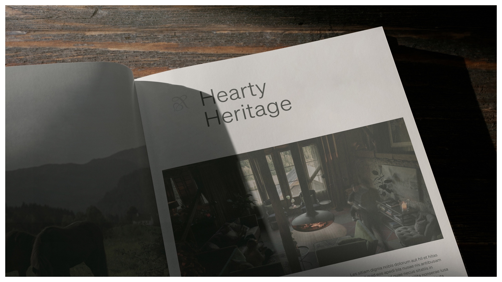
A Hearty Heritage
A rural haven hidden away in the heart of the Norwegian fjords, Åmot is where authenticity meets exclusivity. A natural retreat, a secluded sanctuary, a revitalising experience.
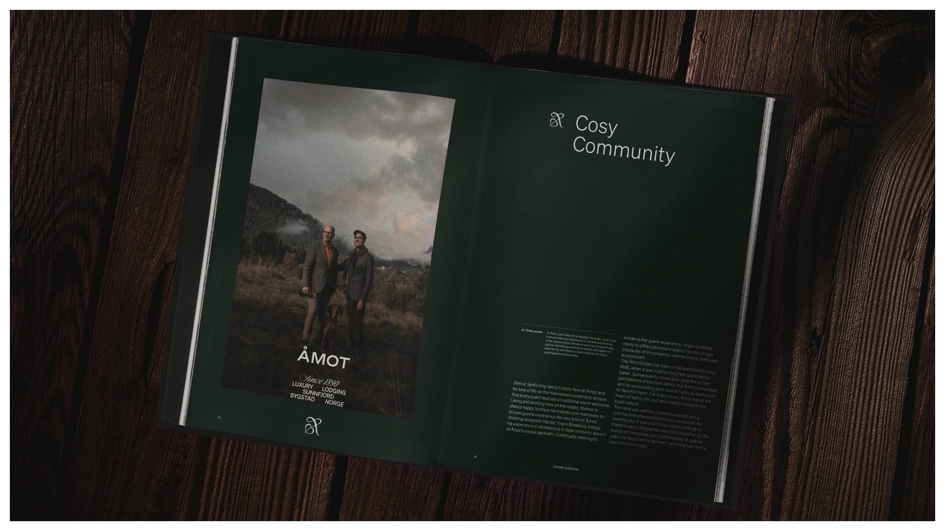
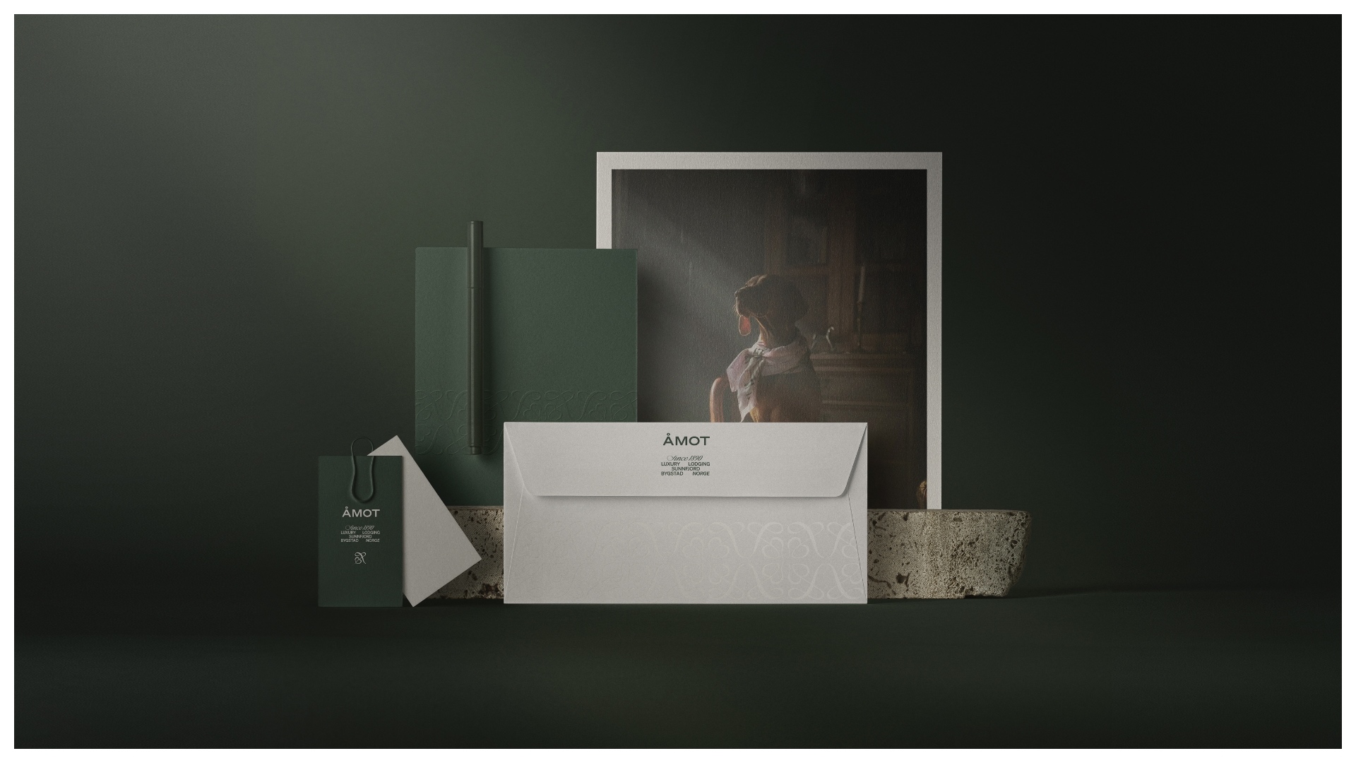
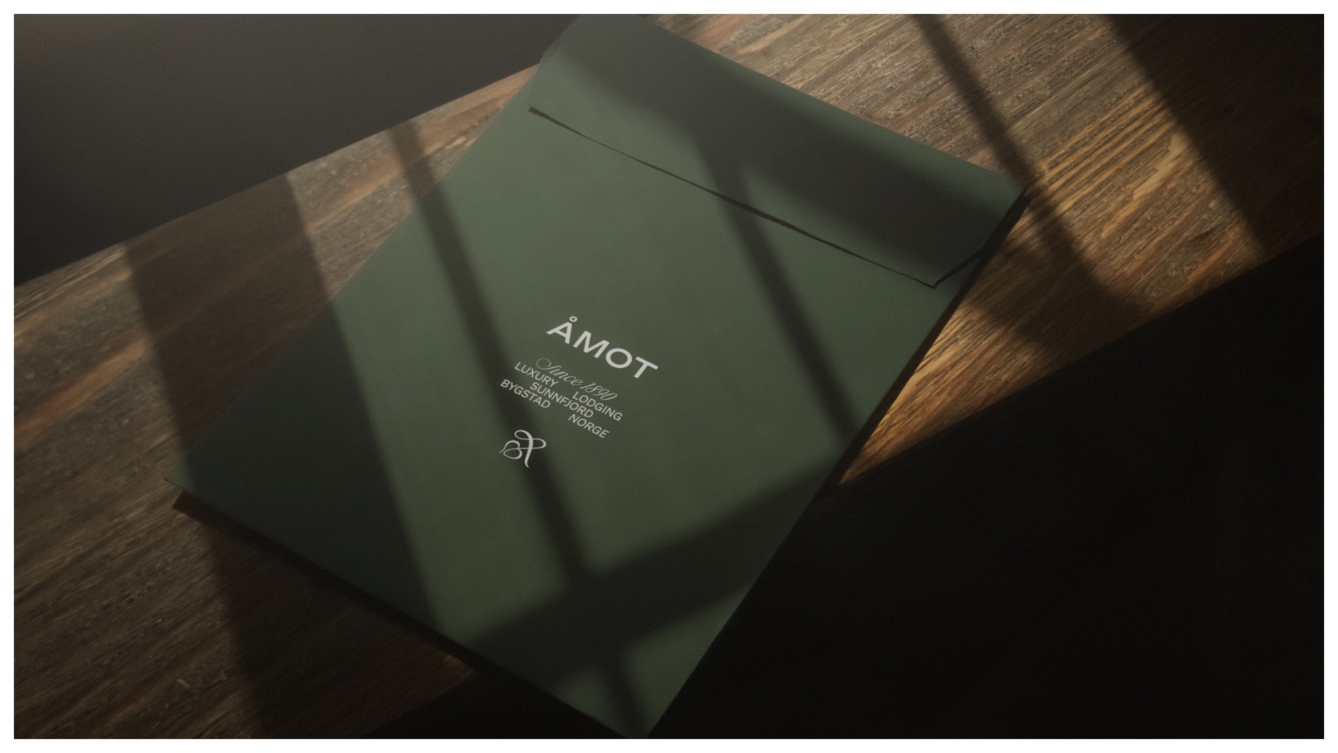
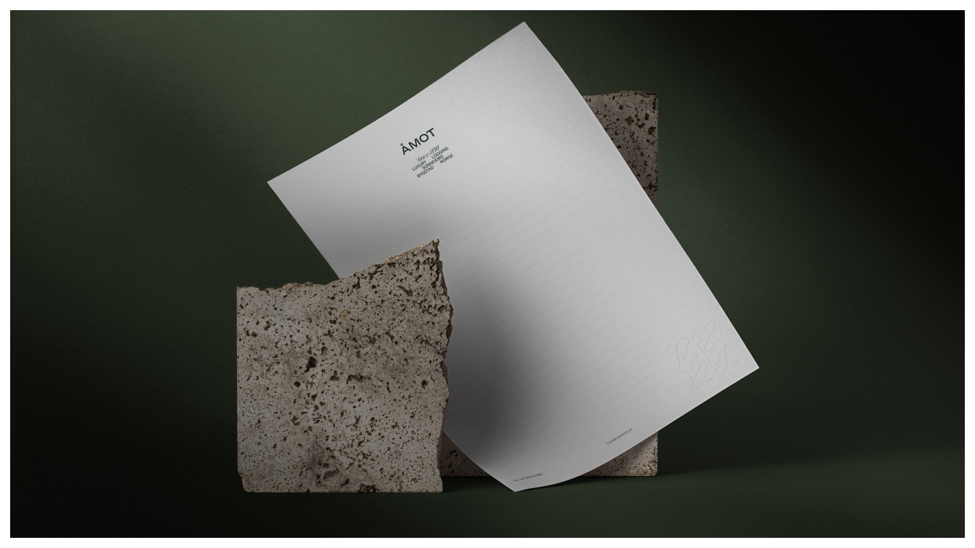
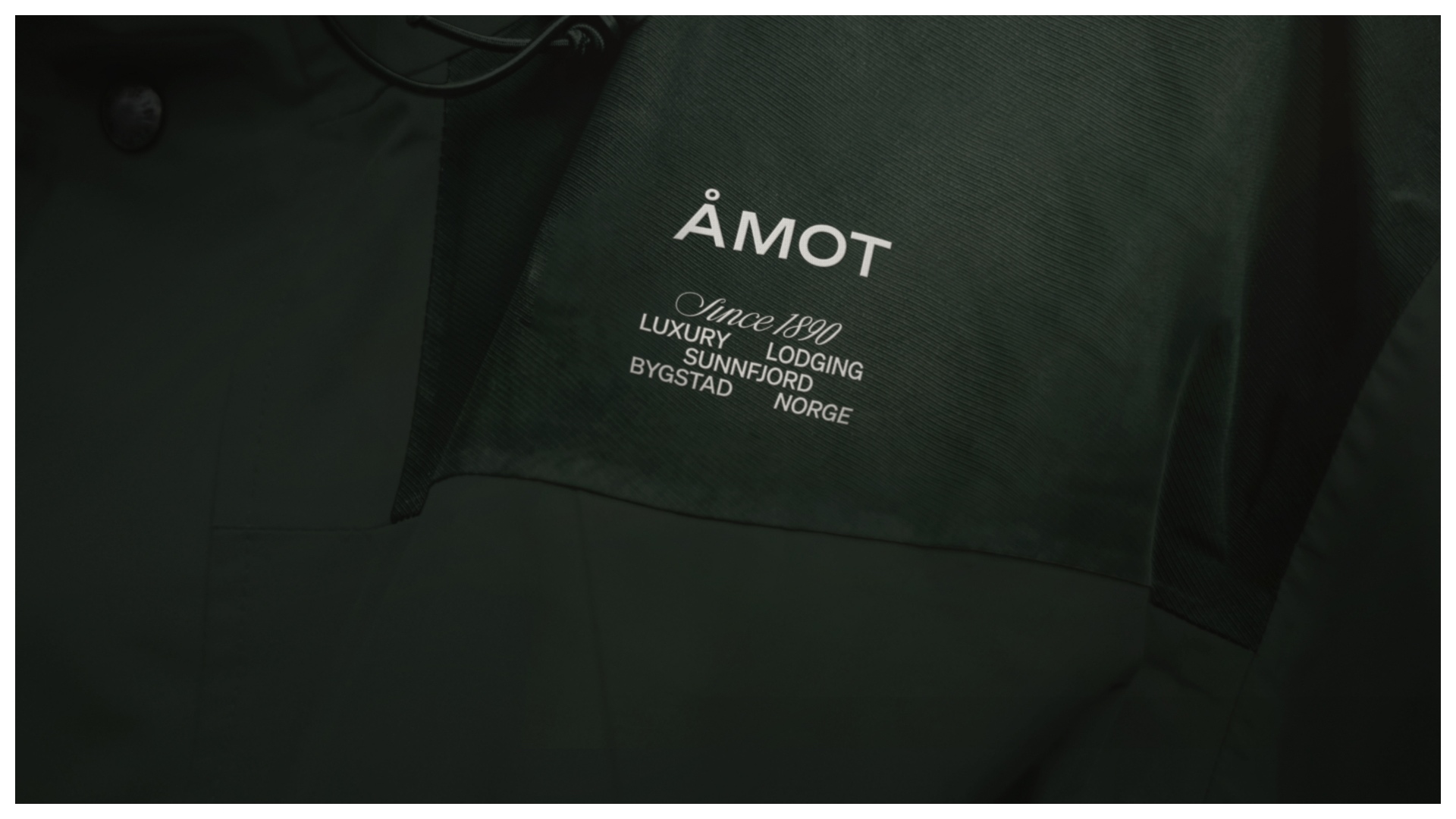
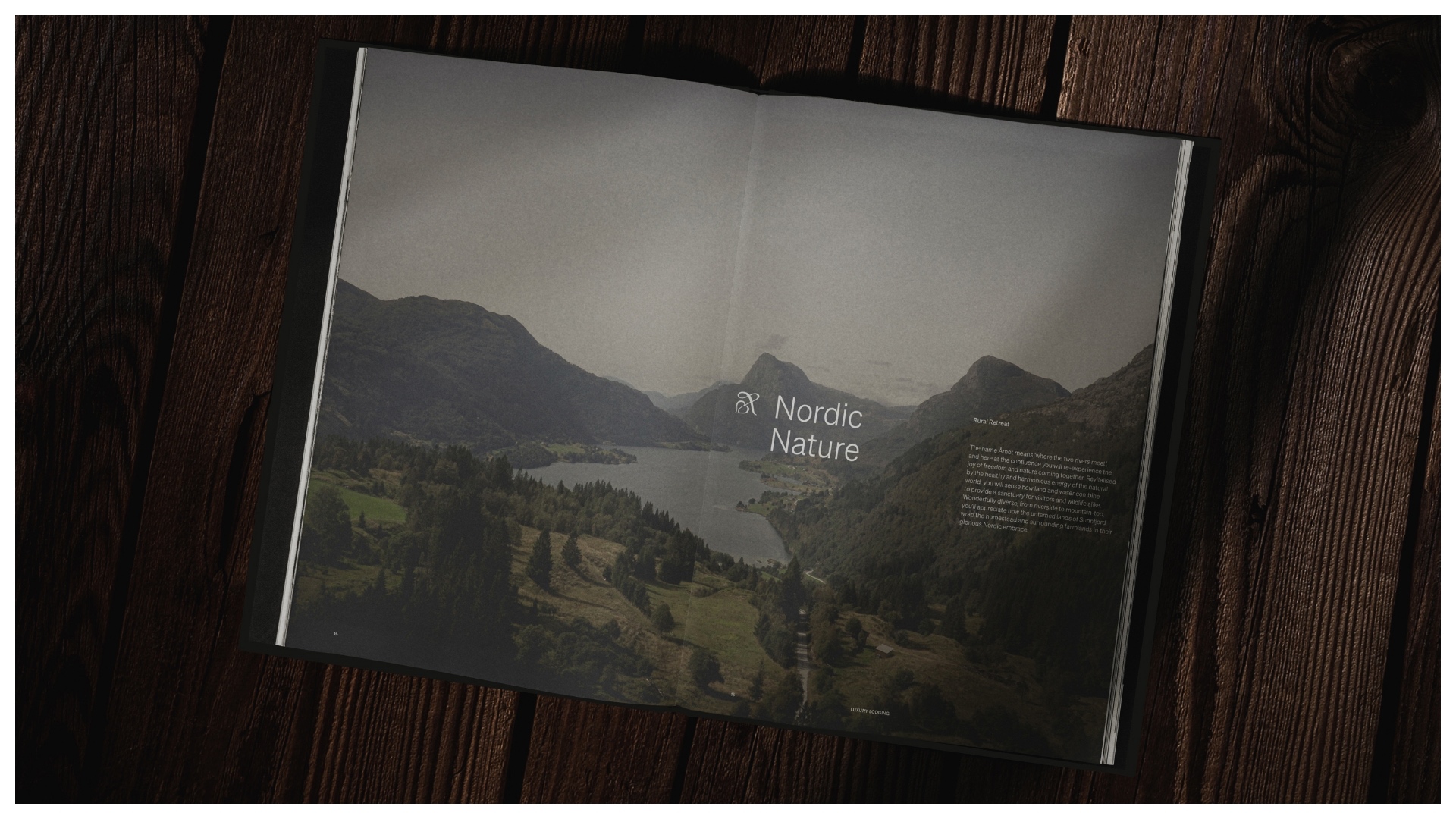
The typography is inspired by 1800s typesetters and a hand-drawn monogram of the Norwegian letter “Å” combined with a floral shape that creates a hearty heritage. The Monogram is also used as an integrated part of written communication.
The communication is warm and inclusive, shaped by headlines with alliteration that sums up the experience in a memorable way.
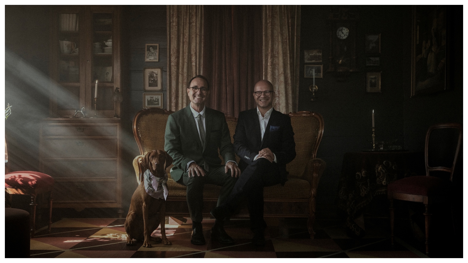
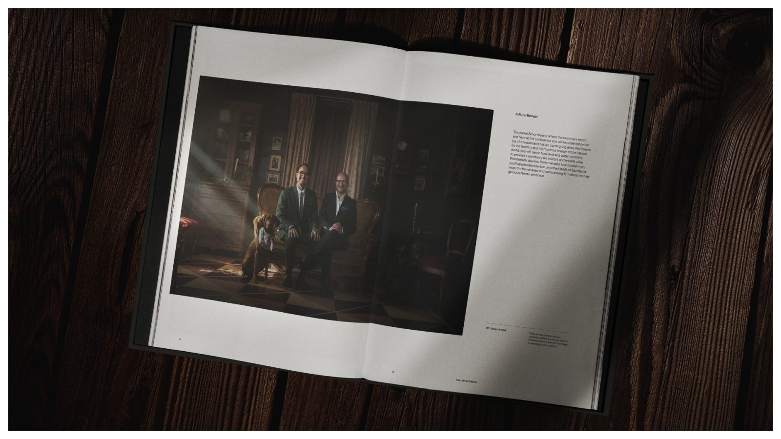
We wanted the identity and photography to have a renaissance feel. We used the low morning light to achieve the desired look and brought it out with haze.
The precise direction of the beams creates a dramatic spotlight and dark shadows in the interior. We removed the blues to enhance the picturesque Renaissance look, which let the brown, warm tones seep through. Step back in time, breathe, discover, savour and remember.
CREDIT
- Agency/Creative: KIND (Conceptual Branding AS)
- Article Title: Åmot Luxury Lodging Logo Design
- Organisation/Entity: Agency
- Project Type: Identity
- Project Status: Published
- Agency/Creative Country: Norway
- Agency/Creative City: Bergen
- Market Region: Europe
- Project Deliverables: Brand Design, Brand Identity, Logo Design
- Industry: Hospitality
- Keywords: WBDS Agency Design Awards 2023/24
- Keywords: Identity, Logo Design
-
Credits:
Chief Creative Director: Tom Emil Olsen
Design Director: Knut Harald Longva
Senior Designer: Agnieszka Gawlik
Senior Designer: Emil Olsen
Senior Designer: Saurabh Kumar
Senior Designer: Lorenzo Galbiati
Graphic Designer: Mihail Mihaylov
Graphic Designer: Tiare Hernández Payano
Graphic Designer: Clara Auda
Graphic Designer: Piotr Deres
Video/Photographer: Isak Norum
Cinematographer: Stian Servoss
Director of Photography: Christoffer Meyer
Key Account Manager: Beate Myren Romslo
Key Account Manager: Marianne Erdal Holm
Project Manager: Laure Mediavilla
Strategic Brand Director: Thomas Danielsen
Strategic Brand Consultant: Jan Willy Skjølberg
Strategic Brand Consultant: Brede Lie Reime


