Curious Design – Amino Mantra
At Amino Mantra they prefer their plants in the buff, just like mother nature made them.
When it comes to health and flavour, they don’t mess around. Nor do they mess around with nature. They make it easy to sustain a nutritionally complete plant based diet, carefully selecting plants, legumes and seeds for their maximum nutritional value, then artfully combine them with yummy natural herbs and spices.
The result? Delicious food, minimally processed and free from unnecessary additives. No gluten, processed starches, protein powders, soy or tree nuts: just vegetables, legumes, seeds, herbs and spices.
So whether you’re plant-based every day or some days, you can trust their products will nourish your body, bring a smile to your soul and leave a lighter footprint on our planet.
Amino Mantra is founded by husband and wife team, chef Pritesh Kajaria and food scientist Trang Duong-Kajaria. From the moment that we met them their vision, passion and desire to make a positive difference to the world absolutely inspired everybody at Curious. Our pledge then was to faithfully match the visual language of the brand to the quality of the products that they lovingly create-and the philosophy that drives them.
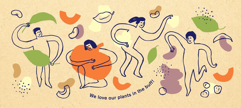
We set out to achieve this by hand crafting all of the key elements-a nod to the same artisan care and attention that Pritesh and Trang place such great emphasis on.
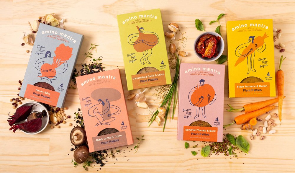
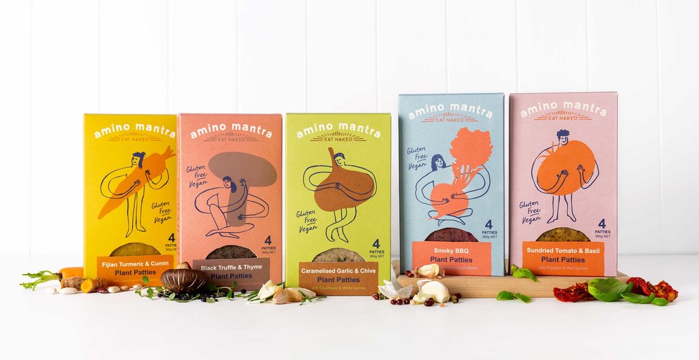
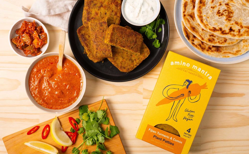
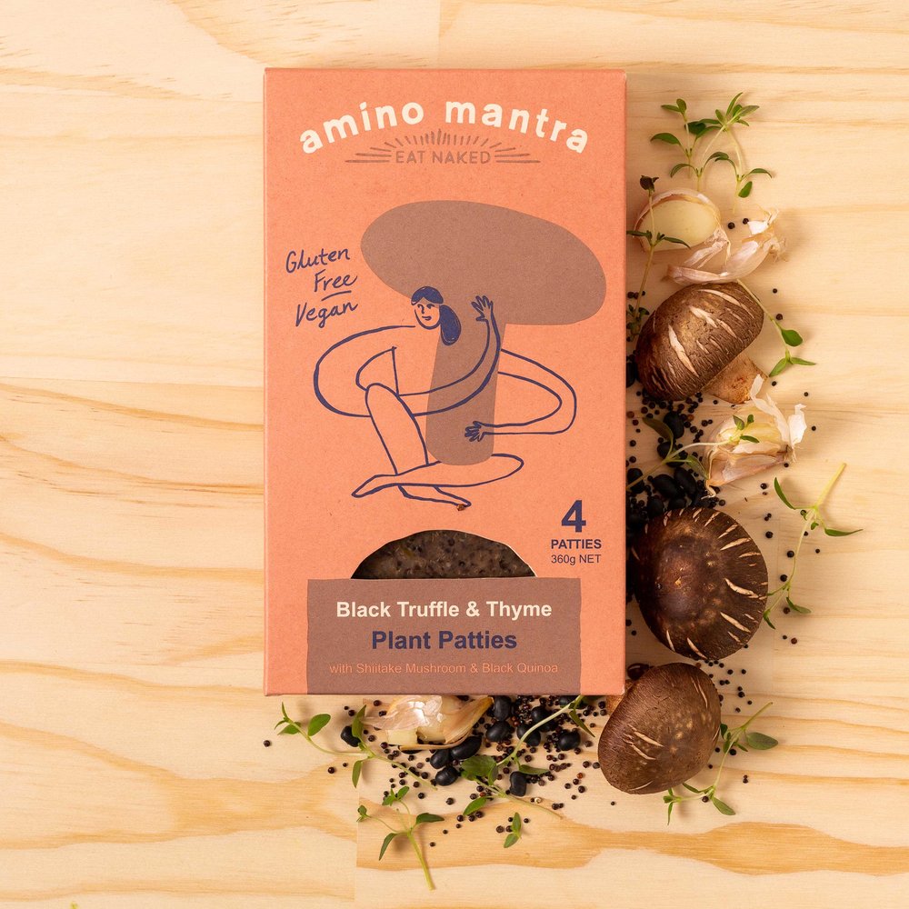
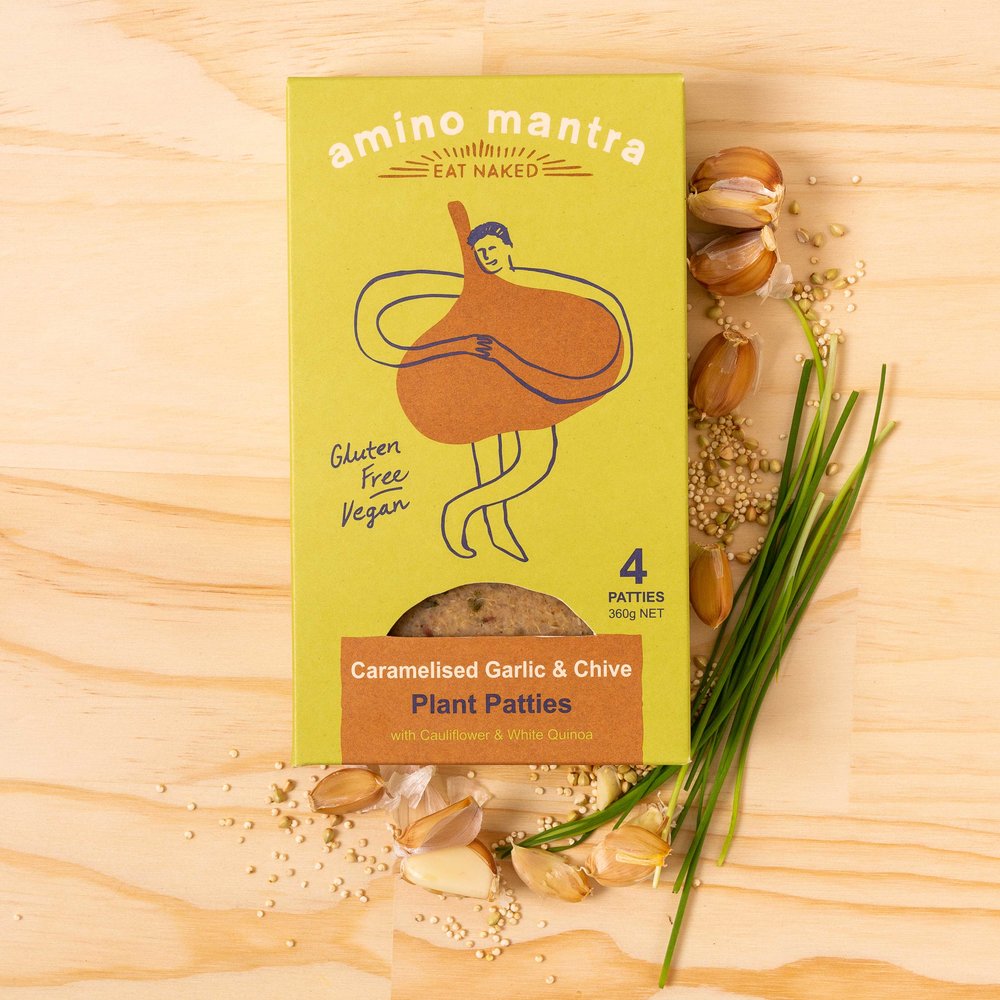
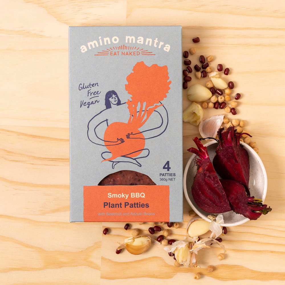
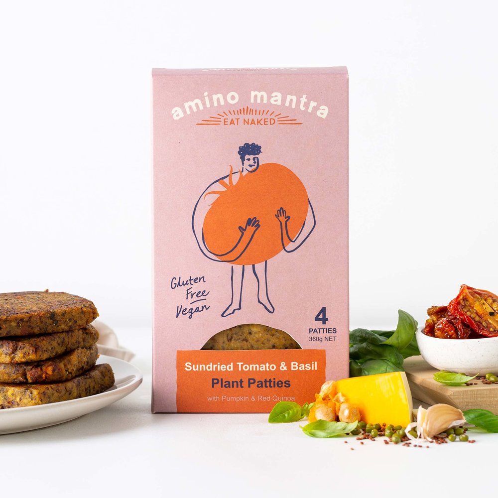
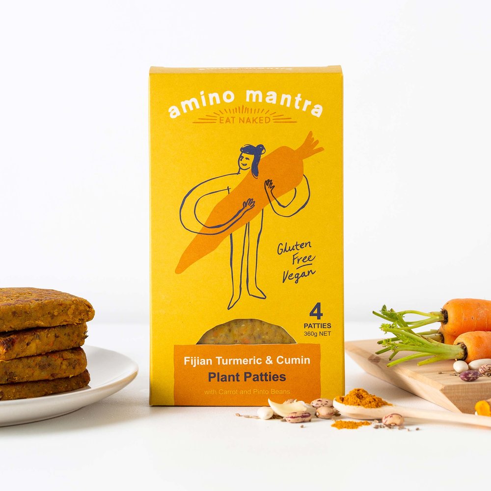
The normal digital design process was abandoned at the outset of the project, going back to the ‘intuitive’ method of pencil and paper. This allowed us to freely create typography and illustrations that had a sense of spontaneity and honesty to them. Through this exploration, the idea of the symbiotic relationship between plants and people also evolved, which we then visually captured by interacting naïve line drawings of characters with the key vegetables for each product variant. A simple analogy of everything that Amino Mantra stands for.
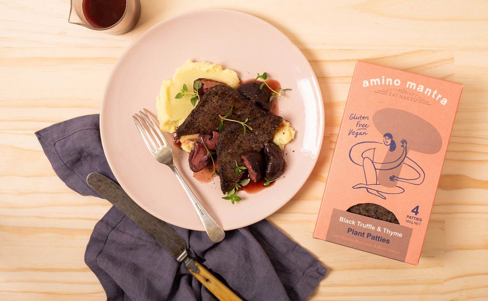
This delicate, but evocative imagery was featured prominently on the packaging and synchronised with a beautifully considered ‘earthy’, but contemporary colour palette.
Finally the designs were printed onto an uncoated stock that allowed a textural finish to the packs.
To complete the design programme a social media campaign and website has been created. These media platforms not only highlights the great products that Trang and Pritesh make, but also detail their ‘giving back’ philosophy-which is such an integral part of the Amino Mantra story.
CREDIT
- Agency/Creative: Curious Design
- Article Title: Amino Mantra Products Packaging Design
- Organisation/Entity: Agency Commercial, Published
- Project Type: Packaging
- Agency/Creative Country: New Zealand
- Market Region: Oceania
- Format: Box
- Substrate: Pulp Board


