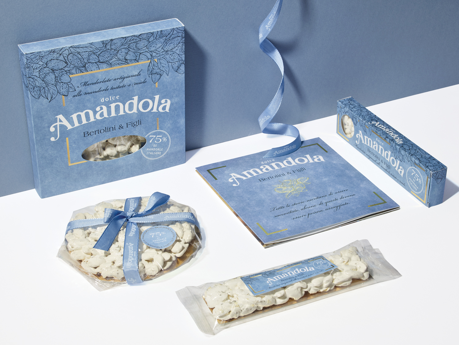
The project stems from the company’s need to enter the FMCG with a new brand, different from the company’s historical one in order not to create a conflict with the Horeca channel. Objective of the project: to create a new brand starting from the concept of the product, the almond cake, a typical dessert of north-eastern Italy. The name AMANDOLA has been created to recall the definition of product but at the same time be more fragrant, soft and lovable.
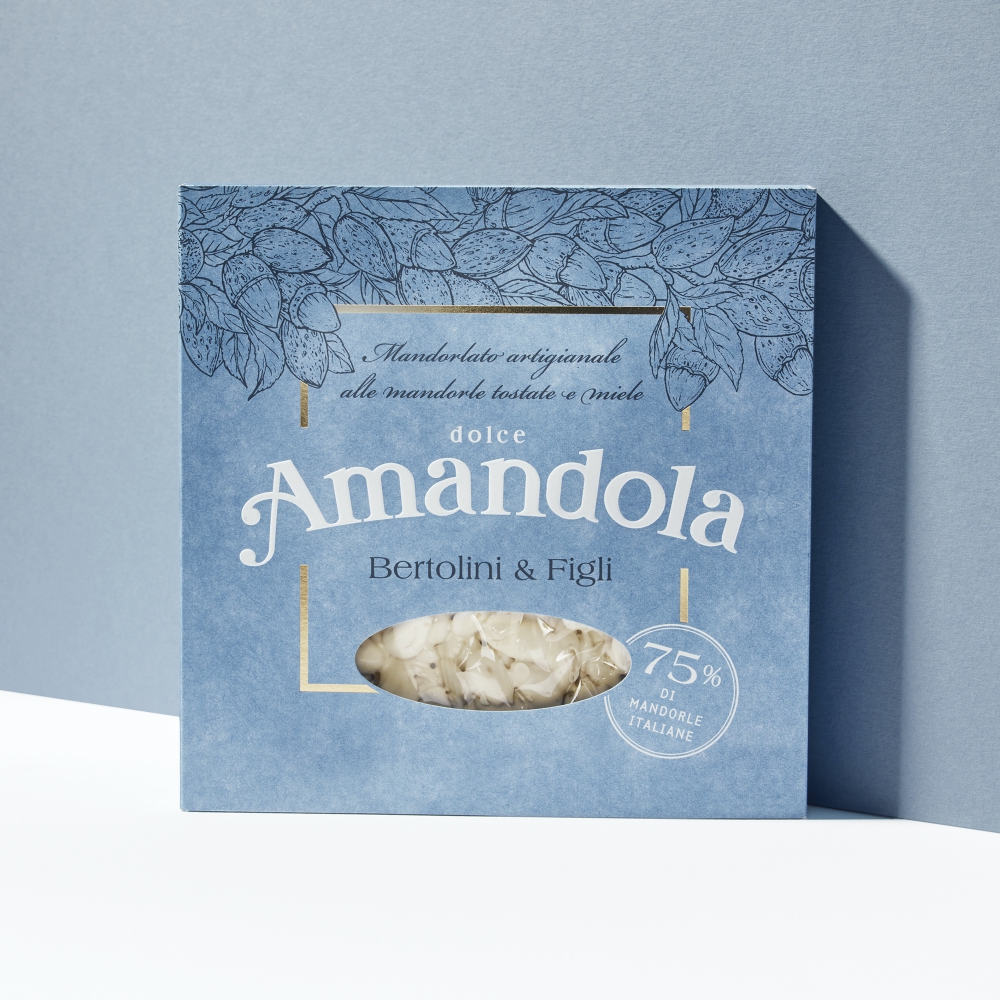
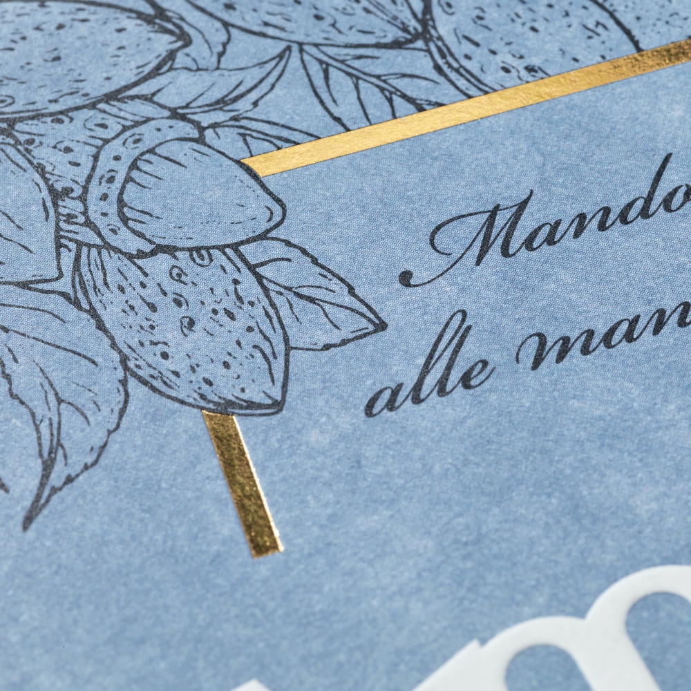
The blue box recall the sweetness and the naturalness, important values that can occur in the ingredients list: 75% of almonds and then to follow honey, egg white and a little sugar.
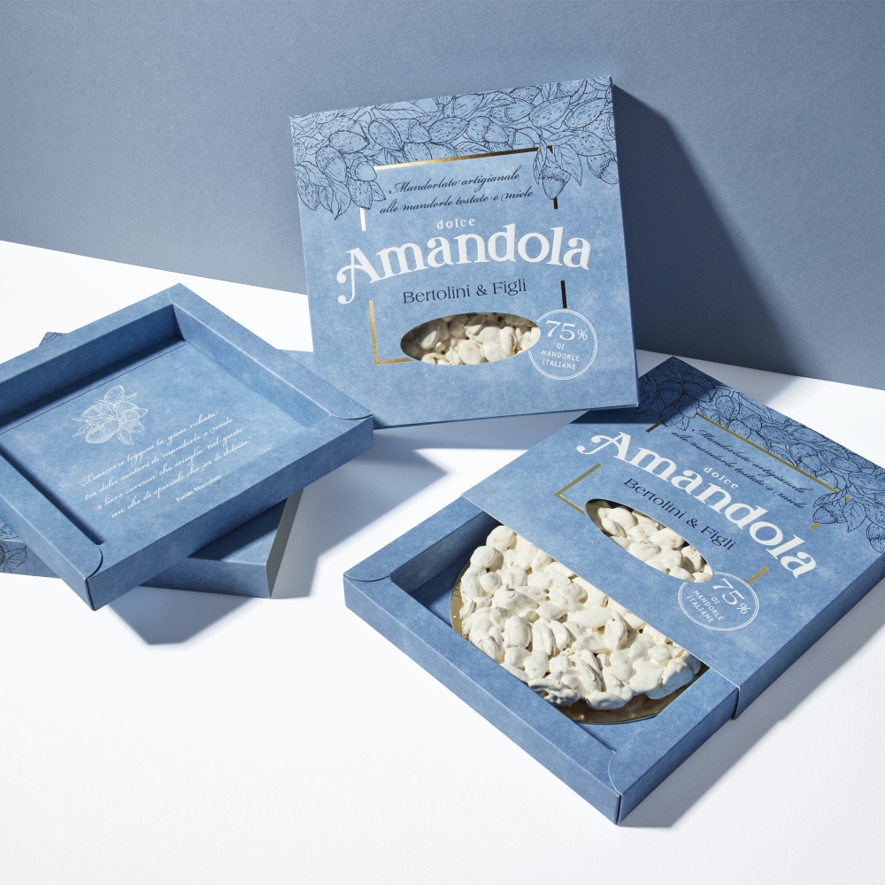
The packaging of the cake is designed specifically for the product and provides two main features:
1) the drawer opening, to discover the dessert slowly and present it inside a tray;
2) a small window that allows you to see the content sufficiently to understand its nature; deliberately the window is not bigger to try to have more visibility on the shelf.
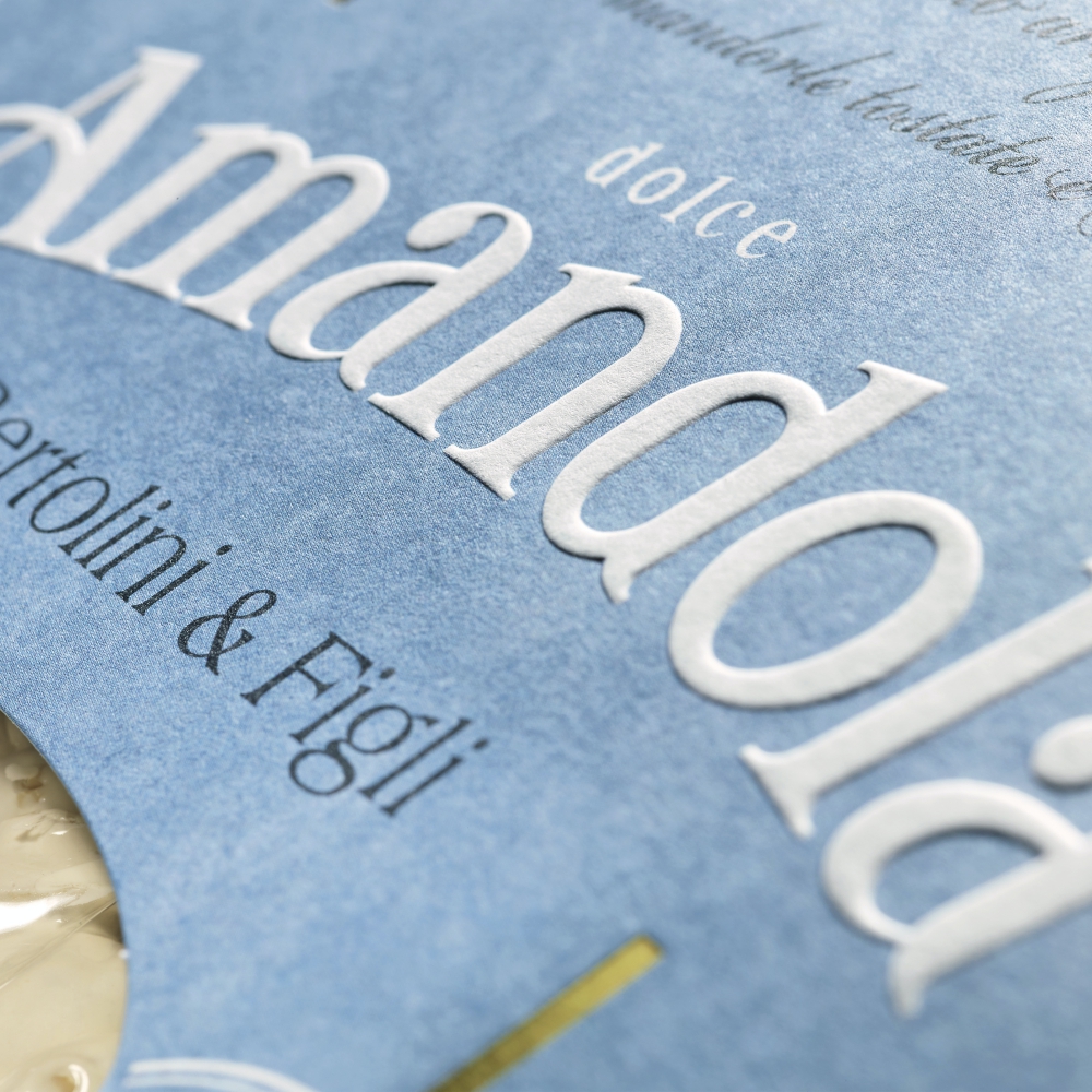
The name AMANDOLA is made with the embossing shape on the natural white color of the Fedrigoni Free Vellum 320gr paper. The hot gold frame emphasizes, frames, the name and the heart of the package and fits with the illustration of the rich almond branches, masterfully made by the sisters Marina and Annalisa Durante to give naturalness and freshness. The leaves deliberately give the impression of being moved by the wind to give a greater sense of vitality.
CREDIT
- Agency/Creative: NEOM
- Article Title: Amandola Brand and Packaging Creation
- Organisation/Entity: Agency, Published Commercial Design
- Project Type: Packaging
- Agency/Creative Country: Italy
- Market Region: Europe
- Project Deliverables: Brand Creation, Brand Naming, Brand Strategy, Brand World, Branding, Graphic Design, Illustration, Packaging Design, Structural Design, Tone of Voice
- Format: Box, Tray
- Substrate: Pulp Paper


