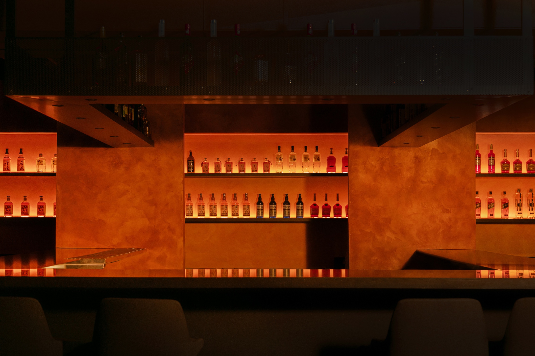
The genesis of the Ama brand was a fusion of unique concepts and inspiration from restaurateur Yannis Keriotis, in collaboration with Chef Takuya Motohashi of Soyfish. The goal was to create a Japanese cocktail and raw bar concept nestled above an existing restaurant in the tranquil suburbs of Vancouver’s Fraserhood. Conceived as a clandestine bar — characterized by a concealed location, an intimate and warm atmosphere, and an interior that transports guests into a dark, seductive, and dimly lit realm. The interior design by &Daughters, drew inspiration from the alluring ambiance of Tokyo’s big-city cocktail bars, the futuristic allure of Blade Runner and the idea of light seen through the depths of the ocean.
Glasfurd & Walker started the work with name generation leading the entire narrative and brand design direction. The name ‘Ama’ is derived from the Japanese term “海女” (meaning “sea women”), who are famed for free diving to collect pearls. The name metaphorically alluded to the restaurant’s hidden status and the Japanese influence on its seafood-focused menu offering.
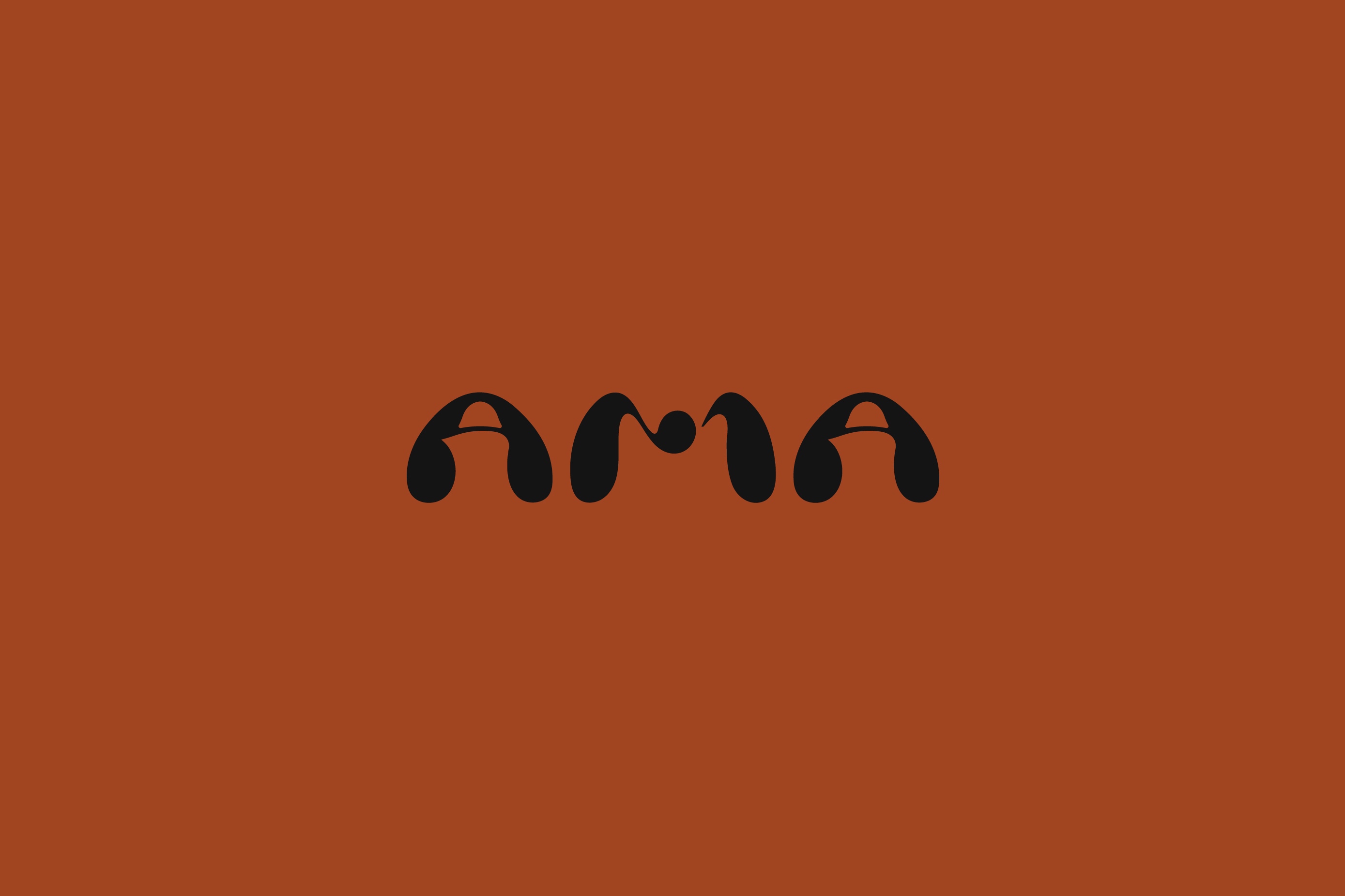
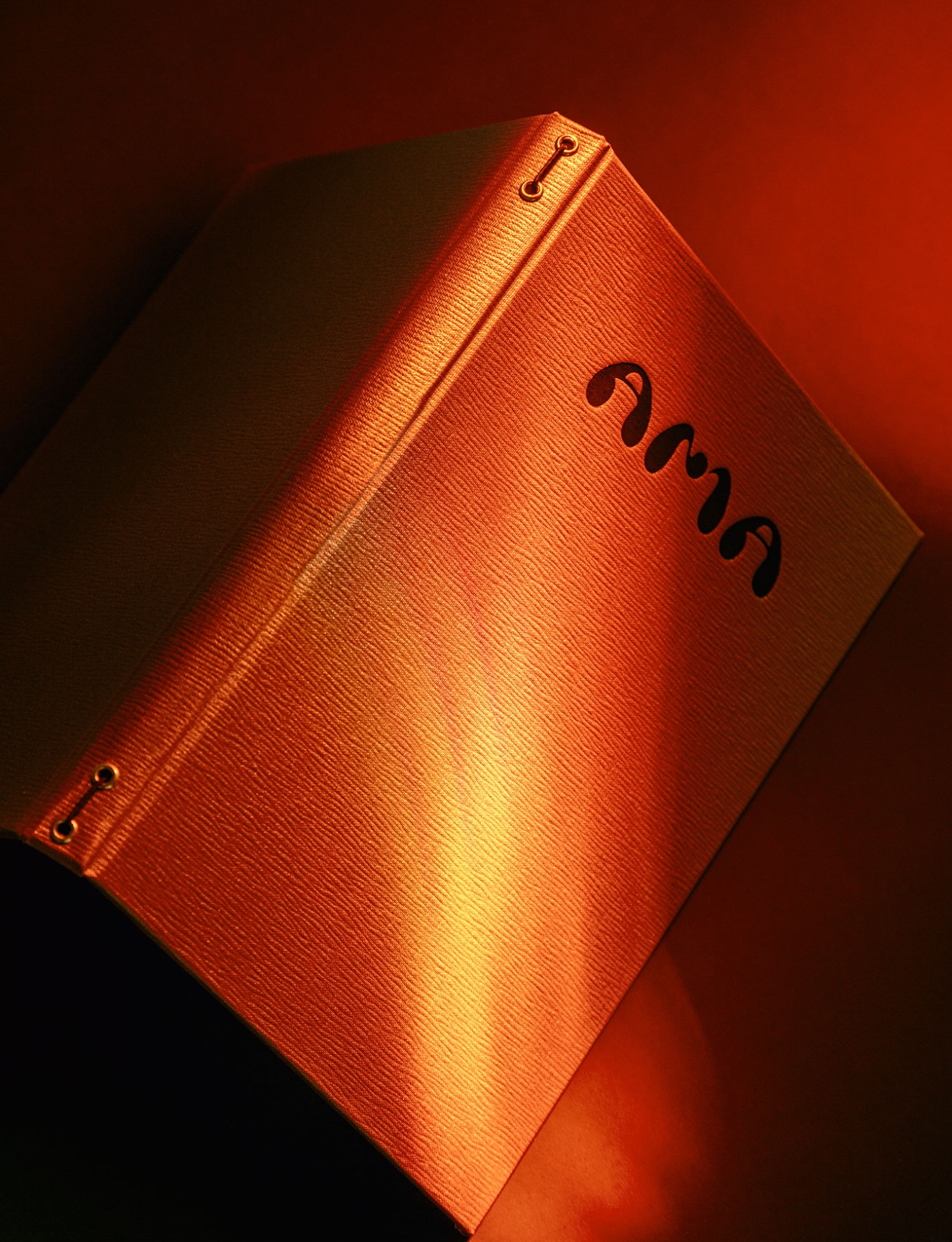
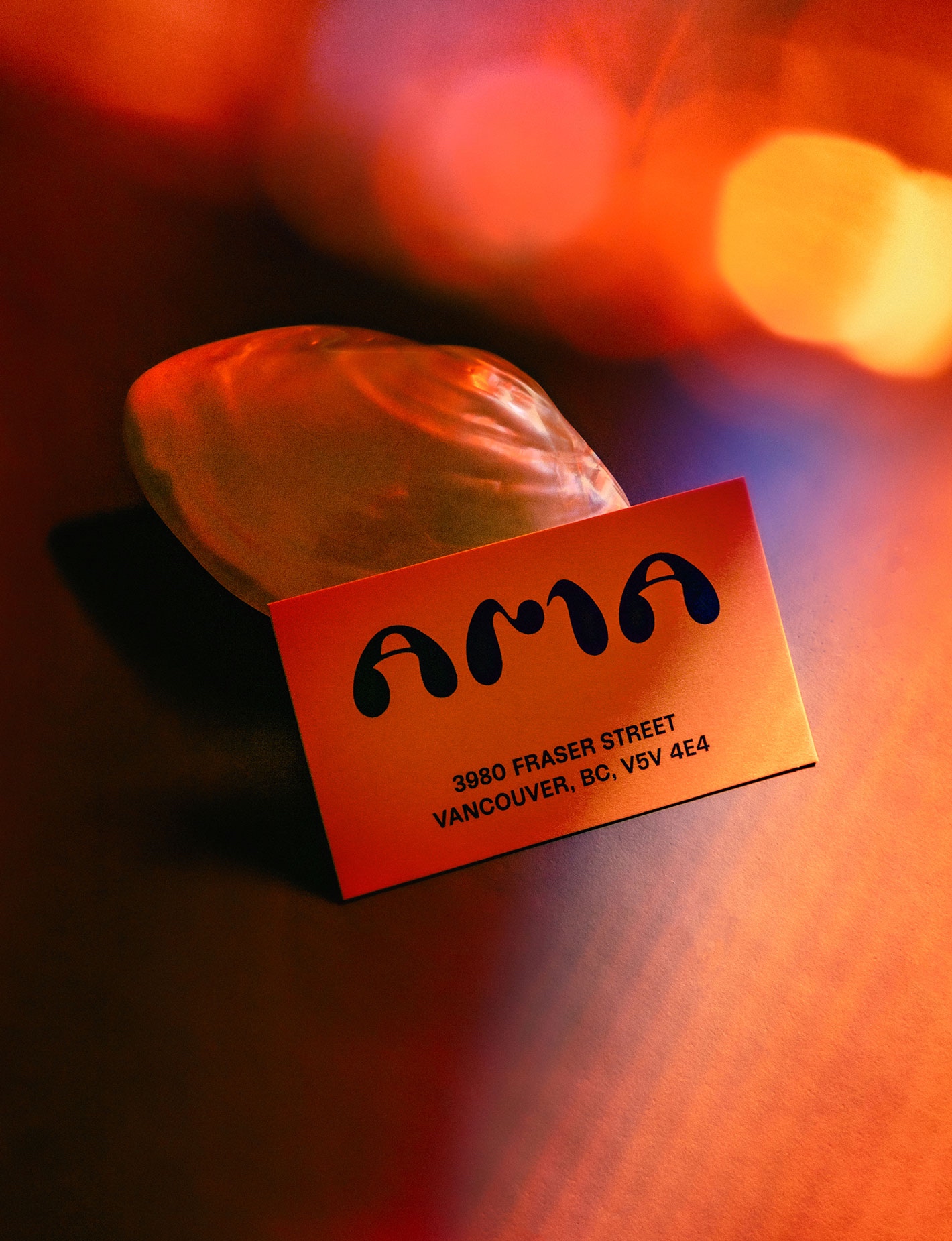
The brand identity delves into the “retro-futurist” references that influenced the interior. The organic and fluid logo, imbued with a touch of ’70s flair reminiscent of flowing water and rounded like a pearl, is constructed with fluid symmetry in its lettering. Complemented by a utilitarian and functional sans-serif typeface, the minimal yet expressive identity permeates every touchpoint with textures and hues of deep reds, oranges, and pearlescent tones. The design narrative weaves together diverse inspirations, inviting guests into a mysterious world as they ascend the stairs to this concealed world.
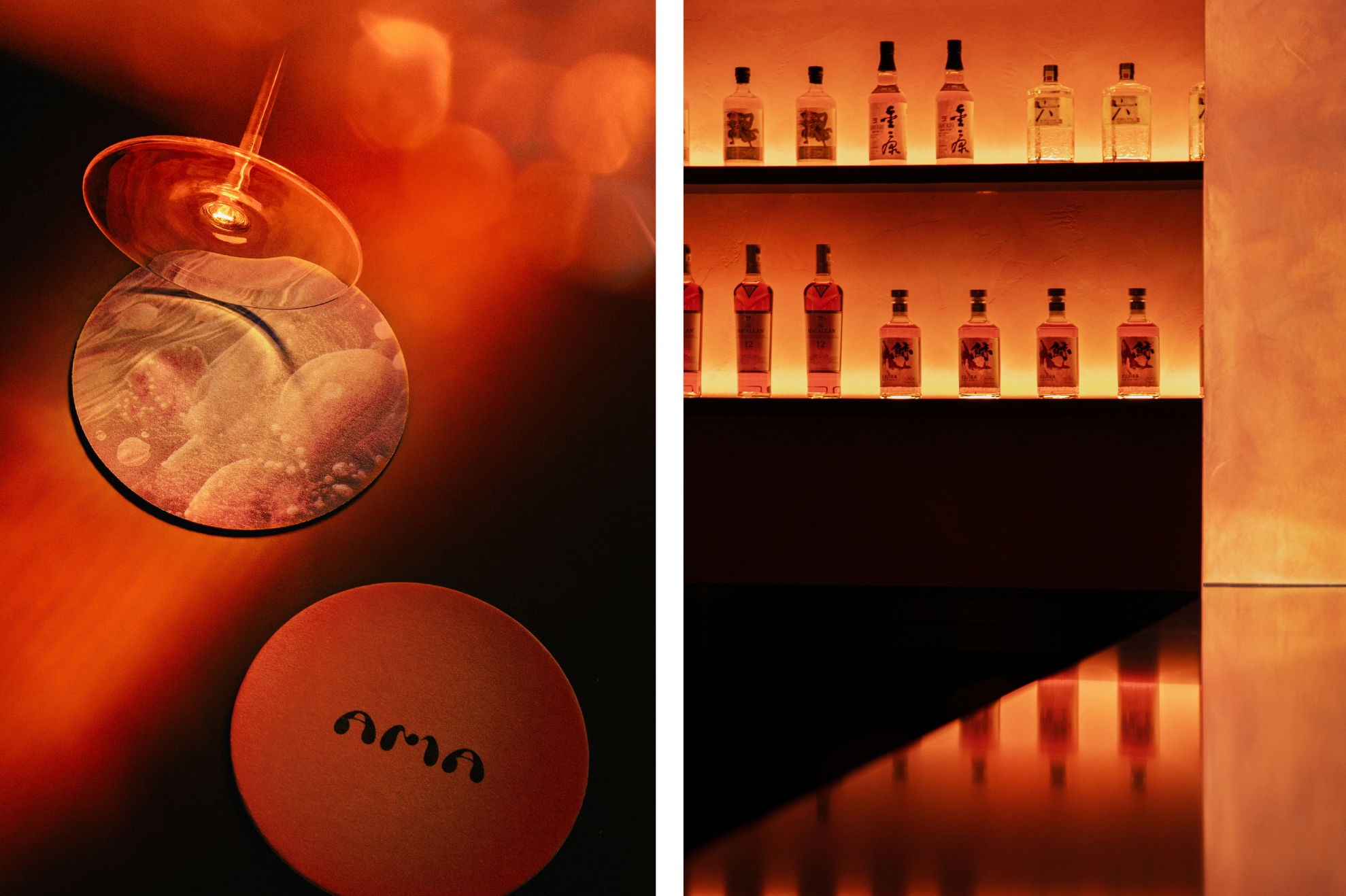
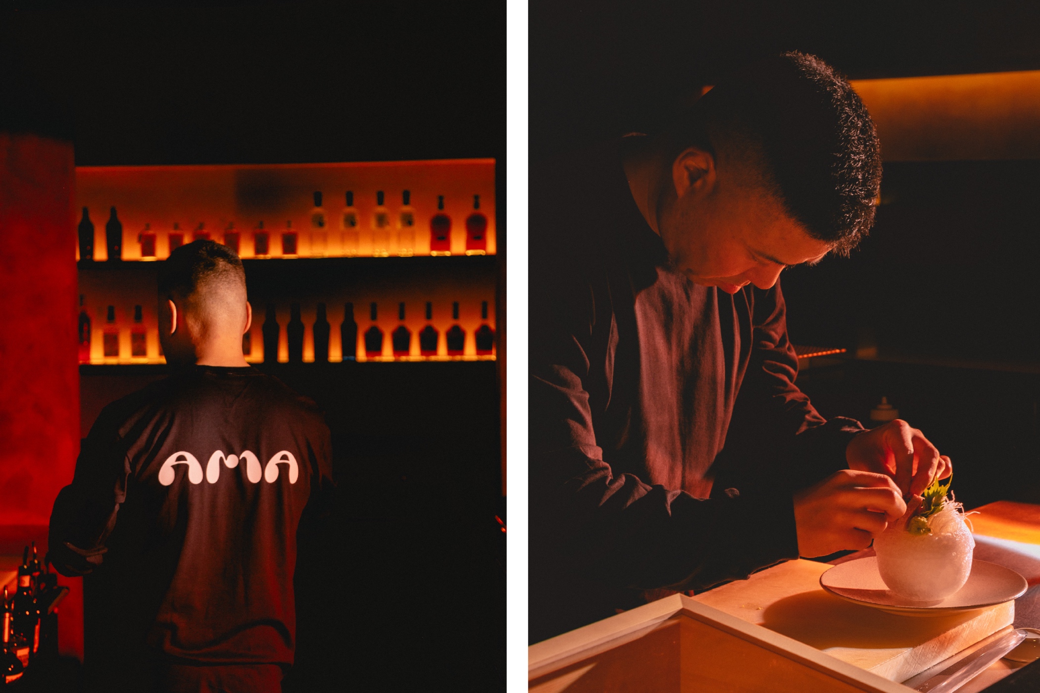
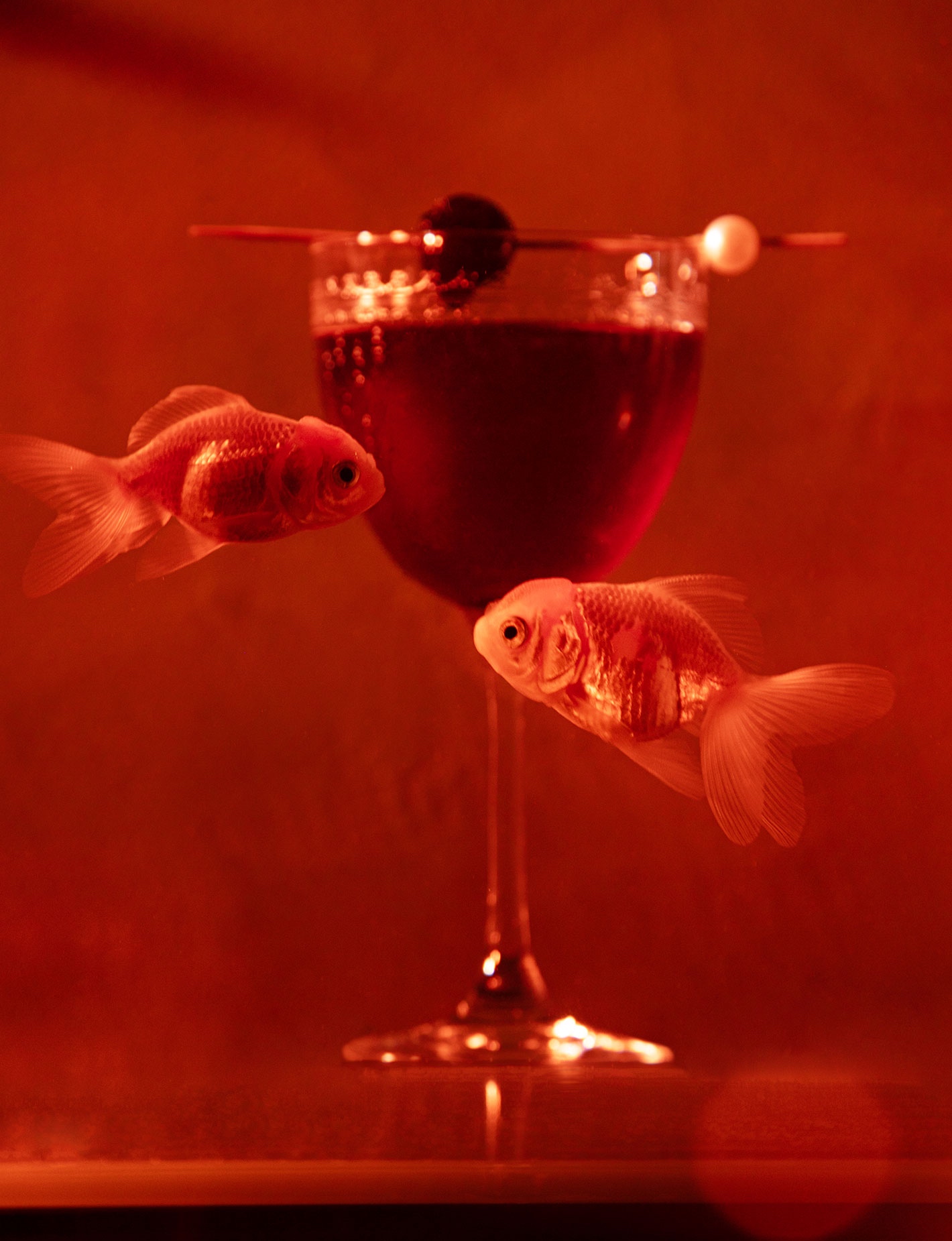
The art direction by Glafurd & Walker and photography by Ian Lanterman breathe life into the brand, adding movement and depth to the clean, architectural lines of the space. Each photograph captures the essence of the deep sea—glistening and dappled lights reminiscent of underwater depths. Creating an intriguing & inviting ambiance that offers an escape from the ordinary, as any exceptional restaurant should.
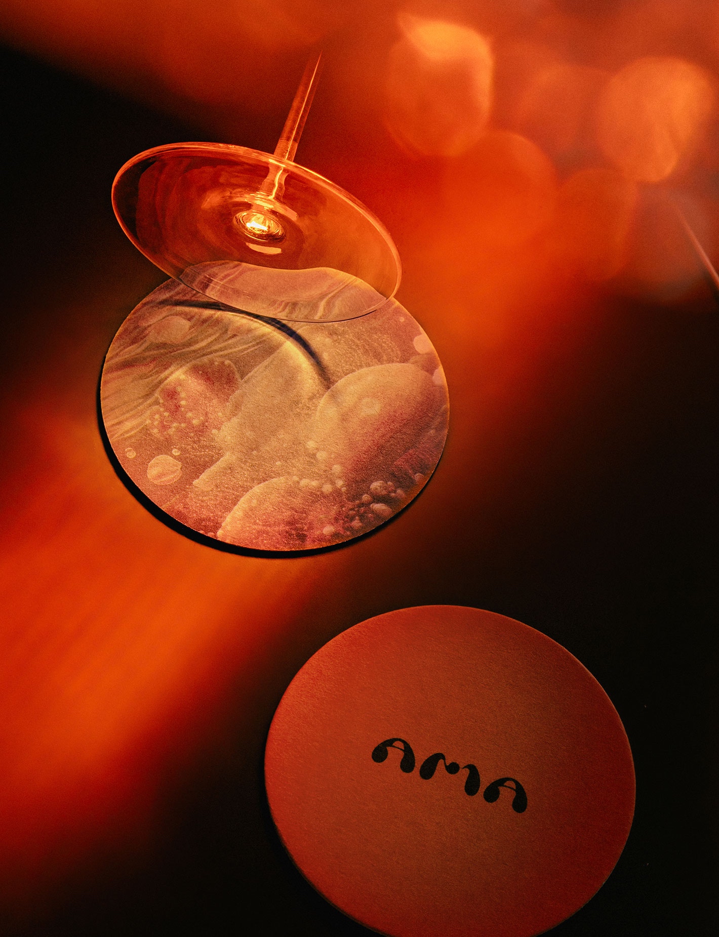
The coasters, are an extension of the immersive experience, showcasing illustrations of an underwater world with pearls and coral. This organic texture forms a bridge between the physical space and the food delights offered, further enhancing the storytelling aspect of Ama.
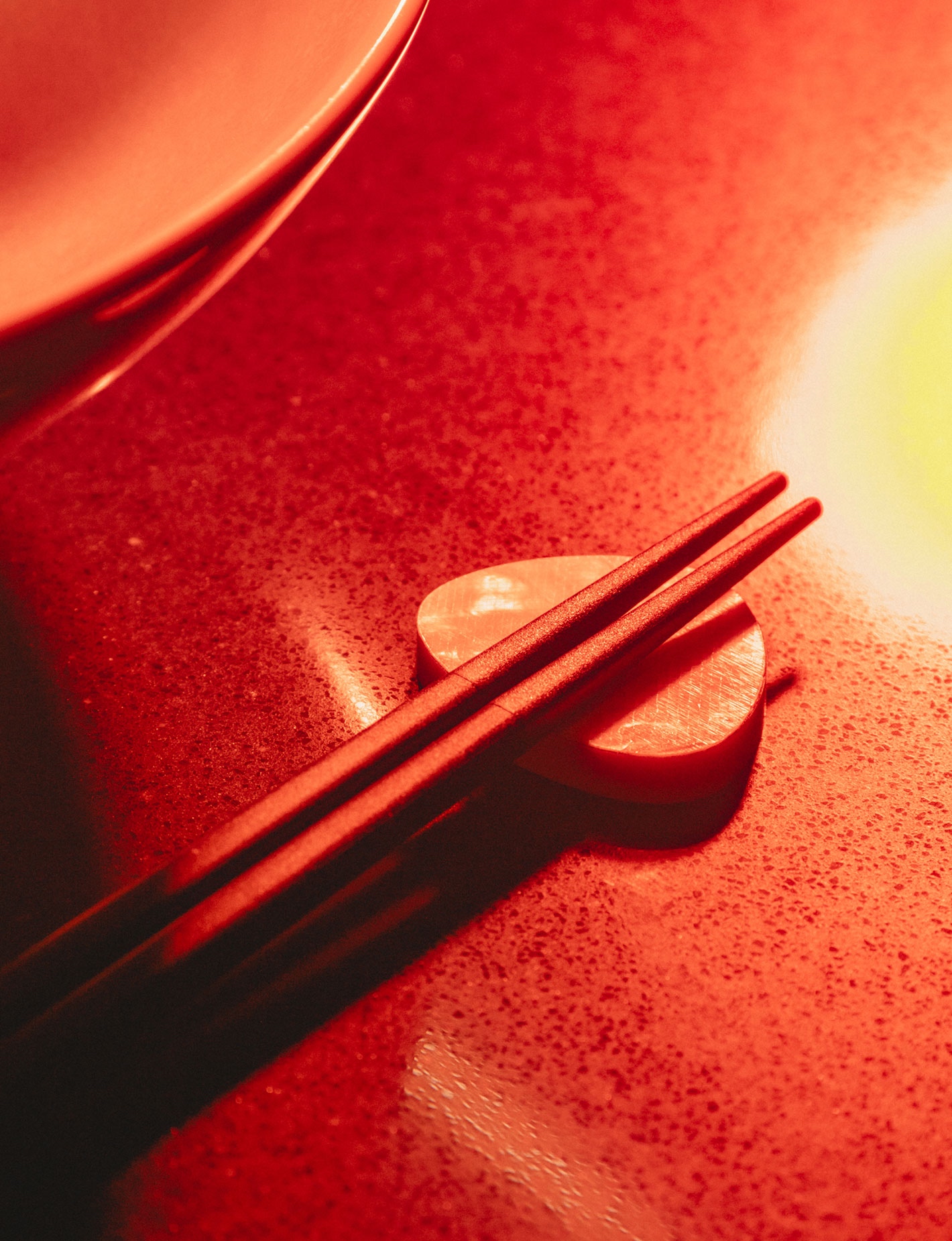
Custom chopstick holders were inspired by the organic shapes of the logo lined with mother of pearl as a direct link to the name serving as a tactile manifestation of the restaurant’s dedication to every facet of the guest experience.
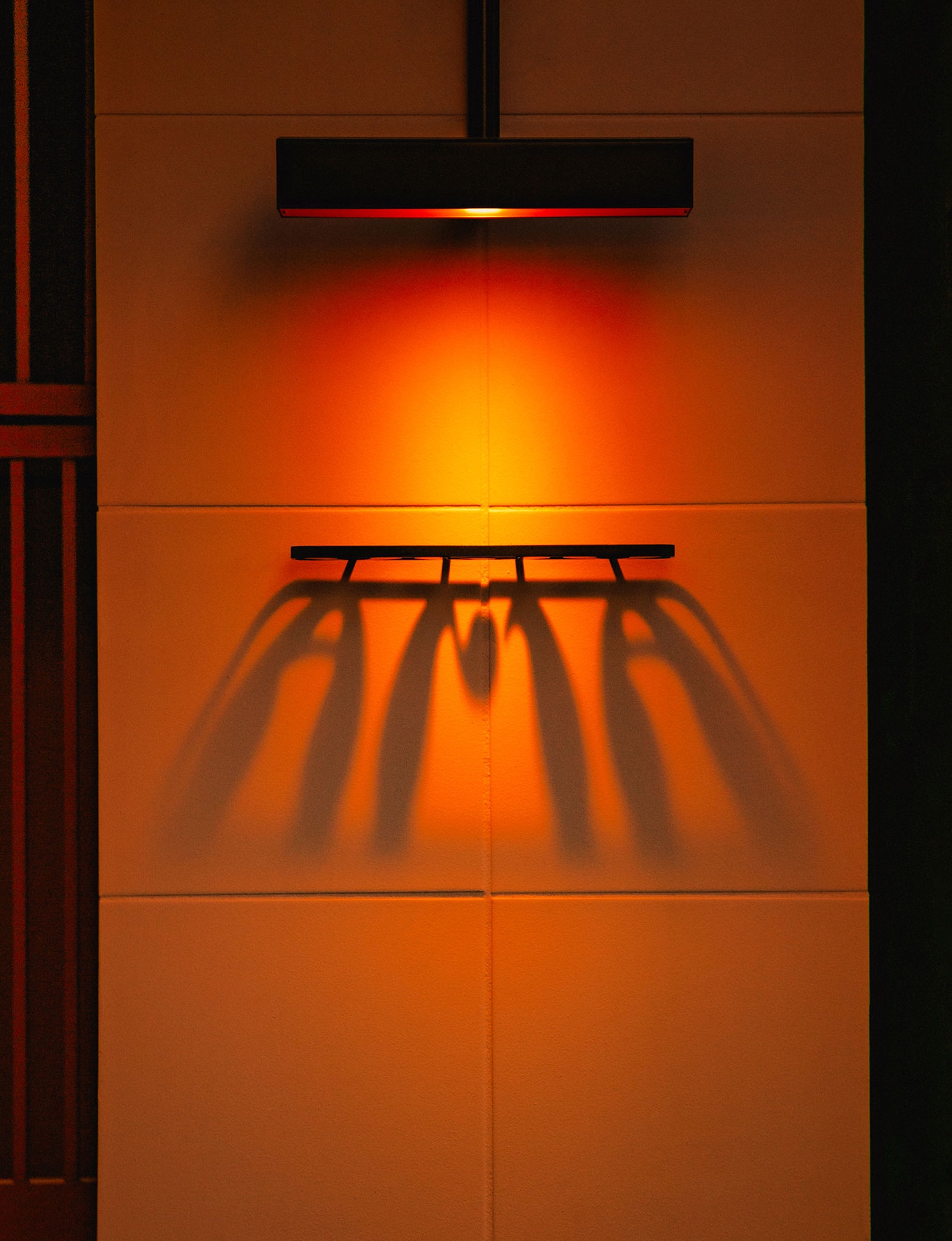
The signage is subtle yet impactful – a custom-designed lighting sconce that projects over a black metal cut logo sign that projects down off the wall – the signage is only revealed with the light on, projecting an orange-lit shadow on the wall beneath it.
The brand hit right away. The impact of Glafurd & Walker’s meticulous work on the branding and design of Ama has been nothing short of transformative. The brand narrative, from the hidden concept to the retro-futurist aesthetic, has resonated, creating a buzz well before the doors even opened. The subtle yet impactful signage, with its orange-lit shadow projection, epitomizes the brand’s concealed allure. Within weeks of unveiling the sign, media attention and acclaim have already positioned Ama as an instant standout in Vancouver’s culinary scene, showcasing the power of strategic branding and design in shaping a memorable and captivating dining experience.
CREDIT
- Agency/Creative: Glasfurd & Walker
- Article Title: Ama Brand Identity
- Organisation/Entity: Agency
- Project Type: Identity
- Project Status: Published
- Agency/Creative Country: Canada
- Agency/Creative City: Vancouver
- Market Region: North America
- Project Deliverables: Brand Identity
- Industry: Hospitality
- Keywords: Identity, Brand Design Creation , WBDS Agency Design Awards 2023/24
-
Credits:
Photography: Ian Lanterman
Interior Design: & Daughters


