Context
Alver Audio is a consultancy, design, upgrade, and optimization entity for bespoke sound equipment, tailored to individual spaces and unique music genres, aiming to maximize the professional audio experience.
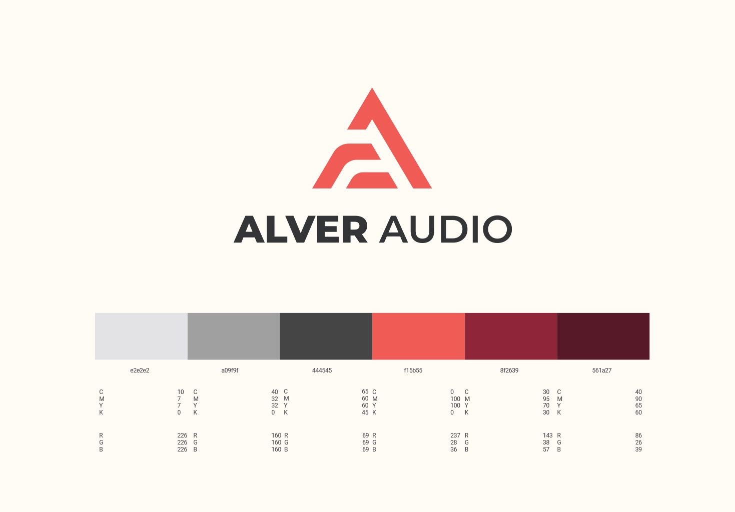
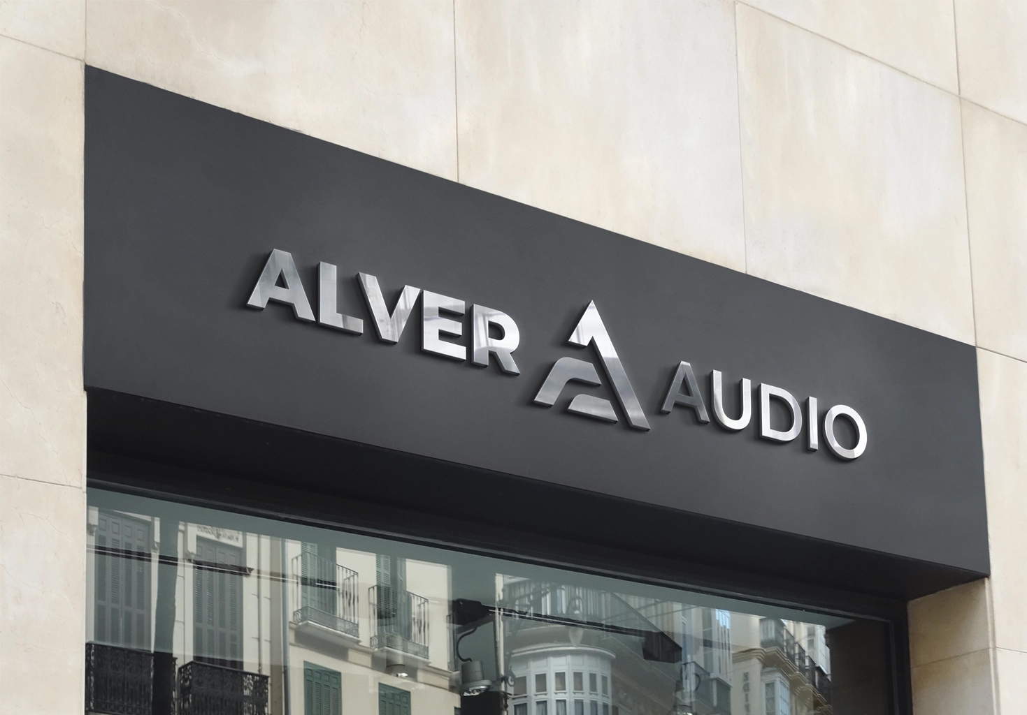
The brand icon is comprised of three main elements deliberately designed, including: the letter “A” (the first letter of the brand name) Alver and the letter “A” (the first letter in the suffix of the brand name) Audio, and the “Equilateral Triangle” shape.
The purpose of using the equilateral triangle as an outer element of the brand icon serves three main objectives:
The equilateral triangle has a structure that is highly suitable for integration with the letter “A” in the brand’s abbreviation. The equilateral triangle has a well-balanced proportion, attracting a sense of perfection similar to that of a circle or square. The equilateral triangle, according to visual principles, represents mystery, danger, beauty, desire. These attributes partly represent the field of business, as well as the goals that the Alver Audio brand aims to achieve.
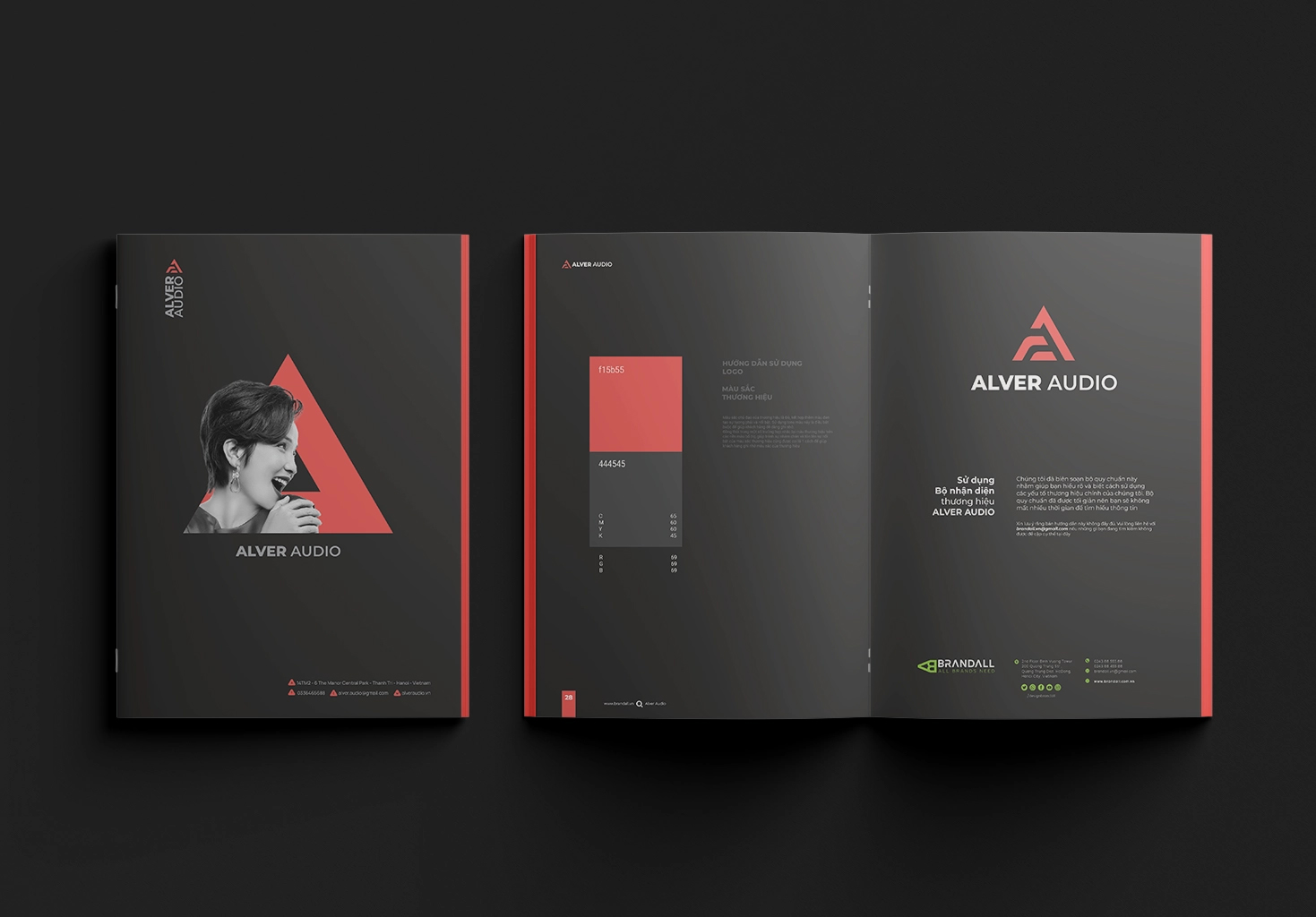
The choice and use of the red color tone combined with black create contrast in terms of intensity and a harmonious balance in shades. Red symbolises power, passion, and attraction. Black represents elegance, sophistication, mystery, and tradition. The combination of red and black is a strong color tone that attracts the highest visual attention, making the logo stand out and leave a strong impression on viewers. With simple yet creative lines, modern fonts, and impressive color coordination, the overall image of the logo evokes a youthful, fresh, and open-minded feel while maintaining a sense of allure, sophistication, and professionalism. It also portrays the brand as having a keen sense of style, staying updated with market trends, and being a reliable expert in the industry, helping partners and customers achieve their dream music spaces.
With the multi-layered meaning of the new brand identity, the spirit and core values of Alver are once again clearly conveyed and further reaffirm its position


CREDIT
- Agency/Creative: Brandall Agency
- Article Title: Alver Audio and the Brand Identity Transformation Journey
- Organisation/Entity: Agency
- Project Type: Identity
- Project Status: Published
- Agency/Creative Country: Vietnam
- Agency/Creative City: Hồ Chí Minh City
- Market Region: Asia
- Project Deliverables: Brand Identity
- Industry: Entertainment
- Keywords: Brandall, Alver Audio, Brand Identity, Logo, Logo design, 2D design
-
Credits:
Desgin Firm: Brandall Agency


