Summary: Altos de Corral is the most unique wine from Bodegas Corral, a vineyard nestled on a small hill next to the winery in Navarrete. A plot sheltered by the Sierra Cantabria with vineyards of more than 30 years, just at the limit altitude in which the vines can develop in an environment where organic farming offers its best results.
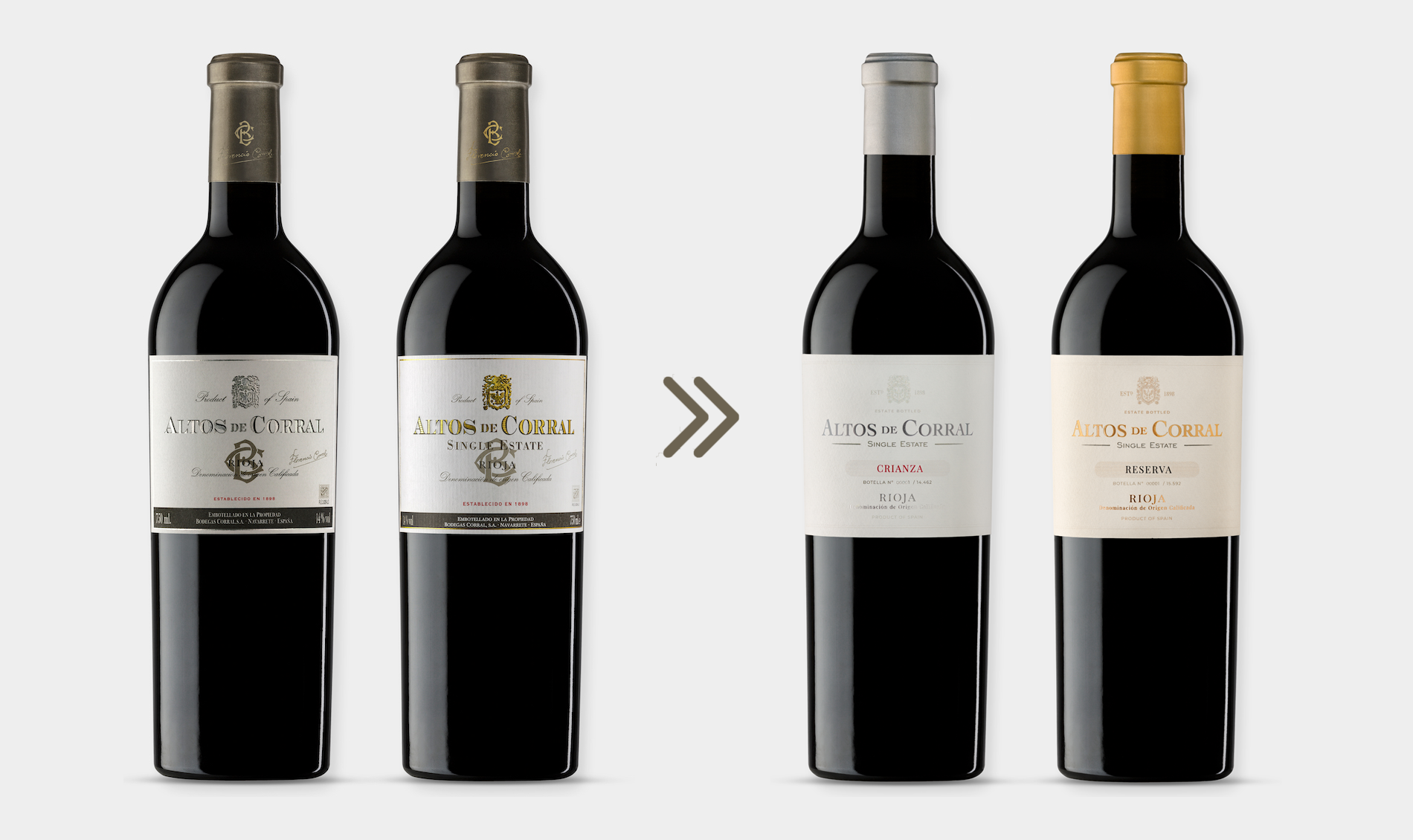
We conserve all the “heritage” of the brand, polishing the unnecessary and eliminating all the accessory, as if it were a sculptor, the work is there, but there is unnecessary material.
Our work consisted of a meticulous process of purifying all the components to keep the essentials, with the most identity of this wine and that the general impression that it produces is of maximum simplicity and refinement.
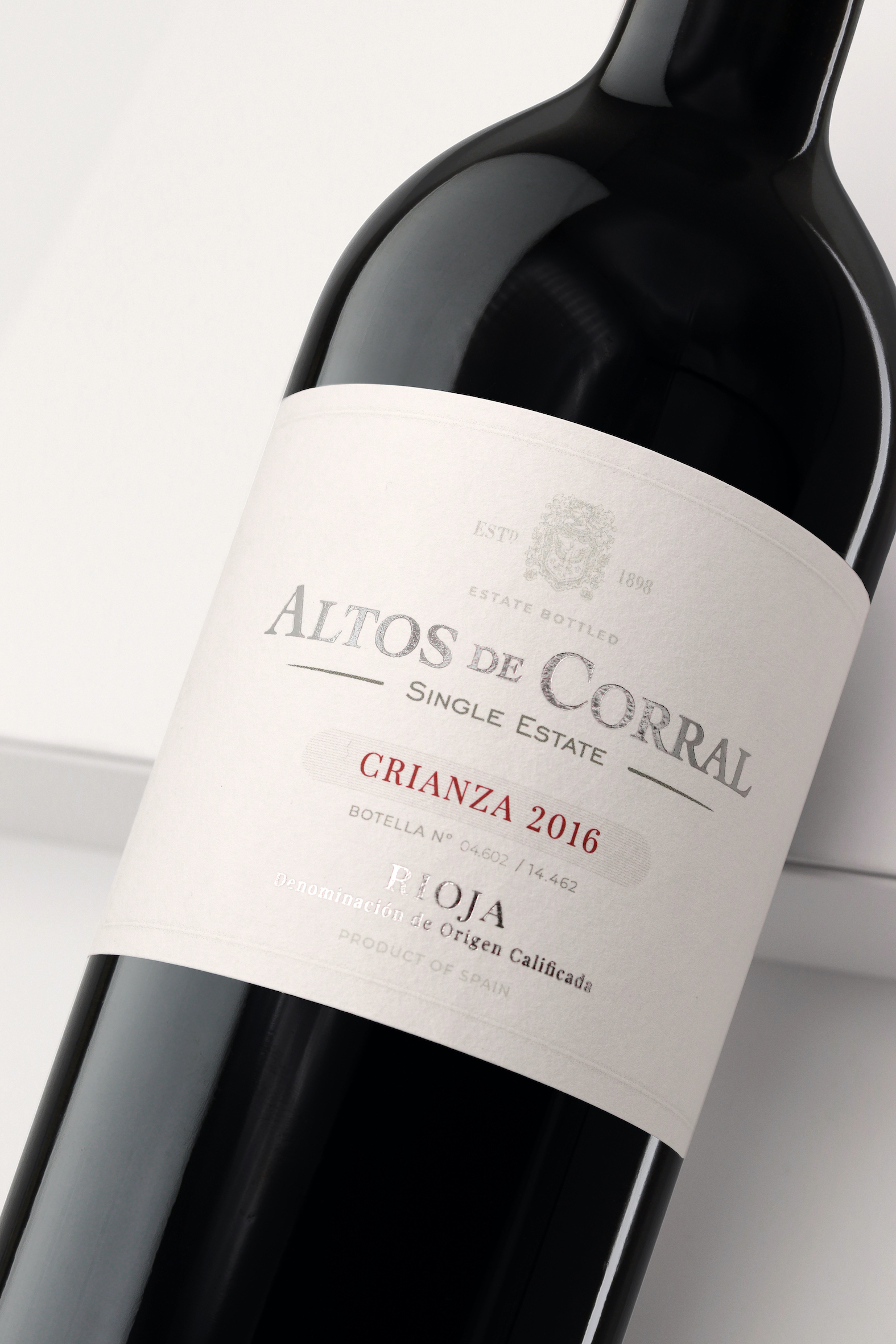
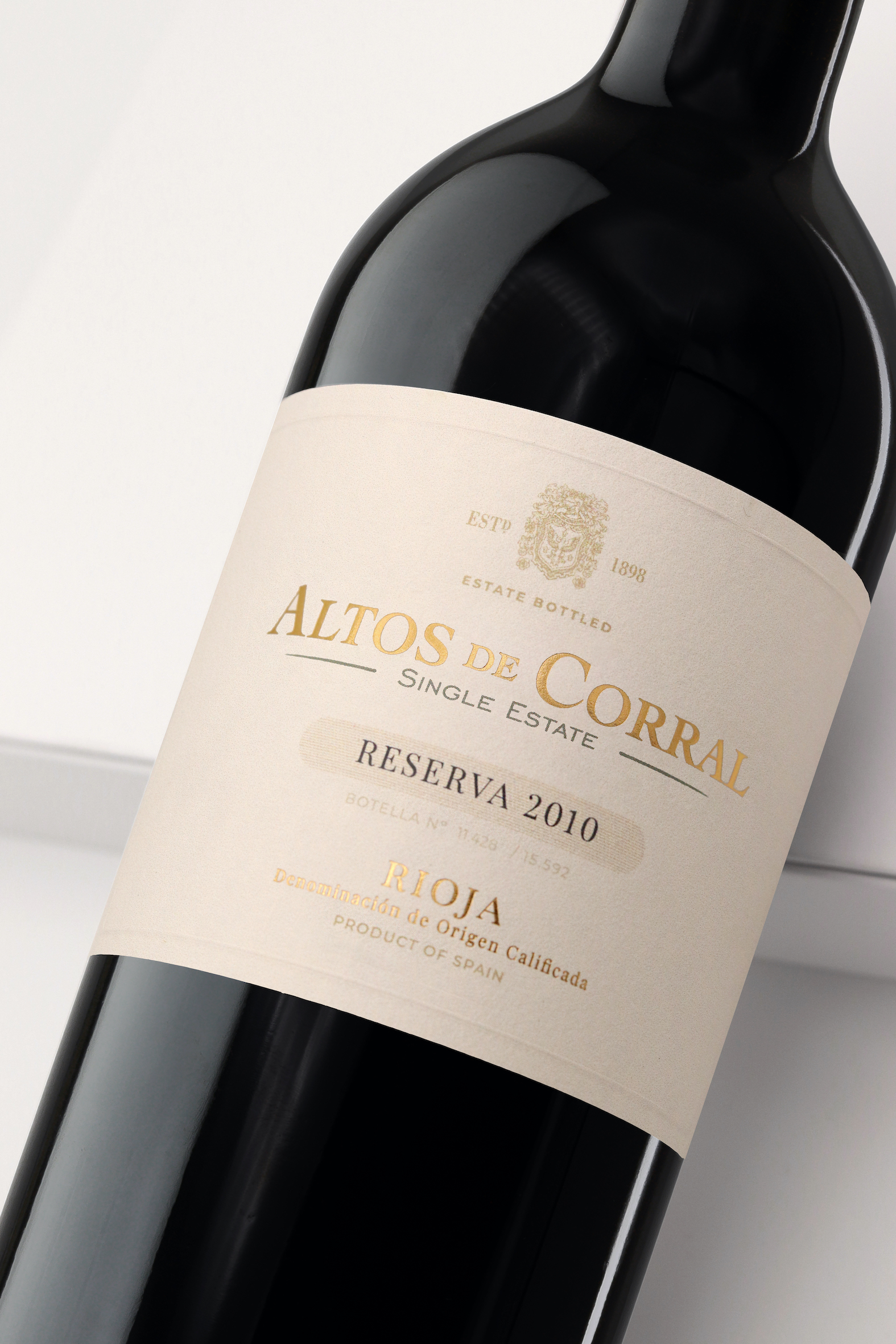
Objectives: To reflect the Premium character of this wine and that the packaging synthesises its values as a classic Rioja winery. To evolve from the heritage of the brand and the presentation that is present in many markets. To singularise each of the wines in a self-explanatory way to differentiate them and show their range.
Proposal: The challenge required to value the uniqueness and sophistication of this Premium wine from Bodegas Corral, without losing the connection with the rest of the references in the portfolio. We approach our proposal by delving into the roots of the brand and the very essence of this vineyard that is barely treated and that in isolation represents the best that a way of understanding viticulture can offer.
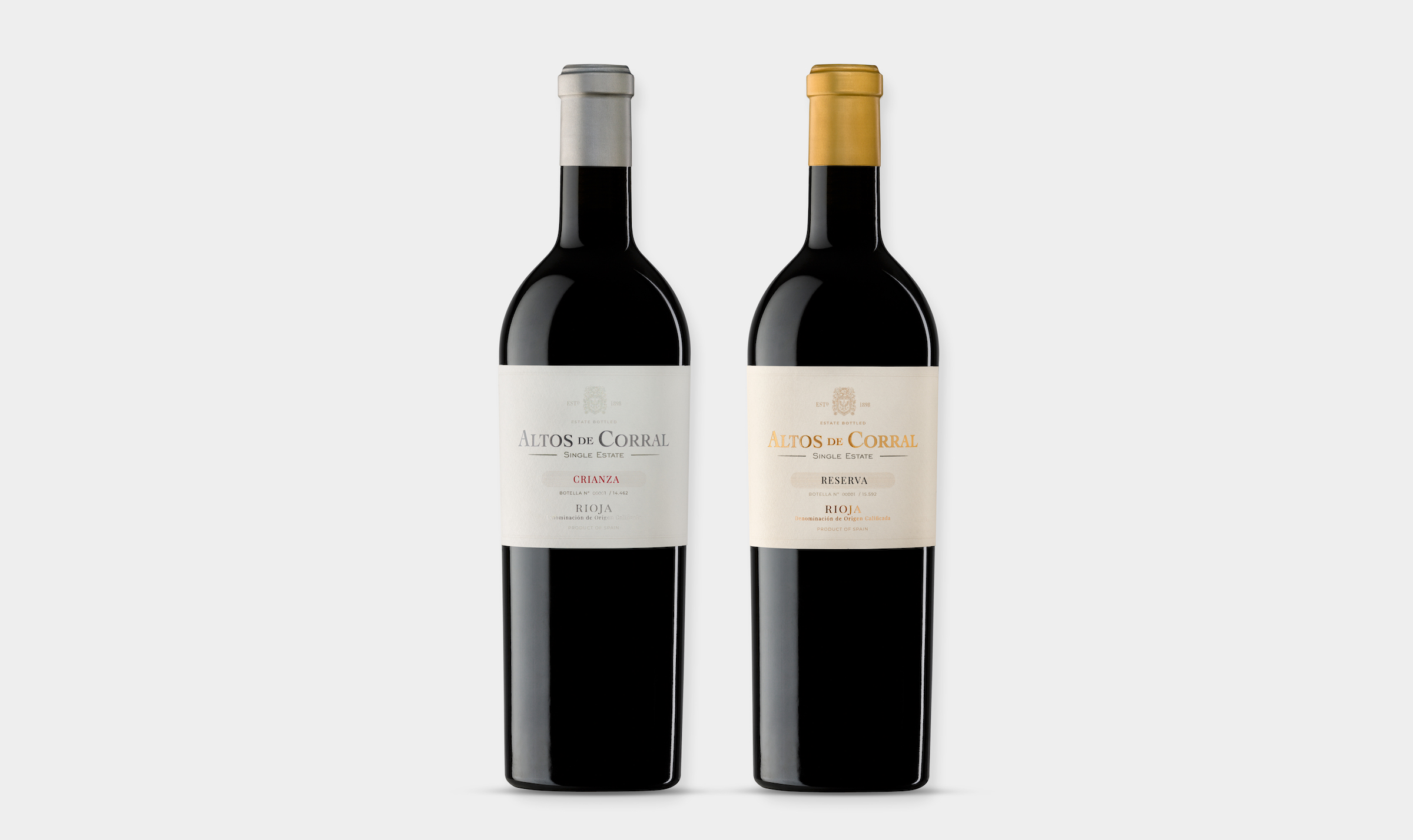
The vocation of this project was also to be able to identify each of the two wines (crianza and reserva) that make up this range and how they are articulated from a point of view of perception by the consumer and the processes involved in their elaboration.
We are firmly committed to stripping away everything that we consider an accessory so that the very lay-out of the winery’s heraldry, the brand, the type of wine are the common thread that allows it to be identified and fixed in memory.
A redesign in which simplicity and aesthetics prevail so that the protagonist is the wine, the authenticity of the processes legitimize the winery to be able to offer and appropriate this aesthetic.
Graphics Solution: The trickiest part of the job has been based on understanding and interpreting what was necessary and what could be eliminated. A work of concretion, of typographic choice, of precision. We leverage the proposal on the most forceful elements of the packaging: the brand and the type of wine that are especially important. The chosen fonts give it an elegant and beautiful character in which the minimum and due to its absence becomes a focal piece of consumer interest.
Production: Acquerello paper by Fedrigoni with a light and subtle texture that at times reminds of the farm itself, with its texture, gives it a feeling of an artisan product that helps make the consumer’s perception more valuable. Golden stamping: which serves to reinforce the premium character of the product and helps us to identify the two wines that make up this range.


CREDIT
- Agency/Creative: TSMGO
- Article Title: Altos de Corral Wine Packaging Labels Designed by TSMGO
- Organisation/Entity: Agency, Published Commercial Design
- Project Type: Packaging
- Agency/Creative Country: Spain
- Market Region: Global
- Project Deliverables: Brand Strategy, Brand World, Packaging Design, Product Architecture
- Format: Bottle
- Substrate: Glass Bottle


