Introduction
In January 2023, Altin Investment Group logo design begun. The company is active in several fields such as cryptocurrency, exchange and foreign currency investment. Since Altin is considered to be an international group, trying to meet the customer`s need for joining the foreign currency and cryptocurrency market, we spent a whole month for surveying basic design ideas and to complete the design process. Early steps contained processing the brand name, creating a distinctive motif, and eventually, to provide a clear connection between the selected symbol and company`s activities.
Altin is originally a Turkish word, translated as pure gold. To extract a symbol to highlight the Altin Group among other pioneers on international level, we decided to pick the “A” from the word and to process the “A” alphabet in accordance with the group`s activities in investment field.
Ideation
Cryptocurrency and foreign currency investment ambience is a dynamic and exciting field; however, a trusted and stable relationship must be developed between the investor and the company to create a feeling of mutual confidence. To process the alphabet “A”, being the first alphabet of the brand`s name and also the beginning of English alphabet, was the primitive idea to create a sense of stabilization for the logo. At the same time, the need for dynamicity was felt. Thus, we had to create a simultaneous connection between stability and dynamicity using other interfering tools within the general idea.
Along the path, a “coin” could be used as a very meaningful and useful symbol. There was a straightforward connection between the “coin” motif and what the Altin Group was involved in foreign currency market; this fact gave us an opportunity to include this coin in the logo design.
Another visual factor could be applied in general design process was to picturize a group of dynamic and active members which are energized to increase and maintain the customer investment. The mentioned group has to be introduced as a coherent and trustworthy whole, to provide an acceptable level of mental stability in a market filled with unpredictable inflammation.
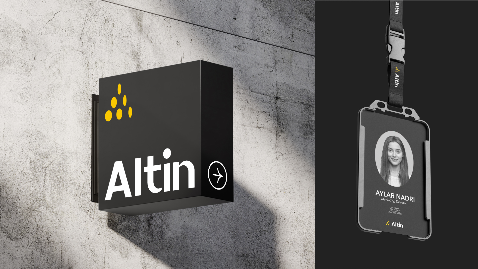
A visual resemblance is observed between the alphabet A and the triangle form. This resemblance was welcomed deeply during the design process, because triangle`s sharp angles remind of an ever-increasing energy. The final logo design was born out of a peaceful emergence between “A” and a passionate triangle, a successful and practical companionship between a stable symbol and an exciting form.
Color palette
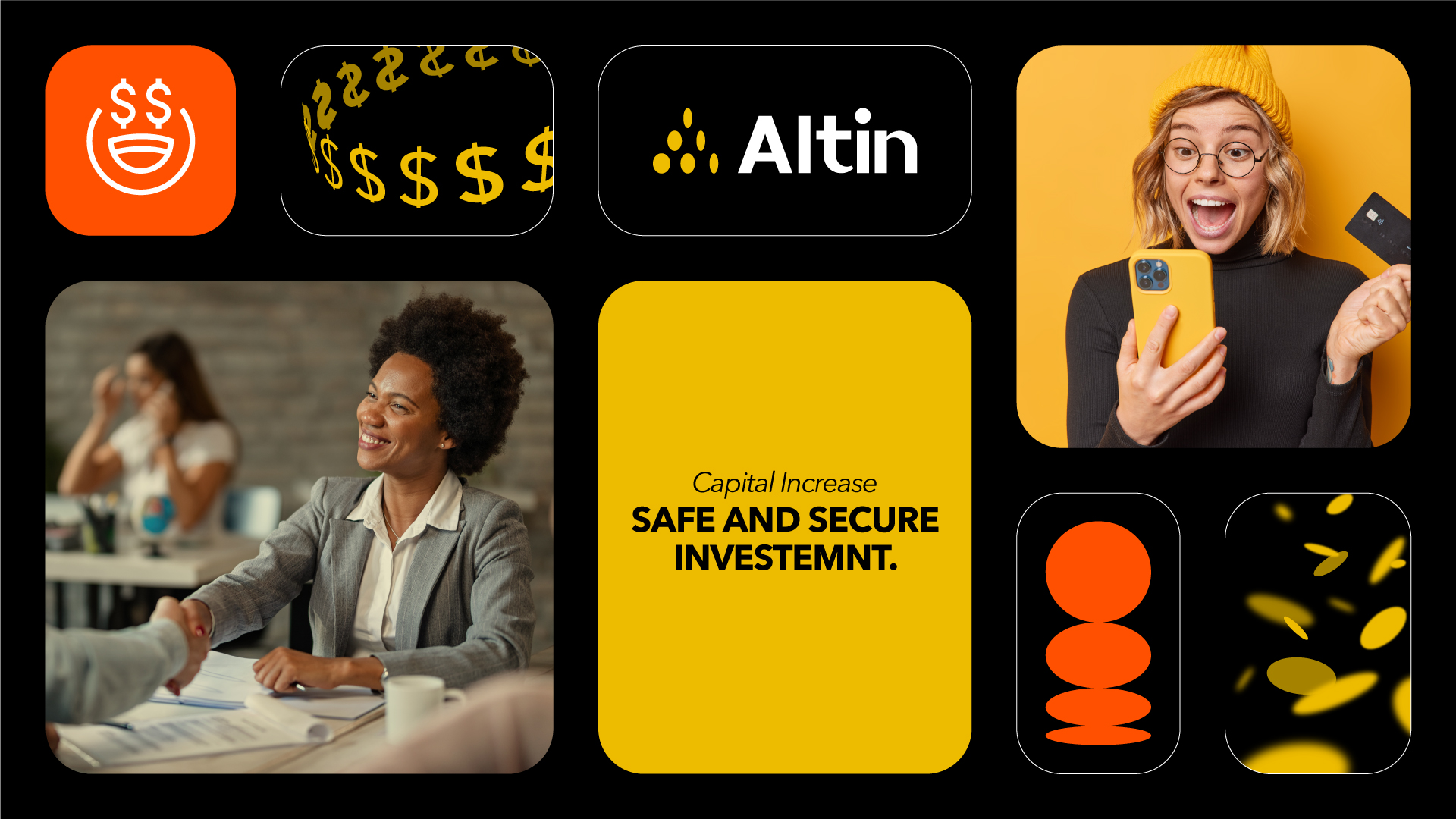
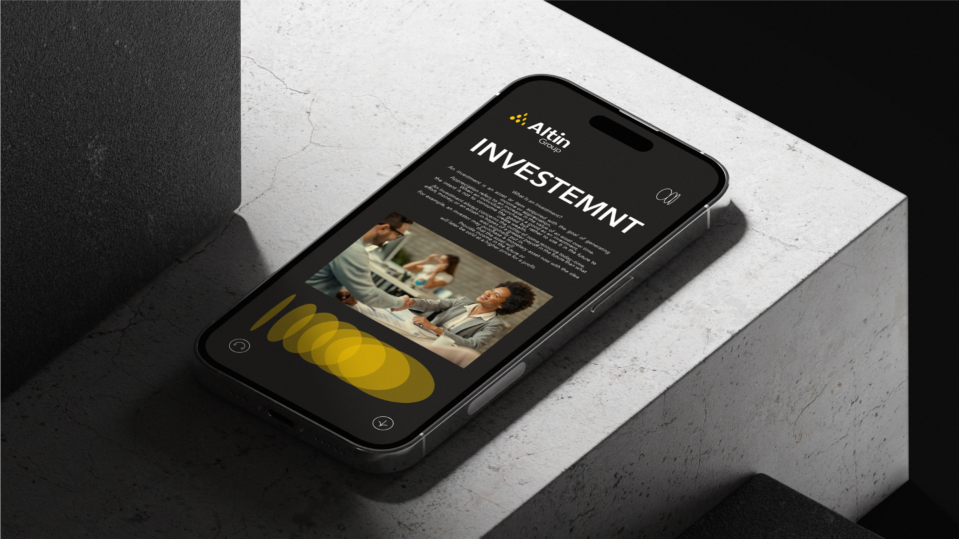
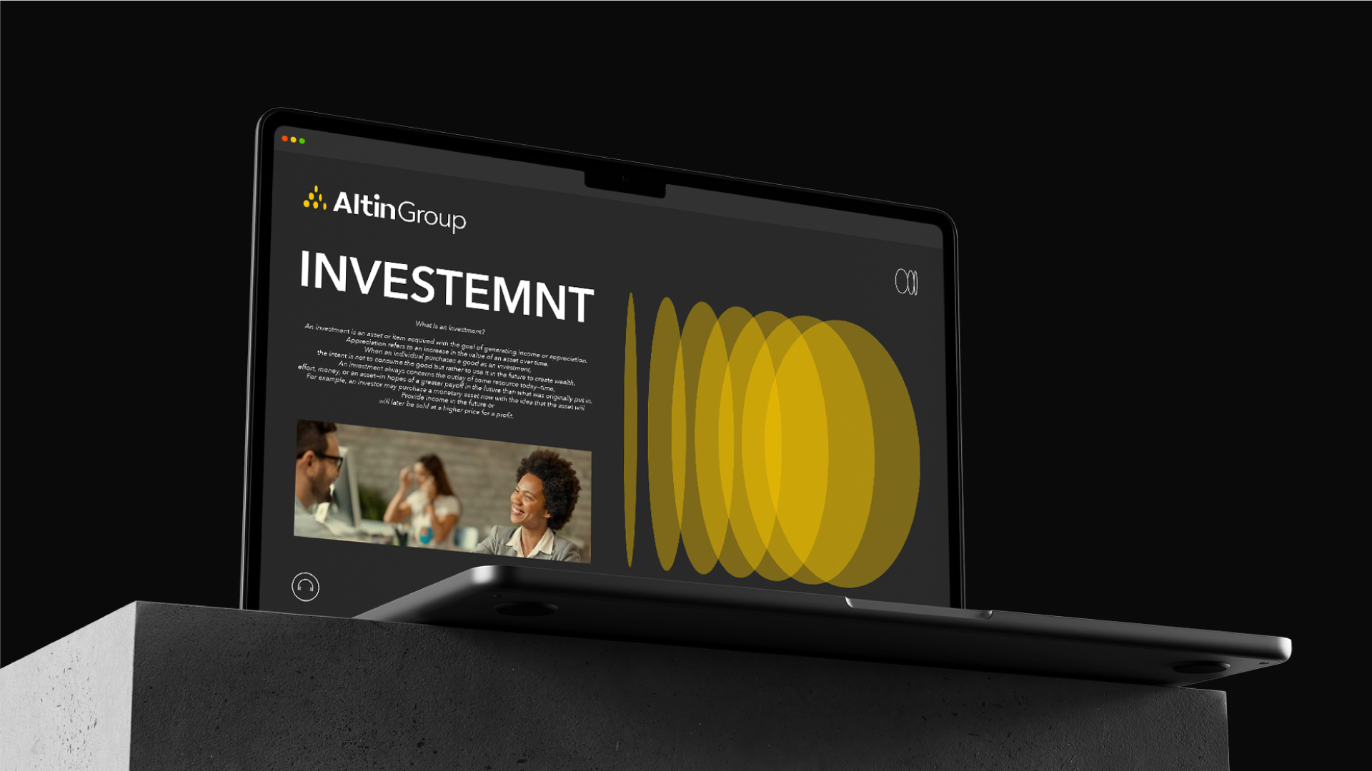
Altin literal meaning as gold was our first inspiring factor for choosing the color palette. Not only the yellow resembles the color of profitable outcome of what Altin Group is up to, but also it indicates life, progress and mobility.
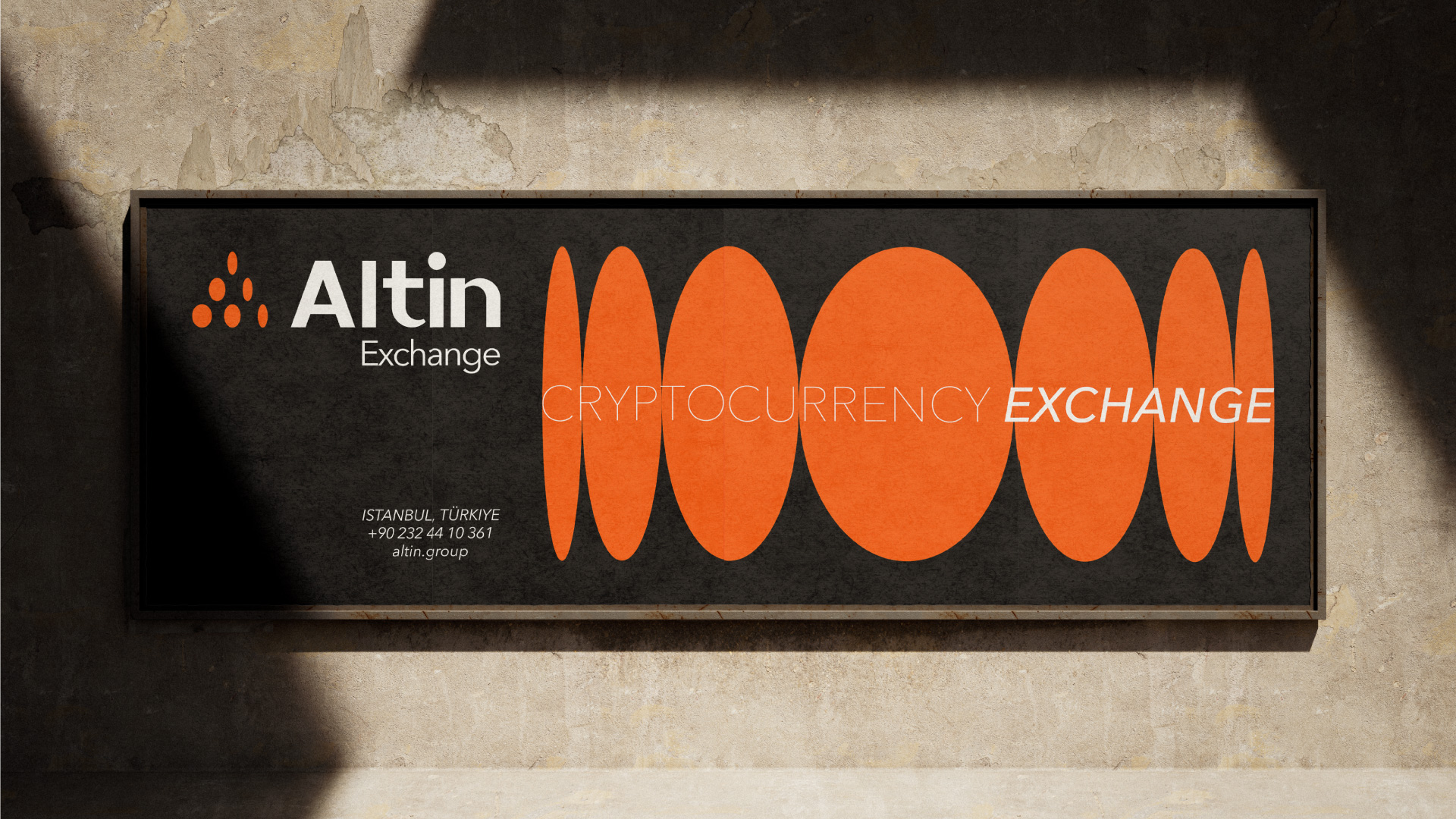
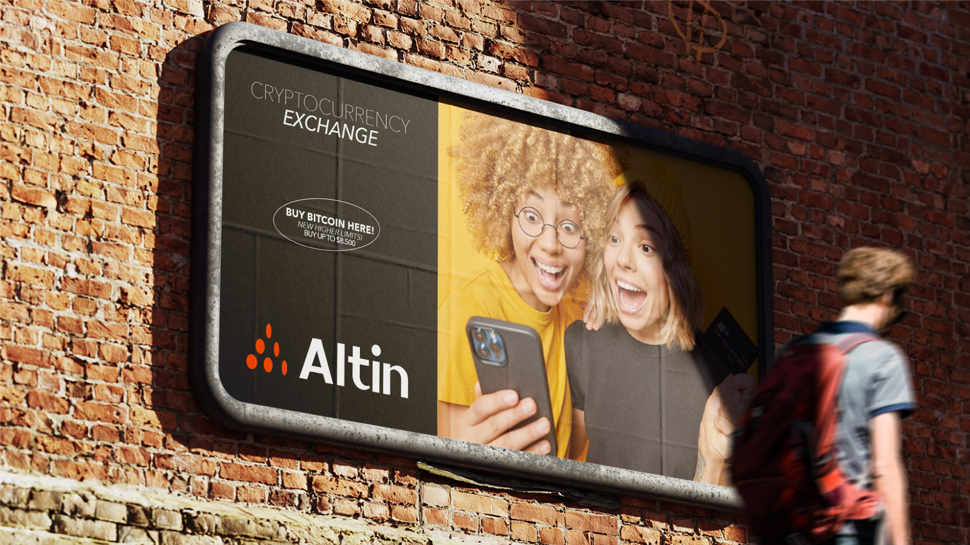
We decided to pick a different color for Altin Exchange logo, which could maintain a distinctive visual identity while remaining in tune with the color palette of Altin Group logo. The color orange was selected. A black background was chosen not only to provide a formal visual experience, but also to highlight the two cheerful colors on a bed of neutral black color.
Visual identity
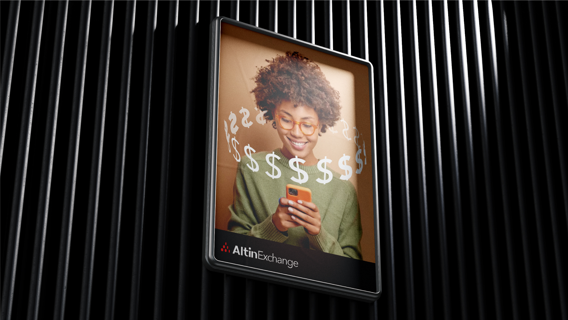
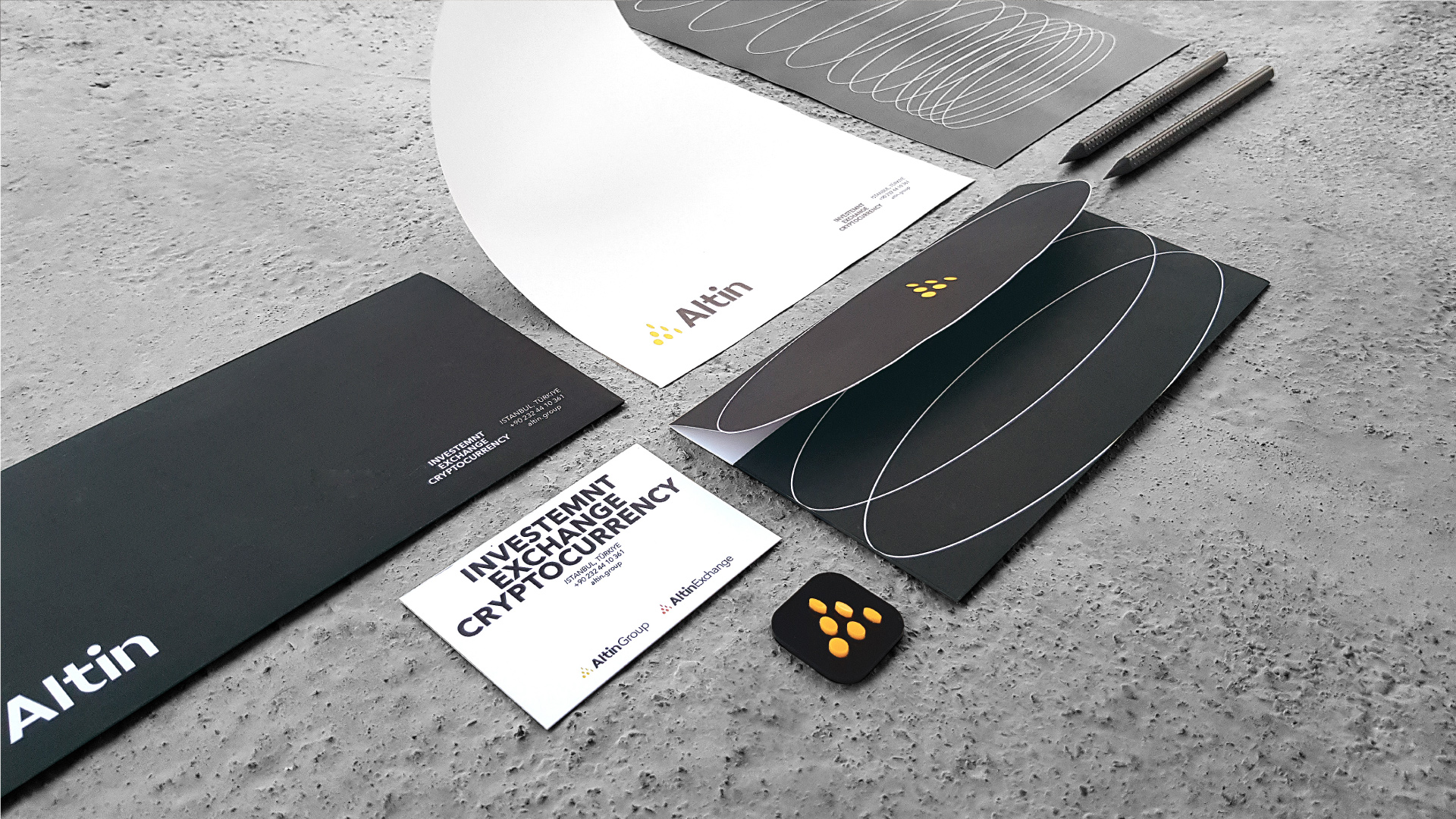
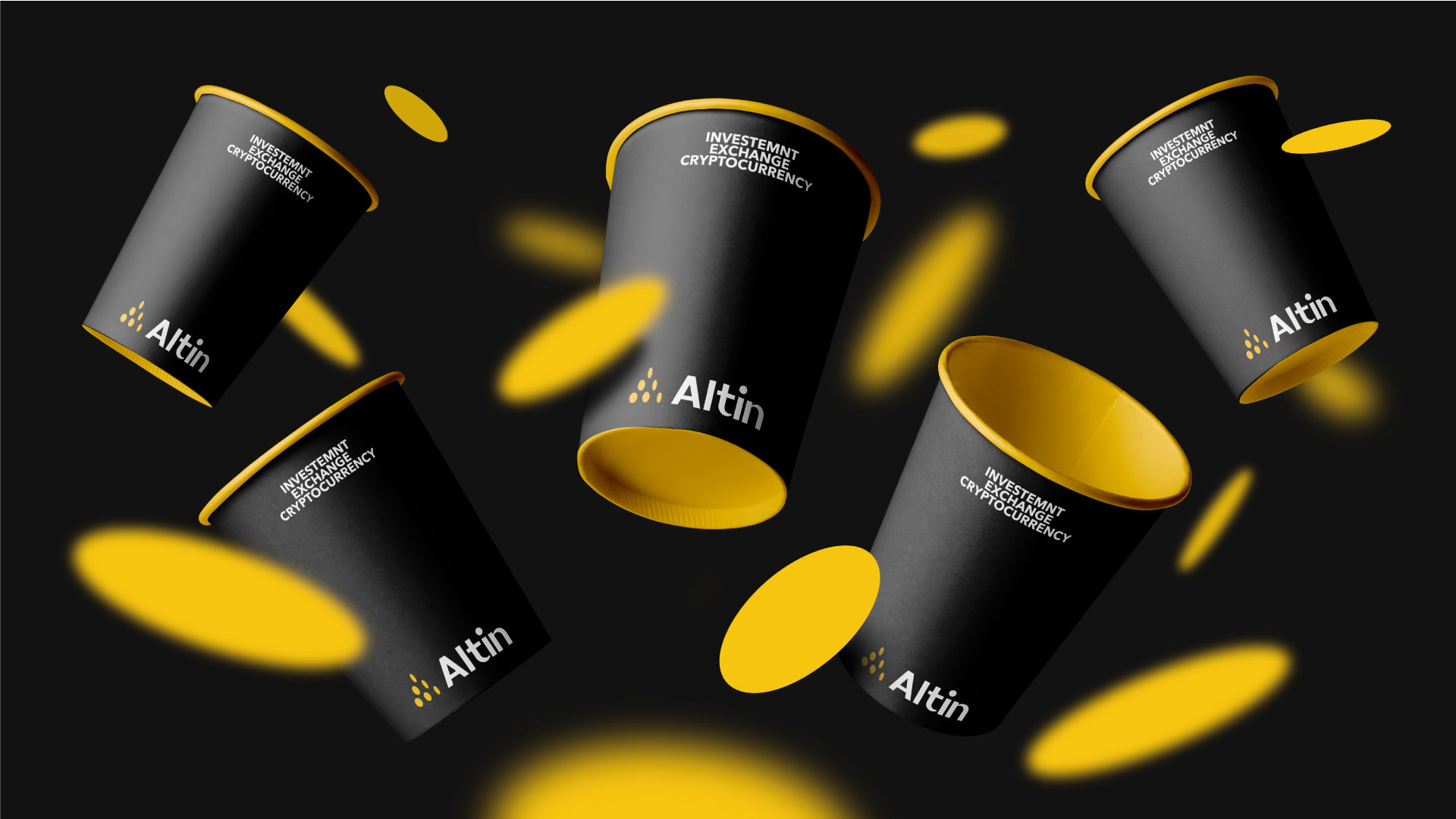
Altin`s integrated visual identity is maintained using the coin motif within the logo design. The circular shape of the coin, while having a soft and flexible rotation is applied in a combined format of lines and surfaces to develop required visual identity while imposing a sensation of motion. The coin shape appears to be a highlighted factor in logo design, so the linear rotation of coin in both vertical and horizontal axis created a hollow space, making coin a meaningful motif in providing visual identity; a motif holding a consecutive and frequent pattern, while being shown as a whole image to resemble Altin`s visual identity.
Design challenges
Although the logo design process took a natural and automatic flow, creating its identity required processing and combining related symbols and concepts. Early triangular shape extracted from Altin`s first alphabet was obvious, while a sever need for providing a creative and harmonious motif was felt. The next stage of design was to pick the “coin” as the main motif, although the main challenge remained as placement and layout method of this round motif within a basic form shaped from three sharp angles. To obtain an eye-catching rhythm combined of coin`s curved lines and “A” closed angles, lead design`s process into linear rotation of coin. Eventually, the very same rotation within different axes was the foundation of design`s final visual identity.
CREDIT
- Agency/Creative: Reza Raei Omran
- Article Title: Altin Investment Group Branding
- Organisation/Entity: Agency
- Project Type: Identity
- Project Status: Published
- Agency/Creative Country: Turkey
- Agency/Creative City: Iran
- Market Region: Asia, Europe
- Project Deliverables: Advertising, App Design, Art Direction, Brand Design, Brand Guidelines, Brand Identity, Brand Mark, Branding, Creative Direction, Graphic Design, Identity System, Logo Design, Web Design
- Industry: Financial
- Keywords: cryptocurrency, exchange, investment, brand identity, branding, creative direction, brand design


