


We rebranded and developed an identity, did a lot of in-depth research and developed a communication platform for one of the flagship universities in the country.
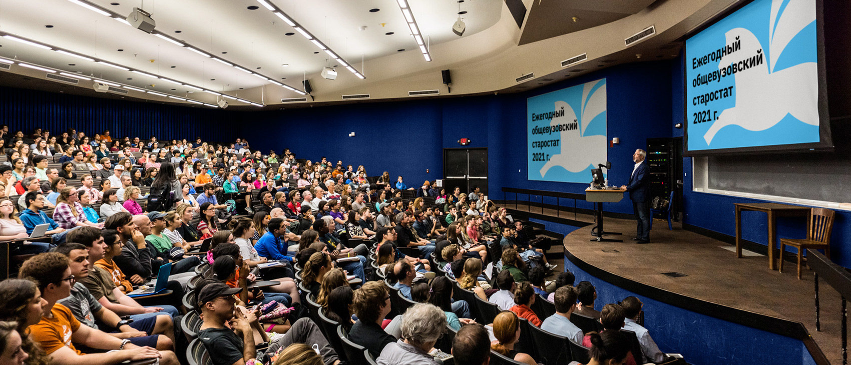
Altai State University is included in the list of the flagship universities of Russia. In 2020, the university was included in the top 100 of the University Impact Rankings, which is compiled by the British magazine Times Higher Education (THE). The rating includes universities according to the level of their impact on the sustainable development of society and their contribution to the achievement of the UN Sustainable Development Goals.
Before starting to develop the rebranding, we conducted a large amount of research — we used the method of in-depth interviews, the purpose of which was to find out and describe the behaviour of consumers of higher education in the Altai Territory. We interviewed three groups of participants: applicants, students and teachers.
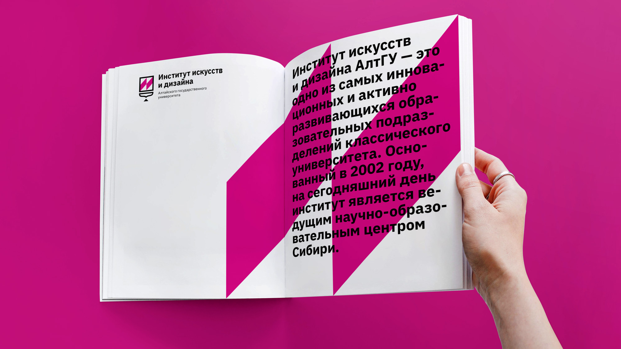
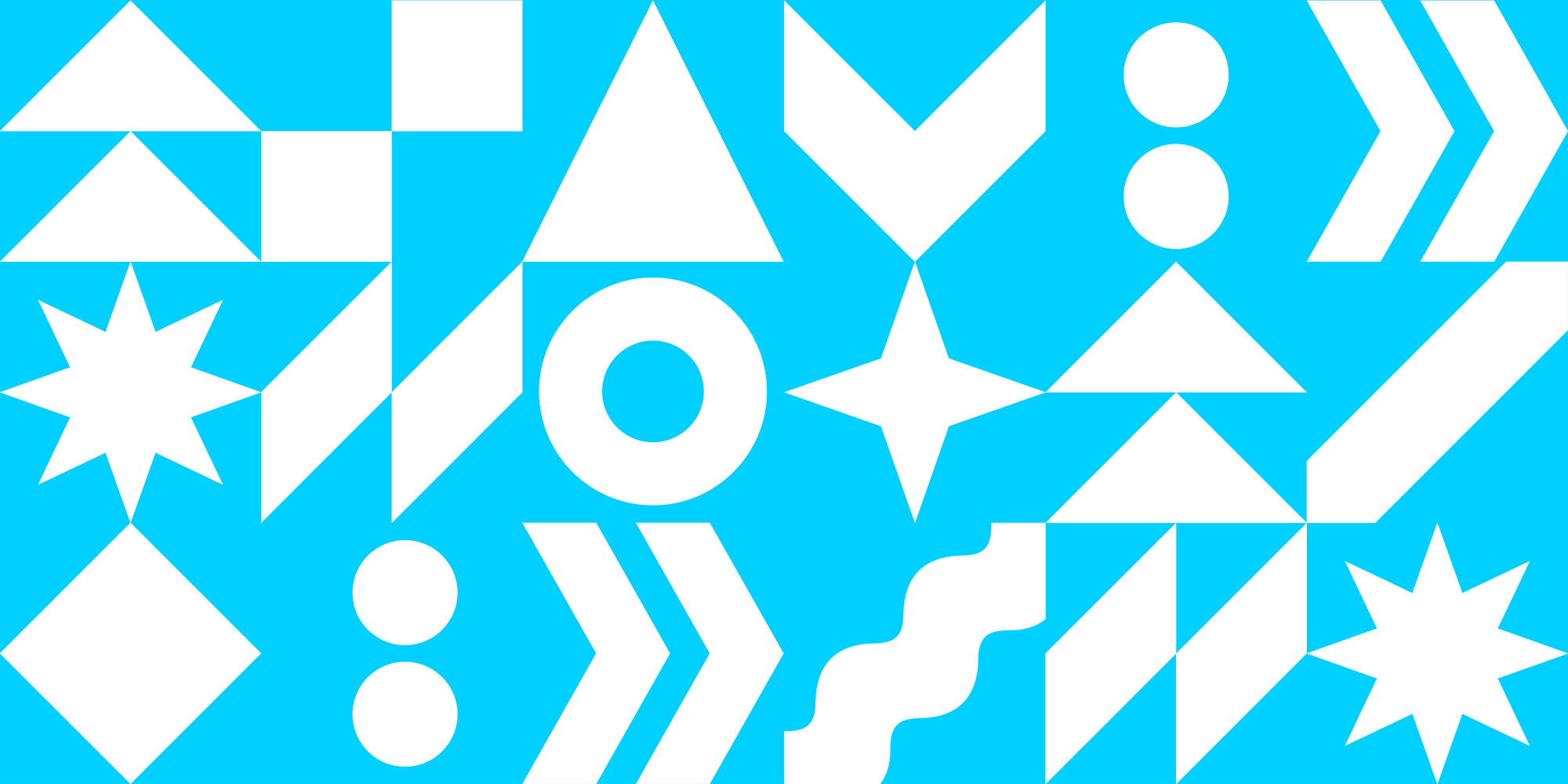
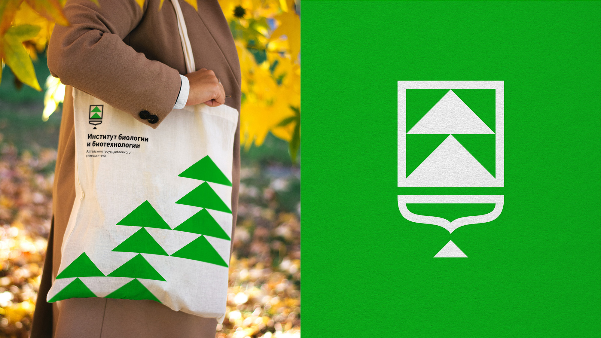
We have reinterpreted the legacy since 1973 into an up-to-date visual communication system. The new logo of the university is based on three symbols: a book, a Big Kolyvan vase and a Pegasus. The Pegasus on the AltSU logo symbolizes knowledge and internal development and also indicates the direct connection between the city, whose coat of arms depicts a horse, and the only flagship university of the Altai Territory. In order to visually structure all products and maintain uniformity, we have developed a visual language and assembled a corporate colour palette. The main colours were sky blue and dark blue. Dark blue
is the official or even “ceremonial” colour for events and documents, and blue is more often used already inside the university. Due to the formation of new principles of visual communication, all products of the university have come to unity and consistency. For the AltSU institutes, we have developed an identity consisting of thirteen characters. Each of them has a relationship with its own institution and has certain meanings.
We developed colour coding and patterns from these signs. We have made a modern reading of heraldry, which is developing into a more modern style. We have also branded merch for students of all institutes — everyone has their own.
In general, the brand turned out to be bright, memorable, based on the history of the university and the heraldry of the region, but at the same time very flexible. The graphic language allows you to brand absolutely any media and includes sub-brands of all the institutes of the university, recognizable and individual, but united by a common concept. Despite the continuity and high concentration of coats of arms, the identity turned out to be vibrant and modern, which allows the university to stand out not only in its hometown but also at the federal level.


CREDIT
- Agency/Creative: DVA SLOVA
- Article Title: Altai State University Visual Branding
- Organisation/Entity: Agency
- Project Type: Identity
- Project Status: Published
- Agency/Creative Country: Russia
- Agency/Creative City: Barnaul
- Market Region: Asia, Europe
- Project Deliverables: 2D Design, Advertising, Art Direction, Brand Design, Brand Tone of Voice, Branding, Identity System, Rebranding, Research
- Industry: Education
- Keywords: univetsity, Altai, Siberia, academy, brand, logo
-
Credits:
Art director: Danil Snitko


