


Vilaco Group Rebrand
For nearly 20 years, Vilaco Group has been providing comprehensive, reliable services in labor export and study, ensuring a safe and transformative journey for Vietnamese individuals to acquire languages, professional skills, and international work experience.
With 8 facilities nationwide and operations spanning 3+ key markets, including Japan, Germany, and the U.S., supported by collaborations with over 200 recruitment unions and 75+ affiliated schools, Vilaco possesses a rich history and a robust operational framework.
While their foundational strength lies in ensuring a “safe journey”, we recognize the market now demands a brand that speaks to the full transformative potential of these opportunities. This rebranding effort is driven by the need to elevate brand perception, enhance recognition, and optimize communication.
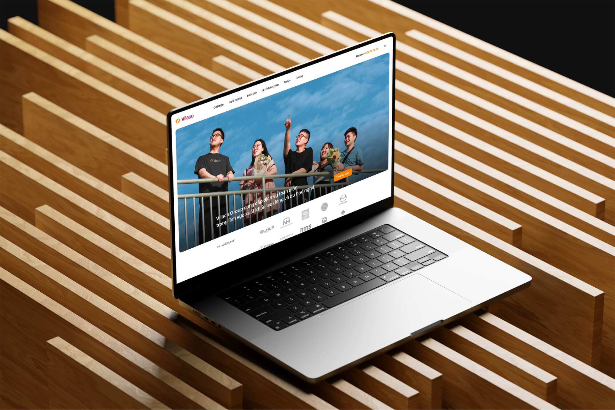
The brand design we develop for Vilaco will reflect their professional stature and empathetic mission, crafting a modern visual identity for global trust, a consistent, inspiring voice, compelling success stories, and powerful digital engagement.
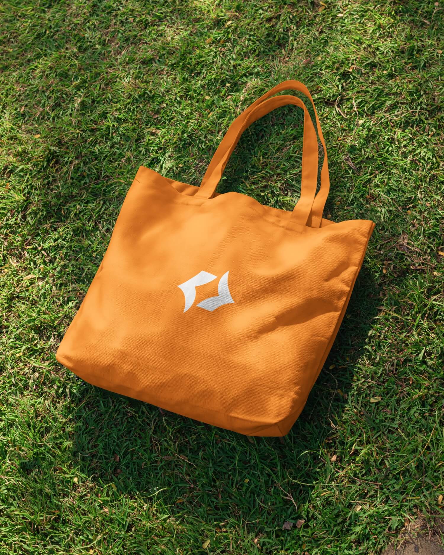
Logomark
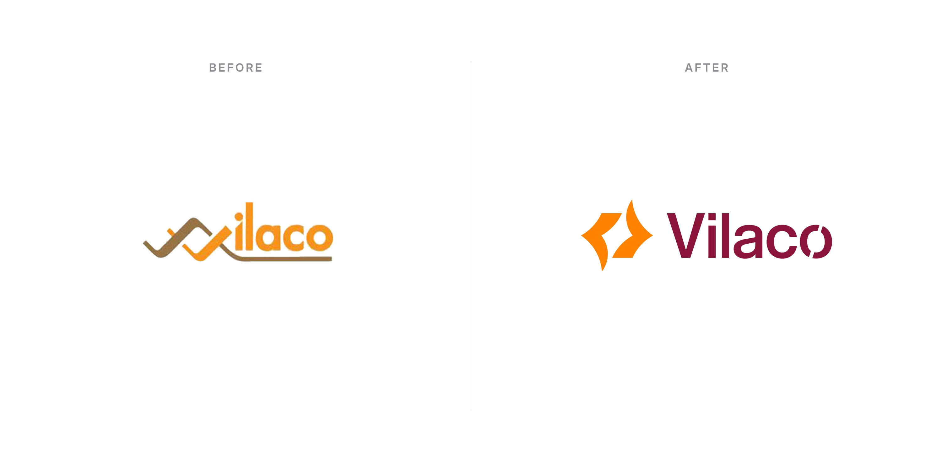
The logomark is a crafted symbol, designed to embody the core values and mission of the brand. Its geometric construction, built from foundational circles and squares and guided by the harmonious principles of the Golden Ratio, ensures visual balance and a sophisticated aesthetic.
It features abstract elements like a central form blending a guiding star with a stylized airplane wing, and an open book, together representing breakthrough, uplifting journeys, and the knowledge and discoveries Vilaco provides to empower futures. Additionally, its geometric structure references every brand name letters V – I – L – A – C – O, conveying precise guidance.
This visual harmony and inherent precision speak directly to the profound care and meticulous attention Vilaco applies to every opportunity they create.
Colors
This diverse and dynamic color palette expertly balances vibrant energy with deep tones. Its energetic accents like Active Orange, Scarlet, and Sunglow inject enthusiasm, innovation, and optimism, projecting a progressive energy.
This color palette allows the brand to project both youthful energy and established professionalism, making a strong, memorable impact while signifying innovation, boldness, reliability, and deep-rooted credibility.
Typography
Vilaco typography style conveys professionalism, creativity, and clarity.
Mona Sans, chosen for its modern, robust character, serves as the primary typeface for impactful display text and branding. Complementing this, Inter is the secondary typeface, ensuring exceptional legibility and clarity for all body text and complex information.
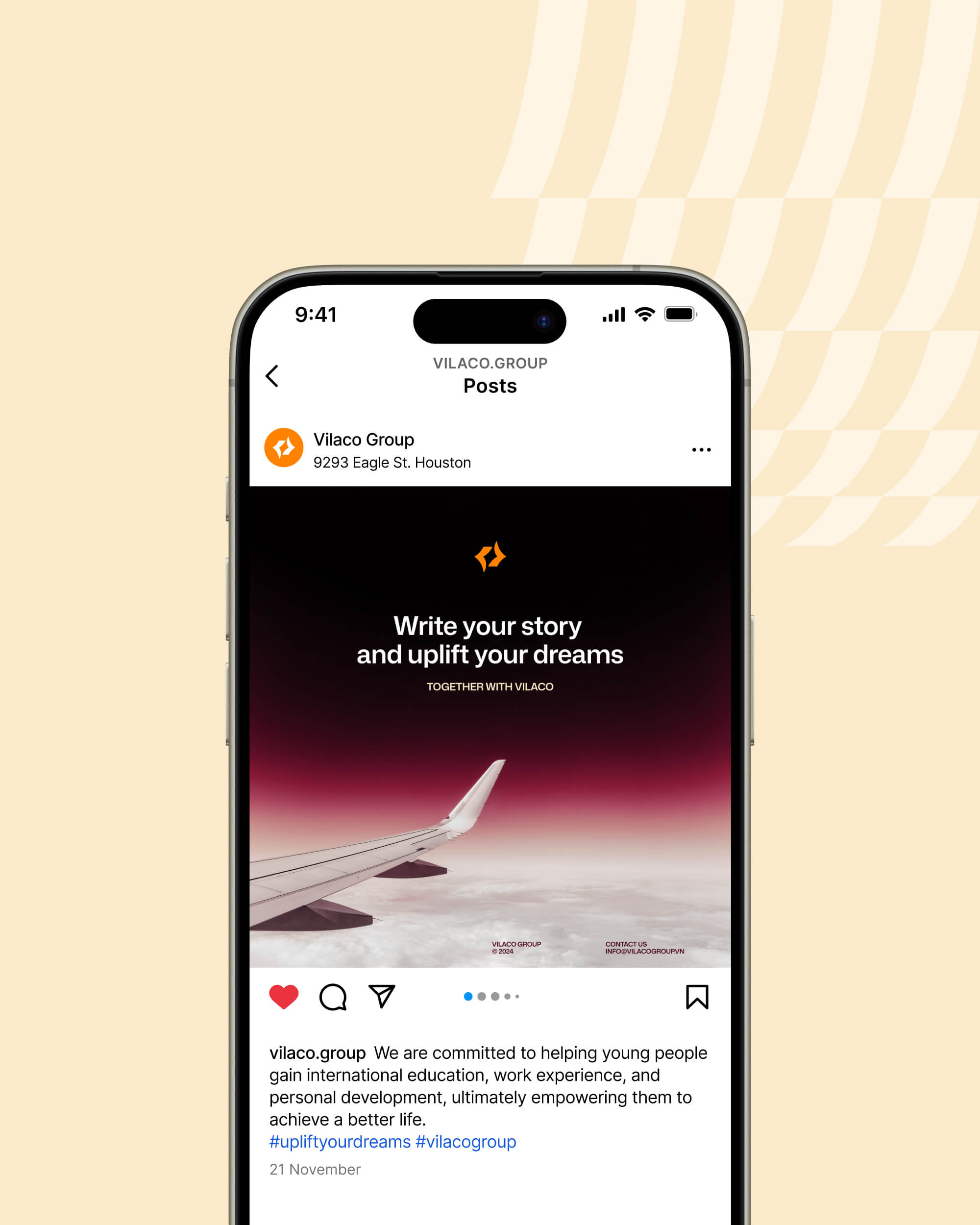
Through this rebranding project, we reinforce Vilaco’s position as the ultimate partner for young Vietnamese individuals aspiring to achieve their dreams on the global stage, ensuring their stories are written with success and their aspirations are empowered for a lifetime.


CREDIT
- Agency/Creative: Studio Alt
- Article Title: alt.all Transforms Vilaco into a Modern Benchmark for International Opportunity
- Organisation/Entity: Agency
- Project Type: Identity
- Project Status: Published
- Agency/Creative Country: Vietnam
- Agency/Creative City: Ho Chi Minh City
- Market Region: Asia, Europe, North America
- Project Deliverables: Brand Identity, Brand Redesign, Creative Direction, Logo Design, Rebranding, Web Design
- Industry: Human Resources
- Keywords: brand identity, logo design, corporate
-
Credits:
Design Agency: Studio Alt
PR Agency Partner: Beon Agency
Creative Direction: Joe Nguyen
PR Strategy: Kate Nguyen
PR Executive: Linh Pham, Trang Tran, Bich Pham
Visual Design: Joe Nguyen
Media Production: Hai Dao
Accounting Management: Thuy Pham
Website Development: Huy Bui, Thanh Nguyen
Website Project Manager: Joe Nguyen


