


Café aLp is a fictional café concept created for Zürich, Switzerland. The brand represents a modern café that produces fresh pastries, desserts made with Swiss chocolate, and specialty coffee roasted in-house. The product range includes coffee beans, brewed coffee drinks, freshly baked goods, desserts, and a signature product — coffee-infused chewing gum manufactured externally exclusively for the café. The café is primarily aimed at a young audience aged 16–30, offering a fresh, energetic, and accessible brand experience for people who appreciate simple design, good coffee, and everyday quality.
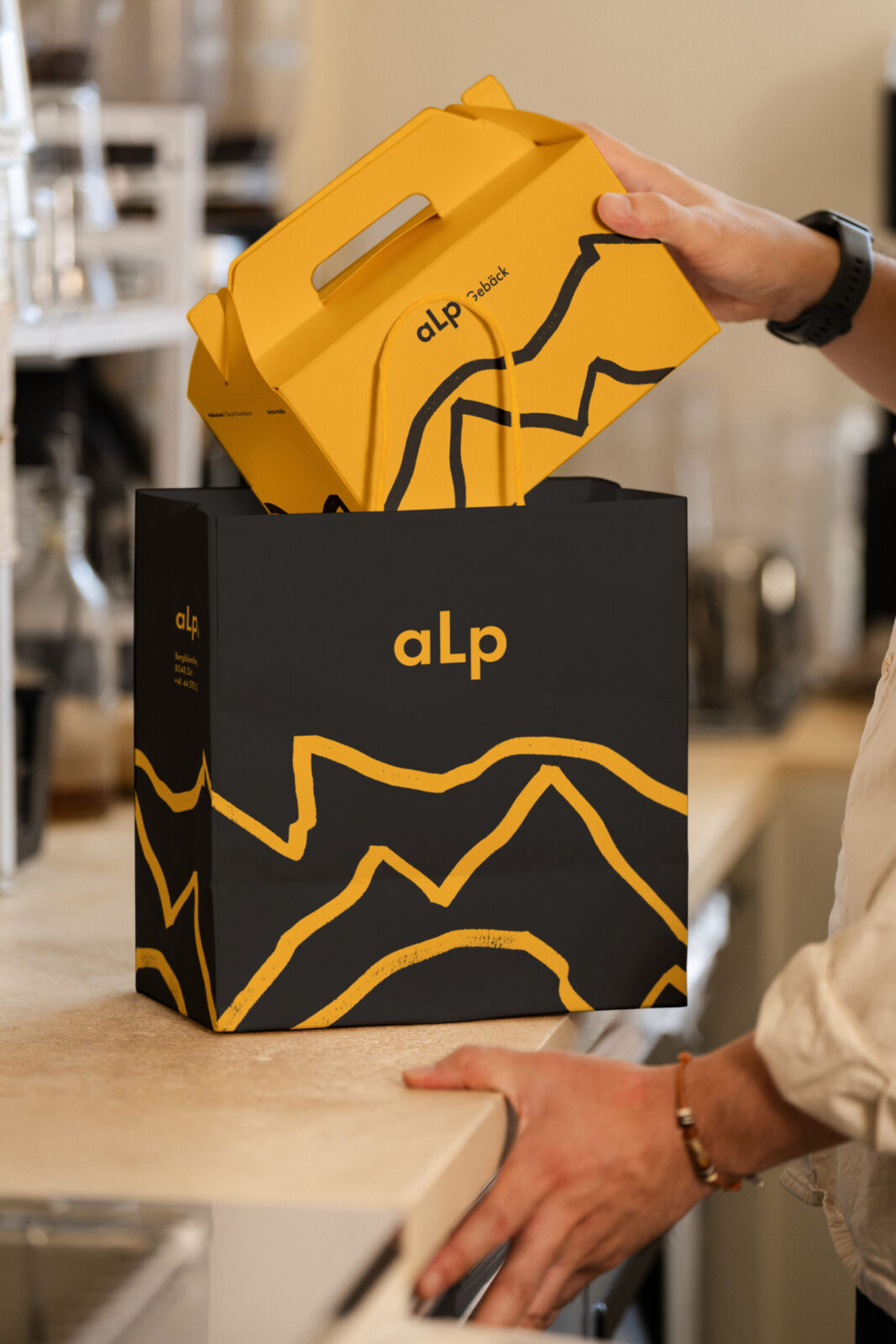
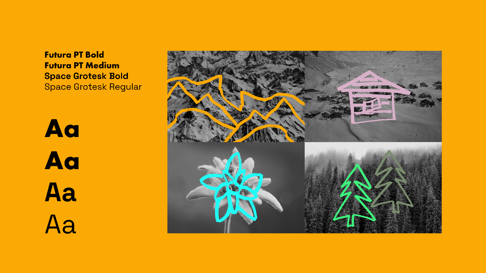
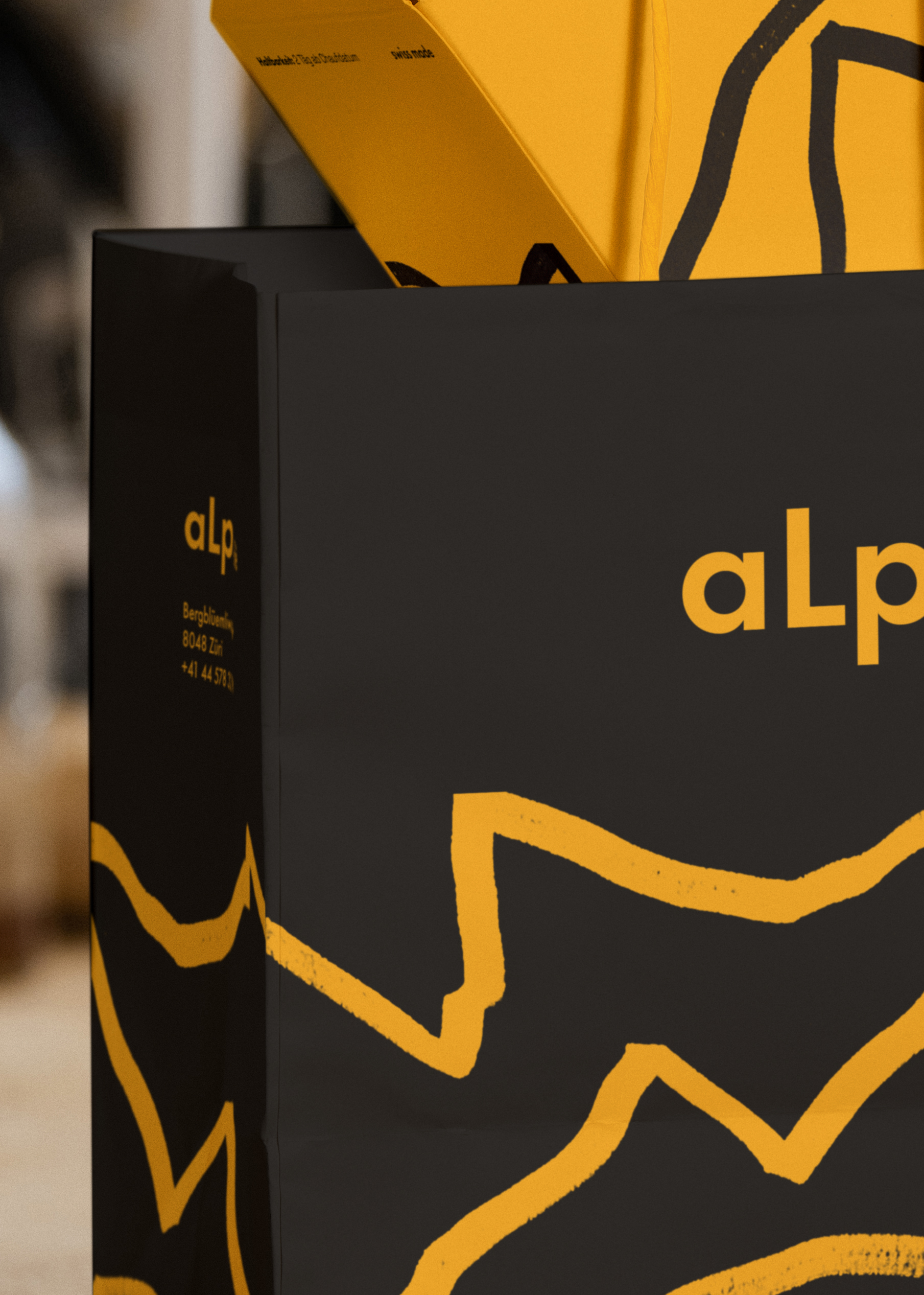
The logo is intentionally simple yet symbolically expressive. The elongated “L” in aLp subtly forms the silhouette of a mountain peak, referencing the Swiss Alps in a minimalistic and contemporary way. This small detail helps the logo feel both modern and connected to Swiss culture. The typography is clean, functional, and easy to read, with a slight modern character that reflects the youthful spirit of the brand and supports the straightforward design.
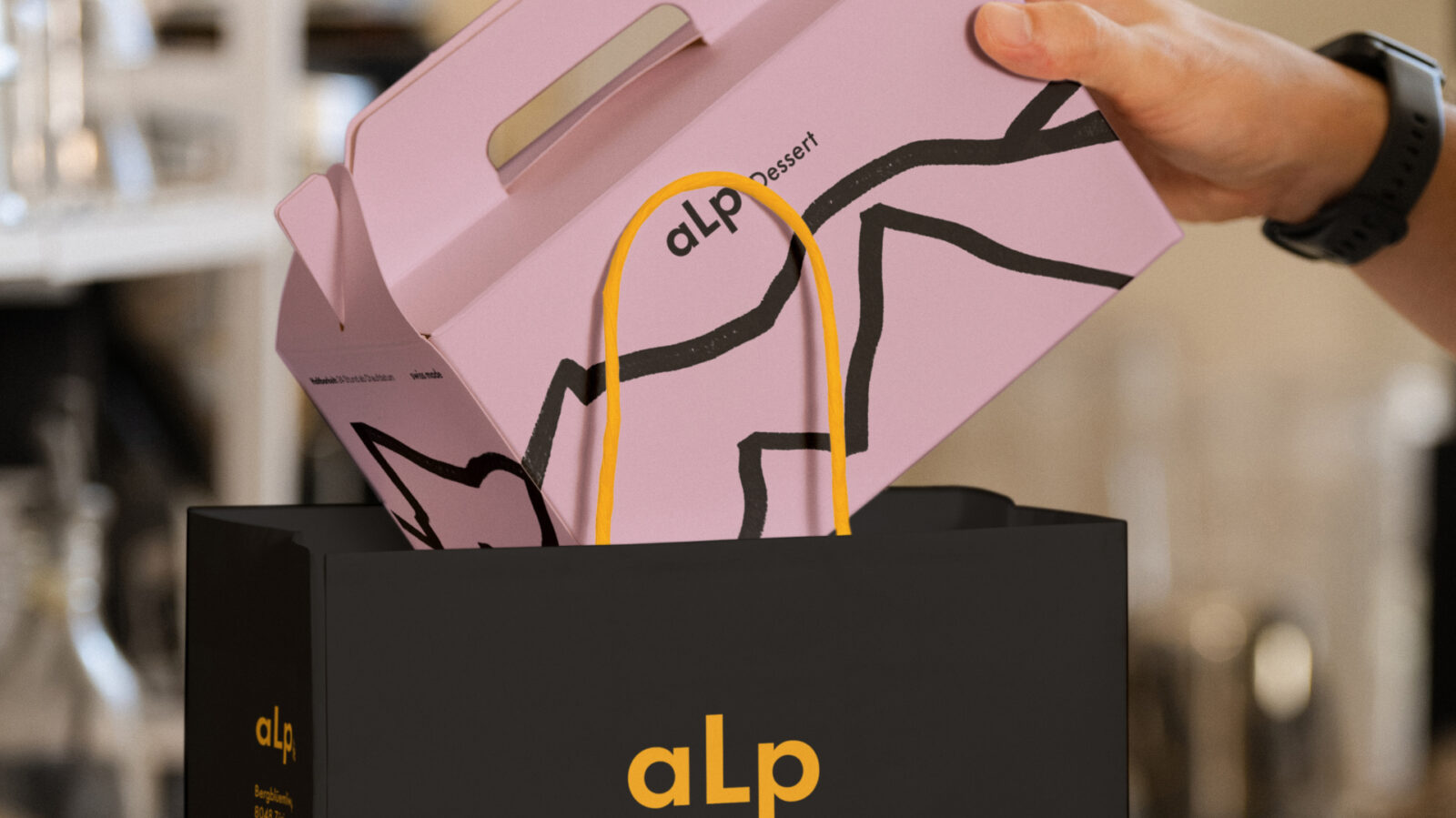
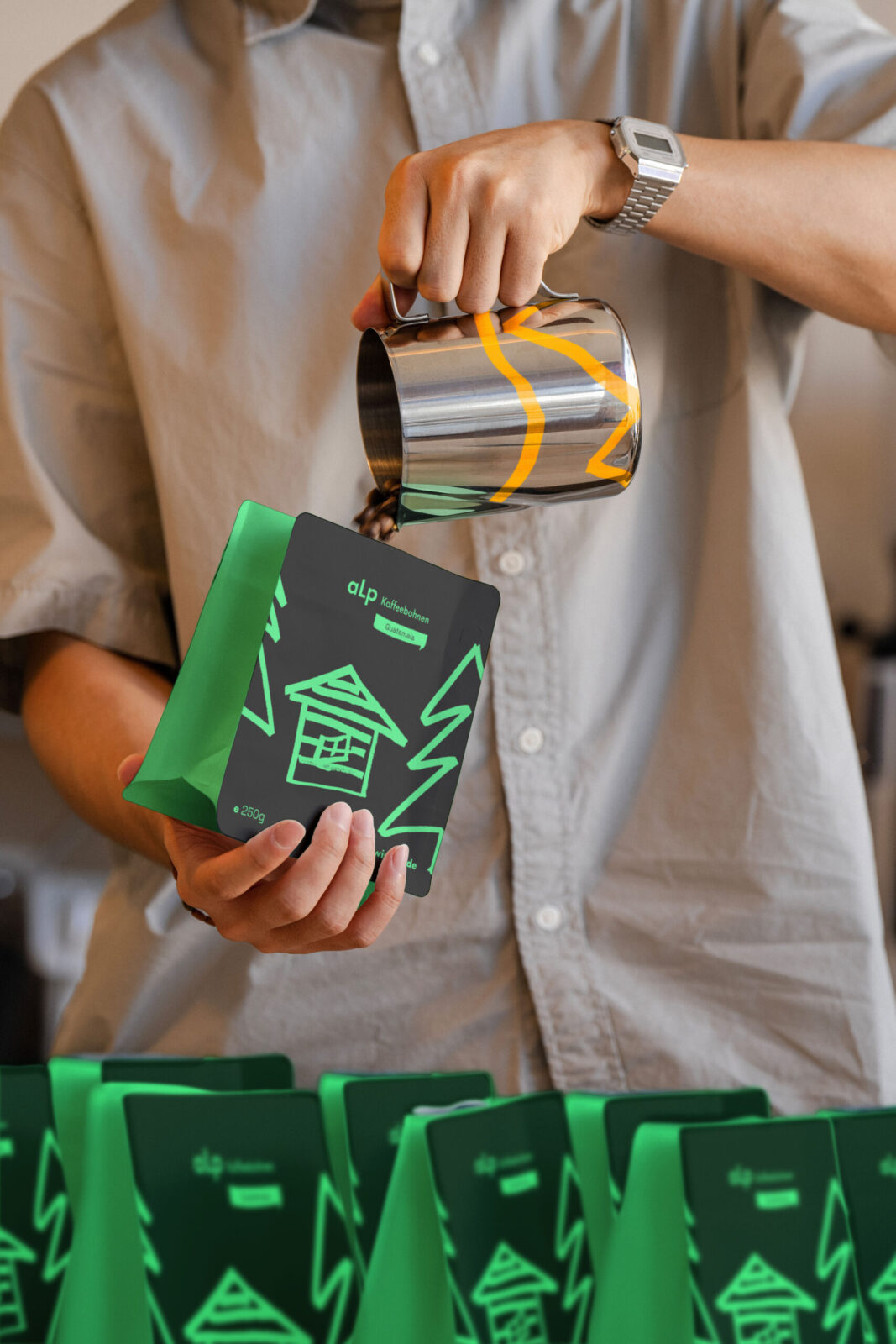
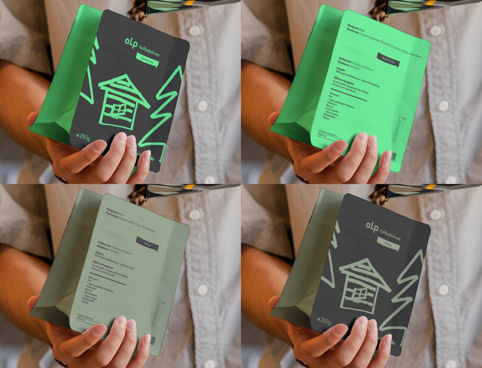
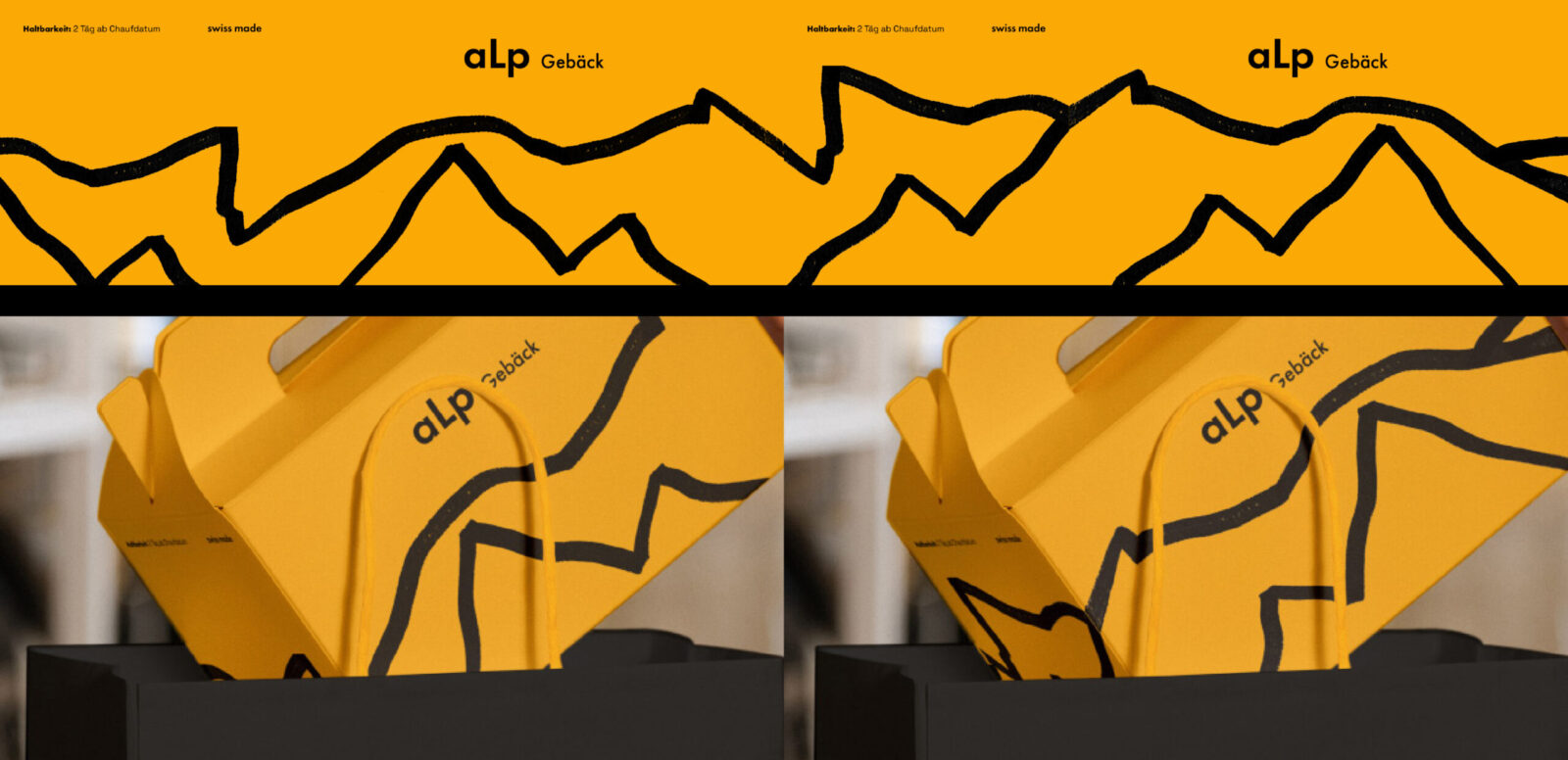
The visual identity is built around hand-drawn illustrations of iconic Swiss symbols: the Edelweiss flower, the Alps, a traditional chalet, and alpine pine trees. These marker-drawn illustrations bring a warm, human character into the otherwise minimalistic system. They serve as simple visual anchors that are easy to recognize and help the packaging stand out without overwhelming the viewer.
The color palette is vibrant yet balanced, inspired by the clarity and structure of Swiss design. The main brand colors are black and orange, while each product category has its own dedicated color to keep the system organized and consistent:
Pastry — orange (the flagship category)
Desserts — red
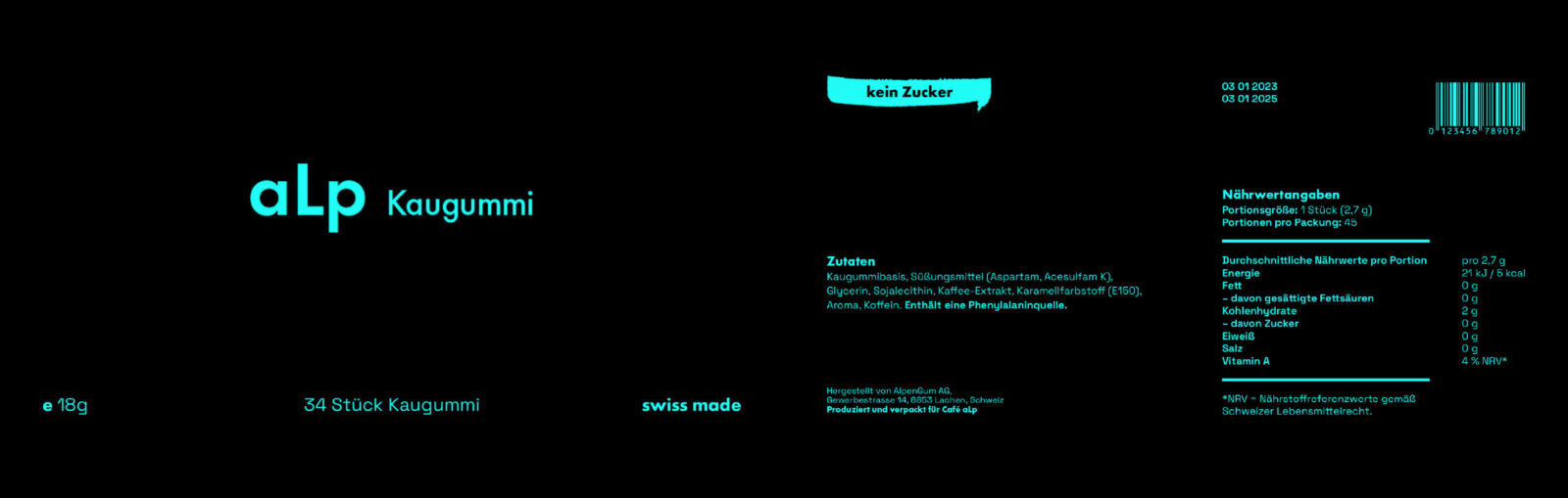
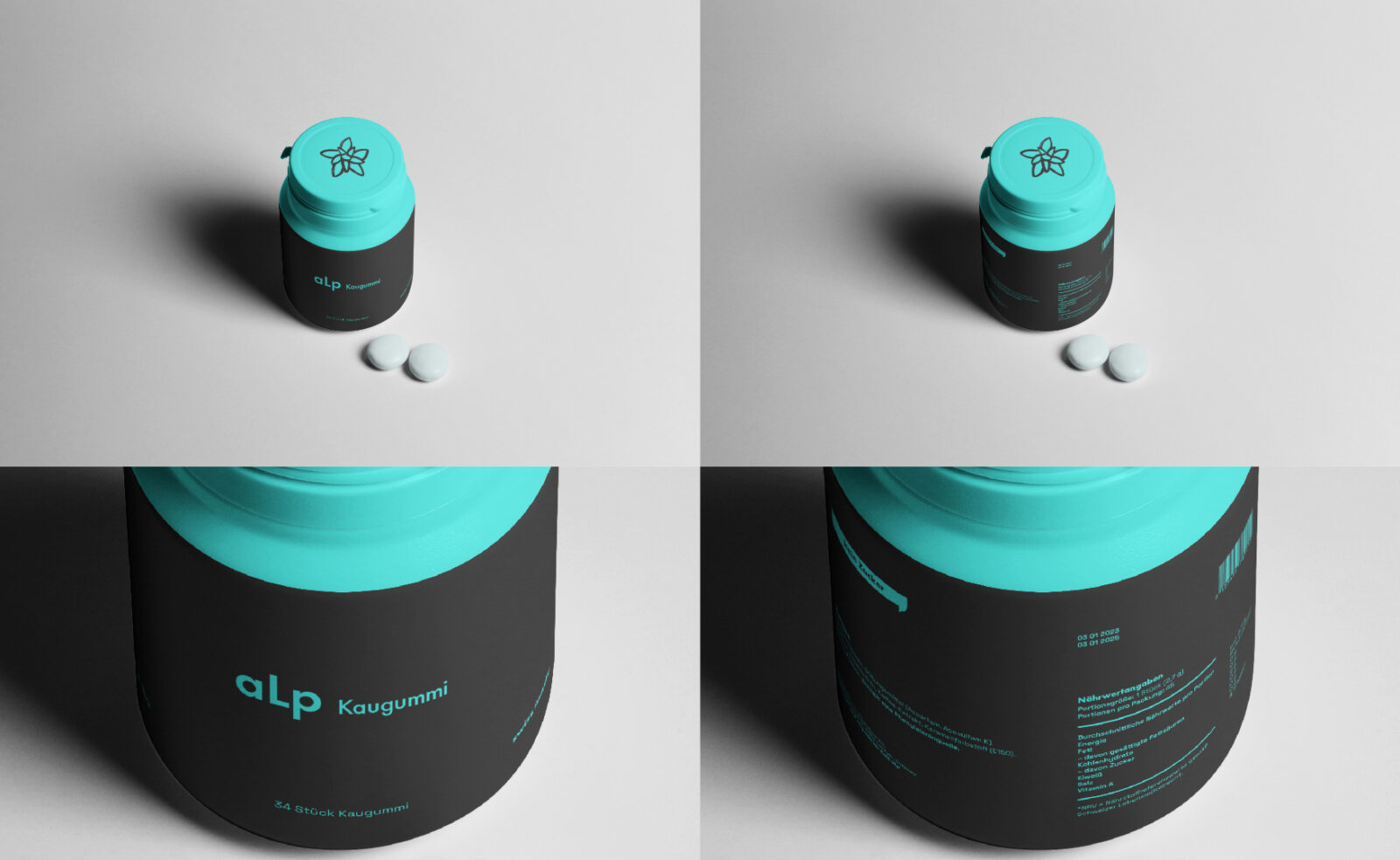
Chewing gum — blue
Coffee — light green and dark green (representing coffee strength)
Since pastries and desserts are freshly baked daily, all packaging includes short shelf-life markings following traditional bakery standards. This detail reinforces the idea of freshness and connects the brand to everyday café routines in Switzerland.
Overall, the final brand and packaging system is simple, modern, and visually distinctive — combining key Swiss cultural elements with contemporary aesthetics and a youthful tone that fits the café’s target audience.
CREDIT
- Agency/Creative: Emil Khusnutdinov
- Article Title: aLp – A Contemporary Swiss Cafè Identity and Packaging Design by Student Emil Khusnutdinov
- Organisation/Entity: Student
- Project Status: Non Published
- Agency/Creative Country: United Arab Emirates
- Agency/Creative City: Dubai
- Market Region: Switzerland
- Project Deliverables: Brand Design, Brand Identity, Drawing, Packaging Design
- Industry: Food/Beverage
- Keywords: WBDS Student Design Awards 2025/26 , Swiss, Identity, Illustration, Packaging, Graphic Design, Food Packaging


